The pivot table is one of Microsoft Excel’s most powerful — and intimidating — functions. Pivot tables can help you summarize and make sense of large data sets. However, they also have a reputation for being complicated.

The good news is that learning how to create a pivot table in Excel is much easier than you may believe.
We’re going to walk you through the process of creating a pivot table and show you just how simple it is. First, though, let’s take a step back and make sure you understand exactly what a pivot table is and why you might need to use one.
![Download 10 Excel Templates for Marketers [Free Kit]](https://no-cache.hubspot.com/cta/default/53/9ff7a4fe-5293-496c-acca-566bc6e73f42.png)
Table of Contents
- What is a pivot table?
- What are pivot tables used for?
- How to Create a Pivot Table
- Pivot Table Examples
- Pivot Table Must-Knows
- 7 Tips & Tricks for Excel Pivot Tables
.png)
Free Excel Marketing Templates
10 free templates to help you master marketing with Excel.
- Marketing Reporting Template
- Email Planning Template
- SEO Template
- And More!
Download Free
All fields are required.
What is a pivot table?
A pivot table is a summary of your data, packaged in a chart that lets you report on and explore trends based on your information. Pivot tables are particularly useful if you have long rows or columns that hold values you need to track the sums of and easily compare to one another.
In other words, pivot tables extract meaning from that seemingly endless jumble of numbers on your screen. More specifically, it lets you group your data in different ways so you can draw helpful conclusions more easily.
The “pivot” part of a pivot table stems from the fact that you can rotate (or pivot) the data in the table to view it from a different perspective.
To be clear, you’re not adding to, subtracting from, or otherwise changing your data when you make a pivot. Instead, you’re simply reorganizing the data so you can reveal useful information.
Video Tutorial: How to Create Pivot Tables in Excel
We know pivot tables can be complex and daunting, especially if it’s your first time creating one. In this video tutorial, you’ll learn how to create a pivot table in six steps and gain confidence in your ability to use this powerful Excel feature.
By immersing yourself, you can become proficient in creating pivot tables in Excel in no time. Pair it with the below kit of Excel templates to get started on the right foot.
What are pivot tables used for?
If you’re still feeling a bit confused about what pivot tables actually do, don’t worry. This is one of those technologies that are much easier to understand once you’ve seen it in action.
The purpose of pivot tables is to offer user-friendly ways to quickly summarize large amounts of data. They can be used to better understand, display, and analyze numerical data in detail.
With this information, you can help identify and answer unanticipated questions surrounding the data.
Here are five hypothetical scenarios where a pivot table could be helpful.
1. Comparing Sales Totals of Different Products
Let’s say you have a worksheet that contains monthly sales data for three different products — product 1, product 2, and product 3. You want to figure out which of the three has been generating the most revenue.
One way would be to look through the worksheet and manually add the corresponding sales figure to a running total every time product 1 appears.
The same process can then be done for product 2 and product 3 until you have totals for all of them. Piece of cake, right?
Imagine, now, that your monthly sales worksheet has thousands upon thousands of rows. Manually sorting through each necessary piece of data could literally take a lifetime.
With pivot tables, you can automatically aggregate all of the sales figures for product 1, product 2, and product 3 — and calculate their respective sums — in less than a minute.

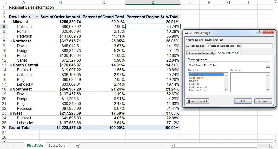
2. Showing Product Sales as Percentages of Total Sales
Pivot tables inherently show the totals of each row or column when created. That’s not the only figure you can automatically produce, however.
Let’s say you entered quarterly sales numbers for three separate products into an Excel sheet and turned this data into a pivot table. The pivot table automatically gives you three totals at the bottom of each column — having added up each product’s quarterly sales.
But what if you wanted to find the percentage these product sales contributed to all company sales, rather than just those products’ sales totals?
With a pivot table, instead of just the column total, you can configure each column to give you the column’s percentage of all three column totals.
Let’s say three products totaled $200,000 in sales, and the first product made $45,000. You can edit a pivot table to say this product contributed 22.5% of all company sales.
To show product sales as percentages of total sales in a pivot table, simply right-click the cell carrying a sales total and select Show Values As > % of Grand Total.
3. Combining Duplicate Data
In this scenario, you’ve just completed a blog redesign and had to update many URLs. Unfortunately, your blog reporting software didn’t handle the change well and split the “view” metrics for single posts between two different URLs.
In your spreadsheet, you now have two separate instances of each individual blog post. To get accurate data, you need to combine the view totals for each of these duplicates.

Instead of having to manually search for and combine all the metrics from the duplicates, you can summarize your data (via pivot table) by blog post title.
Voilà, the view metrics from those duplicate posts will be aggregated automatically.

4. Getting an Employee Headcount for Separate Departments
Pivot tables are helpful for automatically calculating things that you can’t easily find in a basic Excel table. One of those things is counting rows that all have something in common.
For instance, let’s say you have a list of employees in an Excel sheet. Next to the employees’ names are the respective departments they belong to.
You can create a pivot table from this data that shows you each department’s name and the number of employees that belong to those departments.
The pivot table’s automated functions effectively eliminate your task of sorting the Excel sheet by department name and counting each row manually.
Free Excel Marketing Templates
10 free templates to help you master marketing with Excel.
- Marketing Reporting Template
- Email Planning Template
- SEO Template
- And More!
Download Free
All fields are required.
5. Adding Default Values to Empty Cells
Not every dataset you enter into Excel will populate every cell. If you’re waiting for new data to come in, you might have lots of empty cells that look confusing or need further explanation.
That’s where pivot tables come in.
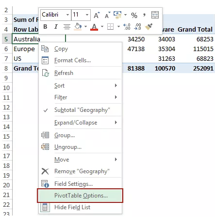
You can easily customize a pivot table to fill empty cells with a default value, such as $0 or TBD (for “to be determined”). For large data tables, being able to tag these cells quickly is a valuable feature when many people are reviewing the same sheet.
To automatically format the empty cells of your pivot table, right-click your table and click PivotTable Options.
In the window that appears, check the box labeled “For Empty Cells Show” and enter what you’d like displayed when a cell has no other value.
How to Create a Pivot Table
Now that you have a better sense of pivot tables, let’s get into the nitty-gritty of how to actually create one.
On creating a pivot table, Toyin Odobo, a Data Analyst, said:
“Interestingly, MS Excel also provides users with a ‘Recommended Pivot Table Function.’ After analyzing your data, Excel will recommend one or more pivot table layouts that would be helpful to your analysis, which you can select from and make other modifications if necessary.
“However, this has its limitations in that it may not always recommend the best arrangement for your data!
“As a data professional, my advice is that you keep this in mind and explore the option of learning how to create a pivot table on your own from scratch.”
With this great advice in mind, here are the steps you can use to create your very own pivot table.
Step 1. Enter your data into a range of rows and columns.
Every pivot table in Excel starts with a basic Excel table, where all your data is housed. To create this table, simply enter your values into a set of rows and columns, like the example below.

Here, I have a list of people, their education level, and their marital status. With a pivot table, I could find out several pieces of information. I could find out how many people with master’s degrees are married, for instance.
At this point, you’ll want to have a goal for your pivot table. What kind of information are you trying to glean by manipulating this data? What would you like to learn? This will help you design your pivot table in the next few steps.
Step 2. Insert your pivot table.
Inserting your pivot table is actually the easiest part. You’ll want to:
- Highlight your data.
- Go to Insert in the top menu.
- Click Pivot table.

Note: If you’re using an earlier version of Excel, "PivotTables" may be under Tables or Data along the top navigation, rather than "Insert."
A dialog box will come up, confirming the selected data set and giving you the option to import data from an external source (ignore this for now). It will also ask you where you want to place your pivot table. I recommend using a new worksheet.

You typically won’t have to edit the options unless you want to change your selected table and change the location of your pivot table.
Once you’ve double-checked everything, click OK.
You will then get an empty result like this:

This is where it gets a little confusing, and where I used to stop as a beginner because I was so thrown off. We’ll be editing the pivot table fields next so that a table is rendered.
Step 3. Edit your pivot table fields.
You now have the “skeleton” of your pivot table, and it’s time to flesh it out. After you click OK, you will see a pane for you to edit your pivot table fields.

This can be a bit confusing to look at if this is your first time.
In this pane, you can take any of your existing table fields (for my example, it would be First Name, Last Name, Education, and Marital Status), and turn them into one of four fields:
Filter
This turns your chosen field into a filter at the top, by which you can segment data. For instance, below, I’ve chosen to filter my pivot table by Education. It works just like a normal filter or data splicer.

Column
This turns your chosen field into vertical columns in your pivot table. For instance, in the example below, I’ve made the columns Marital Status.

Keep in mind that the field’s values themselves are turned into columns, and not the original field title. Here, the columns are “Married” and “Single.” Pretty nifty, right?
Row
This turns your chosen field into horizontal rows in your pivot table. For instance, here’s what it looks like when the Education field is set to be the rows.

Value
This turns your chosen field into the values that populate the table, giving you data to summarize or analyze.
Values can be averaged, summed, counted, and more. For instance, in the below example, the values are a count of the field First Name, telling me which people across which educational levels are either married or single.

Step 4: Analyze your pivot table.
Once you have your pivot table, it’s time to answer the question you posed for yourself at the beginning. What information were you trying to learn by manipulating the data?
With the above example, I wanted to know how many people are married or single across educational levels.
I therefore made the columns Marital Status, the rows Education, and the values First Name (I also could’ve used Last Name).
Values can be summed, averaged, or otherwise calculated if they’re numbers, but the First Name field is text. The table automatically set it to Count, which meant it counted the number of first names matching each category. It resulted in the below table:
Here, I’ve learned that across doctoral, lower secondary, master, primary, and upper secondary educational levels, these number of people are married or single:
- Doctoral: 2 single
- Lower secondary: 1 married
- Master: 2 married, 1 single
- Primary: 1 married
- Upper secondary: 3 single
Now, let’s look at an example of these same principles, but for finding the average number of impressions per blog post on the HubSpot blog.
Free Excel Marketing Templates
10 free templates to help you master marketing with Excel.
- Marketing Reporting Template
- Email Planning Template
- SEO Template
- And More!
Download Free
All fields are required.
Step-by-Step Excel Pivot Table
- Enter your data into a range of rows and columns.
- Sort your data by a specific attribute (if needed).
- Highlight your cells to create your pivot table.
- Drag and drop a field into the “Row Labels” area.
- Drag and drop a field into the “Values” area.
- Fine-tune your calculations.
Step 1. I entered my data into a range of rows and columns.
I want to find the average number of impressions per HubSpot blog post. First, I entered my data, which has several columns:
- Top Pages
- Clicks
- Impressions
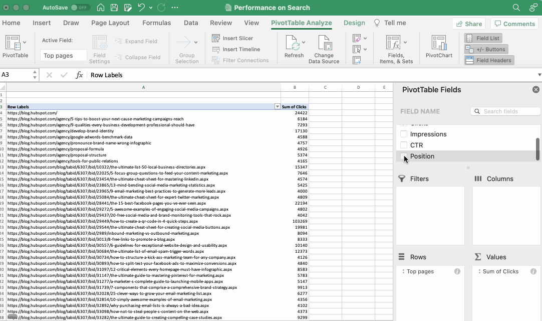
The table also includes CTR and position, but I won't be including that in my pivot table fields.

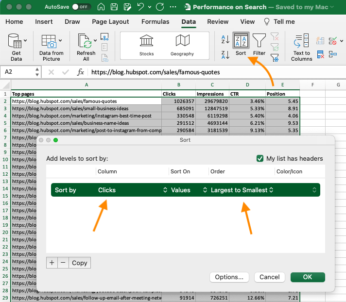
Step 2. I sorted my data by a specific attribute.
I want to sort my URLs by Clicks to make the information easier to manage once it becomes a pivot table. This step is optional, but can be handy for large data sets.
To sort your data, click the Data tab in the top navigation bar and select Sort. In the window that appears, you can sort your data by any column you want and in any order.
For example, to sort my Excel sheet by “Clicks,” I selected this column title under Column and then selected Largest to Smallest as the order.
Step 3. I highlighted my cells to create a pivot table.
Like in the previous tutorial, highlight your data set, click Insert along the top navigation, and click PivotTable.
Alternatively, you can highlight your cells, select Recommended PivotTables to the right of the PivotTable icon, and open a pivot table with pre-set suggestions for how to organize each row and column.

Step 4. I dragged and dropped a field into the “Rows” area.
Now, it's time to start building my table.
Rows determine what unique identifier the pivot table will organize your data by.
Since I want to organize a bunch of blogging data by URL, I dragged and dropped the “Top pages” field into the “Rows" area.

Note: Your pivot table may look different depending on which version of Excel you’re working with. However, the general principles remain the same.
Step 5. I dragged and dropped a field into the “Values” area.
Next up, it's time to add in some values by dragging a field into the Values area.
While my focus is on impressions, I still want to see clicks. I dragged it into the Values box, and left the calculation on Sum.
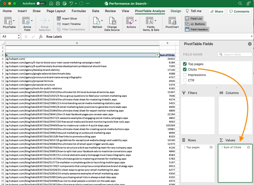
Then, I dragged Impressions into the values box, but I didn't want to summarize by Sum. Instead, I wanted to see the Average.
I clicked the small i next to Impressions, selected "Average" under Summarize by, then clicked OK.
Once you’ve made your selection, your pivot table will be updated accordingly.
Step 6. I fine-tuned my calculations.
The sum of a particular value will be calculated by default, but you can easily change this to something like average, maximum, or minimum, depending on what you want to calculate.
I didn't need to fine-tune my calculations further, but you always can. On a Mac, click the i next to the value and choose your calculation.
If you’re using a PC, you’ll need to click on the small upside-down triangle next to your value and select Value Field Settings to access the menu.
When you’ve categorized your data to your liking, save your work, and don't forget to analyze the results.
Pivot Table Examples
From managing money to keeping tabs on your marketing efforts, pivot tables can help you keep track of important data. The possibilities are endless!
See three pivot table examples below to keep you inspired.
1. Creating a PTO Summary and Tracker
If you’re in HR, running a business, or leading a small team, managing employees’ vacations is essential. This pivot allows you to seamlessly track this data.
All you need to do is import your employees’ identification data along with the following data:
- Sick time.
- Hours of PTO.
- Company holidays.
- Overtime hours.
- Employee’s regular number of hours.
From there, you can sort your pivot table by any of these categories.
2. Building a Budget

Whether you’re running a project or just managing your own money, pivot tables are an excellent tool for tracking spend.
The simplest budget just requires the following categories:
- Date of transaction.
- Withdrawal/expenses.
- Deposit/income.
- Description.
- Any overarching categories (like paid ads or contractor fees).
With this information, you can see your biggest expenses and brainstorm ways to save.
3. Tracking Your Campaign Performance

Pivot tables can help your team assess the performance of your marketing campaigns.
In this example, campaign performance is split by region. You can easily see which country had the highest conversions during different campaigns.
This can help you identify tactics that perform well in each region and where advertisements need to be changed.
Free Excel Marketing Templates
10 free templates to help you master marketing with Excel.
- Marketing Reporting Template
- Email Planning Template
- SEO Template
- And More!
Download Free
All fields are required.
Pivot Table Must-Knows
There are some tasks that are unavoidable in the creation and usage of pivot tables. To assist you with these tasks, we have provided step-by-step instructions on how to carry them out.
How to Create a Pivot Table With Multiple Columns
Now that you can create a pivot table, how about we try to create one with multiple columns? Just follow these steps:
- Select your data range. Select the data you want to include in your pivot table, including column headers.
- Insert a pivot table. Go to the Insert tab in the Excel ribbon and click on the “PivotTable” button.
- Choose your data range. In the “Create PivotTable” dialog box, ensure that the correct range is automatically selected, and choose where you want to place the pivot table (e.g., a new worksheet or an existing worksheet).
- Designate multiple columns. In the PivotTable Field List, drag and drop the fields you want to include as column labels to the “Columns” area. These fields will be displayed as multiple columns in your pivot table.
- Add row labels and values. Drag and drop the fields you want to summarize or display as row labels to the “Rows” area.
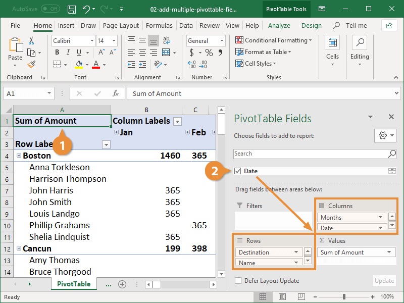
Similarly, drag and drop the fields you want to use for calculations or aggregations to the “Values” area.
- Customize the pivot table. You can further customize your pivot table by adjusting the layout, applying filters, sorting, and formatting the data as needed.
For more visual instructions, watch this video:
How to Copy a Pivot Table
To copy a pivot table in Excel, follow these steps:
- Select the entire pivot table. Click anywhere within the pivot table. You should see selection handles around the table.
- Copy the pivot table. Right-click and select “Copy” from the context menu, or use the shortcut Ctrl+C on your keyboard.
- Choose the destination. Go to the worksheet where you want to paste the copied pivot table.
- Paste the pivot table. Right-click on the cell where you want to paste the pivot table and select “Paste” from the context menu, or use the shortcut Ctrl+V on your keyboard.
- Adjust the pivot table range (if needed). If the copied pivot table overlaps with existing data, you may need to adjust the range to avoid overwriting the existing data. Simply click and drag the corner handles of the pasted pivot table to resize it accordingly.
By following these steps, you can easily copy and paste a pivot table from one location to another within the same workbook or even across different workbooks.
This allows you to duplicate or move pivot tables to different worksheets or areas within your Excel file.
For more visual instructions, watch this video:
How to Sort a Pivot Table
To sort a pivot table, you can follow these steps:
- Select the column or row you want to sort.
- If you want to sort a column, click on any cell within that column in the pivot table.
- If you want to sort a row, click on any cell within that row in the pivot table.
- Sort in ascending or descending order.
- Right-click on the selected column or row and choose “Sort” from the context menu.
- In the “Sort” submenu, select either “Sort A to Z” (ascending order) or “Sort Z to A” (descending order).
Alternatively, you can use the sort buttons on the Excel ribbon:
- Go to the PivotTable tab. With the pivot table selected, go to the “PivotTable Analyze” or “PivotTable Tools” tab on the Excel ribbon (depending on your Excel version).
- Sort the pivot table. In the “Sort” group, click on the “Sort Ascending” button (A to Z) or the “Sort Descending” button (Z to A).

These instructions will allow you to sort the data within a column or row in your pivot table. Please remember that sorting a pivot table rearranges the data within that specific field and does not affect the overall structure of the pivot table.
You can also watch the video below for further instructions.
How to Delete a Pivot Table
To delete a pivot table in Excel, you can follow these steps:
- Select the pivot table you want to delete. Click anywhere within the pivot table that you want to remove.
- Delete the pivot table.
- Press the “Delete” or “Backspace” key on your keyboard.
- Right-click on the pivot table and select “Delete” from the context menu.
- Go to the “PivotTable Analyze” or “PivotTable Tools” tab on the Excel ribbon (depending on your Excel version), click on the “Options” or “Design” button, and then choose “Delete” from the dropdown menu.

- Confirm the deletion. Excel may prompt you to confirm the deletion of the pivot table. Review the message and select “OK” or “Yes” to proceed with the deletion.
Once you complete these steps, the pivot table and its data will be removed from the worksheet. It’s important to note that deleting a pivot table does not delete the original data source or any other data in the workbook.
It simply removes the pivot table visualization from the worksheet.
How to Group Dates in Pivot Tables
To group dates in a pivot table in Excel, follow these steps:
- Ensure that your date column is in the proper date format. If not, format the column as a date.
- Select any cell within the date column in the pivot table.
- Right-click and choose “Group” from the context menu.

- The Grouping dialog box will appear. Choose the grouping option that suits your needs, such as days, months, quarters, or years. You can select multiple options by holding down the Ctrl key while making selections.
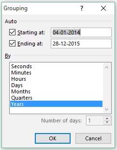
- Adjust the starting and ending dates if needed.
- Click “OK” to apply the grouping.
Excel will now group the dates in your pivot table based on the chosen grouping option. The pivot table will display the summarized data based on the grouped dates.
Note: The steps may slightly vary depending on your Excel version. If you don’t see the “Group” option in the context menu, you can also access the Grouping dialog box by going to the “PivotTable Analyze” or “PivotTable Tools” tab on the Excel ribbon, selecting the “Group Field” button, and following the subsequent steps.
By grouping dates in your pivot table, you can easily analyze data by specific time periods, such as months, which can help you get a clearer understanding of trends and patterns in your data.
Free Excel Marketing Templates
10 free templates to help you master marketing with Excel.
- Marketing Reporting Template
- Email Planning Template
- SEO Template
- And More!
Download Free
All fields are required.
How to Add a Calculated Field in a Pivot Table
If you’re trying to add a calculated field in a pivot table in Excel, you can follow these steps:
- Select any cell within the pivot table.
- Go to the “PivotTable Analyze” or “PivotTable Tools” tab on the Excel ribbon (depending on your Excel version).
- Go to the “Calculations” group. In the “Calculations” group, click on the “Fields, Items & Sets” button and select “Calculated Field” from the dropdown menu.
- The “Insert Calculated Field” dialog box will appear. Enter a name for your calculated field in the “Name” field.
- Enter the formula for your calculated field in the “Formula” field. You can use mathematical operators (+, -, *, /), functions, and references to other fields in the pivot table.
- Click “OK” to add the calculated field to the pivot table.
The pivot table will now display the calculated field as a new column or row, depending on the layout of your pivot table.
The calculated field you created will use the formula you specified to calculate values based on the existing data in the pivot table. Pretty cool right?
Note: The steps may slightly vary depending on your Excel version. If you don’t see the “Fields, Items & Sets” button, you can right-click on the pivot table and select “Show Field List.” They both do the same thing.
Adding a calculated field to your pivot table helps you perform unique calculations and get new insights from the data in your pivot table.
It allows you to expand your analysis and perform calculations specific to your needs. You can also watch the video below for some visual instructions.
How to Remove Grand Total From a Pivot Table
To remove the grand total from a pivot table in Excel, follow these steps:
- Select any cell within the pivot table.
- Go to the “PivotTable Analyze” or “PivotTable Tools” tab on the Excel ribbon (depending on your Excel version).
- Click on the “Field Settings” or “Options” button in the “PivotTable Options” group.
- The “PivotTable Field Settings” or “PivotTable Options” dialog box will appear.
- Depending on your Excel version, follow one of the following methods:
- For Excel 2013 and earlier versions: In the “Subtotals & Filters” tab, uncheck the box next to “Grand Total.”
- For Excel 2016 and later versions: In the “Totals & Filters” tab, uncheck the box next to “Show grand totals for rows/columns.”
- Click “OK” to apply the changes.
The grand total row or column will be removed from your pivot table, and only the subtotals for individual rows or columns will be displayed.
Note: The steps may slightly vary depending on your Excel version and the layout of your pivot table. If you don’t see the “Field Settings” or “Options” button in the ribbon, you can right-click on the pivot table, select “PivotTable Options,” and follow the subsequent steps.
By removing the grand total, you can focus on the specific subtotals within your pivot table and exclude the overall summary of all the data. This can be useful when you want to analyze and present the data in a more detailed manner.
For a more visual explanation, watch the video below.
7 Tips & Tricks For Excel Pivot Tables
1. Use the right data range.
Before creating a pivot table, make sure that your data range is properly selected. Include all the necessary columns and rows, making sure there are no empty cells within the data range.
2. Format your data.
To avoid potential issues with data interpretation, format your data properly. Ensure consistent formatting for date fields, numeric values, and text fields.
Remove any leading or trailing spaces, and ensure that all values are in the correct data type.
3. Choose your field names wisely.
While creating a pivot table, use clear and descriptive names for your fields. This will make it easier to understand and analyze the data within the pivot table.
4. Apply pivot table filters.
Take advantage of the filtering capabilities in pivot tables to focus on specific subsets of data. You can apply filters to individual fields or use slicers to visually interact with your pivot table.
5. Classify your data.
If you have a large amount of data, consider grouping it to make the analysis simpler. You can group data by dates, numeric ranges, or with your special kind of classification.
This helps to summarize and organize data in a more meaningful way within the pivot table.
6. Customize pivot table layout.
Excel allows you to customize the layout of your pivot table.
You can drag and drop fields between different areas of the pivot table (e.g., rows, columns, values) to rearrange the layout and present the data in the most useful way for your analysis.
7. Refresh and update data.
If your data source changes or you add new data, remember to refresh the pivot table to reflect the latest updates.
To refresh a pivot table in Excel and update it with the latest data, follow these steps:
- Select the pivot table. Click anywhere within the pivot table that you want to refresh.
- Refresh the pivot table. There are multiple ways to refresh the pivot table:
- Right-click anywhere within the pivot table and select “Refresh” from the context menu.
- Or, go to the “PivotTable Analyze” or “PivotTable Tools” tab on the Excel ribbon (depending on your Excel version) and click on the “Refresh” button.
- Or, use the keyboard shortcut: Alt+F5.
- Verify the updated data. After refreshing, the pivot table will update with the latest data from the source range or data connection. We recommend confirming the refreshed data to make sure you have what you want.
By following these steps, you can easily refresh your pivot table to reflect any changes in the underlying data. This ensures that your pivot table always displays the most up-to-date information.
You can watch the video below for more detailed instructions.
These tips and tricks will help you create and use pivot tables in Excel, allowing you to analyze and summarize your data in a dynamic and efficient manner.
Digging Deeper With Pivot Tables
Imagine this. You’re a business analyst. You have a large dataset that needs to be analyzed to identify trends and patterns. You and your team decide to use a pivot table to summarize and analyze the data quickly and efficiently.
As you explored different combinations of fields, you discovered interesting insights and correlations that would have been time-consuming to find manually.
The pivot table helped you to streamline the data analysis process and present the findings to stakeholders in a clear and concise manner, impressing them with your team’s efficiency and ability to retrieve actionable insights. Sounds good right?
You’ve now learned the basics of pivot table creation in Excel. With this understanding, you can figure out what you need from your pivot table and find the solutions you’re looking for. Good luck!
Editor's note: This post was originally published in December 2018 and has been updated for comprehensiveness.


![How to Use VLOOKUP Function in Microsoft Excel [+ Video Tutorial]](https://www.hubspot.com/hubfs/VLOOKUP-hero.webp)