One time I tried signing up for a spin class at a new studio. I went to the studio’s website to complete their multi-step sign up form, but by the time I got to part three of of the form, I got an error message that wouldn’t let me complete my registration.
The error message didn’t explain what I was doing wrong. So I attempted to complete the web form another four times (yes, I really wanted to try this studio) with no success. To say I was annoyed is an understatement. Finally, I ditched the site (along with the spin class) and went for a run instead.
Needless to say, a multi-step form that requires dozens of field entries can easily become complicated, frustrating and time-consuming for your leads. But there is a way to make registration with a multi-step form a positive experience for your website visitors.
A well-crafted multi-step form means that more visitors will complete your web form with less hiccups.
You may be asking yourself how creating more work for your leads by spreading information out across a multi-step form could possibly be a good thing when it comes to user experience — fair question.
The answer is that a multi-step form actually makes the large amount of information required to complete a long form appear more organized and less overwhelming. Plus, multi-step forms are proven to result in more conversions than single-step forms. For example, in one experiment, a single-step form experienced an increase in conversions of 59.2% after it was converted into a multi-step form.
Multi-Step Forms vs. Single-Step Forms: Which is Better?
If you use a multi-step form under the right conditions your conversion rates have the potential to skyrocket. But you need to know when to actually enable a multi-step form versus when to keep it as a single-step form.
So, how do you get it right? Unfortunately, there is no concrete answer or rulebook to follow. But here are some thoughts for you to consider when creating your own forms.
Multi-Step Forms
By splitting up long forms into multiple steps, you will make your life easier when reviewing the form entries. You will also simplify things for the people completing your form.
Forms that require a lot of information, such as registration forms or order forms, almost always benefit from being split up into multiple steps.
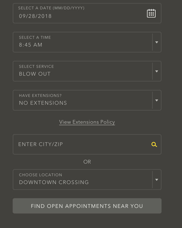
For example, check out The DryBar’s registration form. The sections in their form range from questions about appointment times to billing information. The form separates each category of questions into segmented steps, making the form easy-to-follow.
 Source:Drybar
The Drybar form does not allow users to move forward in the completion process if they have not successfully filled in all of the blank fields.
Source:Drybar
Each section of the form also takes users to a new page. This is another way in which the company splits up the form completion process for users.

Source:Drybar
At the end of the form, users are able to easily complete the form by hitting the “Submit Payment” button.
Single-Step Forms
Single step forms are beneficial when you only need one type of information from your users. Meaning, if you simply need a lead’s basic contact information or if you just need their email address, there is no need to create multiple steps.
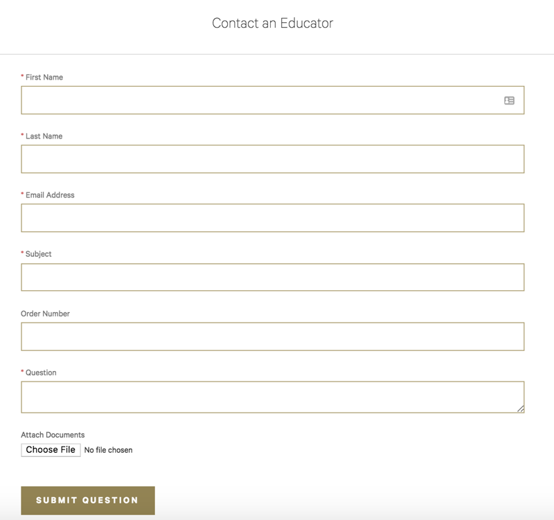
Lululemon’s “contact us” form is a great example of a successful one-step form. There is only one category of questions and there are few enough questions being asked that a website visitor would not feel overwhelmed reviewing them all at once.
Source: Lululemon
Their form has clear fields that make sense for the form type and users have enough space in the fields to answer the form fields completely all on one page and one form.
Multi-Step Versus One-Step Ecommerce Checkout
Some ecommerce sites take customers through a multi-step checkout process while others use a single step process. Although there isn’t necessarily a right or wrong option, businesses have different preferences about which option they prefer on their website. You may choose multi-step or single-step checkout based on what you’re selling, what your customers prefer or what you believe works best for your business.
In a multi-step checkout form, there are several different pages that customers work through that may include form fields asking for the customer to create an account and enter their delivery and billing details. In a single-step checkout form, there are typically the same exact form fields, but instead, they are all visible to the customer at the same time. There is significantly more information visible to the customer at once in a single-step checkout versus a multi-step checkout.
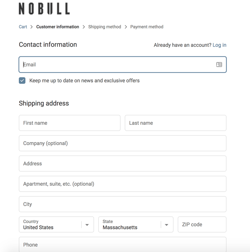
For example, NOBULL (a training apparel and footwear brand) takes customers through three separate pages during their multi-step checkout process to split the content into sections that make sense. At the top of the form, NOBULL outlines the three sections of the form.
Multi-step checkout works well in this scenario because of the amount of information they are asking for — by splitting it up, it looks simple and manageable for customers to complete. Additionally, NOBULL may assume (or know based on data they’ve collected) that their customers prefer a multi-step checkout process that looks clean and minimalist versus a single-step checkout with all of the information visible to them at once.
Source: NOBULL
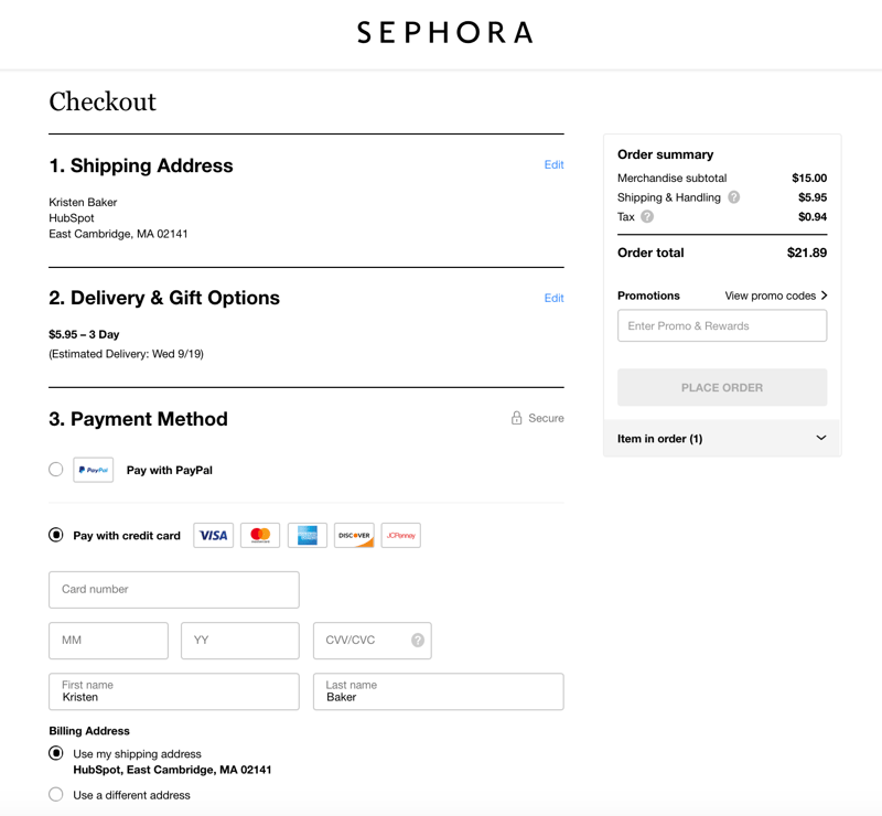
There are also plenty of businesses that choose to keep the entire checkout process on one page, so all of the fields are visible at once, like Sephora. Sephora knows that their client base prefers a single-step checkout form. Although there is a lot of information to consume, it is beneficial for their persona to have everything laid out neatly in front of them to review all at once.
Source:Sephora
There is no rulebook that tells you which option is best for your business. However, you can make an informed decision that works well for both your brand and customer base. If you’re concerned about making the right decision for your buyer personas, then you can always perform an A/B test, or ask your customers for feedback on their buying experience. You can always adapt your form to your customers’ needs.
Now that we have reviewed the reasons why you should consider implementing multi-step forms and the cases in which they are most useful, let’s dive into how to actually create your form.
How to Create a Multi-Step Form
There are many online form builders and tools that you can use to create your multi-step forms. We will work with HubSpot’s form builder as an example. With HubSpot, the form builder is actually meant to work with single-step, one-page forms, but there are a few workarounds that you can implement to create a multi-step form.
Let’s walk through how to create a multi-step form using HubSpot.
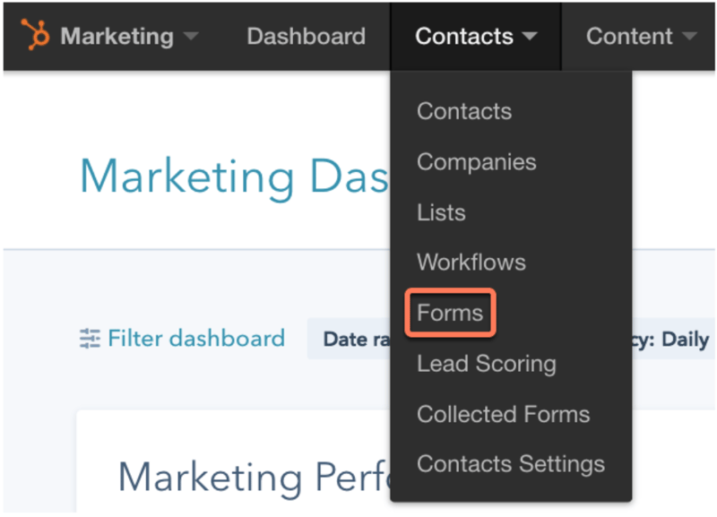
Navigate to your marketing dashboard within HubSpot. Under the “Marketing” drop-down menu, click “Lead Capture” and then “Forms”. Then, follow the steps below:
Create Multiple Pages That Redirect to One Another
Now, let’s walk through these steps to create your multi-step form.
- Create and publish two different landing pages.
- Click “Marketing”, “Lead Capture”, and “Forms”.
- Create a new form with the first set of questions that you want to ask your leads.
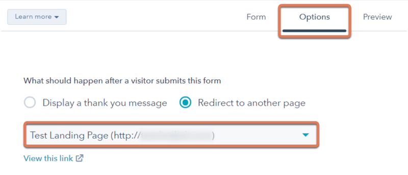
- Click “Options” at the top of the page.
- Click “Redirect to another page” under the question, “What should happen after a visitor submits this form?”
- Now it’s time to add the second landing page. Based on your account type, determine which way you need to do this: Marketing Hub Basic, Professional, or Enterprise accounts: Click on your second landing page in the drop-down menu or click “Add external link” to paste the second landing pages URL in the field. HubSpot CRM or Hub Starter accounts: Paste the URL of the second landing page in the “Redirect to this URL” field.
- Add or embed your form on the first landing page you created.
- Create a new form with your second set of questions.
- Click “Options” at the top of the page.
- Under “What should happen after a visitor submits this form?” you can decide whether or not you’d like to “Display a thank you message” or “Redirect to another page”.
- Repeat the steps above if you decide you want to add more landing pages and more forms.
- To keep in mind while creating your multi-step forms with HubSpot: Unless you add the “Email” field on each form that you create, the new forms you add will only be associated with the correct contact if your website visitor has their “cookies enabled”.
Source: HubSpot
Source: HubSpot
There are other ways to create multi-step forms within HubSpot.
Learn how to use dependent fields or progressive profiling to build your next form.
Congrats! You have just completed your multi-step form using HubSpot!
Using conditional logic with a multi-step form
Conditional logic refers to the dynamic alteration of subsequent questions based on previous responses. In other words, the next step changes depending on your answers to the step before.
Using conditional logic in multi-step forms significantly improves user interaction by eliminating irrelevant questions. This drives stronger user engagement and, in turn, better data accuracy. Plus, this targeted approach improves the relevance and completion rates of forms, enhancing overall user satisfaction.
Interested in leveraging conditional logic in your next multi-step form? Check out Feathery and its native HubSpot integration.
Conclusion
Multi-step forms have the potential to increase your number of conversions, create a better user experience for your website visitors, and ensure a smooth registration or checkout process for your leads and customers. With the help of a great form builder, multi step forms are also easy to create and embed on your website. When you provide your leads and customers with a positive web-form experience, you will create customer relationships that last.
Conversion Rate Optimization
.png?width=112&height=112&name=shortening-property-en%20(1).png)


