The insights from this article came from the HubSpot Academy's Free Website Optimization Course. Take the full course to learn more about responsive design and how to optimize your website's performance.

Across the world, over 50% of total internet activity is done on mobile devices. Desktops follow behind with a little over 45% of total internet activity, and tablets make up the rest.
Today, with so many people surfing the web from their phones, it's essential to offer a great mobile website experience. Without it, you can't cater to the majority of internet users, and are likely missing out on traffic and leads for your business as a result.
 So how do you create an effective mobile experience? That's where responsive design comes in.
Simply put, responsive web design is the method of designing web pages that appear in their optimized form across all devices.
In other words, a responsive design will automatically reformat your website for all screen sizes. This allows your website visitors to easily view and interact with your site no matter what device they're using.
Here, let's explore how responsive design works, and take a look at some examples to inspire your own responsive web design in 2020.
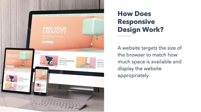
How does responsive design work?
A website developed with responsiveness in-mind adjusts to the size of the device and browser to display the content appropriately. Breakpoints are set up to target ranges that define specific displays. For example, you generally see breakpoints for phones, tablets, and desktops.
There are a number of responsive web design best practices to follow:
- Buttons: A person's finger is much larger than the pointer on a computer screen. Buttons and hyperlinks should be at least 48 pixels wide and 48 pixels tall to ensure all users can click them.
- SVGs: Scalable Vector Graphic Files define an image's shape in terms of vectors, meaning they can scale infinitely without losing quality image quality.
- Responsive Images: Not all of your images are going to be SVGs. For these, you'll want to use CSS rules to automatically adjust the dimensions of the image to fit the users' screen size.
- Fonts: Make sure that your font is legible across all devices. At a minimum, Google recommends using a base font size of 16 CSS pixels.
- Device Features: While prospects and customers can't call you over their computers, they definitely can on their smartphones. Consider changing your “Chat Now!” CTA to “Call Now!” and include your business phone number in lieu of email.
- Test: As always, test your responsive website on different devices and browsers. To see how your website is currently performing, check out HubSpot's Website Grader tool.
Responsive Web Design vs. Isolated Mobile Web Pages
There are two major methods for creating mobile websites: responsive design and mobile templates. Responsive design requires you only have one website that is coded to adapt to all screen sizes, no matter the device the website's being displayed on.
In contrast, a mobile template is a completely separate entity requiring you to have a second, mobile-only website or subdomain. Mobile templates are also built for each specific site, not per screen size.
Mobile-only websites can be great solutions for larger applications such as Facebook and Twitter, but for most businesses, a responsive website is much more cost-efficient, and easier to develop and maintain.
Unlike isolated mobile websites, where you create a whole separate version of a website for mobile devices, responsive design adapts the layout to any screen size by using fluid, proportion-based grids. Responsive websites serve the same HTML to all devices and use CSS media queries to change how your website should look on each device.
As the number of people surfing the web from their phones continues to climb, a responsive design will make your life as a marketer easier and your website more effective. A mobile-friendly website will save you money in the long run, deliver a great user experience, and perform better across all devices.
Responsive Web Design Examples
If you aren't using responsive web design already, then you're in luck because it's very easy nowadays to get started with it.
For example, on the HubSpot Content Hub alone, there are hundreds of templates available for free or purchase that are all responsive right out of the box. Let's take a look at five remarkable examples of responsive web design in action from HubSpot developers for some inspiration.
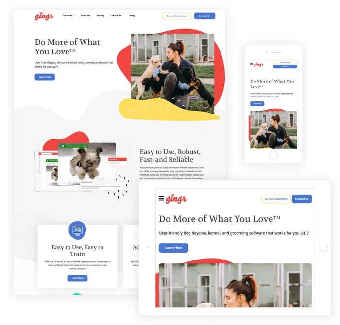
1. Gingr, a pet-care software company, outshines the competition.
SmartBug Media designed a new website for a pet-focused SaaS company, Gingr, that reflected the brand's fun voice while providing rich UX and mobile functionality. The design balances organic shapes with realistic imagery, which conveys and reinforces Gingr's unique solution and professional yet modern voice.
To add texture without creating clutter, the site integrates shapes that play off Gingr's logo, as well as uses organic shapes that resemble animal hair. The website functions well across devices by reorganizing the page elements while keeping the CTA above-the-fold.
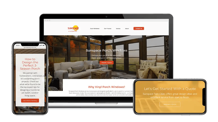
2. Sunspace Twin Cities' new website drives 40% increase in revenue.
Specializing in sunspace porch windows, Sunspace Twin Cities provides luxury porch windows to homeowners and contractors in Minnesota and Western Wisconsin.
The website has a functional UX that makes the most out of the space available on desktop, tablets, and mobile devices. Both the header and body copy are clearly legible, and the simple design allows the website's content to speak for itself. Best of all, once the company updated their website's design, they saw a 40% increase in revenue.
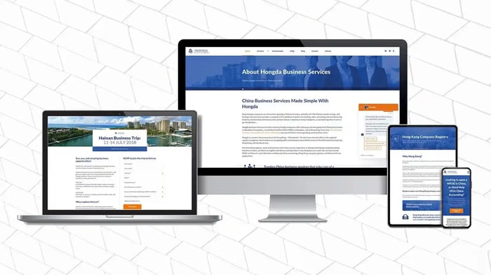
3. Hongda Service 's B2B website redesign.
It can be difficult to design a website that translates well cross-culturally. Hongda's management team knew that appealing to foreigners was paramount to their success as a China-based company, and they were happy to progress with HubSpot to generate more leads.
The purpose of their design was to resonate with a Western audience. The blue primary and orange accent colors help this website stand out. Additionally, the site's elements are easy to engage with across devices.
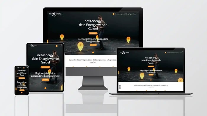
4. Energy sustainability platform Net4energy redesigns for both B2C and B2B customers.
Net4energy is a multisided platform that connects users who want to learn more about energy sustainability concepts and providers of products and services. Net4energy aims to inspire and educate users with guides, ebooks, and helpful content.
With their responsive design, Net4energy is able to offer their content to audiences whether they're in the office or on-the-go. This example functions well because the header copy and CTA are resized to take up the right amount of space on each device without decreasing the readability or usability of the site.
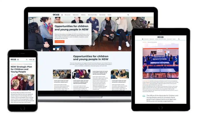
5. ACYP creates a modular website design.
ACYP (the Advocate for Children and Young People) wanted to create a fresh new look for their website and the ability to manage it going forward. This required building page templates and modules using HubSpots's draggable module CMS function.
The website uses a variety of modules that automatically adjust their width and height depending on the device they're being viewed on. The images resize to take up just the right amount of space so that the header and body copy are immediately visible, even on mobile.
To learn more about how to create a high-performing website to grow traffic and leads, check out HubSpot Academy's free Website Optimization Course.


![The Definition of Responsive Design [In Under 100 Words]](http://cdn2.hubspot.net/hub/53/file-597040093-jpg/Blog-Related_Images/Homepage_Images/responsive-design-1.jpg)