.jpg)
Here's what we found after analyzing over 200 infographics -- and takeaways on how you can apply these insights to your own infographics, making them more shareable.
10 Factors Behind the Most Popular Infographics of 2016
1) Most Popular Industries

Infographics were once used to simplify complex topics with the sole purpose of educating the viewer. Now, they're seen as a highly shareable content format, with the same viral potential as memes -- after all, visual content is 40X more likely to get shared on social media.
That could explain why we found that most of the past year's top-shared infographics were in categories like entertainment, sports, health, psychology, lifestyle, and food. And from the evolution of Justin Bieber’s music, to a visual of Kobe Bryant’s career highlights, the most shared infographics of 2016 also had celebrities as their central focus.
Many of the most popular infographics were also focused on topics personally relevant to readers’ lives, like health and lifestyle tips -- which contrasts from content on politics, global causes, or news.
Takeaways for Marketers
Focus on creating infographics that directly appeal to readers’ personal needs and goals. Creating a buyer persona can help, as it helps you to understand what those goals are.
2) Most Popular Industries by Social Network

Certain topics perform better on different social networks. As the site with the most users, for example, Facebook seems to be the place to post content related to entertainment, sports, health, psychology, and education. Meanwhile, infographics with career-related content do best on LinkedIn, where you’re also most likely to find infographics on finance and business topics.
On Pinterest, content related to health, psychology, food and lifestyle perform best. Roughly 31% of online adults use this social network -- compared to 72% for Facebook -- with the majority of users being women.
Twitter, conversely, appears to be the place to post content related to jobs, entertainment, sports, and education. With 23% of online adults using it, it's comparatively lagging among other social networks.
Takeaways for Marketers
When you're developing your buyer personas, figure out where they "live" online. Combined with their interests and goals, that will help you determine where they're most likely to discover your visual content.
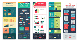
3) Most Popular Infographics by Type

Not all infographics are created equal. From timelines, to maps, to charts, to the occasional article that's converted into an infographic -- No one of these visuals is identical to another.
And while some might argue that the last format -- the article-as-an-infographic -- isn't really an infographic since it contains no numbers, we found it to be the most popular one. They don't actually include any statistics, charts, or visualizations. Rather, they contain existing informational content enhanced by colors, icons, and other illustrations.
The second-most popular type in this sample was the how-to infographic, which guides readers through steps to achieve a certain outcome. Within this category are “cheat sheets” -- the infographics that compile all the information readers need to complete a particular task, within a single graphic. Think: keyboard shortcuts for Mac, or baking and cooking substitutions.
For the sake of comparison, here are some additional formats that were included in our sample:
- Mixed charts: Uses a variety of charts and graphs
- Single charts: Displays one chart or graph
- Visualized numbers: Uses icons, colors, and other graphical elements to visualize stats and figures
- Anatomical: Visualizes the parts of a whole
- Timeline: Visualizes a chronological sequence of events
- Location: Visualizes a geographical location through a map
- Comparison: Compares more than one thing or idea, side-by-side
- Process: Uses a flowchart or decision tree
Takeaways for Marketers
For the most part -- and to our surprise -- infographics with the least amount of statistics and numbers performed best on social media. The one exception to that rule is a visual cheat sheet, which serves as a quick and handy guide. So when you include data in your infographics, choose wisely and keep it limited.
4) Most Popular Types of Infographics by Social Network

To further analyze the performance of different infographic formats, we also examined how each type of infographic performed best on different social networks.
We found that informational and single charts, for example, performed best across Facebook, LinkedIn, and Twitter. Single charts were particularly popular on Twitter, as the nature of the platform favors micro-content.
Cheat sheets and how-to infographics, meanwhile, worked best on Pinterest, which aligned with the topics we found to be most popular on that particular network -- the greatest number of visuals were related to food, cooking, lifestyle, and hobbies.
Takeaways for Marketers
When you create your visual content strategy, plan for a diverse portfolio of infographic formats. That way, you'll have a broad selection of content that you can share across different social networks, depending on where it's shown to perform best.
5) Median Word Count per Number of Shares

A main purpose of infographics is to present complex information in a visual, easy-to-digest way. As expected, the most popular infographics also had some of the shortest word counts.
In order to account for one outlier in the sample -- an infographic with a whopping 10,500 words -- we calculated the median word count for each of five quintiles within the distribution of this sample, according to shares. Those were ranked from lowest to highest.
From there, we saw that the trend roughly followed this pattern: The more words an infographic contained, the less it was shared.
Takeaways for Marketers
Simply put, keep your infographics short and sweet. In general, they should contain no more than a page’s worth of written content, and even that's a bit on the long side.
6) Median Word Count per Network

We were also curious to find out if longer infographics performed better on certain social networks. After calculating the median word count of the top 50 most-shared infographics on each network, we found that the shortest infographics performed best on Facebook and Twitter. Conversely, the longest were shared most on Pinterest, LinkedIn, and Google+.
Takeaways for Marketers
Here's where your diverse portfolio of visual content again enters the picture. Aim for Facebook and Twitter with infographics that are mostly comprised of visuals and minimal text. With longer, more in-depth infographics, go for LinkedIn and Pinterest.
7) Colors Used in Popular Infographics

Color palettes play a huge role in the way an infographic is perceived by viewers. Visuals with color increase a person's willingness to read a piece of content by 80%, but it has to be used correctly.
We found that blue is, by far, the most widely-used color among popular infographics, followed by red and green. Secondary and composite colors that appeared in the sample included brown, yellow, orange, purple, and pink.
But despite the popularity of monochromatic color schemes, there were relatively few infographics that applied variations of a single hue. Instead, most applied between three and four different colors, including such neutral colors as white, black, and grey.
Takeaways for Marketers
Be mindful of your palette when you're creating content. Regardless of social network, it seems, primary colors like blue, red, and green are safe bets -- and perform well across a variety of topics and industries.
8) Median Size of Popular Infographics

Here's another category where we had a bit of an outlier -- one extremely long infographic that weighed in at 1,024 by 46,515 pixels. To keep it from skewing our results, we calculated the median size of the best performing infographics on social media.
We found that the median of this sample was 800 by 2619 pixels. That roughly translates to an infographic with a length that's slightly more than three times its width.
Takeaways for Marketers
When it comes to infographics, keep things vertical. That said, keep a healthy perspective on the dimensions -- The best-performing infographics are three-to-four times longer than they are wide.
9) Average Number of Shares by Alexa Rating

Curious as to how site rankings compare to the number of shares received, we also sorted the sample according to ratings from Alexa -- a site that measures traffic -- for the sites on which they were originally published.
We started with the sites that had highest rankings -- and, therefore, the greatest amount of traffic -- and ordered them in descending order to those with the lowest rankings. We then divided the population into five quintiles, as we did in measuring the median word count per number of shares.
The results were a bit counterintuitive. We found that the sites at both the top 20% and bottom 20% of the Alexa rating distribution actually had the least amount of shares. Those that fell in the middle, however, received the greatest amount of shares.
While more data would be required to fully explain those results, it could have something to do with the fact that many mainstream media outlets -- which are at the higher end of the traffic spectrum -- tend not to publish infographics that are particularly shareable, according to the factors we considered in this study. Instead, they tend to publish visuals like single charts that are mostly educational in nature.
Takeaways for Marketers
Evaluate your priorities. Do you care more about shareability, or traffic? Infographics appearing on sites with low Alexa ratings still managed to garner over 20,000 shares. We're big advocates for focusing on creating good content -- if it's shareable, it will attract views. From there, you don't have as much control over where it's shared, regardless of traffic, but no one can accuse you of creating sub-par content.
10) Average Number of Shares by Social Network

Last, but certainly not least, we found that Facebook and Pinterest were overall the best places to share infographics. The remaining social media platforms exhibited significantly smaller averages of total shares.
Takeaways for Marketers
If virality is your primary goal, look to Facebook and Pinterest first. After you see success there, you can experiment with posting your infographic on LinkedIn and Twitter, and evaluate how it performs there.
Make It Visual
When it comes to the importance of visuals in marketing, the numbers speak for themselves -- 71% of online marketers use them in their social media strategies. But with so much visual content out there, especially infographics, it's important to stand out.
As you begin to plan your content for the coming year, keep these tips in mind. Carving out a name for yourself in the world of viral infographics is a good thing -- but maintain the momentum with a diverse portfolio of images.
What factors have made your infographics shareable? Let us know in the comments.
Visual Content


![How to Make an Animated GIF in Photoshop [Tutorial]](https://53.fs1.hubspotusercontent-na1.net/hubfs/53/how-to-create-animated-gif_6.webp)


![How Visuals Will Impact Marketing in 2017, According to New Data [Infographic]](https://53.fs1.hubspotusercontent-na1.net/hubfs/53/00-Blog_Thinkstock_Images/how-visuals-impact-marketing-2017.png)

![10 Types of Visual Content Your Brand Should Be Creating Right Now [Infographic]](https://53.fs1.hubspotusercontent-na1.net/hubfs/53/00-Blog_Thinkstock_Images/Visual_Content_Types.jpg)
![How Images Make Content More Shareable on Facebook, Instagram & Twitter [Infographic]](https://53.fs1.hubspotusercontent-na1.net/hubfs/53/shareable-images.jpeg)