Like many of you, I'm a trained marketer and more of a "do-it-yourself" designer.
Sure, I read through The Marketer’s Crash Course in Visual Content Creation and learned some sweet PowerPoint and Photoshop tricks that have helped me a lot with my content marketing job. But I really wanted to take my design skills to the next level.
So I asked all my designer friends what my next step should be -- and every single one said to take a course on typography.
Why typography? Turns out that while the importance of typography is often overlooked, it plays a critical role in strengthening your brand, creating interest in your product, and highlighting your central message. Knowing that, I decided to sign up for a typography course at the Massachusetts College of Art and Design. Couldn't hurt to learn how to identify a good font from a bad one, right?
I learned a lot more than that. I realized that paying attention to even the littlest details of type can make all the difference in the world when you're laying out an email, ebook, or image for social media.
This is why I wanted to write this post: to share the most important learnings and resources with my fellow marketers.
So, what do you say? Are you ready to take your DIY design skills to the next level? Let's get started.
Click on a section header below to jump to that section:
- What Is Typography?
- Why Is Typography Important?
- Typography Definitions & Terms
- Type Classifications
- Type Families
- Typography Fonts: Resources & Examples
What Is Typography?
Before taking this course, typography -- to me, at least -- was more the art of scrolling through a dropdown menu until I found a font that looked like it could work. But it turns out there's a lot more to it than that.
Typography is the art and technique of arranging type, type meaning letters and characters.
Notice that it's about more than just the design of letters and characters; the arrangement of those letters and characters is just as big a part of it all. That refers to the selection of point size, line length, and spacing, both on a single line and throughout an entire page or piece of work.
Image Credit: Designspiration
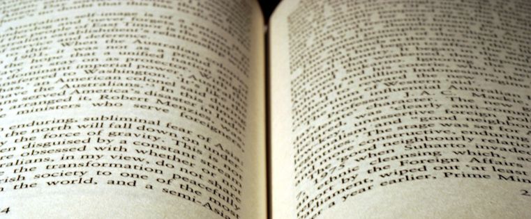
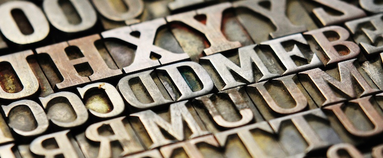
To understand where the importance of arrangement comes in, I like to think back to Johannes Gutenberg's printing press. At one point in time, people practiced typography using printed materials -- meaning they were literally taking letters and characters and arranging them in physical space.
Today, thanks to computers, open source fonts, and scalable computer typography, it's a lot easier to arrange letters and characters. But that physical piece remains important, even in the digital sphere.
Why Is Typography Important?
Typography is absolutely everywhere. Just look at your phone, a billboard, your coffee cup, or even the different styles used in this blog post. Every font, letter, and character arrangement plays a part in determining how a message is conveyed.
Sure, it might seem trivial at times, but even the smallest of type adjustments can impact the look and feel of your work. For example, back in June, Facebook tested a new font on its users called Geneva. While the new font was only slightly thinner and lighter than the original, Helvetica, it made a noticeable difference to some.
"The overall effect is a lighter, more modern looking block of text," explained Chris Mills for BGR.
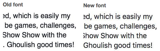
Image Credit: Mashable
Same goes for when Apple changed its default font from the dramatically thin Helvetica Neue to one they developed in-house called San Francisco.
"The differences between Helvetica and San Francisco are subtle, even to the trained eye, but they’re there," wrote Liz Stinson for WIRED. "While still an austere sans serif, San Francisco is bolder and friendlier than Helvetica Neue. Based on the German typeface DIN, San Francisco gives characters more breathing room, which will make it easier to read on relatively tiny mobile screens. Tall and skinny, San Francisco is space-efficient, like Google’s custom typeface Roboto, which you could consider a close cousin to Apple’s font."
The takeaway here? The little details do matter.
In fact, one of the only college courses Steve Jobs took was on calligraphy and typography, which he believed played a critical role in the success of Apple. As he once said in a Stanford University commencement speech, "If I had never dropped in on that single course in college, the Mac would have never had multiple typefaces or proportionally spaced fonts." Can you imagine a world where Apple products didn't have a focus on beautiful design? I certainly can't.
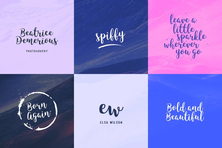
Once you realize how much thought goes into carefully selecting a typeface, it becomes much easier to recognize the differences between typefaces and understand why they might’ve been chosen in the first place. Take a look at some of the examples below to get a better sense of what I mean ...
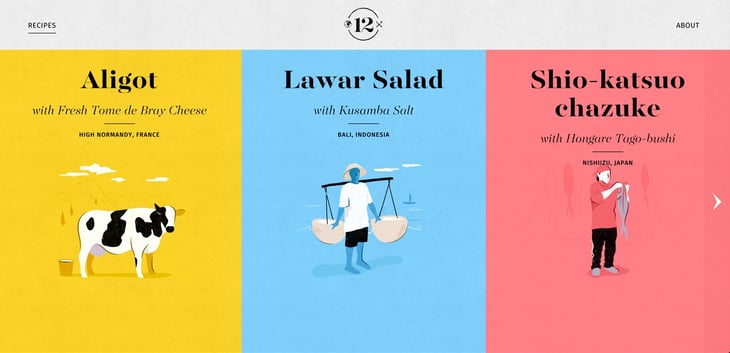
Image Credit: Awwwards
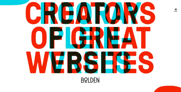
Image Credit: Awwwards

Image Credit: Awwwards
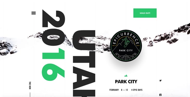
Image Credit: Awwwards
Ready to move on to some typography terminology? Let's go.
Typography Definitions & Terms
Typefaces vs. Fonts
If you thought these two words were interchangeable, you're not alone. But they actually mean two different things.
Typographer, Nick Sherman, once used a great analogy to explain the differences between the terms “typeface” and “font.” He suggested comparing these typography terms to the musical terms “song” and “mp3.” When you’re explaining how much you enjoy a particular tune, you say, “I love this song!” You wouldn’t say, “I love this mp3!” The song is the work of art, whereas an mp3 file is just the delivery mechanism.
The same rules apply in typography. You should use the word “typeface” when describing the creative work (i.e., what you see). This is a more abstract design term used when referring to the way a specific collection looks or feels. For example, Helvetica is a typeface.
If you’re describing the physical embodiment of the collection of letters and characters, you should use the term “font." It refers to what you use -- whether that’s a file on your computer or a case full of metal letters. This is the tangible representation of that collection of letters and characters. For example, Helvetica Bold and Helvetica Light Oblique are fonts.
Here's how you could use these two terms in a sentence:
-
“Wow. The typeface you chose really pulls this design together.”
-
“I’ll change the font size to 12pt so it fits in the box.”
The Anatomy of a Typeface
It’s way easier to communicate with designers when you actually speak their language, which is why it's important to understand the anatomy of a typeface.
Each part of a letter has its own special term, similar to bones in a human body. Below, you’ll see three diagrams that explain the makeup of individual letters, how these elements interact with each other, and how they sit on a line.
For example, let's take with the word "Faulty" as it's shown in the picture below.
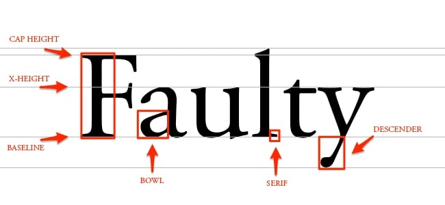
Here's how each of the terms here are defined:
- Baseline: The line where the letters sit.
- Cap height: The distance from the baseline to the top of the capital letter.
- X-height: Located in between the baseline and the cap height, it's the height of the body of the lowercase letter. (In this case, it's the letters ‘a,' ‘u,' and ‘y.')
- Bowl: The curved part of the character that encloses the circular or curved parts of some letters, like 'd,' 'b,' 'o,' 'D,' and 'B.' (In this case, it's that round shape sticking off the letter ‘a.')
- Serif: The slight projection finishing off a stroke of a letter in certain typefaces. (In this case, it's that little foot sticking off the letter ‘l.')
- Descender: The longest point on a letter that falls beyond the baseline.
Now, let's look at the word "flash":

Here's how these terms are defined:
- Ligature: The stroke that joins adjacent letters. (In this case, you'll notice the 'f' and the 'l' smush together to form one character.)
- Stem: The base of a letter, similar to the stem of a flower.
- Spine: The curvy body of the letter 's' -- and only the letter 's.' It gets its own term because the spine can be almost vertical or mostly horizontal, depending on the typeface.
- Ascender: The portion of a letter that extends above the mean line of a font -- i.e., is taller than the font's x-height. (In this case, you’ll also notice the letter ‘h’ is actually taller than the x-height.)
Still with me? Just a few more here. Let's take a look at the word "Beef":
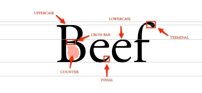
Here's how these terms are defined:
- Cross bar: The bar that goes across the inside of the letter and connects one side to another. (In this case, it's the bar inside the capital letter 'B.')
- Counter: The empty space in the middle of letters such as ‘B’, ‘O’, or ‘A.'
- Finial: The tapered end of letters such as ‘e’ or ‘c.'
- Terminal: A type of curve that you see at the top of the letter ‘f’ or the end of the letter ‘j.'
Good work. Now that you know the anatomy of letterforms, let’s get into the terms related to spacing: kerning, tracking, leading, and hierarchy.
Kerning
Kerning is the modification of the space between two letters. For example, check out the image below:
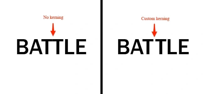
Here, I used Franklin Gothic Medium to showcase the natural space you see between two letter T’s. It looks a little too snug, right? By customizing the spacing between just these two letters, you'll be able to increase readability.
Tracking
Similar to kerning, tracking deals with a modification to letter spacing. However, instead of adjusting the spacing between just two letters, tracking is an adjustment to the spacing between all letters an entire word. See the difference below:
![]()
For this example, I chose to make an extreme adjustment to the tracking. Typically, you’d want to apply tracking in small increments to avoid causing readability issues.
Leading
Remember in high school when you had to double-space your essays? Well, the terms “single-space” and “double-space” can also be called “leading,” which is the distance between the baselines. See leading in action:

You can choose to increase your leading, creating more space between the baselines, or decrease your leading, which pushes your lines of text closer together. The reason high school teachers asked for essays to be double-spaced was because it’s much easier to read, and they could make corrections to the text more easily.
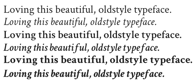
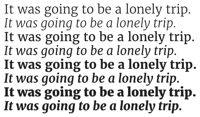
Hierarchy
As you read through this blog post, you'll notice certain words stand out more than others. That's what designers would call creating a hierarchy. You can use different weights (bold, regular, light), styles (italic), and sizes to create a sense of order within your text. Not only does this help create a legible flow, but it helps the reader see what the most important points are.
Here's an example of what hierarchy looks like:
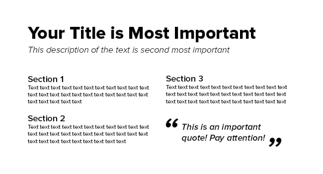
In most cases, you want people to read the title first. That's why you'll see most titles are much bigger and bolder than the body text. Call-out quotes and descriptive sentences can also stand out above the rest of the text using techniques such as bolding and italicizing.
With effective hierarchy, the reader should be able to jump from one section to the next to identify the most important points.
Got all these typography terms down? Cool. Let's move on to how typography is organized with type classifications and type families. (Takes you back to biology class a little, doesn't it?)
Type Classifications
The two main type classifications you see are called serif and sans serif. Other classifications include slab serif, blackletter, script, modern, and decorative. Let's start with the most common two, and then touch on just a few others to give you an idea of what they're all about.
Serif
Remember when I pointed out the little foot in the word “Faulty?” Typefaces with feet like that are called serif. You can see where I highlighted these little feet below:
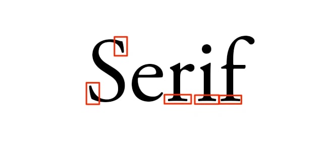
Common serif typefaces include Times New Roman, Georgia, and Garamond. If you’re reading a novel, you might notice the body text is a serif. That’s because a serif is much easier to read in long, printed works due to the distinctiveness between letters.
Sans Serif
In French, the word “sans” means “without.” So the term “sans serif” literally means “without serif.” In the image below, you’ll notice the words lack serifs, as I pointed out with the red arrows.
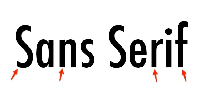
Common sans serif typefaces include Arial, Verdana, and Futura. You’ll see a lot of sans serifs being used in blog posts and documents on the web because it feels more modern and looks great even at lower screen resolutions.
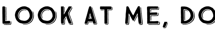
Blackletter
Blackletter typefaces, also referred to as Gothic, Fraktur or Old English, are known for its dramatic thick and thin strokes and its elaborate swirls on the serifs. These typefaces are based on early manuscript writing -- in fact, blackletters were used in Gutenberg's Bible, one of the first books ever printed in Europe. They were much more popular before 1500 than they are today.
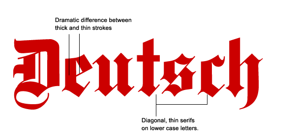
Image Credit: SitePoint
As you can tell, blackletters are pretty hard to read, which is why they're not typically used for body type. You'll usually see them in headers, logos, posters, and signs -- like on newspaper nameplates (New York Times' logo, anyone?), or on the headers of certificates, diplomas, or degrees. Common blackletter fonts include Cloister Black, Deutsche Zierschrift, and Germanica.
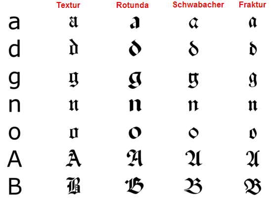
Image Credit: SitePoint
Script
Script typefaces are based upon the varied and often fluid strokes created by handwriting. As scalable computer typefaces, characters in these scripts can now string together with one another automatically so they convincingly mimic handwriting, rather than users having to manually pick and choose which letters go after which -- which you can imagine was a painstaking process.
Under the umbrella of a script typeface, there are two basic classifications: formal and casual. Formal scripts are often reminiscent of the handwritten letterforms common in the seventeenth and eighteenth centuries, and they’re used for elegant designs like invitations and diplomas, not for body copy.
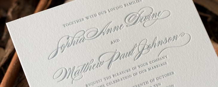
Image Credit: Deciduous Press
Casual scripts, or informal scripts, are just that: less formal script typefaces that look more like everyday handwriting
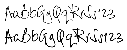
Image Credit: Font Haus
Those are just a few examples of type classifications to give you an idea of how they work. But, since this is a blog post, not a typography course, let's move on to type families.
Type Families
The term “type family” or “typeface family” is used to describe a range of designs that are all variations of one basic typeface.
For example, you’ll see that Proxima Nova has variations such as bold, extra bold, black, regular, light, light italic, and regular italic:
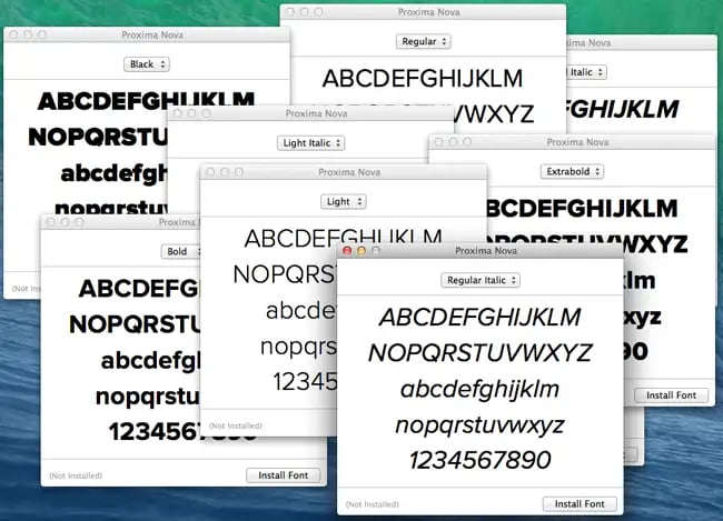
Sticking to a single type family will help add variation to your designs, while keeping it consistent and uniform.
Designers might use various fonts within one family to create a sense of hierarchy -- designing so that the most important elements, such as headlines and quotes, stand out above the rest of the text.
Typography Fonts
Before we wrap up here, I figured I'd leave you with a few great resources for where to find free fonts to download from the web, along with eight free ones I handpicked from these resources to get you started.
Great Resources for Free Fonts
- "35 of the Best Free Fonts You Should Download": A HubSpot blog post curating 35 of the best free fonts on the internet.
- Google Fonts: Hundreds of free, open-source fonts from Google that are already optimized for the web.
- Behance: A great resource for finding beautiful design work, including unique fonts that are free to download.
- HypeForType: Over 25,000 typography designs from top designers, many of which are available to download for free.
8 Cool Fonts That Are Free to Download
1) Crimson Text
Here's one that's great for body copy. It was meant for book production, according to Google Fonts, so it's easy to read. But at the same time, there's a lot to it that makes it special: old-style figures, small caps, fleurons, and math characters and the like. It comes in three styles -- Regular, Light, and Bold -- along with the italic styles of those weights.
2) Harmattan
Harmattan is a typeface on Google Fonts that was actually originally intended to suit Arabic scripts, but it also looks great on Latin characters -- and would love attractive in either headline or body copy.
3) Torcao
Torcao is a unique combination of letters that are "half square, half circle," robust and technical while at the same time, light-hearted and inviting. It a great headline typeface, but it still quite legible in longer text. The family comes in nine weights (slender to black) and has both condensed and extender selections for a complete set of forty-eight fonts.
4) King Basil
This free brush font posted on Behance is great for commercial materials like social media images and flyers. It's a Lite version of the designer's "Full King Basil," and it contains many swashes and connecting letters that make for a beautiful, script-like font.
5) Merriweather
Merriweather was designed to be a typeface that's pleasant and easy to read on screens, making it perfect for a web asset like your homepage or blog. It's an evolving project on Google Fonts and will be updated, but right now, you'll find four styles -- Regular, Light, Bold, and Black -- along with the italic styles of those weights
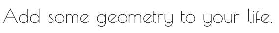
6) Poiret One
Poiret One is a long-time favorite of mine. It's described on Google Fonts as "a fresh, decorative, geometric grotesque with a hint of Art Deco and constructivism." It's sleek, simple, decorative, and great for short texts. Try it on large signs, labels, posters, T-shirts, titles, or headlines.
7) True North
A vintage-inspired headline typeface from HypeForType with sixteen different styles and a monoline script. It also includes free labels and extras like wild animals, numbers, symbols, tools, and other icons. True North comes with labels, extras and free banners. Extras include wild animals, catchwords, numbers, symbols, tools, maple leaves and trees. True North is a headline font with alternate capitals.
8) Bravery
Here's a cool free font posted on Behance created by a professional font creator who was kind enough to accompany the free download with the mockups below. These mockups show folks how they can play around with the font in their own designs. It comes in capital letters and numbers only, and is great for headlines or social media images like the ones below.

Of course, there's always more you could learn when it comes to typography. When graphic designers get a degree, they usually have to go through several rounds of typography courses to become a professional.
But now you know some key terms to get you started and -- at the very least -- you'll be able to sound super smart when talking to your designer friends.
Want more typography tips? Check out this post on the relationship between fonts and feelings.
Editor's Note: This post was originally published in June 2014 and has been updated for freshness, accuracy, and comprehensiveness.

![The Most Popular Font Types in America [New Data]](https://blog.hubspot.com/hubfs/most-popular-font-america.jpg)
![The Typography Trends Every Marketer Should Have on Their Radar [Infographic]](https://blog.hubspot.com/hubfs/typography-trends.jpeg)

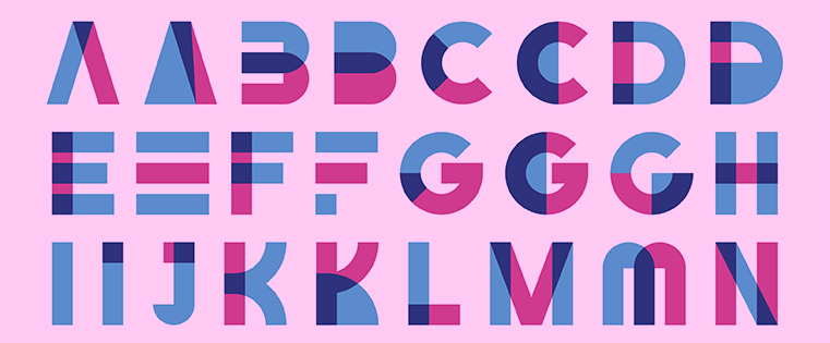
![24 Typography Terms Every Marketer Should Know [Infographic]](https://blog.hubspot.com/hs-fs/hub/53/file-2007733825-jpeg/font-alphabet-typography-1.jpeg)
![A Handy Little Guide to Pairing Fonts [Infographic]](https://blog.hubspot.com/hs-fs/hub/53/file-1509533738-jpeg/mismatched-heart-socks.jpeg)