In the world of social media marketing, the word "engagement" gets thrown around a lot, but few brands actually know how to achieve it.
Brands might pursue the low-effort game of tweeting, "gramming", feeding Facebook, and Linkedin-ing updates about products, services, and educational content, but see little engagement.
Engagement isn’t always to produce. You have to be, well, engaging. In your business niche, the “Like my page!” approach probably isn’t going to be effective as you’d like.→ Free Download: Social Media Calendar Template [Access Now]
Let’s look at ideas that could make you a force to be reckoned with. I’ve organized them into an AEIOU list. (I want to call it an acronym, but how would you pronounce the five vowels?) Let's dive in.
A Is For Ask
The best way to engage someone is to ask a question. “How are you?” and “How’s it going?” are popular options in conversion but too dull for social media warfare.
“What’s your name?” probably won’t work and “What’s your email?” might come off as a bit too forceful. How about …
“What do you think?” Yes! That’s a winner.
People like to think things through. They like to hear from other thinkers. Certainly, they want other people to know what they think.
Try prompting your audience with one of the following "What do you think?" strategies:
- Probe their personality. Post a question that invites people to share their opinion or weigh in on something.
- Play the “test your knowledge” game. It’s irresistible.
- Post a poll. It’s easy to create polls on Twitter and Facebook. In addition to engaging your followers, you stand to learn meaningful things about them too.
- Respond to my email. Email from brands are bound to ask you to click-through to read, watch, and try or buy something, but how often do they simply ask you to write back? I find this to be an enormously engaging strategy and have seen it work for my brand and many others. Notice I wrote, “Respond to my email,” not “our email” or “this email.” A human-to-human first-person approach will be the engaging way to call this play.
- Just ask. Interactivity 101: simply post a question. Whether done so in a social stream, blog post, online group or community, or on a Q&A site such as Quora, asking followers relevant, provocative, and timely questions creates some of the most engaging and thought-provoking social media activity of all.
Let's take a look at a few examples:
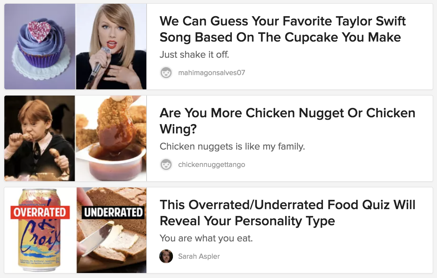
Personality quizzes have been red-hot engagement magnets for years on Buzzfeed, and it’s easy to create them to promote your brand with a template-based tool such as ShortStack.
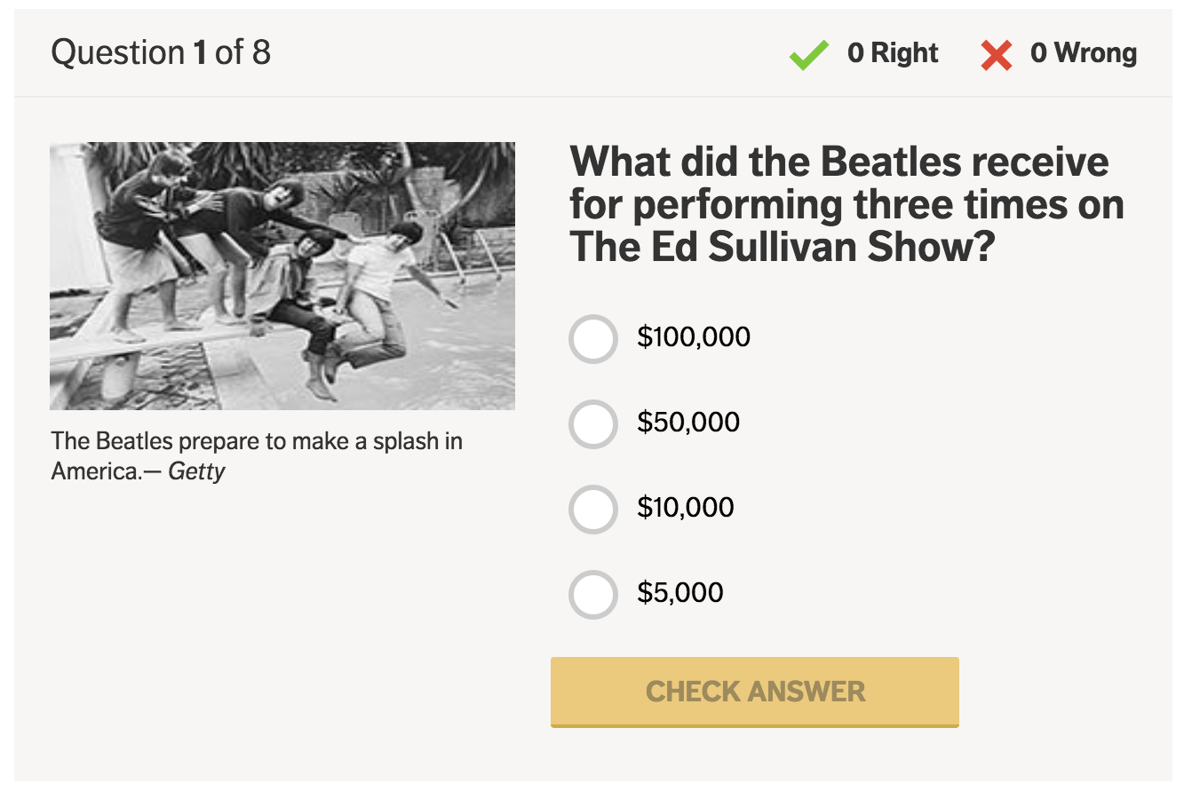
Nice going, AARP. “Test Your Beatles Trivia Knowledge” engaged me, but you could have asked a few easier questions. I went 0–for-8 (and I’m a huge Fab Four fan).
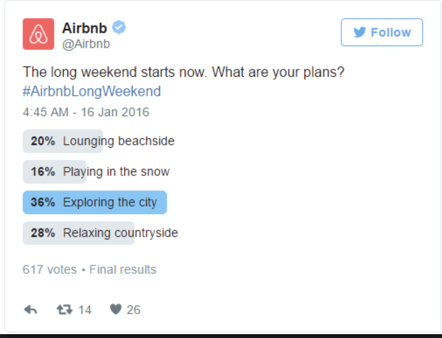
This simple Twitter poll from Airbnb does a great job of engaging followers without any fancy tools.
E Is For Expression
“E” is for “expression” because of the way social and mobile have collided, making the ubiquitous smartphone a personal expression machine.
It doesn't matter how you create content. The camera might be front or rear-facing. Audio might be on or off. Filters, emojis, stickers and so forth may be applied or not. Posts may be permanent or self-destructing. I could go on, but I think you get the idea. Smartphone apps enable people to express themselves every which way, and so they do.
Here are a few ways you can encourage your audience to create content featuring your brand:
- Hash it out. The hashtag has become the click-to-connect ticket for bonding with like-minded people. When you put something of interest out there, do a little hashtag research first, or hash out a unique phrase that reflects your brand. Hit that # key, and invite your followers to jump in and hashtag content related
- Conduct media upload contests. Many social media fans adore Instagram and Facebook contests, and are especially engaged in the types that involve shooting and sharing original photos and videos. Contests may call for other forms of self-expression as well, such as recipes, recordings, illustrations, poems, essays, and more.
- Rally reviewers. Thanks to pioneers like Amazon and Yelp, reviews, ratings, and testimonials have been baked into the fabric of ecommerce selling spaces and beyond.
- Showcase customers, partners, and employees. Provided you’re doing something people like, consider creating advocacy programs featuring customers, partners, and employees to catalyze your community, amplify your voice, and engage newcomers by giving them a platform to express themselves.
Let's take a look at an example:
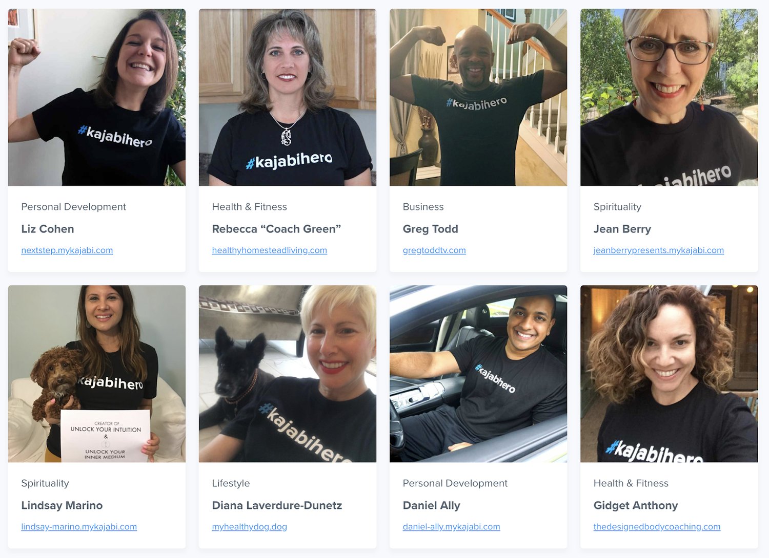
#KajabiHero is an impressive example of customer advocacy at work. Satisfied customers happily endorse the “knowledge commerce platform,” and wear their t-shirts proudly. They're rewarded with special features, links to their websites, and social media support.
I Is For Incentive
I’ve mentioned numerous forms of interactive content (such as competitions), but have yet to introduce the term “gamification.” People like to play games, compete, keep score, and most of all, win. They especially like to do so on social media.
Satisfy your audience’s competitive spirit by featuring compelling incentives in your social media contests. As incentives go, valuable prizes loom largest, but you may be surprised how even small rewards prove to deliver a sizable lure.
Let's look at an example by Converse from a post that features 37 Facebook contest ideas to inspire fans to bond with your brand.
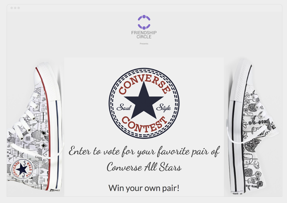
The entry form on this promotion by Michigan’s Friendship Circle explains each person who casts a vote for their favorite pair of hand-drawn Converse All Stars will be entered into a drawing for a chance to win a free pair of the winner. The winning shoe was subsequently reproduced and sold as a fundraiser.
O Is For Offer
Your engagement strategy doesn't need to be interactive or gamified 100% of the time. Your brand can engage customers and prospects the old fashioned way, with attractive offers such as:
- Instant coupons and discounts
- Membership clubs (example below)
- Pick your discount promotions
- Free shipping
The link in Pura Vida Bracelet’s Instagram bio invites you to “join the Pura Vida Club.” BTW, the brand’s Instagram feed (1 million followers) bubbles over with joyous photos, mostly from customers, engaging questions, challenges, posts about charitable causes, and conversations.
Experiment with different types of offers to discover what your customers best respond to.
Facebook makes it easy to promote offers. A flavor of the Facebook ad portfolio is the “offer ad.” Offer ads can be redeemed online and/or be saved by Facebook fans to be redeemed in-store.
This help page from Facebook offers the following best practices:
- Make discounts substantial. Offers with free items or with discounts of at least 20% off will reach more people.
- Use an engaging image. Photos of people using a product often perform better than photos of a product by itself, and both generally perform better than logos.
- Set an expiration date. Give people a few days to discover and claim an offer and allow time for your offer to be shared among friends. The ideal length of an offer is 7 days.
- Promote your offer: After creating an ad for your offer, pin it to the top of your Page to help it get noticed.
U Is For Utility
Engagement and utility are close friends on the web today.
Data from a research report about interactive contact from Content Marketing Institute and ion interactive reveals the top two reasons for using interactive content are (1) educating the audience and (2) engagement.
A major majority of savvy B2B marketers put utility at the forefront of their content marketing programs. Useful content created to engage prospective customers could include tools, blog posts, video, infographics, downloadable guides, mini-courses, helpful email sequences, webinars, and much more.

Above is a LinkedIn ad from ConnectWise Automate that offers what appears to be a highly useful guide to help vendors price IT services.
The ad is the pitcher… and here’s the catcher: a highly engaging and smartly designed landing page.

I love the question style headline, the directional cues, the 1/2/3 infographic vignette, the very cool bonus offer (a calculator), and the nicely designed form.
Utilitarian marketing ideas work offline too—and for any size company or individual.

I love the story from Jay Baer’s book Youtility about Taxi Mike. Jay calls an enterprising taxi driver he encounters a “one man Trip Advisor.” The driver created the Taxi Mike Dining Guide (above) and updates it regularly to handout to his passengers.
Engage Your Followers Today
How will you AEIOU engagement with your brand? Here's a quick review:
- (A)sk questions.
- Invoke (E)xpression.
- Provide (I)ncentives.
- Make (O)ffers.
- Deliver (U)tility.
I hope you found these ideas and examples useful — and engaging!



![How to Deal With Negative Comments on Social Media [+ Examples]](https://www.hubspot.com/hubfs/Copy%20of%20Untitled-May-06-2022-04-54-09-47-PM.png)


![How to Use Instagram Photos to Boost Your Email Engagement [Infographic]](http://53.fs1.hubspotusercontent-na1.net/hubfs/53/00-Blog_Thinkstock_Images/Instagram_email_marketing.jpg)
![8 Interesting Facebook Stats to Help You Increase Engagement [Infographic]](http://53.fs1.hubspotusercontent-na1.net/hubfs/53/00-Blog_Thinkstock_Images/facebook-stats.png)
![BuzzFeed, The New York Times & The Huffington Post: Which Popular Media Sites Succeed With Certain Audiences? [New Data]](http://53.fs1.hubspotusercontent-na1.net/hubfs/53/careful-placement.jpeg)

