I created this in-depth guide on how to create and use customer experience dashboards to your advantage.
We’ll cover:
- What Is a Customer Experience Dashboard?
- Why Do You Need a Customer Experience Dashboard?
- 12 Metrics to Track in Your Customer Experience Dashboard
- How to Create a Customer Experience Dashboard in 3 Simple Steps
- 5 Customer Experience Dashboard Examples to Get You Started
- Building Your Customer Experience Dashboard
What Is a Customer Experience Dashboard?
What if you could access critical customer data and metrics, such as purchasing patterns, support requests, product engagement, and drop-off points, at your fingertips?
Not just that, what if all this data was visualized in easy-to-understand charts and reports?
That’s exactly what a customer experience dashboard is.
It's a centralized hub visually representing core metrics to monitor how customers interact with your product or service. In an ideal scenario, it can help you:
- Track consumer habits and market trends.
- Identify and determine the impact of product issues.
- Analyze customer feedback to enhance ongoing product development efforts.
- Gauge product-market fit by evaluating buyer response and product reception.
Putting all this together, customer experience dashboards give you insight into consumer sentiment, buying preferences, overall satisfaction levels, and more.
Why Do You Need a Customer Experience Dashboard?
A customer experience dashboard is an effective tool for tracking and measuring customer experience. It offers several other benefits, such as:
- Centralize your customer data for a unified view. These dashboards pull data from multiple sources like CRM systems, social channels, and deployed surveys. This offers a cohesive view of how buyers engage with your brand and product.
- Monitor real-time engagement and drive retention. Customer experience dashboards track real-time touchpoint interactions and consumer feedback. This is crucial for monitoring your current customer health score and driving retention.
- Build personalized experiences. Qualitative and quantitative data from such dashboards can help tailor your promotional efforts to fit specific buyer personas. These dashboards also let you create product/service bundles that appeal to a particular demographic.
- Create a continuous improvement cycle. Customer experience dashboards offer visibility into evolving market dynamics and audience needs. This enables you to implement data-driven product improvements and eliminate surface-level insights.
Guillaume Drew, an ecommerce store owner, told me how he uses a customer experience dashboard to his advantage.
Guillaume constantly monitors the CSAT scores and feedback to improve the delivery times, packaging, and other customer touchpoints for his online brand, Or & Zon.
“Our primary use case for a customer experience dashboard has been tracking and managing product returns and exchanges. By color-coding feedback and aligning it with returned items, we drastically reduced associated costs and reinforced our product quality,” Guillaume.
Those advantages aside, research suggests that 80% of businesses that implement real-time analytics software (like customer experience dashboards) report a significant uptick in revenue.
If that’s not reason enough, I don't know what is.
12 Metrics to Track in Your Customer Experience Dashboard
I’ve curated a list of the most commonly tracked metrics across most customer experience dashboards.
Note that this list isn’t all-inclusive. Depending on your customer experience software, you may have to select options that differ from those below.
1. First-Contact Resolution (FCR) Rate
This is the percentage of support queries resolved on a service representative's first attempt.
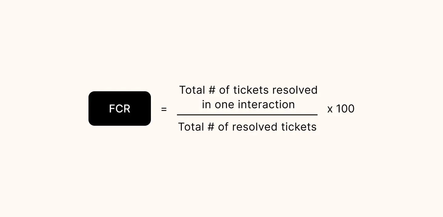
Personally, I believe the FCR rate is one of the most important customer experience metrics if you offer a live-service product.
For example, the longer it takes to resolve a user problem, the less engagement your app gets. If not addressed in a timely manner, that can snowball into a retention issue.
I realized the importance of this metric after chatting with Anna Nierychlewska, who handles customer support for Comfort Pass.
Comfort Pass is a service-based company focusing on delivering a premium customer experience. That’s why the first-contact resolution rate is one of the biggest priorities for Nierychlewska.
“I lean heavily on tracking First Response Time. Response speed is everything when someone’s stuck at an airport and needs help fast,” she shares. “By keeping an eye on this metric, we’ve optimized the speed at which we resolve friction for our customers. For example, when response times stretched during a busy holiday period, we introduced automated responses for common queries, which lightened the load on the team and cut down response times by a ton.”
2. Ticket Volume
This is simply the total number of tickets/query requests in your support queue in a given period.
A massive backlog here indicates redundancies in your customer support strategy. On the flip side, a high ticket volume on the same topic can point to a core problem in product functionality.
3. Average Resolution Time (ART)
ART is the average time it takes for your service representatives to resolve a query/ticket from the time it is submitted.

This can differ depending on your industry and product. Ideally, you want to resolve queries within 24 hours of submission.
However, if it’s a technical issue (app bugs/dashboard functionality), I recommend aiming for a call-to-resolution time of 3-5 hours at most.
4. Churn Rate
Also called attrition rate, this is the percentage of customers/subscribers who stop doing business with your company over a set period.
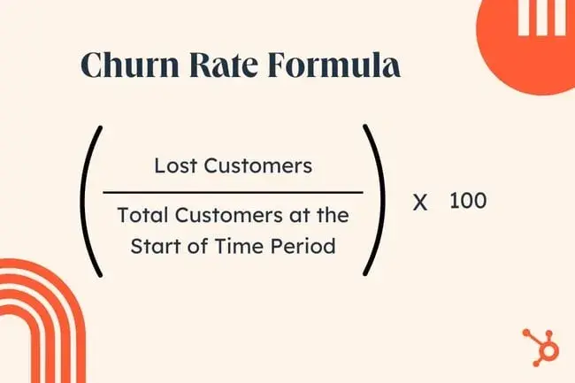
Interestingly, I've discovered that the biggest contributor to churn rate isn't a better market alternative. Instead, it’s the value you provide through your customer experience program and how well you meet buyer expectations.
Data supports this as well. As many as 65% of consumers stop purchasing from certain brands when they fail to meet customer experience expectations.
5. Conversion Rate
Conversion rate is the percentage of users who initiate and complete a desired action on your website, ad, or app.
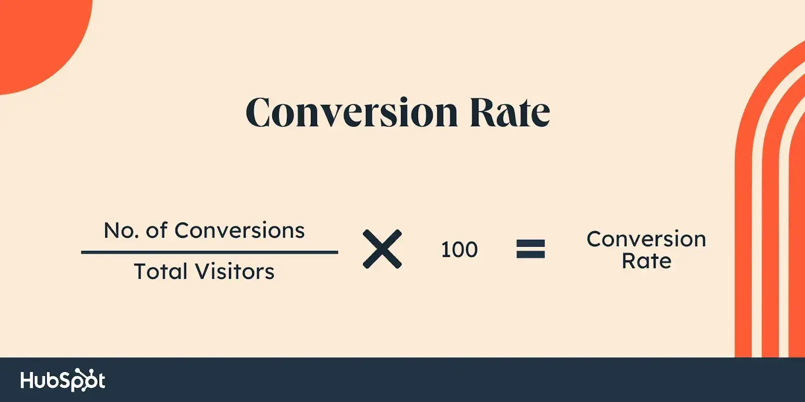
In my experience, this is the most significant indicator of the value you offer through your initial touchpoints. Think landing pages, social media posts, and how-to guides.
Tracking this metric will help you optimize the conversion rate at the most important touchpoints in your buying cycle.
6. Cost Per Conversion (CPC)
CPC tracks the effectiveness of your promotional efforts to draw in new customers. It’s calculated by dividing your total ad/marketing expenditure by the number of conversions.

Here’s a tip: Don’t just look at CPC as a general performance indicator for your campaigns. Instead, try to use it as a gauge to understand market preferences and sentiment.
For example, ask yourself why your CPC is $11 while your competitor (selling a similar product to the same demographic) has a CPC of just $9. What customer traits and expectations have they tapped into with their marketing material?
7. Customer Lifetime Value (CLV)
CLV is the total revenue a customer brings to your business over their entire relationship with your company.
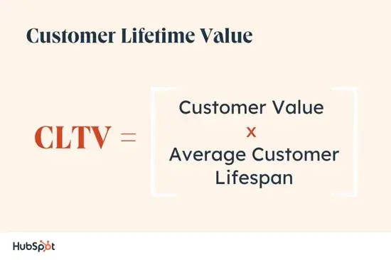
I think this goes without saying: You want your customer lifetime value to be as high as possible.
The best way to do that is to build a personalized customer experience program that consistently addresses buyer expectations and concerns.
8. Customer Retention Rate (CRR)
CRR is the percentage of users/subscribers you retain over a specific period.
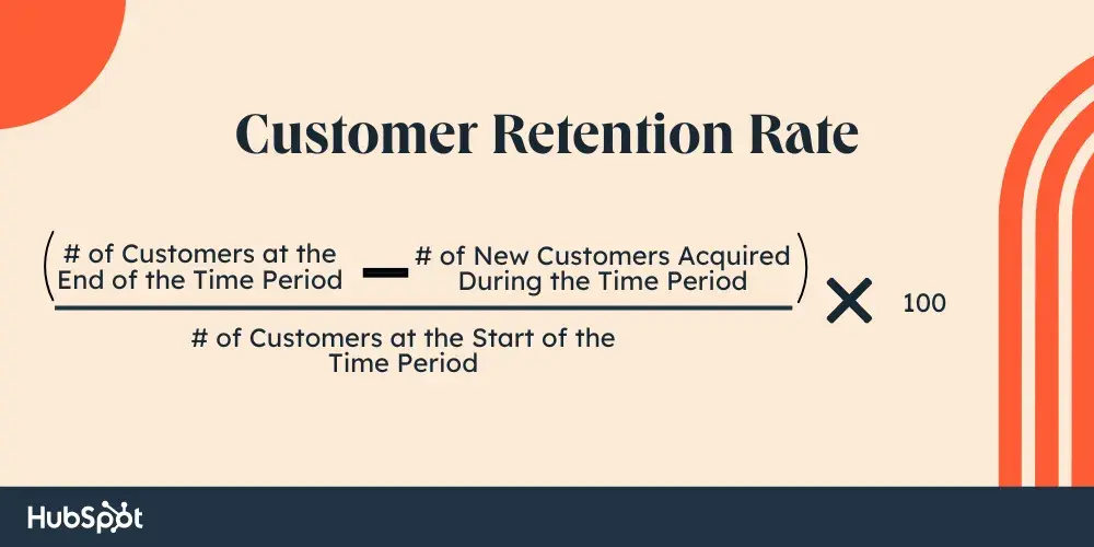
Over the years, I’ve noticed that exceptional digital customer experiences go hand-in-hand with a high CRR. In fact, 80% of first-time buyers are likely to become repeat customers if you have a thoughtfully crafted digital customer experience strategy.
I’ve noticed how global brands like Nordstrom and Starbucks follow this philosophy. Both brands offer customized recommendations on their mobile app based on shoppers’ preferences and past purchases.
9. Net Promoter Score (NPS)
NPS measures how likely your existing customers are to recommend your product/service to others.
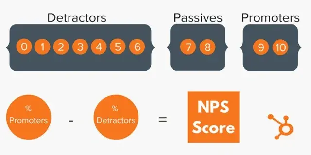
Generally, NPS is a strong indicator of how well your brand is faring in the current market. More importantly, it can help you identify detractors who can negatively impact your brand reputation.
10. Customer Effort Score (CES)
CES tracks user experience with your product. It’s essentially the amount of effort customers must put in when interacting with your business or product/service.
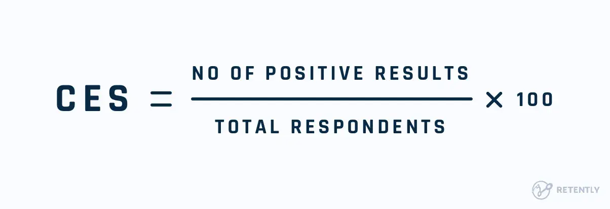
CES is a touchy subject for SaaS products. In most cases, product managers have to strike a delicate balance between ‘facilitating user-friendliness’ versus ‘dumbing down the app.’
In my opinion, the easiest way to deal with this issue — especially if you’re offering complex live service apps — is to create a dedicated resource section. Contextually triggered in-app demos can also help here.
11. Customer Satisfaction (CSAT) Score
CSAT scores measure the satisfaction your customers feel after a conversion action or brand interaction.
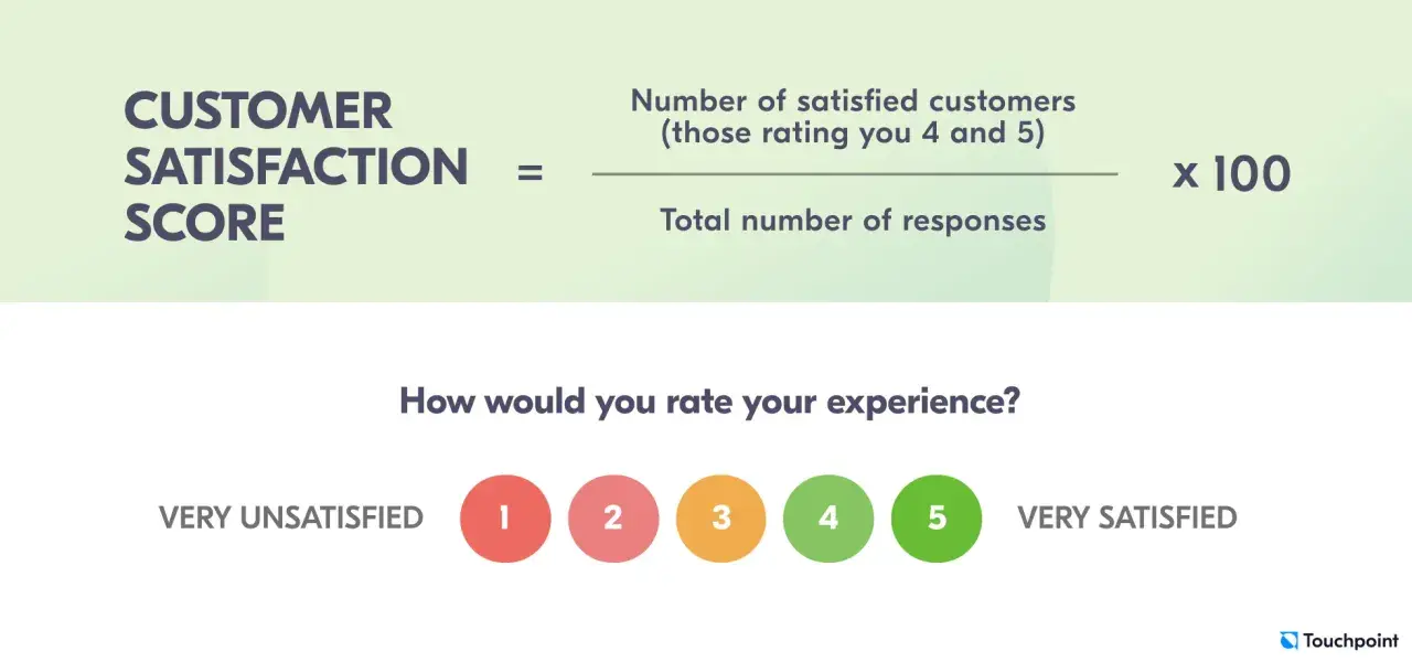
A common misconception (and I’ve been guilty of it myself early on in my career) is that CSAT helps you gauge the overall satisfaction customers feel toward your brand or product.
That’s not the case.
Instead, I’ve noticed that CSAT measures the level of satisfaction your buyers experience after a specific exchange. So, one (or more) CSAT survey doesn't indicate how buyers feel about your company or product. They’re merely a snapshot of customer sentiment in a particular time frame.
12. Topical Insights
Topical insights aren’t technically a KPI or metric you can measure. However, tracking other metrics on a customer experience dashboard often yields interesting insights.
For instance, a high FCR rate and a high ticket volume indicate a product liability rather than a customer support issue. In short, your reps are resolving queries efficiently, but they’re constantly bombarded with users experiencing other problems.
I highly recommend reviewing your data consistently to look for correlations like these.
How to Create a Customer Experience Dashboard in 3 Simple Steps
Creating a customer experience dashboard isn’t an overly complicated task. However, it can be challenging if this is your first time doing it.
So, to minimize any confusion, I’ve broken down the process into three simple steps.
Step 1: Set clear objectives and select the relevant KPIs and metrics.
When building your customer experience dashboard, you must first define clear objectives. This will reveal the metrics and KPIs you need to track.
For example, to optimize my customer contact center and support experience, I'll need to analyze data from CSAT and CES surveys, FCR rates, ticket volume, and ART.
Gordon Hwa, the founder of a digital marketing agency, told me his experience of building a customer dashboard aligned with clear goals. His biggest use case at his agency Khepri Digital is to track multiple campaigns running for different clients.
Hwa shared a case study of how his customer experience dashboard tracks real-time performance data.
“When we ran simultaneous campaigns for an ecommerce brand and a medical clinic, the dashboard allowed us to track conversion rates, customer feedback, and A/B test results in one place,” Hwa says. Through this data, the team noticed that a certain set of creatives for the ecommerce brand had a lower engagement rate than others.
As a result, “we switched them out mid-campaign and saw an immediate improvement in CTR and conversions,” Hwa says.
Once you have your objective, your metrics should fall under three categories. These are as follows:
- Descriptive/Interaction. Measures observable results from customer interactions (FCR, ART, first response times).
- Perception-based. Monitors how customers feel about interacting with your product/company (NPS, CES, CSAT).
- Outcome-related. Tracks conversion-oriented actions (requesting a quote, booking a demo, subscribing to a newsletter).
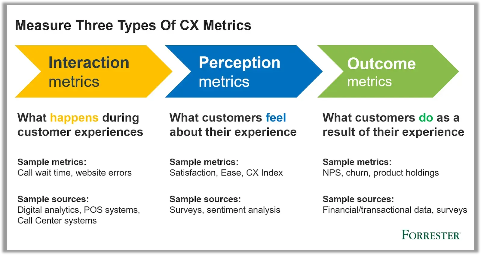
In some cases, depending on your goal, you’ll need to track multiple categories.
So, in the example I used earlier (optimizing contact center and support experience), I’ll be monitoring perception-based and descriptive metrics.
Step 2: Consolidate your data sources and choose the right platform.
Typically, your customer experience data will be spread across multiple tools or platforms.
For instance, let's assume I want to create a more cohesive sales strategy that factors in post-purchase customer service.
To do this, I must consolidate insights from my siloed CRM system, call tracking software, customer feedback channels, and deployed surveys. Doing this manually will take me ages.
That’s where a tool like HubSpot’s Dashboard & Reporting Software can help.
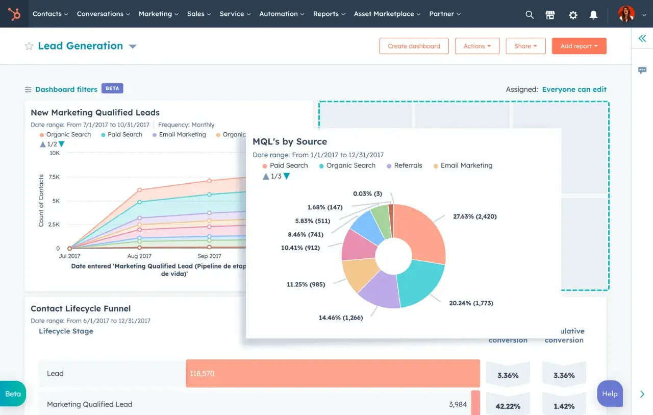
Get started with HubSpot’s Dashboard & Reporting Software.
The tool contains multiple customer engagement and experience dashboards to simplify and centralize cross-team customer data. That allows you to augment your support program while keeping key stakeholders from sales and marketing in the loop.
A few other factors I suggest you evaluate when deciding on such platforms are:
- Real-time data updates, reporting, and syncing functionality.
- Robust customization and cross-team collaboration features.
- Powerful visualization techniques to facilitate effective data storytelling.
- User accessibility and team scalability based on evolving business requirements.
Of course, you also have to consider your budget. My advice? Don’t opt for a big-budget tool if you aren’t planning on scaling soon.
That’s exactly how Cata Zorzini’s team has built an evolving customer experience dashboard at Tutor AI.
Zorzini told me how his small team continually improves and strengthens this dashboard as resources allow. They focus on limited metrics that are closely aligned with their business goals.
“Given the rapidly evolving LLM capabilities, our dashboards are designed flexibly using Looker Studio, allowing us to adapt metrics as new features are introduced. This flexibility helps us stay responsive to user expectations, new LLM developments, and changing market demands. At present, we’ve set up Looker Studio to consolidate data from Google Analytics, Stripe, and HubSpot,” Zorzini says.
Step 3: Deploy, monitor, and continuously improve.
The final step is to deploy your customer experience dashboard and review the insights based on your chosen metrics.
Ensure that the collected information is accurate, and then look for critical areas of improvement.
At this stage, it’s also important to identify team leads or key stakeholders who’ll promote your dashboard within the organization. These figures will encourage others to adopt your tool and further expand on your data collection efforts.
I spoke to Spencer Romenco, the chief growth strategist at Growth Spurt, to understand the best ways to drive adoption for your customer experience dashboard.
Romenco explained that tailoring dashboard views and insights to each team member’s tasks naturally drives adoption. It makes the dashboard more relevant for everyone. He explained how he follows this tactic with his own team.
“Giving each role its own tailored view prevents overwhelm and helps them see immediate value in the data they’re reviewing. It also reinforces how their work ties into the broader customer experience, creating a stronger sense of purpose,” Romenco says.
Beyond that, I recommend establishing a schedule for monitoring and assessing data quality. Going off a monthly basis would work best, but a quarterly review would help, too.
For example, if I’m analyzing customer engagement with my app, I’d want to look at monthly active users, session duration, login frequency, etc. Then, I’d use bi-monthly surveys to collect user feedback and incorporate new data visualizations as needed.
5 Customer Experience Dashboard Examples to Get You Started
There’s an array of dashboards you can incorporate to enhance your customer experience program and strategy. Below, I’ve listed just five of them, along with key metrics and KPIs to track for each dashboard.
Note that all five examples are available in HubSpot’s all-in-one CRM platform.
Still, if you use other tools (Zendesk, Intercom, etc.) to generate your customer experience metrics, you could consider alternatives like Geckoboard or Databox.
1. Real-Time Customer Support Dashboard
Your product and design teams, marketing executives, and sales reps play a critical role in offering dedicated customer support.
Put simply, your support staff have to deliver on the promises made by your marketing team. They also have to follow up on certain allowances (package redemptions/customized quotes) that your sales reps agreed upon.
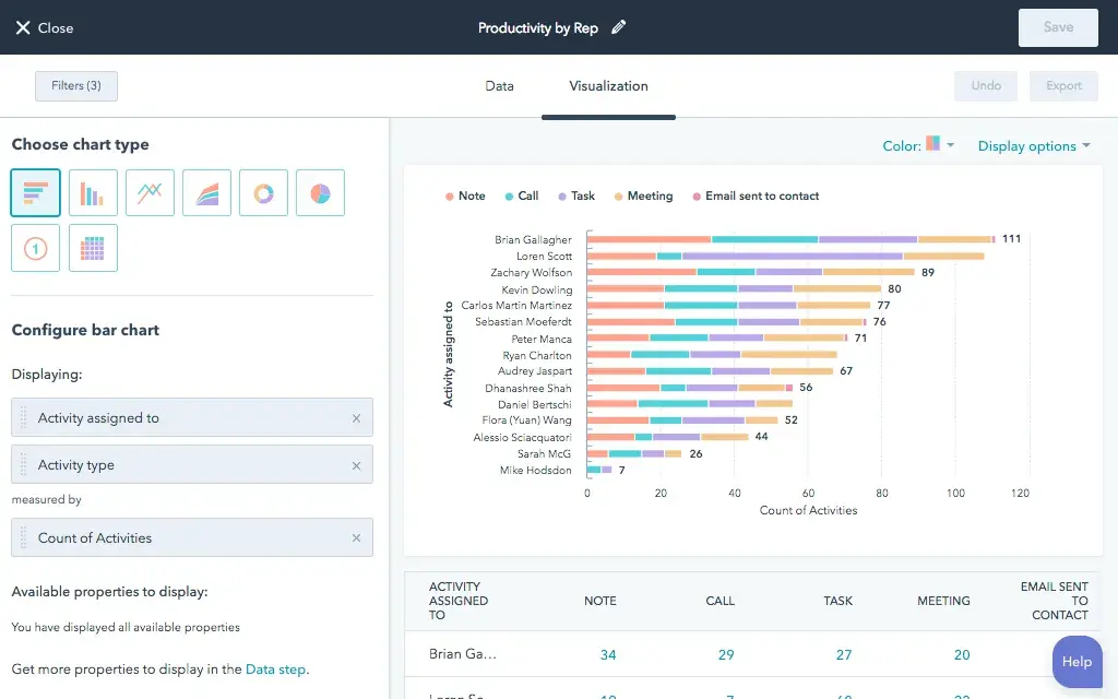
I think HubSpot’s Dashboard & Reporting Software is the perfect example here. It comes with advanced reporting permissions and consolidates marketing, sales, and service data in a central hub.
Essential KPIs and Metrics
- Number of new conversions in a given period
- Currently open support conversations per rep
- Net conversion score
2. Customer Feedback Dashboard
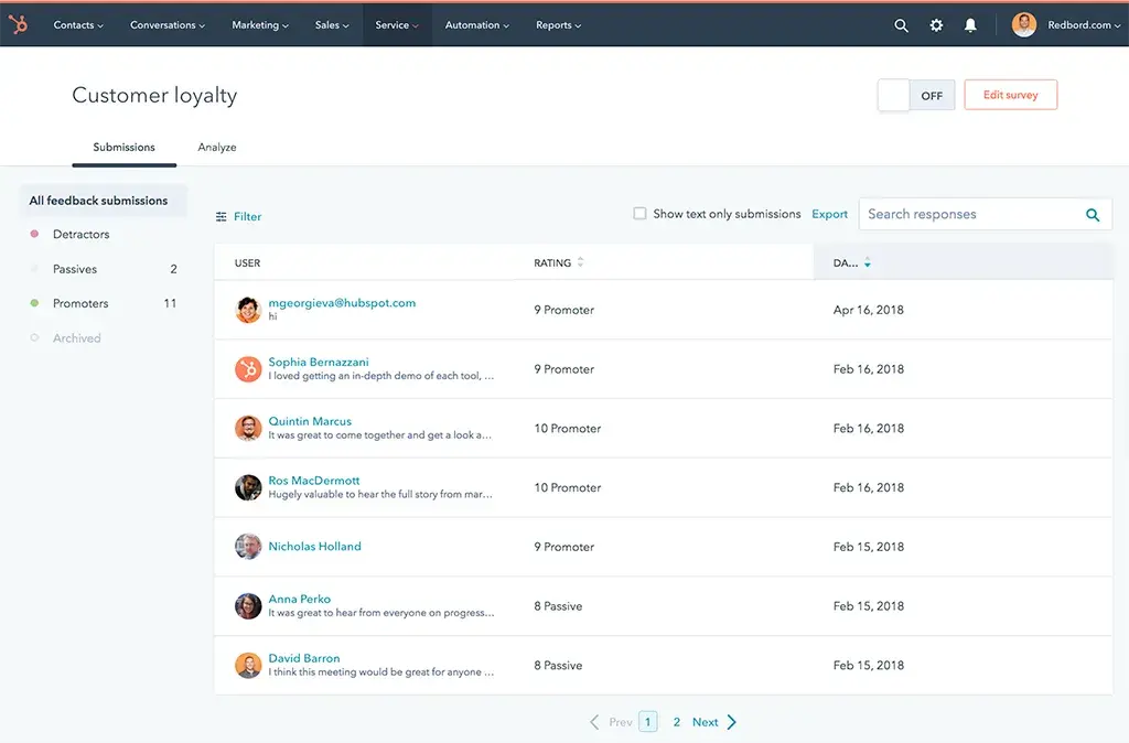
Survey or customer feedback dashboards give you a detailed overview of key metrics like CSAT, NPS, and CES.
While a few platforms offer distinct dashboards for each of those scores, HubSpot’s Customer Feedback Software unifies them in a single space. I love how this enables you to execute a customer experience strategy that factors in all potential areas of improvement.
Essential KPIs and Metrics
- NPS by customer segment
- CSAT trends over time
- CES for specific product functionalities or brand interactions
3. Ticket Dashboards
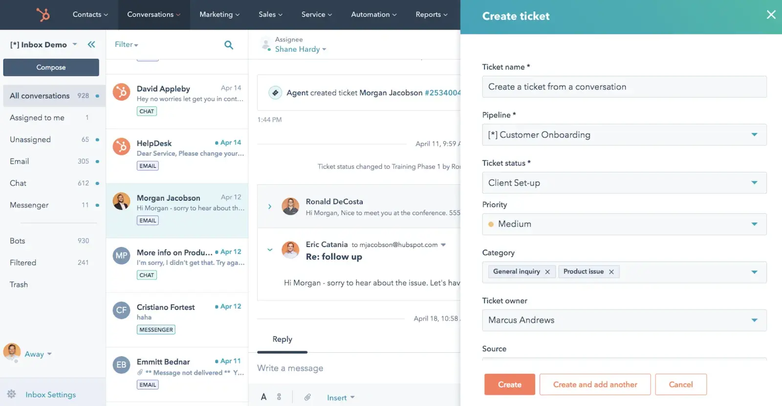
A ticket dashboard allows you to monitor and track customer query requests and metrics from a single location. In doing so, it directly enhances the customer experience.
For instance, HubSpot’s Help Desk & Ticketing Software enables you to deliver personalized AI-powered query resolution. This can streamline service processes, minimize errors, and improve overall time to resolution.
Essential KPIs and Metrics
- Number of queries/tickets received per channel (phone/email/chat/social media)
- Peak hours for inquiries
- Ticket volume over time
4. Call Center Dashboard
A call center dashboard can help team leads review qualitative data on personnel performance based on call volume, resolutions, and outcomes.
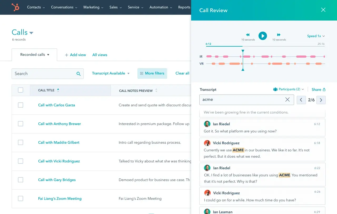
For example, HubSpot’s Call Tracking Software logs all daily calls directly into your CRM. That data can be assessed independently to analyze successful sales pitches or support conversations.
Essential KPIs and Metrics
- Post-call CSAT score
- Average response time and FCR rate
- Call resolution and outcome
5. Live Chat Dashboard
Live chat dashboards provide a visual representation of ongoing chat counts, the total number of engaged site visitors, and total chats over a set period.
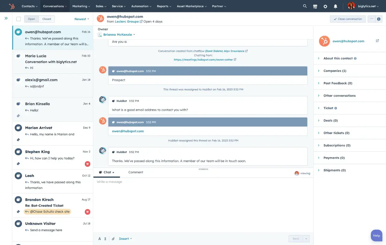
With HubSpot’s Live Chat Software, you can take this a step further and route customer queries to specific departments, including sales and support reps. This cuts back on the number of loops users must jump through to initiate a desired conversion action.
Essential KPIs and Metrics
- Total live chat counts
- Abandoned chat requests
- Average user response rate
Building Your Customer Experience Dashboard
I think building a customer experience dashboard is an exciting project. You get to collect, organize, and analyze customer data to discover what you’re doing well and where you need to improve. It will allow you to serve your customers better and build a stronger business.
However, like I said before, customer experience dashboards aren’t a one-size-fits-all solution. You must first select a specific aspect of your customer experience strategy and build a template around it. Then, determine which metrics you want to track and identify where to source your data. Only then can you decide which type of dashboard will best suit your goals.
Editor's note: This article was originally published in December 2020 and has since been updated for comprehensiveness.
Customer Experience
.png?width=112&height=112&name=Image%20Hackathon%20%E2%80%93%20Vertical%20(85).png)

.png)


![Is The Customer Always Right? [What It Means + Why It Matters]](https://53.fs1.hubspotusercontent-na1.net/hubfs/53/customer-is-always-right-origin-1-20250202-6448090.webp)


