While sometimes overlooked, I have seen how FAQ pages are a key component of most customer support strategies. FAQ pages save time for both the customer and the employees, as they can help deflect customer questions while also providing employees with consistent responses to recurring questions.
Here’s what I’ll talk about in this post:
How to Create an FAQ Page
- Use service data to identify your most common questions.
- Organize your FAQ page.
- Include space for live support options.
- Design your FAQ page.
- Publish the FAQ page on your site.
- Monitor the FAQ page's performance.
- Update content and add more solutions over time.
1. Use data to identify your most common questions.
Your FAQ page should address the most common questions customers have about your products, services, and brand as a whole. The best way to identify those questions is to tap into your customer support ticket data and see which problems customers are consistently reaching out to you with.
Your help desk or call center software can help you easily identify the most common questions that customers are asking. If you’re utilizing tagging within your ticketing system you can sort the tickets by tag to see which topics are most frequently asked about.
Pro tip: I also like to review the data from my help center to see which keywords are being searched for the most and which knowledge base articles are getting the most traction.
2. Organize your FAQ Page.
FAQ pages come in many different styles and formats. Depending on your business and your offerings, your FAQ page may consist of a single page with a list of questions or several pages linked together. When deciding how you’ll organize your FAQ page, consider what will be easiest for your customer to navigate and what will help them quickly find answers.
If your FAQ page consists of multiple pages, one critical element you‘ll need to consider is your navigation bar. If your search bar is tricky to use or doesn’t yield desired results, customers won't have the patience to sift through pages individually until they find an answer.
Pro tip: When I’m creating knowledge base articles, I’m sure to use searchable keywords in both my post titles and copy. This makes my pages easier to find since they'll include the same terms and phrases that visitors are searching. I also avoid using internal acronyms or abbreviations, instead picking terms that my customers are familiar with.
3. Include space for live support options.
FAQ pages are intended as an initial support option for customers looking for an immediate answer to a quick question or problem. It shouldn't replace your knowledge base or your entire support team, but rather supplement your support channels as an additional, lightweight resource.
When customers do have questions that extend beyond the range of your FAQ page, you should have options available that directly connect them with your support team. You could add a link that opens a new support ticket or a chatbot widget that allows customers to live chat with support.
You’ll create a better customer experience by offering your customers the chance to get additional help without requiring them to navigate back to your homepage.
Pro tip: If you are looking for a quick chatbot builder to try out, HubSpot’s free chatbot builder software is a great option.
4. Design your FAQ page.
The next step is designing your FAQ page. This is an important aspect because have you ever been on a page that was either impossible to navigate or just didn’t present information well? I know I have.
To help you design your FAQ page and work through your FAQ format, I’m going to share a bunch of tips later on in the post. If you want to skip there now to read, you can. Otherwise, continue with me here through these basic how-to steps and we’ll revisit the design aspect later.
5. Publish the FAQ page on your site.
Once your FAQ page is ready, it‘s time to publish it to your website. Most companies will provide a link to the FAQ page in their website’s main navigation bar, so no matter where they are on the site, visitors can go directly to the page if they need help.
If you have a knowledge base, then you may want to add the FAQ page as a section of this resource. Make sure your FAQ page is extremely searchable and includes plenty of keywords that will make it easily accessible to customers searching your website.
Pro tip: Software like Content Hub and its free website builder can help you easily create an FAQ page to publish on your site.
6. Monitor the FAQ page's performance.
With your page up and running, customers should be more successful in finding solutions to common problems. To find out if that‘s the case, you’ll need to revisit the customer data that you used to create an online FAQ page in the first place.
Here are the questions I like to ask as I review the topics and tags from support tickets:
- Are there any differences between now and before the FAQ?
- Does it look like more questions are being answered directly through my FAQ page?
- Are the same problems affecting your customer base?
- Or, am I noticing case volume for my most common problems decreasing? I
If I’m seeing this type of positive change, then you know my FAQ page is effective.
7. Update content and add more solutions over time.
Be on the lookout for opportunities to add new questions to your FAQs. Did your company release a new product or feature that’s driving a lot of support questions? Or have you seen an influx in questions related to a recent UI update?
While these may not make sense to add to your main FAQ, you may need to create topic-specific FAQ documents for things like product launches. These topic-specific FAQ documents also help your support team provide consistent information in their customer interactions.
FAQ Page Design Tips
- Be clear and concise.
- Ensure pages are up to date.
- Include a search bar.
- Organize questions by category.
- Quick link your top questions.
- Stick to the basics.
Designing an FAQ page may seem like a piece of cake, but it's easy to get carried away with your design and over-complicate the page.
When you create an FAQ page, there are some standard best practices that you should implement in order to provide a great customer experience. These tips are designed to help you get started with creating your own FAQ page.
1. Be clear and concise.
When it comes to text on your FAQ pages, “the more the merrier” does not apply. Too much text can end up being confusing, causing readers to have to search for the answer they need. I’ve found that rather than writing long and eloquent paragraphs, it's best to be straightforward and brief when providing answers.
2. Ensure pages are up to date.
It’s important for every FAQ page you have to be up to date and accurate. As your organization faces product launches and updates, your FAQ pages should reflect these changes as well. This means your team needs to consistently review each page and revise it after launching new features.
3. Include a search bar.
When building your FAQ page, you should consider ways to make it easy for your customers to quickly find their answers.
Customers often come to an FAQ page with a single question in mind and are forced to scroll through tens or hundreds of other questions to find theirs. If you can provide access to a search bar, you’ll allow customers to quickly locate their question or topic.
I’ll also show you some examples below of how companies are using chatbots to help customers search for specific answers.
4. Organize questions by category.
Make sure there’s a method to your madness when you list out your questions. Consider listing your questions by topic or category to account for customers with multiple questions on related topics.
For example, I like to divide up questions into overarching topics like products, features, billing, etc.
5. Quick link your top questions.
It's good to have categories laid out on the landing page of your FAQ section. However, there are likely some questions that are more popular than others.
To save customers even more time, these top questions should have their own section and a link to their answer at the top of your FAQ page. That way you can maintain your categorical organization while making your most commonly asked questions more accessible.
6. Stick to the basics.
You may be tempted to spruce up your FAQ pages with fun colors, themes, or humor. While this can be effective (depending on your organization and its branding), just remember that customers come to your FAQ pages for the information, not the design.
Pro tip: I think it's best to stick to a basic format and simple design. And don’t forget to consider accessibility when building out your FAQ page. Be mindful of things like color contrast for fonts and backgrounds as well as making images or videos accessible to all audiences.
FAQ Page Examples
Here are some of my favorite examples of well-executed FAQ pages for more inspiration as you work on your own page.
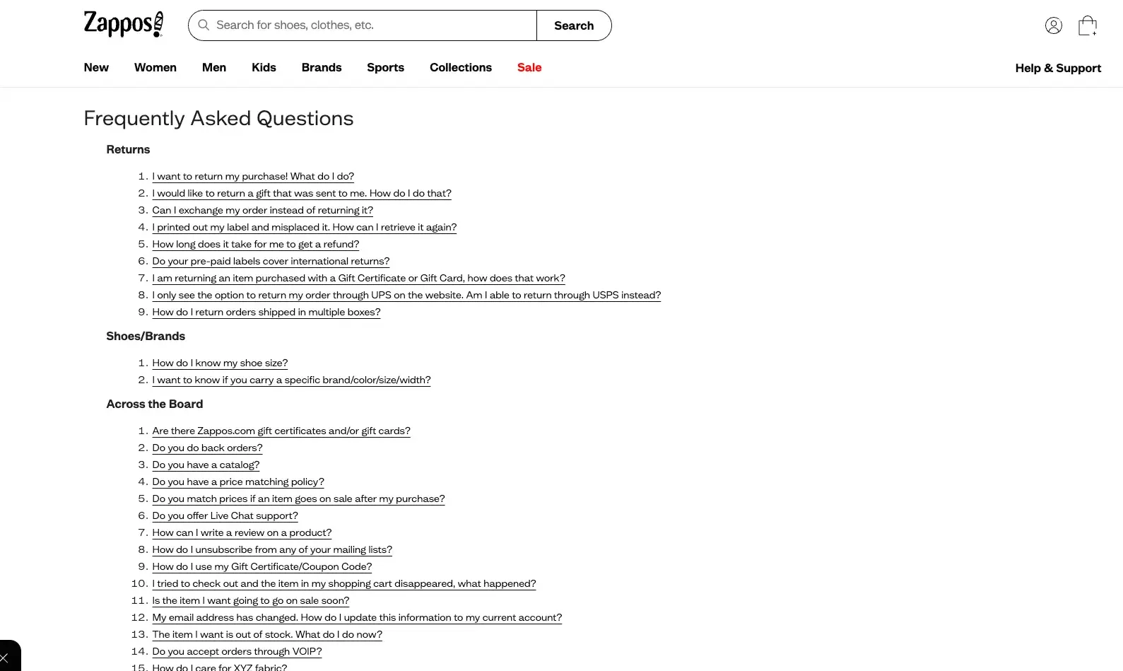
1. Zappos
Zappos saves visitors a lot of time with its simple and easy-to-read FAQ page. Questions are separated into larger categories that make for simple searches. While there's no search bar specific to the FAQs, the ease of viewing all questions on a single page makes for an equally accessible experience.
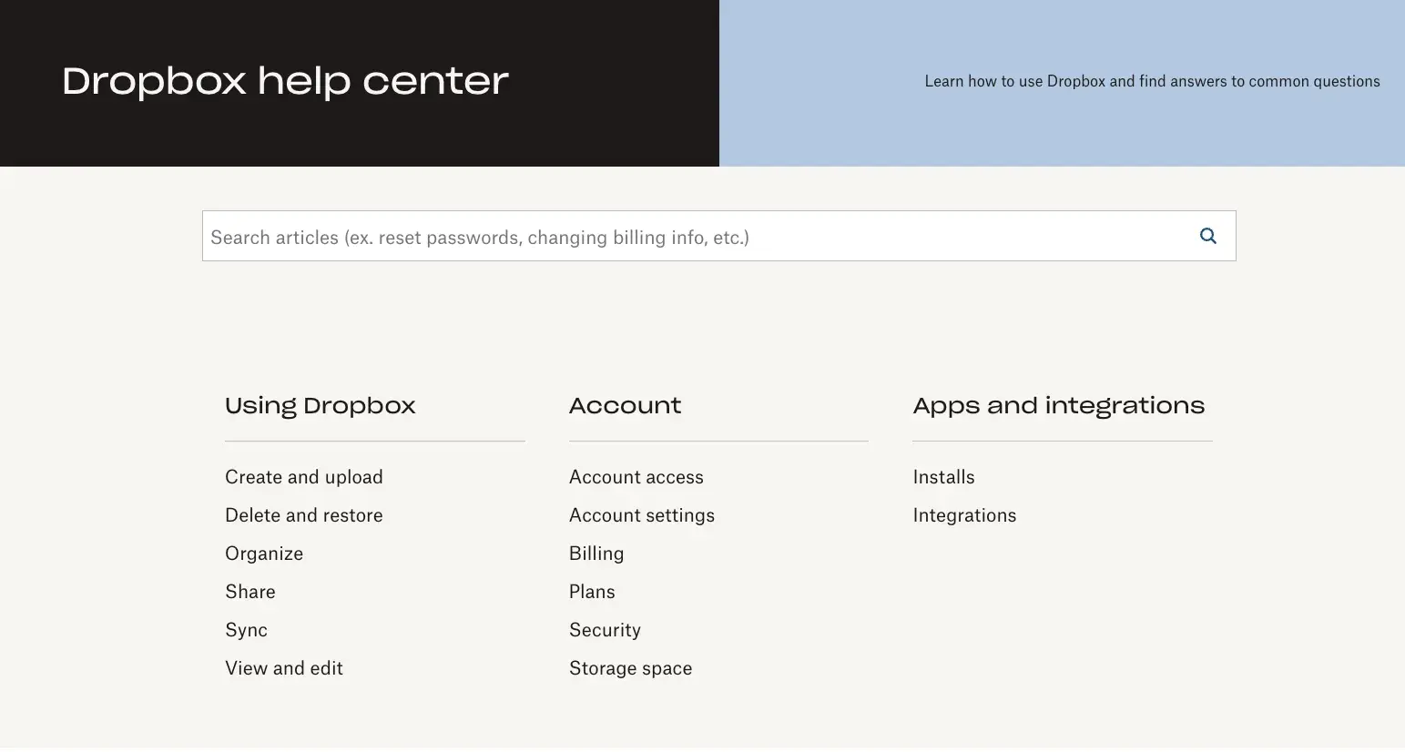
2. Dropbox
Dropbox checks all the boxes with its thorough but uncomplicated FAQ page. The page has a clear search box that encourages visitors to utilize the tool over scrolling for their question. Below the search bar are many topics to help readers find answers quickly.
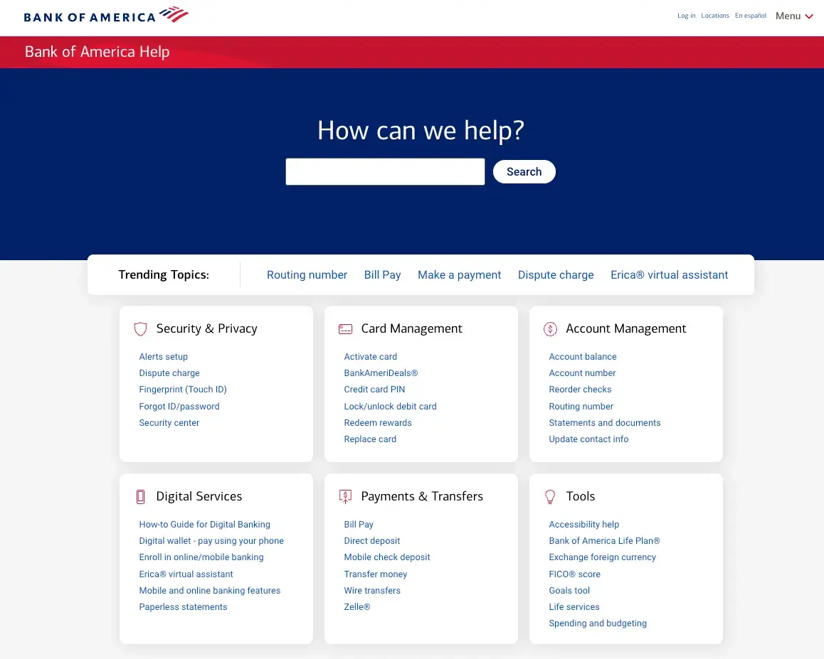
3. Bank of America
Bank of America's FAQ page is excellent. First, before accessing the page, it allows you to select your state of residence. Then, it visually separates the categories into squares which I think helps break up the view and makes it easier to look at.
The topic categories are large and easy to read and include relevant hyperlinked subcategories. You’re also shown trending topics, and have access to a search bar if you prefer to search by keyword.
4. Quince
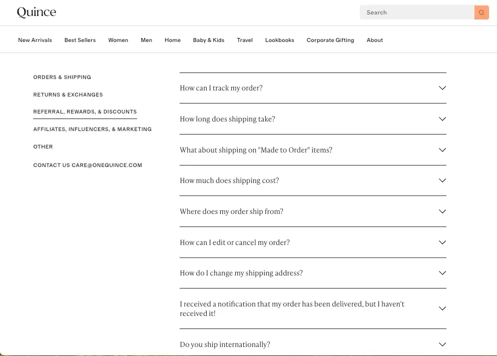
While Quince’s FAQ section is nothing fancy, I applaud the level of detail in the questions and answers they have provided (you can tell they used their support ticket data to curate this list!).
They provide jump links on the left-hand side to help you find topic categories, and when you click the down arrow next to each question, you’re presented with a very concise answer.
They also make it easy to find their contact information (listed at the bottom of the category menu on the left-hand side) so you can reach out to them if your question isn’t represented in this list.
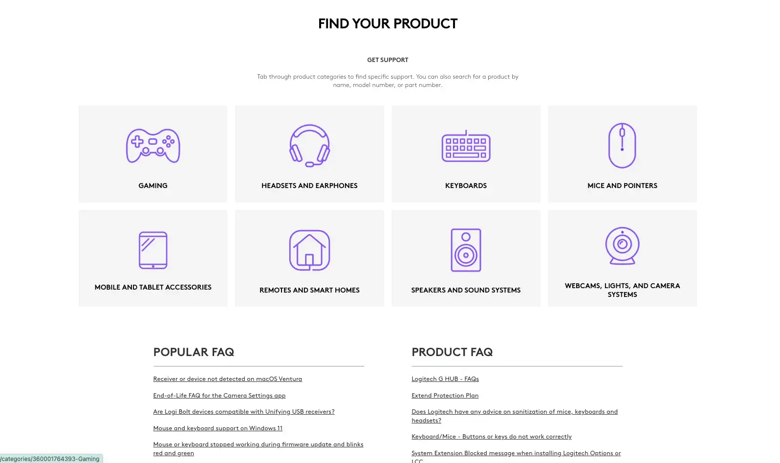
5. Logitech
I recently bought a webcam for my work-from-home setup and was impressed with Logitech’s help center and FAQ site. I like that their categories are actually sorted by product, so you can easily navigate to get help for the specific product you purchased.
You can also find links to popular FAQs as well as some product-specific FAQs. If you were to scroll down, you’d also see quick links for things like product registration or returns and refunds, as well as contact information if you need to reach out for support.
6. Anthropic
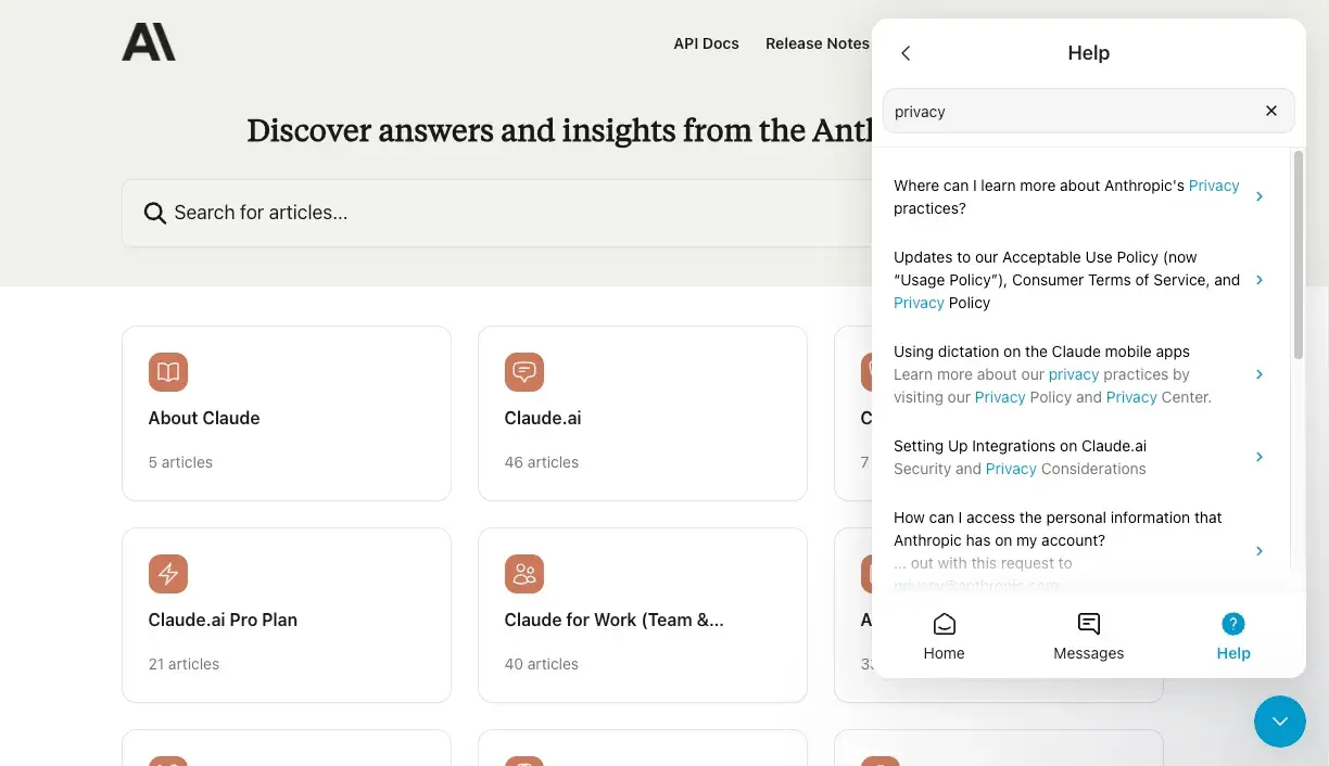
I wanted to highlight a company in this list that’s doing help and FAQ in an innovative way, and I think Anthropic fits that bill.
I love that they’ve integrated their help docs and FAQ into their chatbot experience, which means you can search directly in the chatbot for topics or keywords. When it finds content related to your search, you can click on it and view it in an expanded chat window which allows you to easily navigate back and forth between articles and the search results.
I think this experience is great because it empowers customers to search for help on their own and if they can’t find it, they’re easily able to start a chat or open a ticket, all within the same chatbot interface.
It’s worth noting that you can also use the standard experience of the search bar within the web page, as well as clicking into a topic within one of the boxes.
7. Etsy
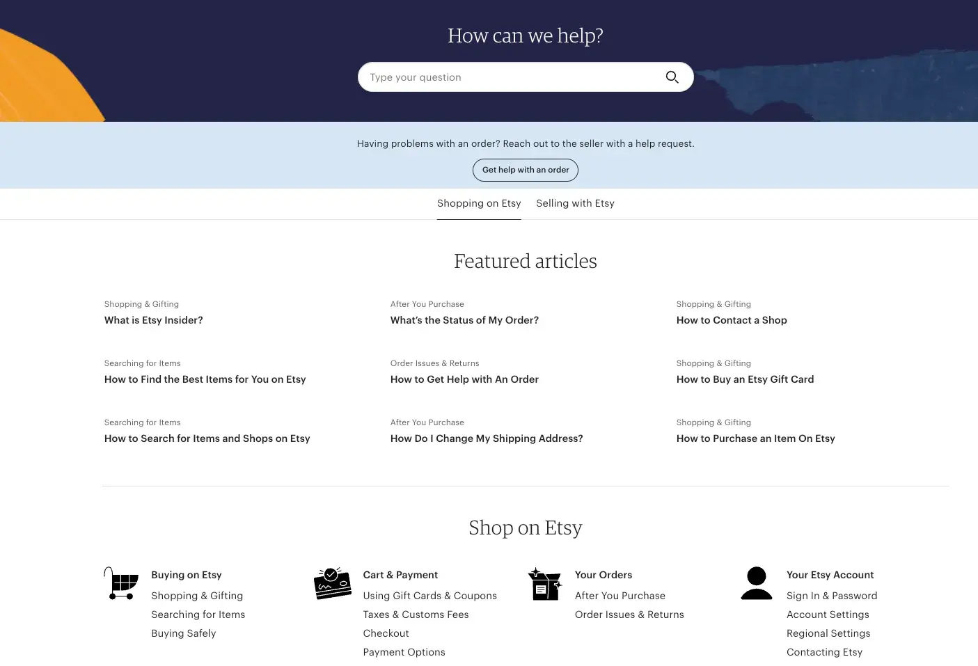
Etsy succeeds in having an FAQ page that's informative, straightforward, and aesthetically pleasing. You can toggle your help view between articles about shopping on Etsy or Selling on Etsy.
They’ve also included Featured articles with their associated topic name for easy access. Below that, they include additional articles — and I like that they included iconography to make the categories even easier to identify.
8. eBay
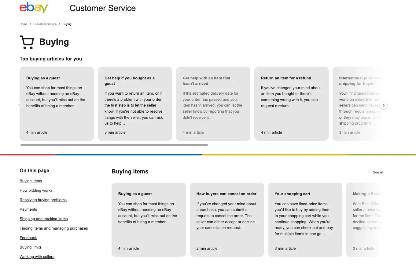
eBay’s FAQ Format is definitely different than most others I’ve seen, and I like what they’ve done here. When you land on their main help page, if you’re logged into your account you’ll be greeted with tailored articles on what you may need help with. (I personally love this approach.)
eBay also recognizes the need for different levels of support between buyers and sellers, so on their main page you can click into the overall category you need help with, like Buying, Selling, Your Account, etc., and then see tailored information based on that category.
Once you click into a category, eBay presents a uniquely designed experience in that you’ll click the arrow to continue scrolling to the right (whereas most pages scroll up or down). Then, you can easily reference the clickable links to the articles under the “On this page” category if you don’t feel like scrolling. At the very bottom of the page, they offer the option to search for more articles or contact an agent for help.
9. Adobe Creative Cloud
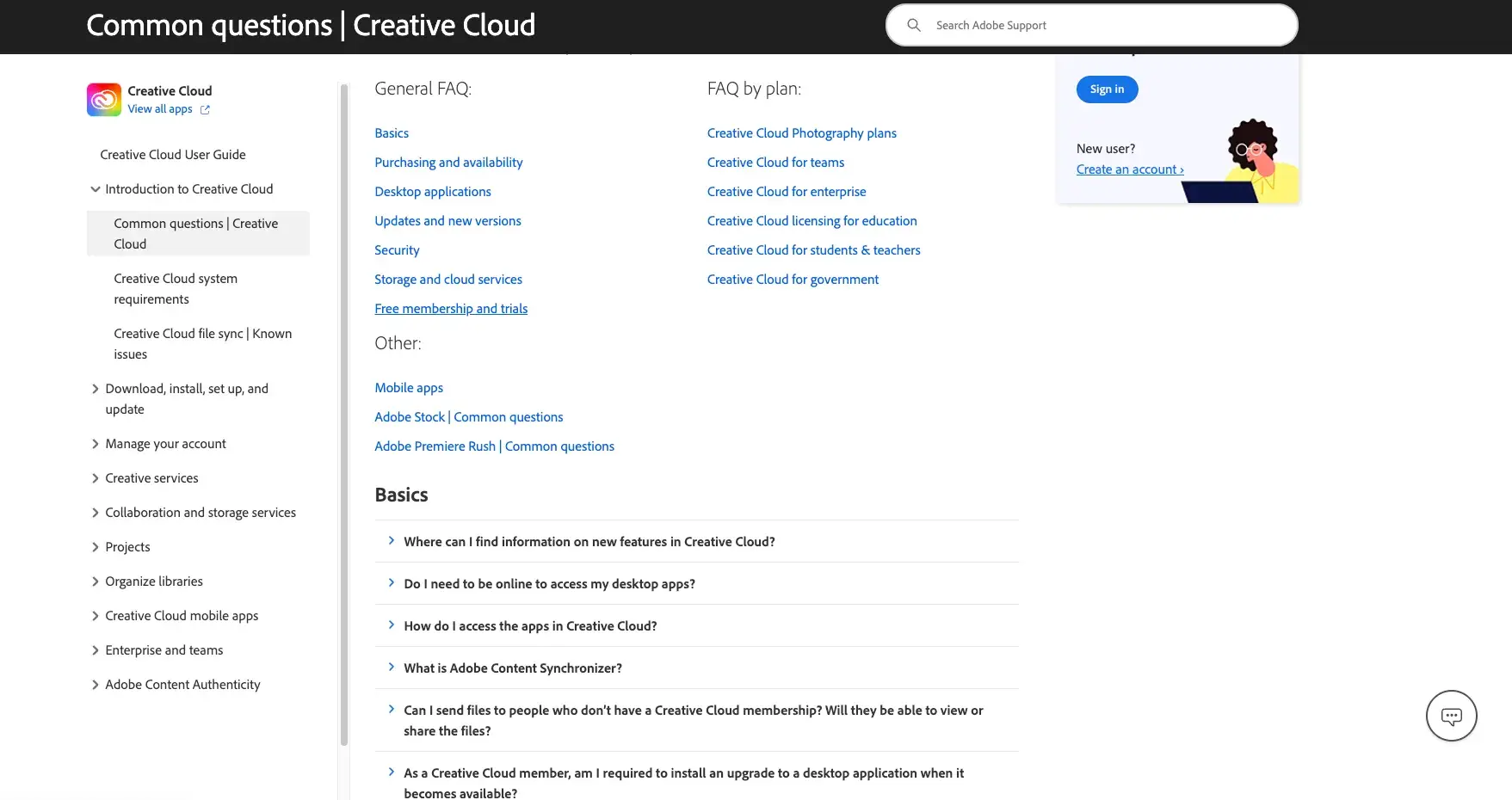
Adobe Creative Cloud has an FAQ page with a search bar at the top and an option to chat with support if you need more help (which I love). I appreciate that they’ve broken the main screen view into sub-areas like General FAQ, FAQ by plan, Basics, etc. They’ve also included an additional menu on the left that allows for deeper topic exploration and easy access to common answers.
10. McDonald's UK
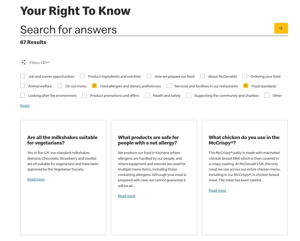
The McDonald's UK FAQ page is simple and well-organized, which is no small feat considering their FAQ page hosts 951 questions. You can search for your question in the search bar or hit the caret icon to open up the menu for filters and check off desired categories (which you’ll see I’ve done here in my screenshot). This presents you with boxes that contain FAQs related to that category as well as the corresponding answers.
I personally like how they’ve created spatial separation by putting the questions and answers into boxes. I find this to be easier on the eyes than seeing lines of text across the screen.
11. Libby
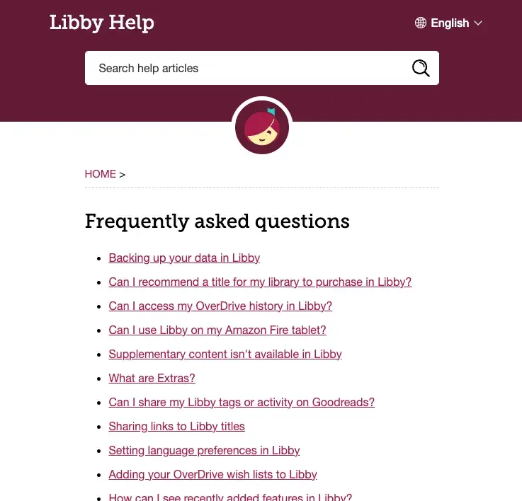
Libby’s FAQ page is a great example of a simple and to-the-point FAQ format. Frequently asked questions are linked on the main page, a search bar is available at the top of the page, and if you scroll to the bottom you’ll see a link to Contact Support.
You can also toggle the language to translate the articles into over 17 different languages, so kudos to Libby for being inclusive of their global audience here. This simplified format is a great option for companies who have a fairly simple product offering or user experience.
12. WhatsApp
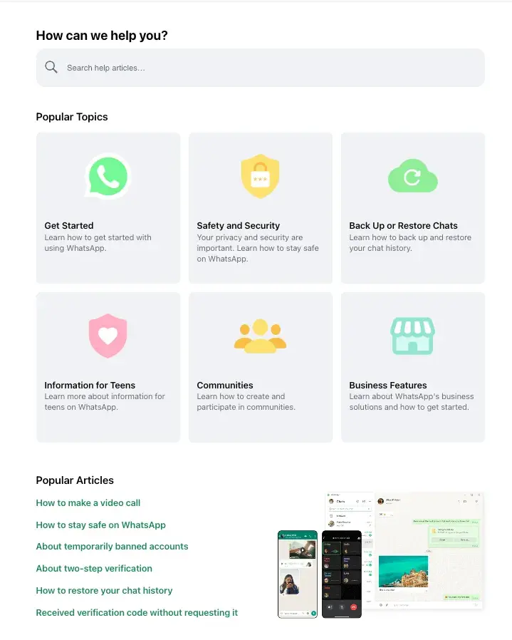
WhatsApp has managed to make their FAQ page feel fun but not overwhelming or cluttered. There's a clear search bar that allows you to type in keywords. Below are the broad topics along with corresponding icons, and at the bottom of the page they’ve listed popular articles. You can view all questions within a topic by clicking the appropriate box.
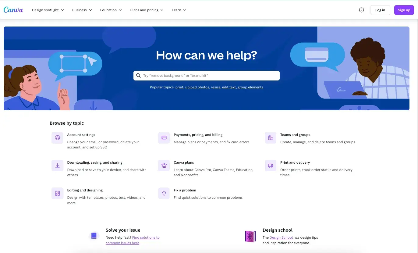
13. Canva
Canva’s help center has all the key elements required of an FAQ page: a search bar, common topics you can browse by, and even suggestions for popular topics.
What I really like about their FAQ format is that their search functionality is advanced enough to allow you to search for phrases (like “brand kit” or “remove background”) versus just a singular keyword.
Why is this important? Having a search function that can surface relevant content for you based on a combination of words means that you can be more specific with your search terms (and thus get more tailored results). This provides a better customer experience and allows customers to self-serve more efficiently.
I also like their “Solve your issue” wizard, which presents step-by-step options to help narrow down a problem and then presents helpful content accordingly.
14. Wikipedia
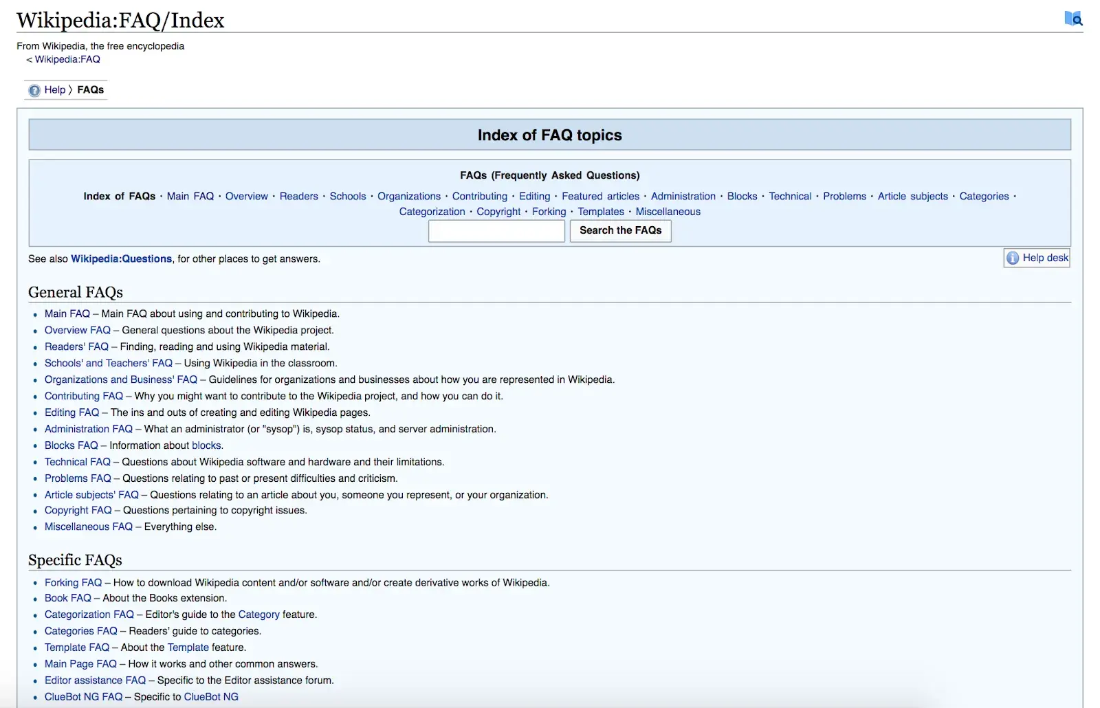
Wikipedia may be the textbook definition of simple FAQ pages, as its FAQ index is formatted very similarly to its articles. You can search through all the FAQs at the top or view overarching topics within the categories of “General” and “Specific.” Each topic brings you to a separate page that lists all the questions and their answers.
15. G2
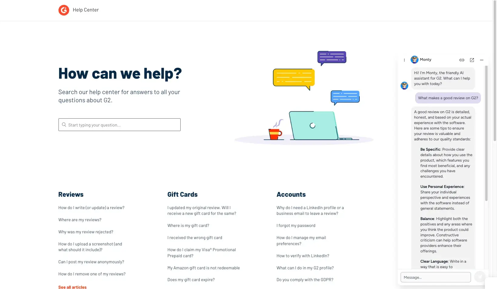
I set out to find a company that was running their FAQ or help center on GPT, because I wanted to see what impact using an LLM would have on the design and experience of an FAQ page. G2 is a great example of how this is being done today.
In my opinion, G2 takes an innovative dual approach to their FAQ support page. They offer the traditional experience of searching for articles by topic, clicking on categories or suggested articles, and then surfacing relevant help docs in response.
But they also offer Monty, their chat widget who runs on GPT. You can see that I asked Monty a bit of an obscure question and the bot immediately gave me guidance within the chat. When I searched the help docs for that same question, I didn’t really find anything, likely because I wasn’t using the right keywords or search terms.
When I did ask Monty a more common question that matched keywords, the bot wrote out specific step-by-step instructions on how to solve my issue and linked to the help article those instructions came from.
I personally love this approach because it allows customers to ask more nuanced questions that the bot can then decipher and use to provide helpful information in response.
16. Shopify
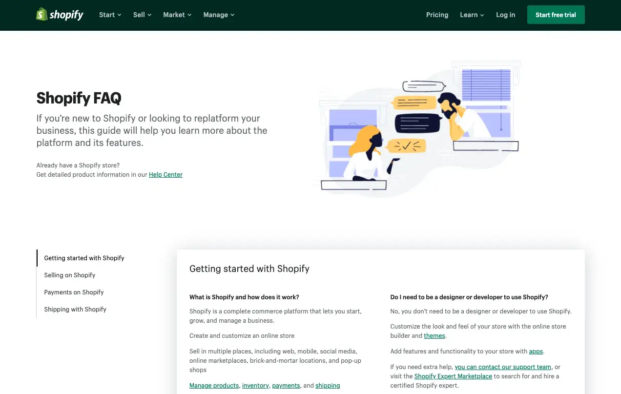
Shopify‘s FAQ page is an example of one FAQ page that doesn’t necessarily require a search bar. Since there isn't a surplus of questions — just 14 in total — visitors may not need to search their question at all. You can click one of the four topics on the left-hand side or scroll down to view all questions and answers on the same page.
17. Zoom
Zoom’s overall help page allows you to search for your own topic, click on a dedicated category, or visit one of their featured articles or top resources. Within the “Getting Started” Category, they have a simple FAQ article that covers frequently asked questions for Zoom beginners.
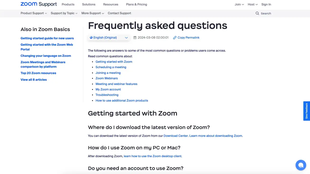
Zoom also encourages users to join their Community to find answers to commonly asked questions from other Zoom users. The community includes forums for different Zoom features to help you find the discussion that’s relevant to your specific question.
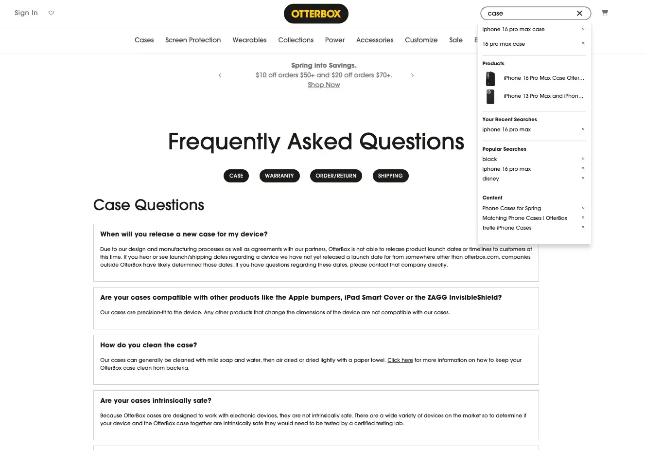
18. Otterbox
Otterbox’s no-frills FAQ page covers four main categories with quick links that allow you to easily jump to a category’s list of Q&A. There’s no interaction needed from the user to see the answer for each question, since they are both displayed outright.
While the search bar isn’t specific to the FAQ page, it does a nice job of separating the search findings out so you can easily see the results that are content versus the search results that are products. They also offer the option to chat if you need more support.
19. Microsoft
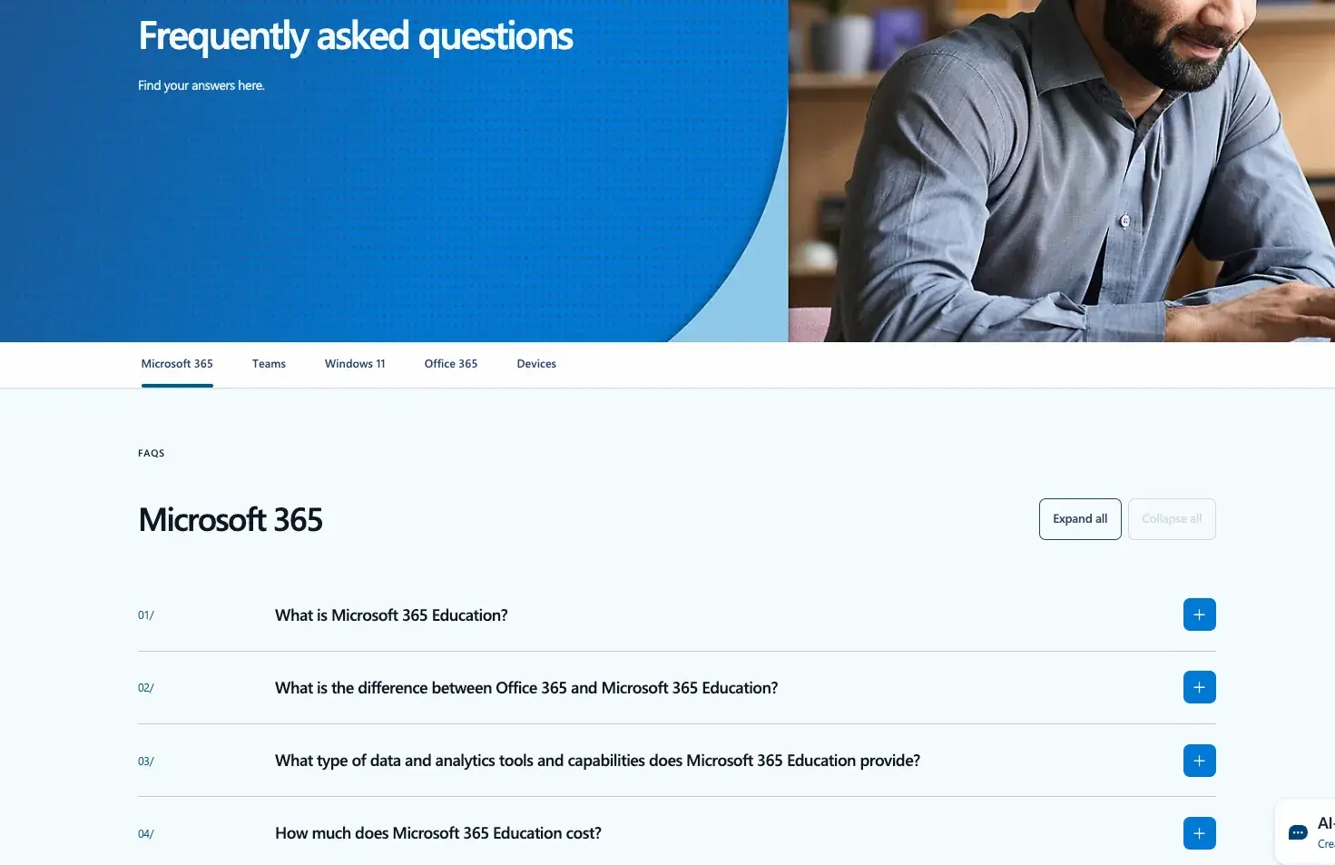
Microsoft’s Education division has created an FAQ page that allows you to easily surface information across five of their main products. At the top left of the page, you can change the view to show questions related to different products, such as Microsoft 365, Teams, Windows, and more. Based on the view you’ve chosen, you’ll see a number of frequently asked questions and can click the plus sign next to a question to see the answer.
Additionally, you can toggle on the option to “Expand all” questions and answers if you’re using something like control+F to search for a term within the page. Lastly, while you can’t fully see it in this screenshot below, their AI-powered chatbot assistant is ready and available in the right-hand corner if you need additional help.
20. The Honey Pot
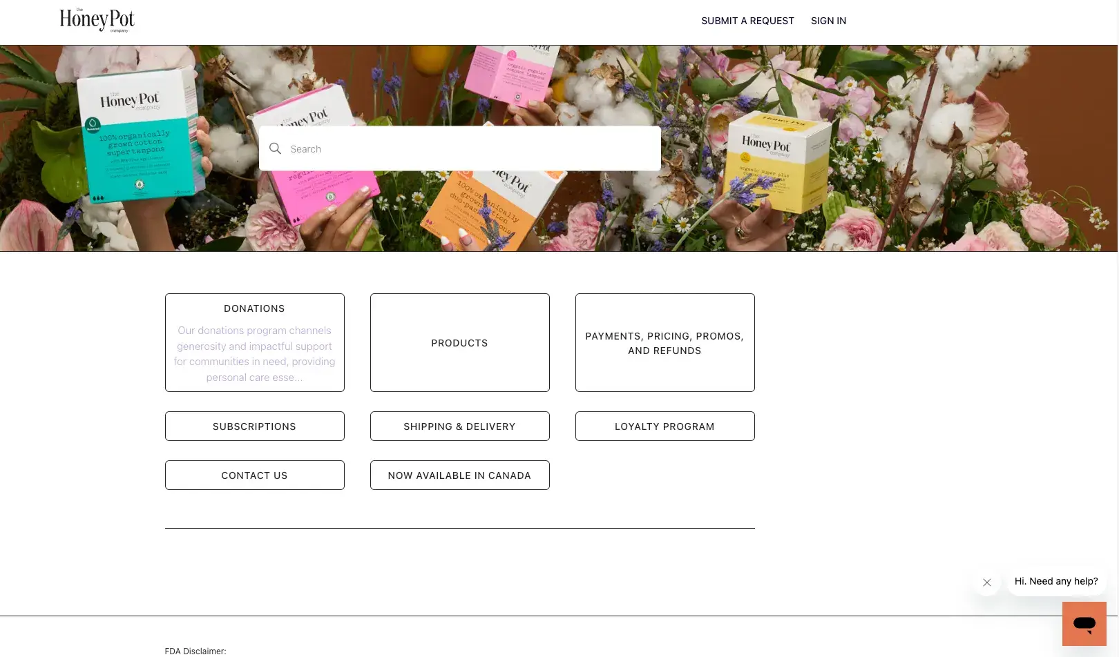
The Honey Pot’s FAQ page is short and sweet, you can search for topics or click on the section you need clarification on in the center of the page. They’ve also got easy access to chat with someone if you need more help.
Make Your FAQ Page Answer the Questions
An FAQ page is a resource that can save your employees time and quickly provide customers with the information they need. As I’ve seen while working in the customer service industry — and on the customer side myself — an FAQ page is worth the effort it takes to build and keep up to date.
I hope you use this list to build your own FAQ page. If you focus on answering common and pertinent customer questions, you’re sure to see a return.
Editor's note: This post was originally published in March 2019 and has been updated for comprehensiveness.
.png?width=112&height=112&name=Image%20Hackathon%20%E2%80%93%20Vertical%20(50).png)

.png)


