In this post, let’s review what user onboarding is, and dive into some examples of real companies who execute it perfectly.
What Is User Onboarding?
User onboarding helps new users become accustomed to a product or service. Onboarding teams assist customers with creating and managing accounts, teaching them how to use relevant features, and explaining additional upgrades and actions that will help them achieve their goals.
In general, user onboarding should shorten the time it takes to learn the product. This lets customers obtain more value from your business and develop a new habit of using the product. By guiding them through these initial steps, you'll improve customer retention and minimize churn.
Below, we've curated a list of brands that have awesome user onboarding experiences. Use these examples when developing the onboarding process at your own business.
5 User Onboarding Examples
1. Hulu
Switching streaming services can be daunting. You have no idea what movies and shows are offered and it's frustrating to learn a new organization system.
Hulu simplifies this roadblock with its user onboarding process.First, when you create an account, you're immediately shown an entrance page containing its three plan options: No Ads, Ad-supported, and Hulu + Live TV.
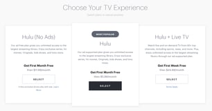
Each plan offers a 30-day trial. But, don't worry, Hulu will remind you three days before your trial ends so you can decide whether to cancel or move forward with a paid plan.
Once your account is created, you move onto the onboarding process depicted below, where you’re asked to select various TV shows and movies that appeal to your interests so it can surface and suggest content that you may like, helping you make the most out of the service by finding new things to watch.
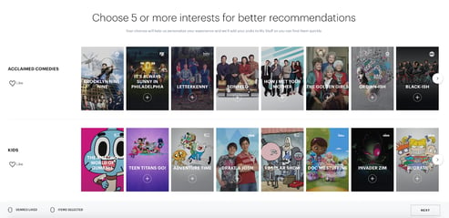
Hulu wants to personalize your viewing experience and avoid any stress caused by its large library. So, it breaks content up into 21 categories. Then, Hulu suggests shows and movies based on your interests and preferences. This way, Hulu caters your experience to your personal interests and doesn't bore you with irrelevant options.
This onboarding process is simple, yet effective. Users are more likely to remain with a brand that personalizes its offers and makes operation easier for the user.
What we like:
Hulu’s onboarding process is simple yet effective as it champions a key customer desire right from the beginning: a personalized experience. After selecting their plan, users pick shows and movies that speak to their interests, and Hulu immediately makes tailored recommendations and sets them up for success.
2. Duolingo
Duolingo helps customers learn a language with individually-set goals and fun, colorful prep questions. With 34 language options and a plethora of difficulty levels, it can be tough to get started. However, Duolingo's simple and effective onboarding process makes it easy to use.
As soon as you click "Get Started," you're brought to a page outlining every language offered by Duolingo as well as the number of users currently learning those languages. This shows new users the sheer volume of people dedicated to using Duolingo's services — a valuable form of social proof.
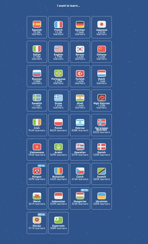
After selecting a language, users answer a series of questions that help Duolingo personalize course materials. This includes creating a daily goal and understanding why the user is learning a language.
After completing this, users can either jump into a course or complete a placement test to assess their level of expertise. Overall, this system ensures customers are put on a path that's tailored to their needs and makes sure they achieve short- and long-term success.
What we like:
People use Duolingo to learn new languages or practice those they already know. Based on this user intent, Duolingo immediately guides users to a diagnostic quiz to assess their level of expertise and places them in a course that aligns with their skill level. Without this sequence, users who are new to a language may be part of a course that is above their level, which may cause them to find another learning resource.
3. Slack
Slack is a popular messaging app that companies use to communicate internally. Since it simplifies communication, it makes sense that its onboarding is equally user-friendly. To start, you can either join an existing channel or create your own, like in the example below.
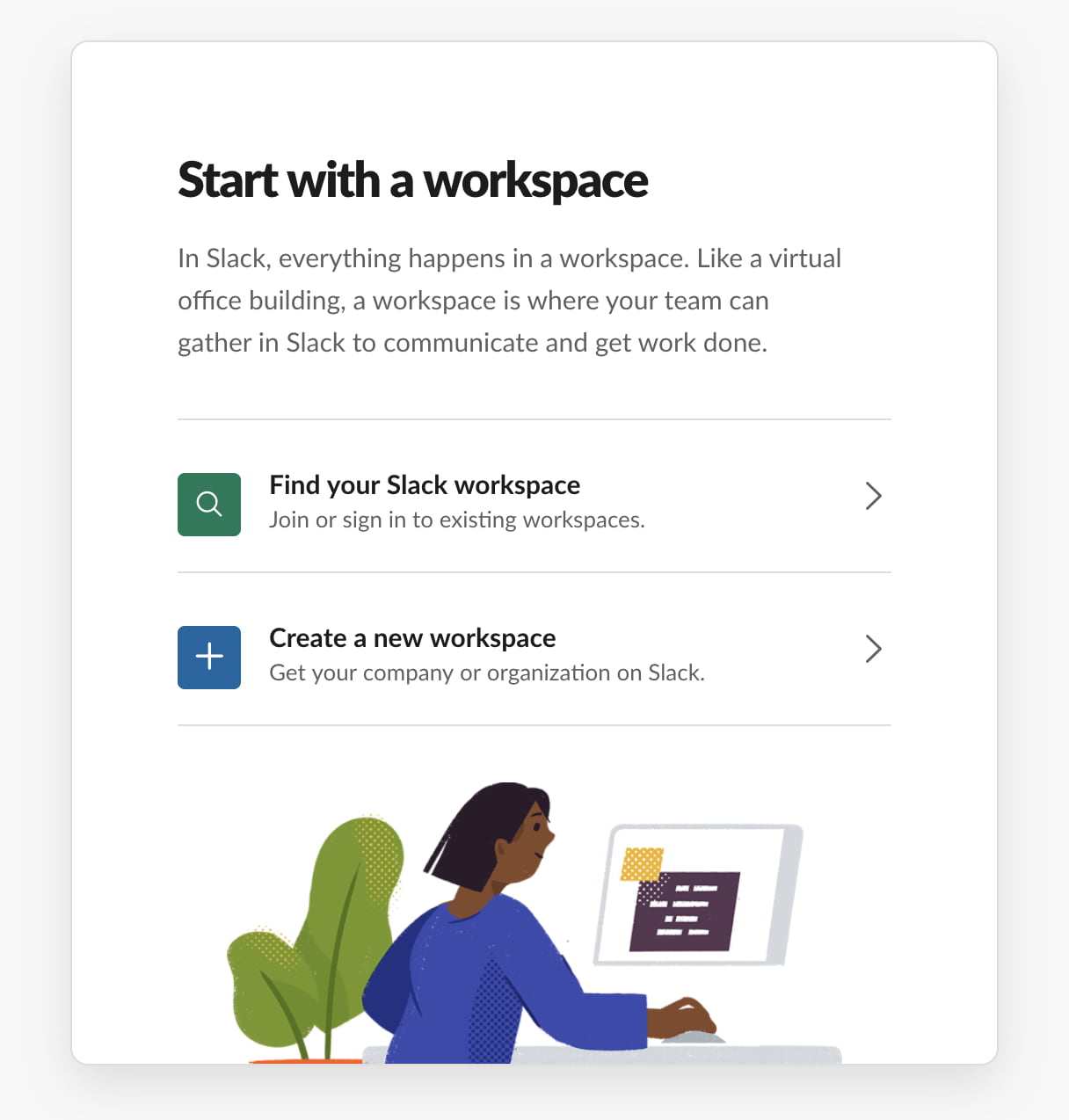
Let's say you're creating a new workspace. After confirming your email address, Slack will open up its messaging platform. It will look something like the image below.
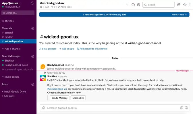
Slack’s onboarding tool Slackbot then takes over and shares helpful intuitive tips for using the app that share everything you need to know to begin using it to meet your needs. For example, in the image below, you can practice messaging and using different Slack features by messaging the Slackbot, so you can get a feel for the different functions before sending a message to your coworkers.
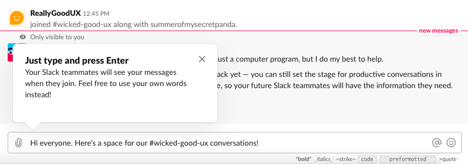
Once you've gotten the hang of messaging, Slack then walks you through creating new channels and inviting team members to join your workspace.
What we like:
Slack has various uses and tools for users to learn. Given this, it uses Slackbot, an onboarding bot, to provide an interactive walkthrough that demonstrates tips and tricks for successfully using the platform. A hands-on approach ensures audiences aren't left to figure things out via trial and error, or reading a quick-start guide and going back and forth between the app to figure out what each instruction means.
4. Canva
Canva is a graphic-design site for designers whose expertise range from beginner to intermediate. With ready-made templates, fonts, images, graphics, and more, Canva is a great tool for those looking to create quality designs without complicated or expensive software.
Upon creating Canva account, users are asked what they're using the site for. This helps Canva accurately recommend design types and appropriate templates to fit users' needs.
Next, users can get started designing. Based on the information you just provided, Canva recommends templates that are relevant to your goals.
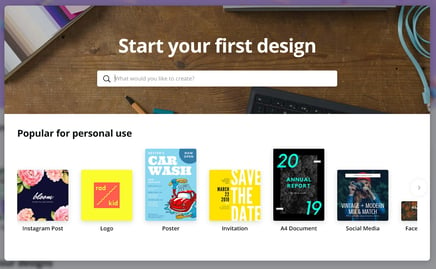
For example, users can search for whatever design they'd like, such as "resume" or "Instagram post," and Canva will fill surface appropriate templates that fill that need. Once users have selected a template, they can access the help bar at the bottom.
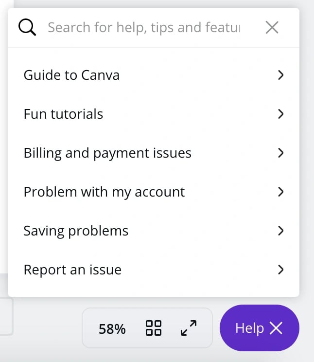
Here, users can view tutorials and guides that teach them about the platform. And, these tools are included at the bottom of every page, making Canva's knowledge base and FAQ pages readily available to its customers.
What we like:
Canva immediately asks users to set their intentions, which helps it surface the most relevant tools and templates related to customer needs so they can get started immediately. For example, a freelance designer may need a color palette generator, but a student creating presentations does not — setting an intention would let Canva know when this tool is most relevant.
5. Apple Music
Apple Music is Apple’s music and video streaming service. Users can stream music and listen to existing or customized playlists. When customers first join, they're brought to this page in iTunes:
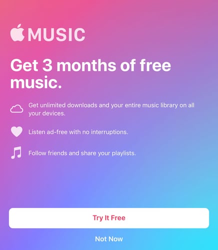
Users are shown exactly what they can gain from the platform and are offered a free three-month trial which is much longer than the typical 30-day trials offered by its competitors. If users decide to try Apple Music, they're brought to this screen shown below which prompts them to choose one of three plan options once their 3-month trial expires.
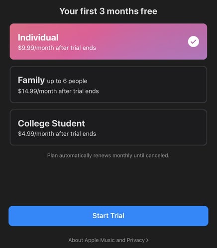
Similar to Hulu, users are shown a series of plans that they can join post-trial. Once selected, Apple Music starts tailoring the listening experience to the user. It asks about your favorite music genres and the artists that you enjoy listening to the most.
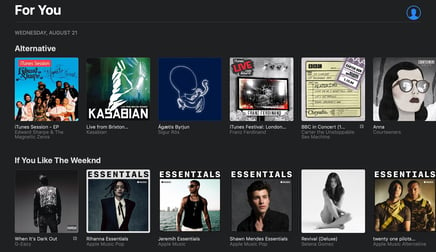
Apple Music's onboarding process parallels Hulu, having users curate their own experience by selecting their interests. The great thing about selecting artists is that users can keep clicking "Show More" to discover and choose their favorite ones. The more preferences users add, the better the suggestions Apple Music offers. Finally, when users have completed this part of onboarding, they will view a page that says “For You” and contains relevant music based on their selected interests.
What we like:
Apple Music’s “For You” tab tailors offerings based on music preferences. When scrolling, users will see music categorized by their favorite genre, artists, and new, relevant releases immediately after the onboarding process is complete. This again speaks to the customer's desire for personalization and tailored experiences that happen automatically.
For more tips on user onboarding, read about the sales to service handoff.
Customer Onboarding


![Email onboarding examples you can use to increase customer loyalty [+ templates and tips]](https://53.fs1.hubspotusercontent-na1.net/hubfs/53/onboarding-email-examples-1-20251219-2952026.webp)


![10 Customer Onboarding Challenges You Might Face This Year [+Expert Tips]](https://53.fs1.hubspotusercontent-na1.net/hubfs/53/ai%20customer%20service%20predictions%20(2).webp)


![Digital Onboarding: How to Make It Work For You [+ 5 Helpful Tools]](https://53.fs1.hubspotusercontent-na1.net/hubfs/53/digital%20onboarding_featured%20image.jpg)