What Is Card Sorting?
Card sorting is a form of user testing where participants categorize items into groups using cards or labels. This helps businesses understand how visitors perceive their site's content and how to structure it so that it's easy to find information.
During a card sorting test, participants are presented with a list of topics and are asked to organize them in a way that makes sense. In some cases, they're presented with predetermined categories, and in others, they're asked to assign a label to each group that accurately describes it. Researchers then compare the results and look for common or similar groups created by different participants. This helps web designers create the site's information architecture by identifying topics or information that should be grouped together.
Card sorting can come in handy for many different scenarios. Let's review a common one in the section below.
Card Sorting Example
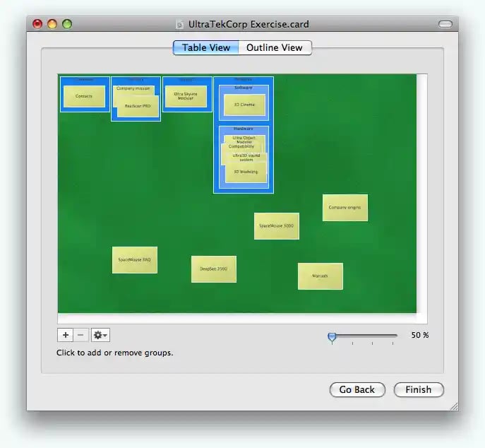
Card sorting is particularly valuable when you're designing a home page or navigation bar. For example, if you're not sure what to include in your navigation bar, card sorting can give you an idea of how you should segment your site. You can either ask participants to group webpages based on personal preference or create preset categories to see where pages are most commonly placed. The image below can show you how this process might look in action.
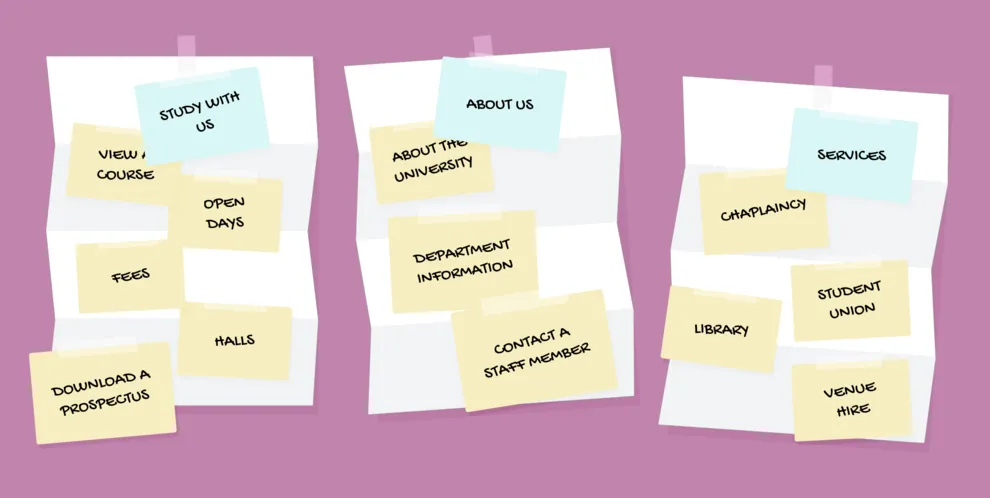
Card sorting can also tell you how to label each category so visitors will know exactly what to expect whenever they click on a link or topic cluster. After you identify the most common groups, ask your participants to label each one. This will ensure you're using language that's familiar to your target audience so visitors will know exactly where to look whenever they're seeking information on your site.
Ready to get started? Read on to the next section to learn how to conduct a card sorting test.
How to Go About Card Sorting
- Create a list of topics.
- Find Participants to Test.
- Choose a Test Environment.
- Determine the Categorization Method.
- Present Topics to Individual Participants.
- Take Notes During Card Sorting.
- Analyze and Compare Results.
- Determine How You'll Present Your Data.
1. Create a List of Topics.
If you're building a new website, then you should have a general idea of what types of pages and content that it will host. You can start by creating a list of these items and put them in an order that you feel would make sense. This will give you a baseline to compare your findings to after you conduct your test.
If you're redesigning your current site, then you may already have topics or pages that you'll want to include in your list. If that's not the case, then you can conduct a site audit and look for pages or sections that aren't getting a lot of traffic. If you're expecting more traffic to certain areas of your website, then it may be that users are having trouble finding or accessing that content.
2. Find Participants to Test.
Since card sorting is more hands-on than taking a survey or filling out a questionnaire, you should be more selective when seeking out qualified participants. You should aim to have 20-30 people participate and look for individuals that are familiar with your brand and have previously purchased your products. These people make up the core part of your target audience and their feedback is exactly what you're looking for when redesigning a website.
3. Choose a Test Environment.
The next step is fairly straightforward — you need to decide whether your test will take place online or through an in-person environment. Both have their advantages and are viable ways of card sorting.
Online card sorting tools create an interactive user experience that's accessible from your computer or smart device. This makes the test more available to your target audience and typically easier to follow. The downside is some of these options are paid tools and, depending on your business needs, the right tool for you might fall outside your team's budget. Fortunately, there are free tools available, but we'll talk more about these options later on in this post.
In-person card sorting is advantageous because you're only testing 20-30 people. You can work with participants one-by-one and take extra time if needed to answer questions or explain a specific aspect of the test. The catch here is that your researchers have to analyze the data manually which can lead to inadvertent mistakes or inaccurate findings. While you may save some money upfront from using an in-person approach, it might cost you in the long run if you have to go back to the drawing board after a few unsuccessful weeks.
4. Determine the Categorization Method.
Another important decision you'll need to make is whether you'll go with open or closed card sorting. This will likely depend on your team's goals and where you are in the web design process.
Open vs Closed Card Sorting
Open card sorting gives participants the freedom to choose their own groups as well as their own group labels. With this approach, researchers are provided with general information about customer behavior that can help them become more familiar with their target audience's preferences.

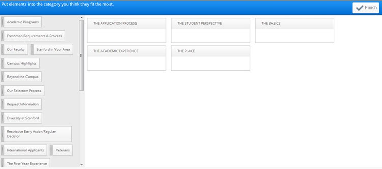
Closed card sorting is a more controlled approach to this research process. Rather than letting participants choose the names of the categories, researchers provide the labels ahead of time and participants must place topics within each group, similar to the example below.
5. Present Topics to Individual Participants.
Once you have everything set up, it's time to start testing. It's best practice test participants one-by-one so you can avoid any biases that might occur if individuals sorted cards together. This way, you'll get 20-30 unique responses rather than one collective piece of feedback.
6. Take Notes During Card Sorting.
When participants are working, you shouldn't be sitting by idly. Instead, you should be taking notes from a distance to see how people are making their organizational decisions. Without interrupting the test, try to determine the participant's priorities for categorization and why they might have assigned certain labels for specific groups.
7. Analyze and Compare Results.
Once everyone has gone through your test, you can review your results to see how each participant grouped your topics. Similar to what your participants just did, try to group their feedback into different categories based on what you think makes sense. Whether you organize these responses by popularity or common characteristics, your goal should be to segment the feedback so that similar labels and topics are grouped together.
8. Determine How You'll Present Your Data.
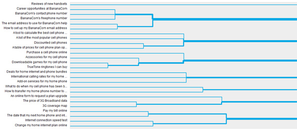
Card sorting results are typically displayed using a graph or visual. Charts like dendrograms are perfect for outlining the relationship between topics and categories because they show where an individual topic falls within your site's information architecture. Similar to the example below, you can use this type of visual to map out exactly how you want to design your site.
There's plenty of software available that can help you streamline this process. Below are some handy tools that can help you conduct your card sorting tests.
Card Sorting Tools
1. Proven By Users
Proven By Users lets you create sharable card sorting tests that you can add to your website, social media page, or email newsletter. This tool lets you conduct open or closed card sorting tests, as well as hybrid tests that contain customized messaging and branding. Tests are accessible via a unique URL and results are automatically saved and updated whenever participants complete the assessment, so you can continuously collect responses rather than asking for them all at once.
Price: $40 for 30 days; $70 for 60 days; $400 for one year
2. XSort
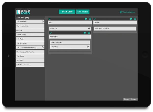
XSort is a free card sorting app that's ideal for conducting straightforward card sorting tests. This software lets you create subcategories within your overarching topic labels so users can further categorize items within a specific group. Results are updated in real-time and data is displayed individually for each response.
Price: Free
3. Optimal Workshop
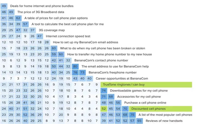
Optimal Workshop is an advanced card sorting tool that pulls out unique insights from your data automatically. As demonstrated in the image below, this software can identify common groups created by your participants and provide your research team with design recommendations based on your test results.
Price: $14/month
4. kardSort
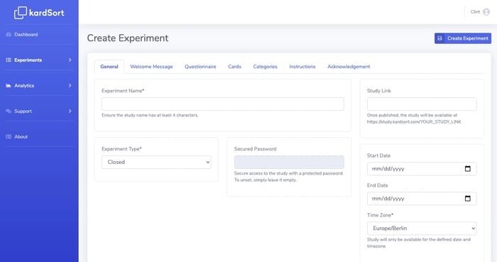
kardSort is another free card sorting tool that includes handy automation tools that make testing easier for researchers. For example, kardSort offers a scheduled start and end time so you can choose how long participants have to complete each test. It also lets you include an integrated questionnaire so you can ask participants specific questions regarding their decision-making process.
Price: Free
5. usabiliTEST
This card sorting tool is very flexible and is easily integrated into most user testing strategies. It can sync up to your CRM, so you can send your test to specific people in your contact list. This lets you target the most ideal participants to take your test, giving you higher quality feedback on your information architecture.
Price: $25/month for Premium Plan; $225/month for Pro Plan

For another user experience test, read how to create an affinity diagram.
User Testing
.png?width=112&height=112&name=Image%20Hackathon%20%E2%80%93%20Square%20(10).png)



![5 Qualitative Research Methods Every UX Researcher Should Know [+ Examples]](https://53.fs1.hubspotusercontent-na1.net/hubfs/53/qualitative%20reseach%20methods_featured.png)
![How the Serial Position Effect Influences Your Users [Cheat Sheet]](https://53.fs1.hubspotusercontent-na1.net/hubfs/53/shoppers%20making%20purchasing%20decisions%20off%20of%20the%20serial%20position%20effect.jpg)


