.jpg)
There's no question that landing pages -- and the lead-capture forms that come with them -- are two of the most important elements of lead generation. Without them, marketers would be much more limited in their ability to convert website visitors into leads -- and generate reconversions, too.
That's because landing pages enable us to direct site visitors to better targeted pages that have the ability to capture leads at a much higher rate than forms on other web pages.
Landing pages also focus your visitors' attention on one particular offer, limiting the distractions of everything else on your website. Visitors are on a landing page for just one single purpose: to obtain an offer by completing a lead-capture form.
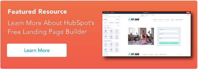
Learn More About HubSpot's Free Landing Page Builder
But converting visitors into leads, even with landing pages, is much easier said than done. In fact, there are quite a few best practices every marketer should consider when setting up and optimizing landing pages.
So to keep you on track, here is your landing page tip list, excerpted from our newest ebook, The 30 Greatest Lead Generation Tips, Tricks & Ideas.
Free Landing Page Builder
Create and test beautiful landing pages that generate leads and look great on any device.
- Build landing pages.
- Turn visitors into leads.
- Optimize for SEO.
- And more!
Lead Generation Tips
- Include all critical elements of an effective landing page.
- Remove the main navigation.
- Match the headline of the landing page to its corresponding CTA.
- Remember: Less is more.
- Emphasize the offer's value.
- Encourage social sharing.
- Create more landing pages to generate more leads.
- Only ask for the information you really need.
- Consider whether To Submit, or Not to Submit?
- Reduce anxiety with proof elements.
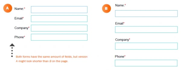
- Make the form appear shorter.
- Include rich media on your landing pages.
- Pay attention to the copy.
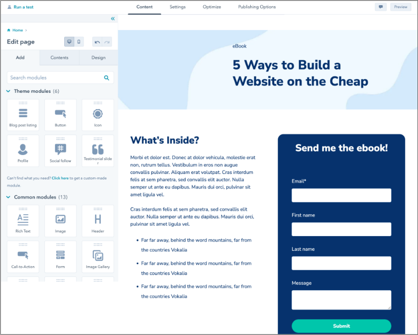
1. Include all critical elements of an effective landing page.
Landing pages, sometimes also called “lead-capture pages,” are used to convert visitors into leads by completing a transaction or by collecting contact information from them. In order to make these transactions happen, it’s critically important that your landing pages consist of the following components:
- A headline and (optional) sub-headline
- A brief description of the offer that clearly emphasizes its value
- At least one supporting image
- (Optional) supporting elements such as testimonials or security badges
- And most importantly, a form to capture visitors' information

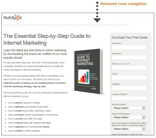
2. Remove the main navigation.
Once a visitor arrives on a landing page, it’s your job to keep them there. So if there are links on the page that enable visitors to move about your website, you run the risk of distracting them, which creates lead generation friction and increases the chance they'll abandon the page before even converting. And, let's face it: No respectable marketer wants that. One of the best ways to reduce this friction and increase your landing page conversion rates is to simply remove the main navigation from the page. Simple as that!
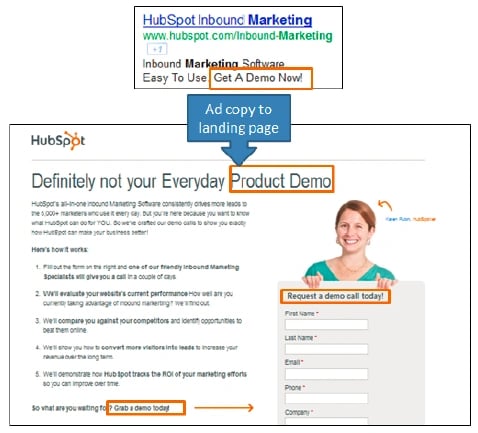
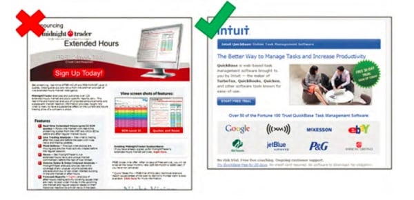
3. Match the headline of the landing page to its corresponding CTA.
Keep your messaging consistent in both your call-to-action (CTA) and the headline of the landing page. If people click on a CTA for a free offer only to find out there’s a catch on the landing page, you’ll instantly lose their trust. Similarly, if the headline reads differently than the CTA, it might lead to confusion, and the visitor might wonder if the CTA is linked to the wrong page. Eliminate any and all confusion, and make sure your landing page consistently reflects what you promised in your call-to-action -- and vice versa.
4. Remember: Less is more.
Many of you are probably aware of the phrase “keep it simple, stupid.” Apply that same philosophy to your landing pages. A cluttered page usually results in a distracted, confused, and/or overwhelmed visitor. Talk about landing page friction! Instead, embrace white space, and keep the text and images on the page simple and to-the-point.
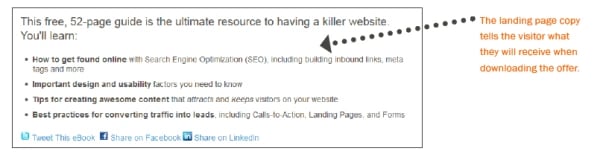
5. Emphasize the offer's value.
Highlight the benefits of the offer with a brief paragraph or a few bullet points. The best landing page description offers more than just a list what comprises the offer; it also clearly highlights the value of the offer and gives visitors a compelling incentive to download. For example, instead of “Includes specifications of product XYZ,” say something along the lines of, “Find out how XYZ can increase productivity by 50%.” In other words, emphasize how the offer addresses a specific problem, need, or interest your target audience cares about.
6. Encourage social sharing.
Don’t forget to include social media sharing buttons that enable your prospects to evangelize your content and offers. To limit cluttering, just be sure to only include buttons for the social platforms your audience uses. And don't forget to add an email forwarding option, since people have different sharing preferences. Keep in mind that even if your social media contacts never buy from you, there's always a possibility that someone in their personal network will!

7. Create more landing pages to generate more leads.
According to HubSpot's Marketing Benchmarks Report, companies see a 55% increase in leads when increasing their number of landing pages from 10 to 15. The takeaway is simple: The more content, offers, and landing pages you create, the more opportunities you have to generate leads for your business. More landing pages also usually means more targeted content that better appeals to your various buyer personas, which can help to increase your conversion rates. To increase the number of landing pages you have on your site, invest in an easy-to-use landing page creation tool, create more offers, tweak the offers you already have to cater to individual personas, and repurpose content you already have. In fact, we elaborate on all of the above in this blog post about why you (yes, you) need to create more landing pages.

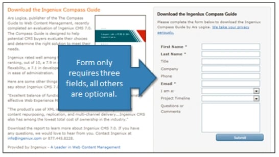
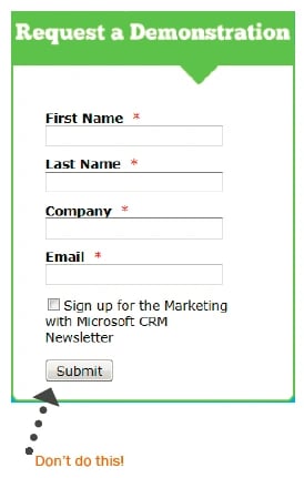
8. Only ask for the information you really need.
You might be wondering how much or how little information you should require in your forms. There is no magic answer to this, but the best balance is to collect only the information you really need to qualify leads. In general, the fewer fields you have on a form, the higher the conversion rate. This is because, with each new field you add to a form, it creates more work for the visitor, and thus fewer conversions. A longer form looks like more work and will often be avoided altogether. On the other hand, the more fields you require, the better quality those leads will likely be, because they thought your offer was valuable enough to warrant a form completion. Essentially, the best way to determine what form length works best for your business is to test it for yourself.
9. Consider whether "To Submit, or Not to Submit?"
That is the question most of your visitors are probably asking. That's why one simple yet effective way to increase form conversion rates is to avoid using the default word "Submit" on your form button. If you think about it, no one wants to “submit” to anything. Instead, turn the statement into a benefit that relates to what prospects will be getting in return. For example, if the form is to download a brochure kit, the submit button should say, “Get Your Brochure Kit.” Other examples include “Download Whitepaper,” “Get Your Free Ebook,” or “Subscribe to Our Newsletter.” Here's another helpful tip: Make the button big, bold, and colorful, and make sure it looks like a button, which is usually beveled and appears “clickable.”
10. Reduce anxiety with proof elements.
People are even more resistant to give up their personal information now than ever before. It's understandable, considering all the spam out there. Luckily, there are a few different features you can add to your landing pages to help reduce visitors' form completion anxiety:
- Add a privacy message (or a link to your privacy policy) that indicates visitors' email addresses will not be shared or sold.
- If your form requires sensitive information, include security seals, a BBB rating, or certifications so visitors know their information is safe and secure.
- Add testimonials or customer logos. It's a great way to leverage social proof. For example, if your offer is for a free trial of your product or service, you might want to include a few customer testimonials about that particular product or service.

11. Make the form appear shorter.
Sometimes people won’t fill out a form just because it looks long and time-consuming. If your form requires a lot of fields, try making the form appear shorter by adjusting its styling. For example, reduce the spacing in between fields or align the titles to the left of each field instead of above it so that the form appears shorter. If the form covers less space on the page, it may seem as if you’re asking for less. And whenever possible, implement Smart Fields -- dynamic form fields that automatically adjust to a shortened version if a visitor has already been entered into your marketing database.
12. Include rich media on your landing pages.
In this day and age, one of the ways to make your landing pages stand out is to include rich media.
For example, you can have moving GIFs, videos, and interactive images. While design isn't necessarily the most important component of a landing page, it's important that your design helps your landing pages stand out.
The goal is to entice the user to feel compelled to download your content offer. Design can help with this.
13. Pay attention to the copy.
The most critical component of your landing pages is to have copy that inspires users to download your offer. How do you do this?
Well, the best way is to write copy that is targeted toward your persona. This means that your target market should feel like they could've written the copy themselves. When your target market feels like you understand their problems, they're more likely to download your offer.


![Why You Need to Create More Landing Pages [Data + Tips]](https://53.fs1.hubspotusercontent-na1.net/hubfs/53/create%20more%20landing%20pages.png)
.png)