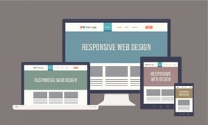
Responsive design is a web design approach that leverages one content base and one codebase to render content across multiple screen resolutions. Although the web design methodology isn’t new, it has seen a rebirth of popularity among many web designers and businesses looking to upgrade its digital presence. With the increased popularity of responsive web design, companies must confront a variety of common misperceptions. These misperceptions can create roadblocks to planning, scoping, estimating and executing a responsive project, so clarifying these misperceptions up front can lay the groundwork for a successful redesign project.

Myth #1: Responsive design is about offering the same experience on every browser and device.
Reality
Experiences shouldn’t just look consistent. Because people want experiences that are device-relevant and flexible enough to utilize the features they have on their device, designers need to create unique experiences tailored to of each different device type, whether mobile, tablet, desktop, TV or even a gaming console. Instead of focusing on how things respond to the screen size, focus on the experiences you’re going to deliver on the device.
Today people are looking for a mix of both responsive and adaptive design. Adaptive elements include capabilities such as recognizing an iPhone or iPad and registering the screen resolution accordingly. Adaptive design using JavaScript allows landscape and portrait modes to respond differently and allows designers to make the maximum use of touch features on a device.
Myth #2: Responsive design is less expensive.
Reality
While the long-term benefits of a unified infrastructure, codebase, content repository and analytics platform will ultimately deliver return on investment, development costs are significantly higher than a straightforward website redesign. Responsive design in the purest form is the application of style sheets to render content across screen resolutions; however, as stated in Myth No. 1, consumers are demanding a more personalized experienced based on their device. As a result, many businesses have to go a step further than a basic responsive site and implement adaptive features. This is a more complex undertaking because it requires more specialized expertise and a more detailed requirements definition.
At a minimum, plan to spend 2.5 times the cost of a basic website redesign, regardless of the size or complexity of your existing website. Also, you should be aware that testing costs are significantly higher because actual testing on the devices is necessary. Emulators just don't provide accurate results. Typically, for a level-of-effort estimate, the amount of time spent on development should correspond to the time needed for testing. Budgets vary based on the cost of the resources for development vs. QA resources.
Myth #3: Every company should deploy a responsive design.
Reality
Although the potential ROI for responsive design can be very alluring, responsive design is not a one-size-fits-all approach. Whether or not to undergo a responsive redesign should be considered on a case-by-case basis. To help with the decision, it’s important to consider your audience and the experience they are looking for. For example, there are still circumstances where native apps are needed to optimize an experience for a particular device type.
At a higher level, consider the industry you’re in when determining if responsive is the right choice. Corporate websites are a perfect example of an effective use-case for responsive design. Visitors of corporate websites are looking to access information quickly, and static websites are much easier to manage from a marketing and IT standpoint.
In contrast, media and e-commerce websites should look to use a combination of adaptive and responsive design. Visitors of e-commerce and media websites are constantly expecting to engage with different experiences.
Myth #4: Content just needs to be repositioned for responsive design.
Reality
When possible, we recommend designing and planning the project from a mobile-first perspective. This approach to responsive design is beneficial for numerous reasons, but the most important to note is that by addressing your mobile presence first, you are able to identify high-priority content items early on. Identifying high-priority content items also helps with identifying content priority as it relates to other devices.
With a mobile-first strategy, it is important to recognize that some content should not be requested by mobile devices. One rule of thumb: faster is better. Business and consumers alike are constantly concerned about page-load times. When you think about it, mobile devices really should not be attempting to load large images, heavy video or content experiences that require large screens.
Optimizing performance of a responsive site requires tight integration between front-end and back-end development. Your infrastructure team needs to adjust to modify images so that you’re not sending massively large images to your device. To do this, a completely different rendition needs to be sent so you’re not just repositioning content or hiding content using CSS, but selecting a smaller, high-priority content payload to be sent to the device. Many digital asset management (DAM) tools create renditions of images that provide a smaller version to support faster load times. If you’re in digital marketing, be sure to work with your internal IT teams to ensure there is a strategy in place for creating the proper renditions.
Myth #5: 2014 will be the year of responsive design.
Reality
Responsive design has gained tremendous interest in the past two years and that interest will continue. But, what marketers really need is the next generation of digital engagement. People will be adding adaptive and responsive together to create an “experience website.” So, although responsive design is an effective solution to the ongoing proliferation of digital devices, it is but one means to that ultimate end. Work with your development team to determine which mixture of adaptive and responsive works for you.
Want more information on responsive design? Download our new white paper, “Keys to a Successful Responsive Redesign: A Guidebook for Marketers.”