Like many of you, I am a trained marketer and a DIY designer. I read The Marketer’s Crash Course in Visual Content Creation and learned some essential PowerPoint and Photoshop tricks, but I really wanted to take my design skills to the next level. So I asked all my designer friends what my next step should be, and every single one said to take a course on typography.

So I decided to sign up for a typography course at the Massachusetts College of Art and Design. I figured I'd learn how to identify a good font from a bad one. What I didn't realize was that starting out small and paying attention to the details makes all the difference in the world when you're laying out an email, ebook, or image for social media.
Every little change you make to a word or a body of text can make a huge difference in the overall piece. The little details do matter.
In fact, one of the only college courses Steve Jobs took was on calligraphy and typography, which he believed played a critical role in the success of Apple. As he once said in his Stanford University commencement speech, "If I had never dropped in on that single course in college, the Mac would have never had multiple typefaces or proportionally spaced fonts." Can you imagine a world where Apple products didn't have a focus on beautiful design? I certainly can't.
So, what do you say? Are you ready to take your DIY design skills to the next level? Let's get started.
What Is Typography?
Typography is both an art and a technique. Once created through printed materials (remember Johannes Gutenberg’s printing press?), typography is all about arranging type (letters or characters) in a way that enables learning and recognition.
However, typography is more than just the design of the letters and characters -- it also involves careful arrangement and selection of point size, line length, and spacing both on a single line and throughout an entire page. If you know the basics of typography, you will be able to lay out an arrangement of headers, paragraphs, etc. in an attractive and convincing way.
Typography is absolutely everywhere -- just look at your phone, a billboard, your coffee cup, or even the different styles used in this blog post. Once you’re conscious about the fact that typography is used all around you, you’ll start to recognize the differences between typefaces and why they might’ve been selected.
Typefaces vs. Fonts
Most people assume that these words are interchangeable, but they actually mean two different things.
Typographer, Nick Sherman, once used a great analogy to explain the differences between the terms “typeface” and “font.” He suggested comparing these typography terms to the musical terms “song” and “mp3.” When you’re explaining how much you enjoy a particular tune, you say, “I love this song!” You wouldn’t say, “I love this mp3!” The song is the work of art, whereas an mp3 file is just the delivery mechanism. The same rules apply in typography.
You should use the word “typeface” when describing the creative work (what you see). This is a more abstract design term used when referring to the way a specific collection looks or feels. For example, Helvetica is a typeface.
If you’re describing the physical embodiment of the collection of letters and characters, you should use the term “font” (what you use -- whether that’s a file on your computer or a case full of metal letters). This is the tangible representation of that collection of letters and characters. For example, Helvetica Bold and Helvetica Light Oblique are fonts.
How you could use these two terms in a sentence:
-
“Wow. The typeface you chose really pulls this design together.”
-
“I’ll change the font size to 12pt so it fits in the box.”
The Anatomy of a Typeface
Learning the anatomy of a typeface will help you articulate why you do or don't like a typeface instead of saying, “I don’t know, it just looks funny.” Trust me, I’ve been there. But it’s so much more effective (and more fun) to communicate with designers when you actually speak their language.
Each part of a letter has its own special term, similar to bones in a human body. Below, you’ll see three diagrams that explain the makeup of individual letters, how these elements interact with each other, and how they sit on a line.
In the first example with the word “Faulty,” you’ll see the line where the letters sit is called the baseline. The distance from the baseline to the top of the capital letter is called the cap height. The x-height, located in between the baseline and the cap height, is the height of the body of the lowercase letter (in this scenario, it would be letters ‘a’, ‘u’, and ‘y’). The bowl is that round shape sticking off the letter ‘a’. See that little foot sticking off the letter ‘l’? That’s a serif. Finally, the descender is the longest point on a letter that falls beyond the baseline.
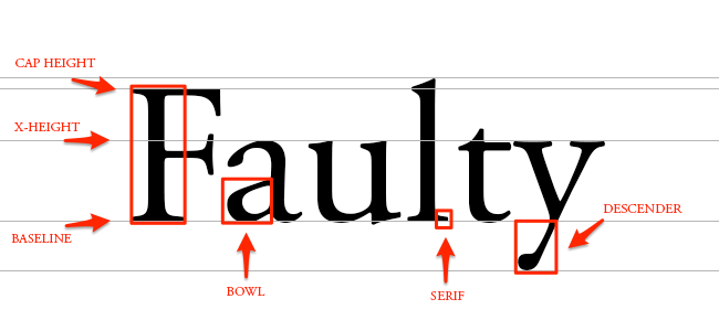
When typing the word “flash,” you’ll notice the f and the l smush together to form one character. This formation is called a ligature. The base of a letter is called the stem (similar to the stem of a flower). The curvy body of the letter ‘s’ is called a spine. You’ll also notice the letter ‘h’ is actually taller than the cap height. The tall piece that goes above this line is called an ascender.

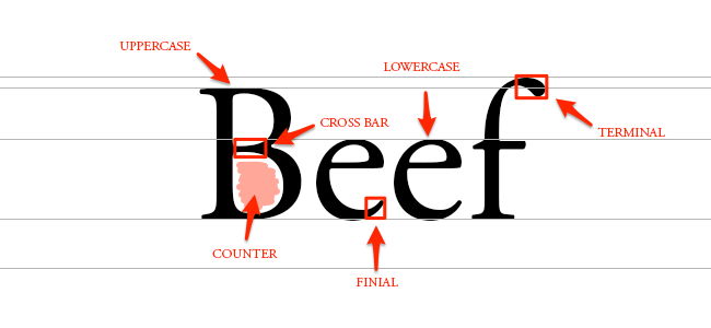
You’re probably already aware of the differences between uppercase and lowercase letters (in case you need a refresher, you can see these in the diagram below). In the uppercase letter ‘B’, you’ll see something called a cross bar. This is the bar that goes across the inside of the letter and connects one side to another. The empty space in the middle of letters such as ‘B’, ‘O’, or ‘A’ is called the counter. The finial is the tapered end of letters such as ‘e’ or ‘c’. The terminal is a type of curve that you see at the top of the letter ‘f’ or the end of the letter ‘j’.
Got all that? Now that you know the anatomy of letterforms, let’s go into the different type classifications.
Classifying Types
The two main type classifications you see are called serif and sans serif. Other classifications include modern, slab serif, blackletter, script, and decorative. However, in the interest of time, I’m only going to go into detail for the most common two.
Serif
Remember when I pointed out the little foot in the word “faulty?” Typefaces with feet like that are called serif. You can see where I highlighted these little feet below:
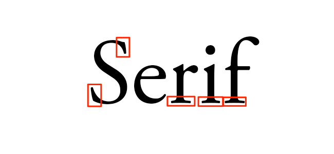
Common serif typefaces include Times New Roman, Georgia, and Garamond. If you’re reading a novel, you might notice the body text is a serif. That’s because a serif is much easier to read in long, printed works due to the distinctiveness between letters.
Sans Serif
In French, the word “sans” means “without.” So the term “sans serif” literally means “without serif.” In the image below, you’ll notice the words lack serifs, as I pointed out with the red arrows.
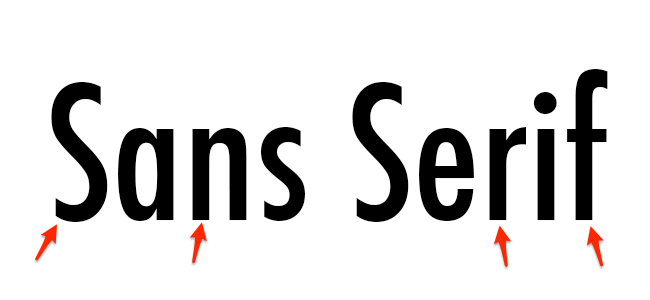
Common sans serif typefaces include Arial, Verdana, and Futura. You’ll see a lot of sans serifs being used in blog posts and documents on the web because it feels more modern and looks great even at lower screen resolutions.
Type Families
The term “type family” or “typeface family” is used to describe a range of designs that are all variations of one basic typeface. For example, you’ll see that Proxima Nova has variations such as bold, extra bold, black, regular, light, light italic, and regular italic:
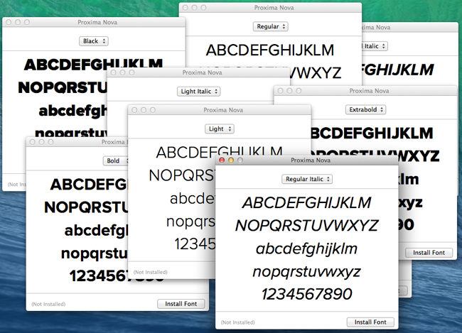
Sticking to a single type family will help add variation to your designs, while keeping it consistent and uniform. Designers might use various fonts within one family to create a sense of hierarchy -- designing so that the most important elements, such as headlines and quotes, stand out above the rest of the text.
Kerning
Kerning is the modification of the space between two letters. For an example, see the image below:
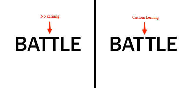
Here, I used Franklin Gothic Medium to showcase the natural space you see between two letter T’s. It looks a little too snug, right? By customizing the spacing between just these two letters, you'll be able to increase readability.
Tracking
Similar to kerning, tracking deals with a modification to letter spacing. However, instead of adjusting the spacing between just two letters, tracking is an adjustment to the spacing between all letters an entire word. See the difference below:
![]()
For this example, I chose to make an extreme adjustment to the tracking. Typically, you’d want to apply tracking in small increments to avoid causing readability issues.
Leading
Remember in high school when you had to double-space your essays? Well, the terms “single-space” and “double-space” can also be called “leading,” which is the distance between the baselines. See leading in action:
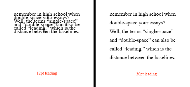
You can choose to increase your leading, creating more space between the baselines, or decrease your leading, which pushes your lines of text closer together. The reason high school teachers asked for essays to be double-spaced was because it’s much easier to read, and they could make corrections to the text more easily.
Hierarchy
As you read through this blog post, you'll notice certain words stand out more than others. That's what designers would call creating a hierarchy. You can use different weights (bold, regular, light), styles (italic), and sizes to create a sense of order within your text. Not only does this help create a legible flow, but it helps the reader see what the most important points are. Here's an example of what hierarchy looks like:

In most cases, you want people to read the title first. That's why you'll see most titles are much bigger and bolder than the body text. Call out quotes and descriptive sentences can also stand out above the rest of the text using techniques such as bolding and italicizing. With effective hierarchy, the reader should be able to jump from one section to the next to identify the most important points.
Of course there's always more you could learn when it comes to typography. When graphic designers get a degree, they usually have to go through several rounds of typography courses to become a professional. However, now you know some key terms to get you started and you'll be able to sound super smart when talking to your designer friends. And hey, you might even consider testing out some kerning and tracking adjustments in your next ebook design!
What other design lessons would you like to learn? Let us know in the comments.