-Sep-01-2022-06-11-18-76-PM.png)
If you’re running out of blog ideas and unsure how to use data in your content, keep reading to learn the best ways to use data before, during, and after the content creation process.
Use of Data in Content Creation
As a marketer, you need to use data at three stages: before creating content (to determine the type of content you create, who you’re creating for), during content creation (to shape narratives, give scale, etc.), and after content creation (to analyze how well your content has performed).
How to Use Data in Content Creation
Let’s consider how to use data properly at different stages of the content creation process: before, during, and after.
1. Using Data Before Content Creation
Just as no one sets out to build a house without first calculating the cost, so too should marketers not create content without looking at what the data says first.
Insights from data can help you know what type of content to create, who to create it for, and the best format to present such content.
Here are some specific ways to use data before you start creating.
Conduct Keyword Research
Before creating any piece of content, the first step is to know the topics you want to talk about or the keywords you want to target.
Since one of the primary goals of content creation is to engage with an audience, it’s crucial to uncover the queries they’re searching for online. Keyword research is how you get valuable insights (data) into these queries.
While conducting keyword research, it’s crucial to analyze the intent behind a search — whether it’s informational, navigational, transactional, or something else.
Some of the best tools you can use for keyword research include HubSpot’s SEO Marketing Software, Arel="noopener" target="_blank" hrefs, SemRush, etc.
Identify Your Audience
Imagine making the best steaks in town but then trying to sell them to a vegan audience - surely you won’t make any sales. Similarly, even your best pieces of content can have mediocre results if you don’t put them in front of the right people.
Data can help you identify the right people.
Using data, you can remove assumptions about your audience and who reads your content.
Data can tell you things about your target audience, like their age range, interests, emotional triggers, and social media platform where they hang out.
You can use Google Analytics, customer surveys, or some other social media analytics tool to uncover data insights about your audience.
Choose the Right Content Format
After uncovering who your audience is and what they search for online, you can also use data to discover their most preferred content format.
Do they want to read a blog post? Twitter thread? Or see video content like TikTok videos? Instagram Reels?
What the data shows will determine where to spend most of your content creation efforts to generate the highest return on investment.
BuzzSumo and Sparktoro are excellent examples of tools you can use to find the right content format your target audience loves.
2. Using Data During Content Creation
Let’s now consider how to use data while creating content.
Data can breathe life and new significance into your posts when leveraged well. This doesn't mean threading spreadsheets directly into your posts. Instead, you should think about how to responsibly frame the data in a way that will advance your narrative.
By putting data into context and using it to strengthen your point, you can give readers a post that will stay with them long after they've left the page. Here are a few narrative techniques to consider when using data in your posts.
Demonstrate Change
There is no more powerful narrative technique than using data to demonstrate change over time.
In the example below, The Zebra uses data and maps to demonstrate the changing cost of car insurance in the United States over the last few years.
The darker areas on the map indicate areas with the highest car insurance rates.
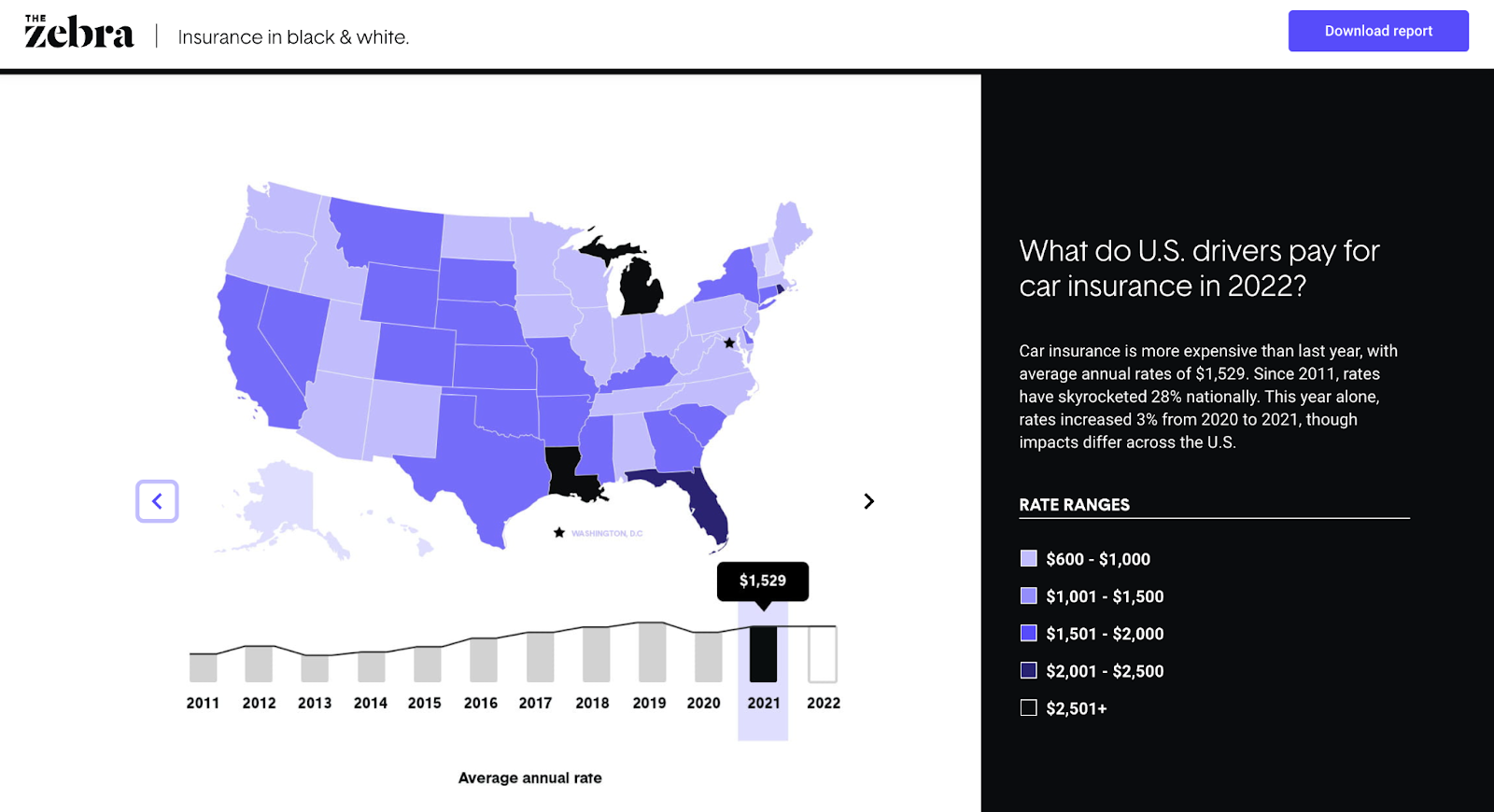
You can see the cost changes over time as you click the slider button.
Why It Works
Showing a striking change trend (whether it be deterioration or dramatic improvement) not only brings weight to the discussion but can also evoke an emotional response from your readers.
Show Discrepancy
Isolated on its own, data can fall flat. But put a set of data into context to highlight discrepancies, and you have a strong narrative.
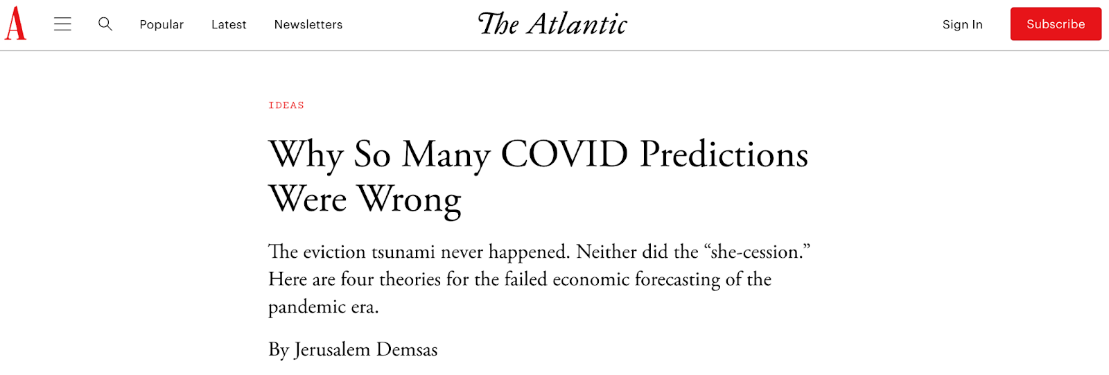
In the example below, The Atlantic highlights the discrepancy between the many COVID predictions (and other economic issues) and the reality.
 Why It Works
By showing discrepancies between perception and reality or between two sets of data, you can highlight gaps that lead to clear calls to action.
Show Connection or Correlation
In this article, the British Heart Foundation (BHF) used data to show the correlation between watching TV and the risk of having coronary heart disease. Although the original data is from a third source, BHF does well to show the effect of a sedentary lifestyle.
Note: When showing the correlation between two things, be careful that you don't imply causation. Be clear that you're only showing that two things are connected somehow, not that one directly leads to the other.

Why It Works
Using data to show the connection between two or more different things helps readers make better decisions concerning future actions.
Give Scale
Another excellent way to use data in content creation is to demonstrate scale.
In this chart, New York Post uses a visual representation of data to demonstrate the scale of the tallest buildings in the world.

Why It Works
Scale can help you add context to your posts. What data do you have that can lend itself to this type of visualization? For example, did you serve more customers last year than the average number of attendees at a Red Sox game? How can you show the scope of your impact?
3. Using Data After Content Creation
You’ve seen how data can work before and during content creation. Let’s now consider how you can still use data even after you’ve hit publish on your post.
Optimize Published Content
One excellent way to use data “post-content creation” is to find opportunities for content refreshing.
Data from a tool like Google Analytics and Google Search Console can show you content that has been consistently losing traffic over time, allowing you to identify content needing an update or refresh.
You can also run a content audit to identify the best performers from the existing content that can be leveraged or repurposed for other marketing channels.
Analyze Audience Engagement
There are a ton of metrics you can track after publishing a piece of content to see how your audience interacts or engages with said content.
For instance, you can use Google Analytics to check how long readers stay on specific pieces. You can also use other tools to track your audience’s interaction in terms of clicks and cursor movements on a webpage.
Final Thoughts
There you have it — nine simple but effective ways to use data in different phases of your content creation process.
Even if you’ve never used data in your process before, the strategies mentioned in this article are easy to follow, and there are many tools you can use to make data work for you.
Editor's note: This post was originally published in September 2011 and has been updated for comprehensiveness.
Content Creation
![12 ebook templates for InDesign, PowerPoint, and Google Docs [free download]](https://53.fs1.hubspotusercontent-na1.net/hubfs/53/free-ebook-templates-1-20240529-4957105.webp)


![How to Create an Ebook From Start to Finish [Free Ebook Templates]](https://53.fs1.hubspotusercontent-na1.net/hubfs/53/how-to-create-an-ebook-1-20250128-3015373.webp)
![How to Write a Content Brief [Template + Examples]](https://53.fs1.hubspotusercontent-na1.net/hubfs/53/content-brief-1-20250120-7521165.webp)