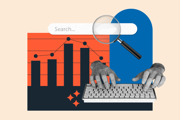
What is Bounce Rate?
Your website's bounce rate is the percentage of people who land on a page on your website, then leave. They don't click on anything else or visit a second page on the site.
Keep in mind that bounce rate is different from an exit rate. Bounce rates only measure "one-and-done" visits — the ones in which people arrive and leave your website without navigating away from a single page. Here's what they look like in your HubSpot Web Analytics Dashboard, for example:

Exit rates, on the other hand, are a little more complicated. They include the percentage of people who leave your website from a certain page — but, that's not necessarily the only page they've visited on your website. The page from which they exited could be the last in a long sequence of page visits. That's why the exit rate isn't always as troubling as bounce rates.
Bounce Rate vs. Exit Rate
Let's say you were comparing bounce rates and exit rates for a thank-you page. A high bounce rate on that page would be kind of alarming, because that means people are only viewing that page alone, then clicking away. Even worse, they didn't fill out a form to get to it, which means you're losing out on conversions.
But a high exit rate, on the other hand, wouldn't be cause for concern. It would mean that this page was the last in a chain of visits — people exiting from that page probably arrived from its preceding landing page, downloaded the offer on the thank-you page, and left to go make use of the content they just downloaded.
Keep in mind that this scenario is hypothetical, and these takeaways can differ based on other page metrics — but it serves as a simple illustration of the difference between bounce and exit rates.
Bounce Rate Formula
Since the bounce rate is the percentage of visitors who only view one page on your site, it’s calculated by dividing the total number of single one-page visits by the total number of visitors.
For example, if 100 people visit your site and 10 of them only visit one page, then your bounce rate would be 10%. This number will likely change over time, so using an analytics provider to track all the changes is beneficial for understanding what’s affecting your bounce rate.
What is a good bounce rate?
If you’ve recently taken a look at your website’s bounce rate, you might find yourself discouraged at the number. But if you then decide to aim for a 0% bounce rate, you’ll probably find yourself even more discouraged. The average bounce rate is somewhere between 26% and 70%, with the optimal range being between 26% and 40%. To land anywhere under 20% is generally unlikely, so if that’s what your data is showing then you may want to double-check some things. Duplicate code, incorrectly implemented tracking, and third-party add-ons can all result in an inaccurately reported bounce rate.
The average bounce rate can also change depending on the viewer’s device. Mobile devices, for instance, have the highest bounce rate across all industries at 51%. Whereas the average bounce rate on a desktop is 43% and the average for tablets is 45%. So, take into account where the traffic is coming from as you’re judging your site’s bounce rate.
.png)
Free Website Optimization Checklist
This website optimization checklist will help you perfect your website's:
- Performance
- SEO
- Security
- Mobile Performance
Download Free
All fields are required.
High Bounce Rate
A bounce rate over 70% is above average, but it’s not necessarily on the high side until it’s reaching 56%. If it’s over 90%, that’s a major cause for alarm but it's usually easy to decrease because there’s something specific scaring everyone off. Things like bad design, errors in your tracking code, excessive bots, or browser incompatibility could be the culprit. Also be aware that high traffic from social media or paid ads, as well as a lot of mobile visitors can be increasing your bounce rate as well.
How to Reduce High Bounce Rates
Now you know what a bounce rate is. But what can you actually do about it?
In general, high bounce rates might indicate that the page is irrelevant or confusing to site visitors. But don't jump into drastic actions like deleting a page or undertaking a redesign right away. There are some important steps you need to take before you figure out which action to take.
Remember: Bounce rates only tell you that someone landed on a web page and left it without visiting any other page on your website. It doesn't tell you how someone interacted with your page. That's why it's important, says Director of Product Marketing at Iterable Jeffrey Vocell, to take "practical steps" to examine other metrics and pieces of your web presence to see what might be behind the bounce rates. We've outlined these steps below.
1. Ensure your website is mobile-friendly.
Mobile users account for abouthalfof web traffic globally. That makes it crucial, says Vocell, "to not only provide a mobile-ready experience," but to make sure that experience is engaging. How annoying is it when you arrive at a mobile site, only to have to zoom in to read its content? Having a responsive site is no longer enough — engagement with the mobile version has to be user-friendly and interactive.
Video is one particularly engaging type of content. It can often explain complex topics more concisely than text, which might be why 4X as many customers would rather watch a video about a product than read about it. But when it comes to mobile usage, long videos require a significant amount of data and might therefore slow the user experience — causing the visitor to bounce. For that reason, Vocell suggests eliminating these longer videos from your mobile site or creating more concise versions that still address the most important points.
This kind of improvement, however, isn't limited to video. Take a holistic approach to evaluating your mobile experience, and consider how you'll address contingencies like these.
2. Look at your bounce rate based on different sources.
Sometimes, the sources directing traffic to a given page might have something to do with its bounce rate. That's why the HubSpot Web Analytics Dashboard allows you to break down the bounce rate according to source:

Let's say your bounce rate is particularly high from direct traffic — take a close look at the URL to make sure it's easy to read, remember, and type in. Then check to see that the visitor isn't being greeted with a 404 error or a home page that isn't very inviting. The headline should be clear and signal to the person that they're in the right place.
You have to meet the expectations of the visitor — regardless of source.
3. Avoid other disruptions that might hurt the user experience.
We've already discussed the importance of a good mobile user experience, and that goes for all platforms. Things like full-screen pop-ups, for example, are not only annoying but can also result in search penalties.
The key thing to consider is the user. "You want visitors to be drawn into your page and stay for as long as needed to convert," says Vocell, and while "some pop-ups are good," — like well-crafted inbound messages that add context to a site — avoid any that significantly disrupt the user experience in a way that might cause visitors to leave.
4. Determine which keywords this page ranks for — and if your content sufficiently covers those topics.
Remember how we cautioned against misleading visitors about your site's content in social distribution? The same goes for keyword rankings. "Matching keyword intent to your content is important to ensure organic visitors get the content they expect," explains Vocell.
Let's say someone is searching for "marketing automation software solutions" — it's likely that this person is looking for software to help nurture leads into customers. But if someone is using the query, "What is marketing automation?", she's probably not at a stage where she's looking to buy a product. Rather, this person is looking for content that's more informative than anything else.
So when you evaluate the keywords for which your page is ranking, make sure they're aligned with the actual content. Once you've done that, try looking at a topic-cluster framework — the kind that groups your site's pages into clusters according to subject — to help attract organic traffic to the right pages.
Let's Bounce
When you're investigating bounce rates, make sure you're looking at the full picture. Take a look at the time people spend on your site, where they're coming from, and what device they're using — and if your content and experience are aligned with all of those factors. You might uncover patterns that show how you can fix the bounce rate problem.
Think of bounce rates like your car's "check engine" light. When it goes on, you know there might be a problem — but you need to check all of the car's systems to accurately diagnose the issue. There's no one-size-fits-all fix for bounce rates, but knowing what they are and how they can inform your marketing strategy can help ensure your website's success.
Editor’s Note: This post was originally published in April 2014 and has been updated for accuracy and comprehensiveness.
.png)
Complete SEO Starter Pack
An introductory kit to optimize your website for search.
- Increase your organic traffic.
- Plan your keyword strategy.
- Debunk SEO myths.
- Build a blog strategy.
Download Free
All fields are required.
Web Analytics


![How Many Visitors Should Your Website Get? [Data from 400+ Web Traffic Analysts]](https://53.fs1.hubspotusercontent-na1.net/hubfs/53/how-much-traffic-does-website-get.png)


![What Is the Average Time Spent On a Website? [+ How to Improve It]](https://53.fs1.hubspotusercontent-na1.net/hubfs/53/GettyImages-1356122303%20copy.jpg)

![6 Steps to Reduce Your Bounce Rate [+ Platform-Specific Tips]](https://53.fs1.hubspotusercontent-na1.net/hubfs/53/decrease-bounce-rate.jpg)