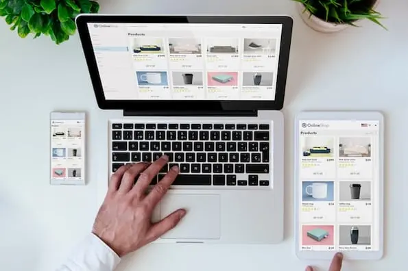
The Internet superhighway can be particularly cruel to ecommerce marketers, what with more than 50% of all shopping carts abandoned prior to purchase according to Marketing Experiments. It's no accident that the most successful ecommerce companies take a strategic, calculated approach to their product pages and shopping cart usability. Simple, oft-overlooked tweaks can yield dramatic results.
Consider a product page’s load time, for example. Amazon calculated that one additional second of load time on their product pages would cost them $1.6 billion in annual sales. Yikes.
From the add to cart button to recommendation engines and product images, ecommerce marketers have plenty of opportunities to optimize shopping cart conversion rates. Here are crucial changes you should make to your website to prevent shopping cart abandonment and enjoy better conversion rates.
1) Show Visitors Exactly Where They are ... and Where They can Go
Clear site navigation is not only crucial for search engine optimization -- users who land on a product page need to know exactly where they are within the site architecture. Make it easy for them to browse other categories with breadcrumbs on every page. If you're not familiar with the term, breadcrumbs refers to a component of your site navigation that lets users see where they are and where they have been. Let's take a look at Zappos for an example:
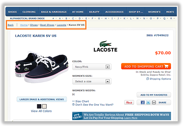
See that orange callout in the top left corner? Those are breadcrumbs! So even if someone lands on this page directly from a search engine, he or she can easily digest what other options are available: other shoe types, other types of boat shoes, other shoe brands. The hierarchy is crystal clear, which means the user experience is swift and painless.
2) Make it Unbelievably Easy to be Contacted
I know you're an ecommerce marketer, but some people are just more comfortable using the phone. If not to place an order, then to assess the professionalism of a company, to ask product questions, or to give feedback. Give these people an opportunity to talk to you in their preferred method by placing your phone number on every page of your ecommerce website. In fact, an A/B test from LessEverything showed that simply placing a phone number more prominently on the website generated a 1.8% increase in overall site visitors to paying customers. That's an easy change to make that leads to money right in your pocket.
3) Follow Product Page Best Practices
Design your product pages to be as simple and striking as possible so they pass the blink test -- the commonly accepted three seconds you have to orient a new visitor to your website so they don't get overwhelmed, causing them to click their browser's back button.
Since the average visitor's attention span is so short, stick to a product page outline that is clear and effective. You can do this by displaying the checkout or add to cart button near large, high-quality images and away from cluttered text like user-generated reviews or comments. Use no more than three columns, and limit the amount of distractions around the page.
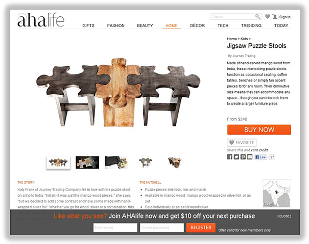
AHAlife does an excellent job of simplifying their product pages to increase shopping cart conversion rates. Their product page layout is two columns, the product is featured more prominently than any page copy, and the eye is drawn to both the large image area and the buy now button.
4) Include User Reviews and Unique Content
Many ecommerce product pages include hackneyed, generic product descriptions -- I get it, it's much easier to just plop in the manufacturer's description. But doing so not only subjects your website to duplicate content penalties that harm your SEO, but it does nothing to convince your shoppers of your product's value. In fact, a study from CompUSA and iPerceptions showed 63% of consumers are more likely to purchase from a site if it has product ratings and reviews.
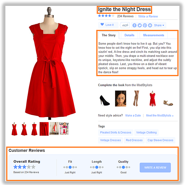
Write unique, compelling product descriptions, and encourage user reviews so your website can reap the SEO benefits and appeal to buyers who may be on the fence. One company who always does it right is ModCloth -- take a look below for an example. This product alone has generated over 234 user reviews which are displayed right on the product page. And if you've ever read their product names and product descriptions -- browse through "The Story" behind "Ignite the Night Dress" -- you know they have a sense of humor in their copy that appeals to their core demographic.
5) Offer a Secondary Call-to-Action for Non-Buying Visitors
The sooner you embrace the notion that not everyone on your ecommerce product page is ready to buy, the better. To capture the attention of non-transactional leads, use a secondary call-to-action that offers value. Of course, make sure this button does not cannibalize your primary add to cart button. Let's take a look at a company that's doing this right, ecommerce vintage eyewear company Warby Parker.
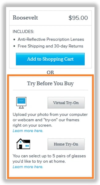
They take advantage of non-buying users with a secondary 'Home Try-On' button. This is a great secondary call-to-action because it helps move the visitors who aren't ready to buy further along the sales cycle with an offer that's less of a high commitment -- plus they offer a virtual try-on that might save some visitors from abandoning as they wait to try on their glasses at home.
6) Take Your Add to Cart Button More Seriously
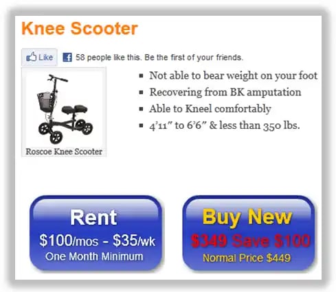
The add to cart button is undoubtedly the most important element of the product page and sadly, it is often the most overlooked. Give your product page's primary call-to-action the attention that it deserves. Use direct language like "add to basket" and large, bold font. Some marketers are inclined to make their button blend in with the rest of their site skin, too; but remember that you want the button to stand out from the color scheme of the rest of your product page. Finally, embrace negative space around the button, and make it the largest clickable button on your product page. HubSpot customer Goodbye Crutches has designed bright, bold buy now buttons that draws visitors' eyes with its contrasting colors and clear language.
7) Showcase Your Products With More Oomph
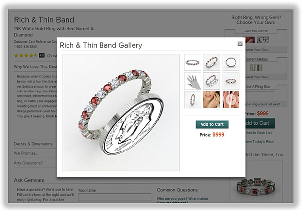
Oomph being a marketing term, obviously. The age of static imagery is over. Great ecommerce marketing now leverages technology to simulate a shopping experience as close to real life as possible. Showcase your product with large, high-quality imagery, and offer elements like dynamic zooming, different angles and color variations.
By implementing a 360-degree spin to their product images, DueMaternityincreased their conversion rate 27% compared to standard two-dimensional images. Golfsmith found similar results when adding 360-spin functionality, bumping up conversion rates as high as 40%. And for a company that does this particularly well, check out customizable jewelry retailer Gemvara. This particular product has eight different views, with an additional 25-second video.
8) Use a Recommendation Engine to Increase Product Cross-Selling
Popularized by companies like Amazon and Netflix, a recommendation engine promotes the up-selling and cross-selling of ecommerce products.
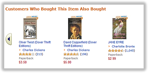
Most recommendation algorithms utilize the user's history and profile to drive recommendations, but this logic can be difficult to build on your own. A simpler approach would be to take a look at your analytics, marry that up with your own product knowledge, and create your own logic for each of your product pages.
Search Engine Land worked with a company that saw the following changes after implementing an ecommerce recommendation engine:
- Pages per visit (PPV): +20.1%
- Time on site: +2.8%
- Bounce rate: -5.9%
- Conversion rate: +4.8%
What do you do to improve your ecommerce shopping cart conversion rates?
Image credit: schuss
Ecommerce Marketing


![How to Write an Ecommerce Business Plan [Examples & Template]](https://53.fs1.hubspotusercontent-na1.net/hubfs/53/ecommerce%20business%20plan.png)


.jpg)
![How to Start an Ecommerce Business [Steps + Must-Follow Tips]](https://53.fs1.hubspotusercontent-na1.net/hubfs/53/how%20to%20start%20an%20ecommerce%20business.jpg)

