
Your brand identity isn’t just how things look. It's how they feel, sound, and show up in the world. It’s the gut feeling people get when they see your name.
When I hear “Brave to rebuild,” an NGO, I picture powerful construction projects to house people in crisis. Coca-Cola? Fizzy, refreshing, old but gold. I can literally taste it.
Free Kit: How to Build a Brand [Download Now]
These are excellent examples of how brand identity should be perceived. It’s not about a logo, a clever tagline, and a color palette that screams aesthetic.
None of that matters if your brand doesn’t feel like you or paint vivid pictures. But how can you achieve this with a new brand?
I broke it down for you, with expert advice and examples.
Table of Contents
- What is brand identity?
- 7 Strong Brand Identity Examples
- Why is brand identity so important?
- How to Create a Brand Identity, According to Experts

Free Brand Building Guide
A comprehensive guide to effectively define, launch, scale, and monitor your brand.
- Understanding brands today.
- Incorporating brand in marketing.
- Creating brand strategy.
- Measuring brand impact.
Download Free
All fields are required.
What is brand identity?
A brand identity is made up of what your brand says, what your values are, how you communicate your product, and what you want people to feel when they interact with your company. Essentially, your brand identity is the personality of your business and a promise to your customers.
The terms “brand” and logo“ are often used interchangeably, but they are not the same. Originally, the term ”brand“ was used to refer to the mark that ranchers ”branded" on their cattle.
However, the idea of a “brand” has since evolved to encompass much more than just a name or a symbol.
A brand is a feature — or set of features — that distinguishes one organization from another. A brand is typically comprised of a name, tagline, logo or symbol, design, brand voice, and more.
Brand identity, then, is the aspect of branding that focuses on your brand's personality, as well as the values you convey to your customers.
“Brand identity is the full set of elements that help people recognize, relate to, and remember your brand,” says James Martin in a video for The Futur.
He further explains that if you don’t actively shape how your brand is positioned, someone else will do it for you. And that can turn into a disaster.
To further understand this concept, let's explore some examples next.
7 Strong Brand Identity Examples
- Coca-Cola
- Hustle and Hope Greeting Cards
- Madhappy
- Burt's Bees
- Asana
- Rothy’s
- IKEA
1. Coca-Cola

I don’t know about you, but when I hear Coca-Cola, the first thing that pops into my head is that classic logo, even before the taste. In winter, it’s the polar bear, the giant holiday truck, the “Share a Coke” campaign, and of course, “Shake Up the Happiness”.
Here are two things that comprise Coca-Cola's brand identity:
- That iconic red script. Coca-Cola’s brand starts with its bold red logo in a flowing script. Red sparks energy and confidence. Think of it this way — coffee gets you through the workday, but Coke is what you and I reach for when it’s time to relax.
- The classic bottle shape. I’d recognize Coca-Cola’s contoured bottle with my closed eyes — no other uses the same bottle shape. That unique design signals authenticity and heritage, helping the brand stand out and build trust with every sip.
2. Hustle and Hope Greeting Cards
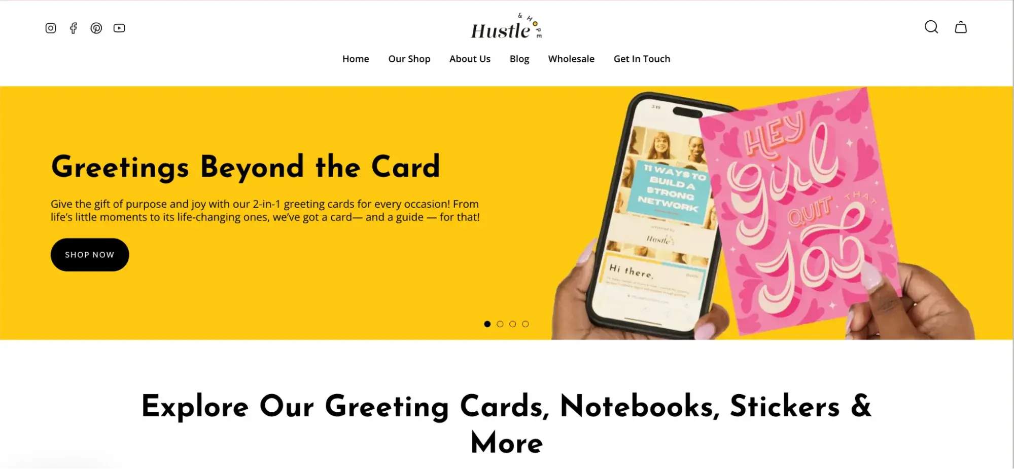
Hustle and Hope Cards are about doing something meaningful, which I truly like. These cards don’t stop at inspiration. They give you tools to actually improve, visualize, and dream, whether you’re job hunting, building confidence, or just need a push.
Here are two things that define Hustle and Hope’s brand identity to me:
- Cards that do more. Each one comes with a bold, modern design and a message that goes beyond the usual “you got this.” On the back, there’s a code you can scan to access real resources — career tips, personal development guides, and more. It’s like sending motivation and a plan.
- Purpose in every product. Founder Ashley Sutton took her corporate experience and turned it into a mission: to help people grow. That energy runs through the whole brand, so every card feels personal, thoughtful, and genuinely helpful.
See how “you” is woven here into brand identity?
3. Madhappy
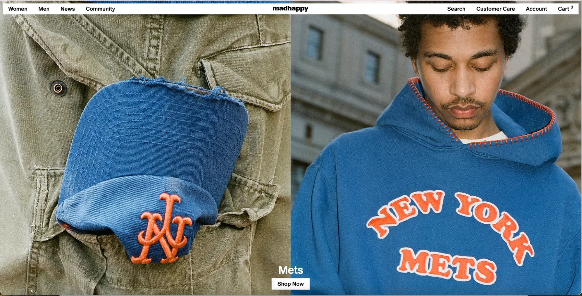
I like how Madhappy positions a streetwear brand as a mood booster, built on mental health awareness and community. It takes optimism and weaves it into everyday life. Their Foundation also has its own emoji-style logo that looks happy or sad depending on how you see it — and that’s exactly the point.
Here’s what defines its brand identity:
- Optimism as DNA. From bright tie-dye sweatshirts to upbeat pop-ups, Madhappy radiates positivity. Their foundation funds mental health initiatives, so buying gear also means supporting a cause.
- Community‑driven activation. Their stores aren’t just shops. They’re gathering spots. I’m talking about events, local collabs, and “Local Optimist” magazine. It’s lifestyle branding with heart.
If this brand lived in my neighborhood or country, I’d shop there for all my friends. Tons of streetwear out there, but few I know about with the same purpose and community.
4. Burt's Bees

When I think of Burt’s Bees, the yellow lip balm tube with the vintage-style bee and Burt’s bearded face immediately pops into my mind. Then it’s the paper packaging, that distinct natural scent, and the brand’s constant reminder that what goes on your body should be just as good as what goes in it.
Why Burt’s Bees’ brand identity sticks with me:
- Nature-first design. Burt’s Bees uses earthy packaging, hand-drawn elements, and a muted color palette to reflect its natural, eco-friendly values. It visually reinforces the brand’s promise of simple, recognizable ingredients, reminding me of honey.
- “True to Nature” messaging. From product labels to social posts, Burt’s Bees consistently highlights sustainability and simplicity. They sell more than lip balm. It’s a trust in every tube.
What fascinates me is the fact that I’m well aware of thousands of natural lip balms, but only two I actually remember — Burt’s Bees and Carmex. They catered to my needs and my preferences.
5. Asana

I found out about Asana six years ago. I was a user of another project management platform back then. Asana caught my eye because of its simplicity. It brought a sense of calm to the chaos of team projects. Unlike other tools that feel cluttered right from the websites, Asana keeps things clean, light, and easy to follow.
Here are two things that define Asana’s brand identity:
- Clean, focused design. The interface uses tons of white space, which helps everything feel lighter and easier to navigate. Then they add bursts of color to keep it fresh and energizing, just enough to keep you going without overload.
- A logo with purpose. The three dots represent balance and teamwork, which is exactly what the platform is about. And the name “Asana,” a nod to yoga, ties it all together. Be calm. Be focused. Be productive.
6. Rothy’s

Rothy’s shoes feel like a hug for the planet. Each pair is knit from recycled plastic bottles and made to shape, which means almost no material waste and no cutting scraps.
The best part? They’re comfy, washable, and look polished — not “eco” in a crunchy way, but straight-up stylish.
Why this simple brand caught my eye:
- Community-driven innovation. Rothy’s listens to its audience. Many products come from customer feedback, including expanded sizing, bag launches, and gender-neutral options, showing that sustainability and style coexist side by side.
- Circular and luxury-adjacent. They’ve built their own LEED-certified factory and recycled over 179 million water bottles into shoes. But again, they feel premium enough to catch the eye of Meghan Markle and yet remain true to middle-of-the-road pricing and eco-credibility.
I actually first met this brand through Reels, talking about 100% recycled apparel. See how the right tone for your brand can attract customers all over the globe with no direct advertising.
7. IKEA

Where do you go shopping for furniture? IKEA is top of mind. There’s something reassuringly familiar about IKEA — like walking into a friend’s warm, Swedish-inspired space. The brand makes me feel at home before I even pick a piece of furniture.
And here’s what defines IKEA’s brand identity:
- Blue and yellow legacy. The simple blue-on-yellow logo nods to Swedish heritage and flashes a bold, optimistic vibe, trustworthy and joyful.
- Design for the many. IKEA’s mission is “to create a better everyday life for the many people,” and that comes through in everything — from flat-packed efficiency and low prices to clever product hacks and sustainability initiatives. It’s all about smart living, without the designer price tag.
In the above examples, you can see that the brand is so much bigger than the logo or visuals for the business. I’ll talk more about this in the sections below.
Free Brand Building Guide
A comprehensive guide to effectively define, launch, scale, and monitor your brand.
- Understanding brands today.
- Incorporating brand in marketing.
- Creating brand strategy.
- Measuring brand impact.
Download Free
All fields are required.
Why is brand identity so important?
As the embodiment of almost everything your business is and does, a brand identity can inspire customers and increase a sense of loyalty for your brand. Brand identity, therefore, is crucial to your business's future.
So, if your brand is more than just its logo, how can you replicate what brands like Coca-Cola have done and instill other unique elements into your business's identity?
Here are five components of a well-developed brand identity, and why it's so important for you to develop them.
1. The “Face” of Your Business
For all intents and purposes, your brand‘s logo is the "face" of your business. But that face should do more than just look cool or interesting — a logo’s contribution to brand identity is associative, too.
It tells the public that [this image] means [the name of your company].
And considering that 62-90% of first impressions come from color and design, your logo quietly sets the tone before you even say a word. It's the mood. The whole first chapter.
I actually found out that a colorful logo can increase brand recognition by up to 80% compared to monochrome versions.
2. Credibility and Trust
Having a brand identity doesn't just make your product more memorable; it makes your brand more authoritative in the marketplace.
A brand that establishes a face, and maintains that face consistently over time, develops credibility among its competitors and trust among its customers.
I like IBM for that matter, which has kept its iconic blue “striped” logo since 1972. A design that quietly signals trust, innovation, and professionalism. That kind of consistency over the years has made them look practically synonymous with reliability in tech and enterprise.

3. Advertising Impressions
A brand identity is a template for everything you would include in an advertisement for your business, whether that ad is in print, online, or a preroll commercial on YouTube.
A brand with a recognizable face and industry credibility is well-prepared to promote itself and make a lasting impression on potential buyers.
For instance, booking.com’s Super Bowl 2025 ad featuring the Muppets (Kermit, Piggy, Gonzo) hit YouTube with 18 million views on a teaser alone.

Why it worked:
- Massive nostalgia and beloved characters lead to instant emotional engagement.
- Short, high-production-TV tie-in assets perfectly repurposed online.
4. Your Company's Mission
When you create an identity for your brand, you're giving it something to stand for. That, in turn, gives your company a purpose.
We all know companies have mission statements, right? Well, you can't have one without first giving your brand an identity.
A notable example I can refer to is Allbirds, a natural materials apparel brand, which has built its identity around sustainability.

From their earthy color palettes and biodegradable packaging to their use of merino wool and sugarcane foam, every part of the brand reinforces their mission to tread lightly on the planet.
5. Generating New Customers and Delighting Existing Ones
A brand identity — one with a face, trust, and a mission — attracts people who agree with what your brand has to offer. But, once these people become customers, that same brand identity gives them a sense of belonging.
A good product generates customers, but a good brand generates advocates and returning customers.
A brand that immediately comes to my mind when we’re talking about this is Fenty Beauty. Fenty built its identity around inclusivity, starting with 40 foundation shades when most competitors offered half that.
But what really sets Fenty apart is its UGC machine. Creators and micro-influencers constantly post unboxings, reviews, and tutorials that reflect real people using the product. Not only women but men, too.

The brand even reposts and celebrates that content, making its community feel seen, valued, and central to the brand itself.
Speaking of results, the brand has accumulated 13.2M followers on Instagram alone.
If you want your business to become a well-known and beloved brand name, it's going to take some work. The following steps will help you build a brand identity. They are simple, but implementing them is another story. Learn and remain patient and consistent.
How to Create a Brand Identity, According to Experts
- Research your audience, value proposition, and competition.
- Design the logo and a template for it.
- Integrate language you can use to connect, advertise, and embody on social media.
- Know what to avoid.
- Monitor your brand to maintain its brand identity.
Building a brand is not something that should be done hastily. Many moving parts go beyond creating a logo and selecting a few key colors. Developing a brand identity will require the following:
1. Research your audience, value proposition, and competition.
Just like any other aspect of starting a business, the first step in creating a brand identity is to complete market research. As former HubSpot Brand Strategist James Zabik said,
“One of the most important things to consider when building a brand identity is how your messaging will resonate with your target audience. Start by finding out your audience's pain points and communicating how your company or product helps solve them.”


Zabik adds, “You might have a flashy logo and eye-catching marketing copy, but if it doesn't address your customers' pain points clearly and effectively, it'll be challenging to build a strong and lasting brand identity.”
And to start doing that, I advise you to clarify and understand these five things.
Audience
It‘s no secret that different people want different things. You can’t (usually) target a product to a pre-teen the same way you would target a product to a college student.
Learning what your audience wants from a business in your industry is vital to creating a brand people will love.
Beauty brand Glossier is the blueprint for building a brand around what real people want. Their success stemmed from a deep understanding of women’s frustrations and building an approachable brand centered on “skin first, makeup second.”
Founder Emily Weiss leveraged the deep trust and feedback from her blog’s readers to crowdsource Glossier’s first products. This way, she made fans feel like co-creators rather than just consumers. It grew into a fiercely loyal “tribe” who don’t just buy the products, but also shares them, reviews them, and wears them as identity markers.
Value Proposition and Competition
What makes your business unique in your industry? What can you offer your consumers that others can't? Knowing the difference between you and your competition is imperative to developing a successful brand.
Keeping an eye on your competitors will also educate you on what branding techniques work well — as well as those that don't.
Take Liquid Death. They nailed their value proposition from the start. While most water brands went for clean and calm, Liquid Death did the exact opposite. They leaned into wild humor and bold messaging around sustainability.
And it worked. By 2023, they were valued at $1.4B and outselling Vitamin Water at Whole Foods.

It’s a great example of how knowing what makes you different — and owning it — can help you stand out in a crowded market.
Mission
You know what your business offers, but be sure to have a clear and direct mission statement that describes your vision and goals.
In other words, know your business‘s purpose. I can’t imagine one would very well create a personality for a business unless they know what that business is about.
From my experience, this is where many new brands lose customers. They start selling before they’ve ever really decided what they stand for. But the truth is, people don’t just buy products anymore — they buy stories, values, and shared beliefs.
If your mission is just a line on your About page, it’s not doing its job. A good mission should guide how you hire, how you design, how you show up on social media, and even who you say no to. It should feel so clear that if you handed it to someone else, they’d know exactly how to run your brand without messing it up.
Personality
Even though you‘re not necessarily branding an individual, that doesn’t mean that you can't be personable when developing a brand image. Use your type, colors, and imagery to represent who the brand is. Then enhance that visual representation with your tone of voice:
Are you ritzy and professional, like Givenchy? Or a confident business with a lot of sass, like Nike?

Either way, be sure to develop your brand as a way to represent your business.
Research may be boring, but the more you know about your business, the stronger your brand identity will be.
SWOT Analysis
Finally, I recommend conducting a SWOT analysis to gain a deeper understanding of your brand’s characteristics and what you want to portray through it.
SWOT stands for:
- Strengths. Positive characteristics of your business that provide an advantage over your competition.
- Weaknesses. Characteristics that prove to be a disadvantage to your business.
- Opportunities. Changes and trends in your industry that offer opportunities for your business.
- Threats. Elements in the environment or industry that may cause problems for your business.
To make a SWOT analysis easier, grab HubSpot’s free template. It comes with:
- A short guide on how to do it right
- A real example to follow
- A blank worksheet to map out your own strengths, weaknesses, opportunities, and threats

2. Design the logo and a template for it.
Once you know your business inside and out, it’s time to bring your brand to life. In the words of graphic designer Paul Rand, “Design is the silent ambassador of your brand.” Here‘s what you’ll need to know:
Logo
Although the logo is not the entirety of the brand identity, it’s a vital element in the branding process — it’s the most recognizable part of your brand. It’s on everything from your website to your business cards to your online ads.
I’ll use Nike here again as a good example. The Nike Swoosh is instantly recognizable and used across every surface: apparel, shoes, ads, athlete partnerships, even app icons.

What’s smart is how adaptable it is — the Swoosh works with or without the wordmark and is scalable from a tiny tag to a giant billboard.
Interesting Form
As imperative as your logo is to branding, it's not the only element that makes a brand identity strong. Your product(s), the packaging, or the way you present your services all need to play a part in your brand identity.
Visually representing your business in everything you do will create consistency and help create a familiarity with your consumers.
Take McDonald's golden arches as an example. They used an interesting form to create the iconic “M,” which is now recognizable all over the world.

Color and Type
Creating a color palette is a way to enhance your identity. It provides you with variety so you can create unique designs for your business while remaining faithful to the brand identity.
Type can also be a double-edged sword if not used properly. Although “mix and match” type design has become quite the trend, that doesn't mean mixing a handful of fonts is necessarily a good idea for your business.
In your logo, on your website, and on any documents that your business creates (print and digital), there should be consistent use of typography.
Among all, I like Spotify’s use of color. That bold green and black combo, paired with clean sans-serif fonts, is instantly recognizable. You see it across the app, in ads, on playlist covers — and it always feels cohesive.

Featured Resource: Brand Kit Generator
HubSpot’s Brand Kit Generator helps you create a unique and cohesive brand image. With the tool, you can:
- Create a custom logo using logo templates and the logo generator.
- Pick your brand's unique typography and style.
- Design your own custom icons and favicons for your company.
- Enter your starting colors and choose from auto-generated color schemes.

Templates
You probably send out emails, type up letters, or hand out business cards to potential customers on a daily basis.
I strongly suggest creating templates (even for a detail as minute as email signatures), which will give your business a more unified and professional look and feel. Plus, it will save you hours.
Free Brand Building Guide
A comprehensive guide to effectively define, launch, scale, and monitor your brand.
- Understanding brands today.
- Incorporating brand in marketing.
- Creating brand strategy.
- Measuring brand impact.
Download Free
All fields are required.
Consistency
As I mentioned in nearly every step already (I can't stress it enough), consistency is what can make or break a brand identity.
Use the aforementioned templates and follow the design choices you've decided upon for your brand throughout all areas of your business to create a harmonious brand identity.
A great example here is Notion. From its black-and-white color scheme to its minimal, clean type and calming tone of voice, everything Notion puts out feels cohesive — a landing page, a mobile UI, a help doc, or a YouTube tutorial.
Even community-made templates and integrations follow the brand's aesthetic because Notion has kept its identity so easy to recognize and replicate.

Flexibility
Yes, consistency is crucial, but remaining flexible in a society that is always looking for the next best thing is just as important.
Flexibility allows for adjustments in ad campaigns, taglines, and even some modernizing to your overall brand identity, so you can continuously keep your audience interested.
The key is keeping any changes you make consistent throughout your entire brand (e.g., don't change the design of your business cards and nothing else).
A perfect example of occasional flexibility I can think of is Google’s seasonal logo variations — the Doodles. While Google’s core logo remains unchanged, the company frequently swaps it out for creative versions tied to holidays, historic moments, or cultural events.
They don’t sell by adding Doodles. They just make their brand lovable.
For instance, here’s how Google looked on Father’s Day 2025:

Document
How to ensure a business sticks to its branding “rules”? Create a set of brand style guidelines that document all of the dos and don'ts of your brand.
Skype is one brand that has done an amazing job creating a clear, cohesive brand guide that anyone can follow. Pity the platform retired this May, but it's a great brand identity example to look up to.
3. Integrate language you can use to connect, advertise, and embody on social media.
Now that you‘ve established your brand within your company and have taken all the necessary steps to develop it, you’re ready to integrate your brand within your community.
In HubSpot's ebook Branding in the Inbound Age, Patrick Shea writes, “In every way, your content is your brand online. It‘s your salesperson, your store, your marketing department; it’s your story, and every piece of content you publish reflects on, and defines, your brand. So, great content, great brand. Boring content, boring brand.”
Here are the parts I recommend paying attention to produce quality content:
Language
Use language that matches the personality of your brand. If your brand identity is high-end, use professional language; if your brand is laid-back, be more conversational.
Duolingo nails this with its playful, sometimes unhinged tone. The brand speaks like your chaotic-but-funny friend — across push notifications, app screens, emails, and even its social posts.

Reminders like these might make you laugh, but they also get you back into the app. The consistency of that voice — equal parts encouraging and trollish — makes the brand feel human and memorable, especially to Gen Z users.
Connection and Emotion
People love stories. More accurately, people love stories that move them (emotionally and to action).
A strong brand identity can establish an emotional connection with consumers, which can be a solid foundation for building a lasting relationship with a brand.
The right example I found is Dove, which continues to lead the way with campaigns like #TurnYourBack, speaking out against toxic beauty standards on social media.

Dove told a story here. A lesson. A message. Standing with girls facing unrealistic beauty filters.
That emotional connection aligns perfectly with their long-standing “Real Beauty” mission and builds deep trust with their audience.
Advertise
Designing ads, whether traditional or digital, is the most efficient way of introducing your brand to the world. It‘s a way to get your brand’s message seen and heard by your target audience.
Social Media
Another great way to establish a connection with your consumers is through social media. The plethora of platforms on the internet offers up a ton of free digital real estate to establish your brand identity.
Ryanair has become a Twitter/X, TikTok, and Instagram legend by using brutally honest humor and self-deprecating memes. Their tone breaks every airline PR rule — and yet it works.
Ryanair is a loyal audience of Gen Z and meme lovers who now expect the brand to clap back.

Social media is also important for directly conversing with your customers and creating brand affinity.
If you're mentioned in a tweet, status, or post (especially if the customer has a question or concern), be sure to give your brand a good reputation by responding efficiently to your customers.
4. Know what to avoid.
You can follow all the steps of creating a strong brand identity, but if you're guilty of any of the following practices, your brand might falter or fail.
Don't give your customers mixed messages.
Know what you want to say, and use the appropriate language and visuals to say it. Just because it makes sense to you doesn't mean it will make sense to your customers.
Don't copy your competitors.
Your competition may have exemplary branding, and since you‘re selling the same products or services, you might want to do what you know works — don’t.
Take what they do into account, and put your own twist on it to make your business stand out in your industry even more.
Don't lose consistency between online and offline.
Yes, your print material might look a little different than your online presence, but your colors, type, theme, and message should all be consistent.
I recently came across a great story from Canva about their offline campaign at Waterloo Station in London. Even though it was a huge out-of-home ad, everything from the tone to the visuals felt exactly like Canva online: design-forward and totally on-brand.

It’s a perfect reminder that your brand should feel the same, whether someone sees you on Instagram or on a billboard.
Scale, don't sacrifice.
Rosen told me, “As your brand scales onto new channels, resist the urge to simply chase trends that don't align with your brand's DNA. Scaling identity only works when you iterate off your original song sheet … rather than writing a new song entirely.”
5. Monitor your brand to maintain its brand identity.
Similar to other aspects of your marketing, it‘s difficult to know what you’re doing right (and what you're not) without tracking key performance metrics.
Use Google Analytics, surveys, comments, social media monitoring tools, etc., to track your brand and get a sense of how people talk about and interact with you.
HubSpot offers a powerful and beginner-friendly suite of social management tools to never miss a mention, analyze impact, and run all your social media campaigns from one central location.

This will give you the opportunity to implement changes to your brand as needed, whether it's to correct a mistake or to improve brand identity.
As Zabik puts it, “Test, learn, and optimize. Figure out what sets your brand apart from your competitors and learn to communicate that in a way that builds trust. If your product lives up to the hype you create, you'll start to build momentum with customers that believe in your brand.”
When it feels right, it looks right.
I’ll close this out the same way I kicked it off: Your brand identity should feel like you. Not some shiny costume you throw on for show. When your voice, visuals, and story behind it all speak the same language, people don’t just notice — they remember.
Whether they catch you on a billboard, your site, or a random IG story, it should always feel like you.
Start simple. Stay real. Keep showing up. That’s how brands with a real identity are built.
Editor's note: This post was originally published in January 2019 and has been updated for comprehensiveness.
Free Brand Building Guide
A comprehensive guide to effectively define, launch, scale, and monitor your brand.
- Understanding brands today.
- Incorporating brand in marketing.
- Creating brand strategy.
- Measuring brand impact.
Download Free
All fields are required.
Branding
![30 Famous Brand Names You're Probably Pronouncing Wrong [Infographic]](https://53.fs1.hubspotusercontent-na1.net/hubfs/53/pronounce-brand-name-wrong-infographic_2.webp)


![The 5 P's for Building a Powerful Brand [SlideShare]](https://53.fs1.hubspotusercontent-na1.net/hubfs/53/00-Blog_Thinkstock_Images/powerful-brand.png)