
 Allow me to make an assumption about you: at one time or another, you’ve heard (or uttered) the phrase “if (insert friend’s name here) jumped off a bridge, would you jump too?”
Clichés usually exist for a reason, and this one is no different. Success rarely occurs in simply following the herd and doing what everyone else is doing. Hard to believe, but your parents did actually know something.
As a content marketer who has a experimented with conversion optimization, I can tell you this: when it comes to optimizing your blog for conversions, you’re all jumping off of the proverbial bridge.
Recently we removed the sidebar from our blog posts, and while it seemed unconventional bordering on crazy, we lived to blog about it. On the surface, it seems we’ve eliminated conversion opportunities by omitting the sidebar, but our conversion rates have actually increased.
How is that even possible?
Well, because we found other ways of increasing conversions while staying with our goal of also improving the overall reading experience.
Let me show you how.
1) Subscribe Banner
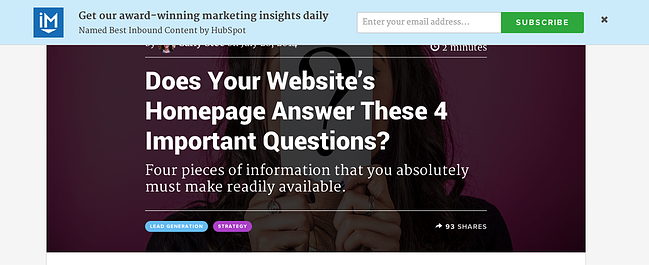
Now that we had nixed the sidebar, we needed to find a new way to generate blog subscribers.
Aware of its importance, we chose to incorporate a subscribe banner that only appears when the person reading has not already subscribed. This provides us with an opportunity to capture more subscribers without leaning on the support of a sidebar, or presenting existing subscribers with an unnecessary distraction.
The banner simply slips in as the reader scrolls through the article to do its job, and after they fill it out it’s gone without a trace.
The numbers: No banner blindness here, as once we moved the subscribe field to the top of the page from the sidebar, we saw an increase in conversion rates of .02%. (Sounds like nothing? Well, when you’re talking hundreds of thousands, or even millions of pageviews, the difference is huge.)
2) In-Line CTA

Removing all of the noise from our sidebar placed a greater emphasis on the below the post CTA. As a result, we had to try something new there, too.
While our old below post CTAs were attractive, and certainly converting, we had a hunch we could make a change that would set them up for even greater success.
So rather than sticking to the standard “click here” CTA, we decided to eliminate the middle man. By placing the form directly under the CTA copy, we shortened the conversion path and in the hopes of capturing more leads at precisely the right time: immediately after finishing a post.
We started calling this new style “in-line CTAs”, simply because they allow readers to convert in the post rather than clicking off the post to fill out a form.
The numbers: Our standard CTA for The Beginner’s Guide to Inbound Marketing saw a 3.3% view-to-click ratio. This means that out of 1,000 visitors, 33 clicked-through to the landing page. Of those 33, 42% converted on the offer, leaving us with 14 new leads. Out of 1,000 visits for the in-line CTA for The Beginner's Guide to Inbound Marketing, 2.4% of readers converted right on the form. This resulted in 24 new leads. That’s a 71% increase in conversions.
How we did it: For the code required to implement this feature on your blog, pass this link along to your designer/developer.
3) Featured Tweets
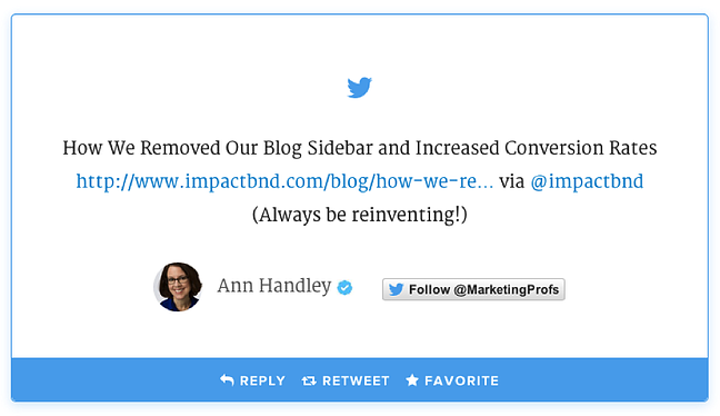

We’ve recently started pulling tweets about our latest content and featuring them on our blog’s homepage as a way to incentivize people to share our content.
The thinking was this: rather than feature our own social activity, let’s highlight those who are actively engaging with us already as a way to further incentivize sharing.
Here’s how this small change could potentially pan out:
You feature a reader’s tweet on your blog’s homepage → they’re delighted to be featured → they pass the link to their friend to show them → their friend decides to share your content with their network → now their network is clicking-through to your posts!
This tweet acts as social proof as well as an endorsement of your brand. Serving as a creative way to show off the support of your readers, these tweets will help to assure visitors that they’ve got their hands on some good stuff.
Not to mention, when the tweet comes from Ann Handley, it serves as a pretty powerful indicator that you’re doing something right.
How we did it: For the code required to implement this feature on your blog, pass this link along to your designer/developer.
4) Slide-In CTA

No one likes a pop-up. No one.
And while their invasive nature is not encouraged, there are elements of a pop-ad that can be applied to less annoying methods.
You see, pop-ups are designed to get your attention by creating a change on the page. While it’s easy to skip over static ads or CTAs placed throughout your article, something that moves is something that gets noticed.
With that being said, we suggest you scrap the the pop-ups and consider the benefits of incorporating slide-in CTAs.
Slide-in CTAs are designed to smoothly transition into view from the right side of the screen. Through our experiences, we’ve found that they are less intrusive than pop-ups, they don’t block your content, and they actually convert.
The numbers: While the bottom of the post CTA for The Beginner’s Guide to Inbound Marketing saw nearly a 43% click-to-submission rate, the slide-in CTA saw almost a 46% click-to-submission.
How we did it: For the code required to implement this feature on your blog, pass this link along to your designer/developer.
Rethinking That Bridge Yet?
If you’re following the advice of every blog article you’ve ever read, are you really doing anything ground breaking?
My point being, if your competitors are all doing X, try Y.
Forcing yourself out of your comfort zone will open you up to opportunities you may not have come across otherwise.
After all, you can’t come in first if you’re following, right?

Originally published Aug 5, 2014 10:00:00 AM, updated January 18 2023