That’s where CRO comes in. It’s all about fine-tuning your website and marketing efforts to make sure every interaction counts.
By zeroing in on CRO — content enhancements, split testing, and workflow improvements — you can boost sales by creating a smooth, enjoyable experience for your audience. It’s about making sure that every click gets you closer to your goals, while also keeping your customers happy and coming back for more.
In this guide, I’ll illustrate the power of CRO, why your business should focus on improving your conversion rate, and how to get started.
What is a conversion rate?
A conversion rate is the percentage of visitors who complete a desired action, like completing a web form, signing up for a service, or purchasing a product.
A high conversion rate means your website is well-designed, formatted effectively, and appealing to your target audience. A low conversion rate could be the result of a variety of factors related to either website performance or design.
In my experience writing website copy, common reasons for a poor conversion rate include slow load times, a broken form, or website copy that doesn’t convey the value of the offer.

What is a good conversion rate?
A 2023 survey by Ruler Analytics found that an average conversion rate across fourteen different industries was 2.9%.
However, a “good” conversion rate depends on your industry, niche, goals, traffic channel, and audience demographics, among other factors.
The key is to understand your baseline and work on making incremental improvements toward your business goals.
Pro tip: If your conversion rate is lower than you‘d like, it’s time to optimize. Before sharing the benefits of CRO, I want to share how to calculate your site's conversion rate to give you a better understanding of how much time and resources to invest in a CRO strategy.
How to Calculate Conversion Rates
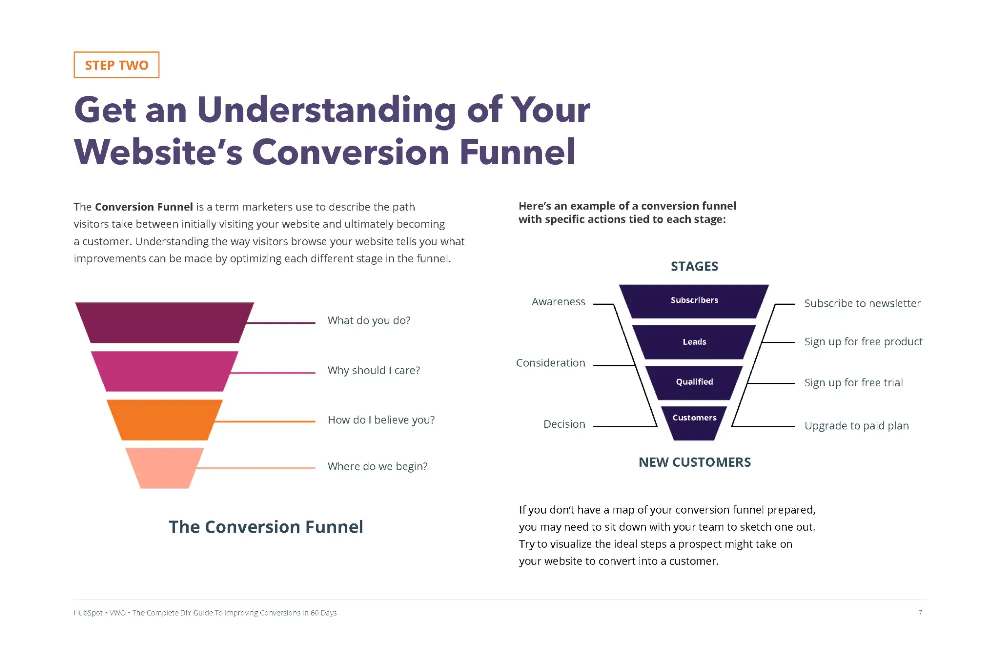
Conversion rates are calculated by dividing the number of conversions by the number of visitors and multiplying that number by 100 to get a percentage.
So how can you identify your conversions in the first place? I find that marketing analytics tools equipped with conversion tracking capabilities make this process straightforward.
By defining a custom conversion event, like a form sign-up or a product purchase, the platform can spot and keep track of visitors who performed that specific action.
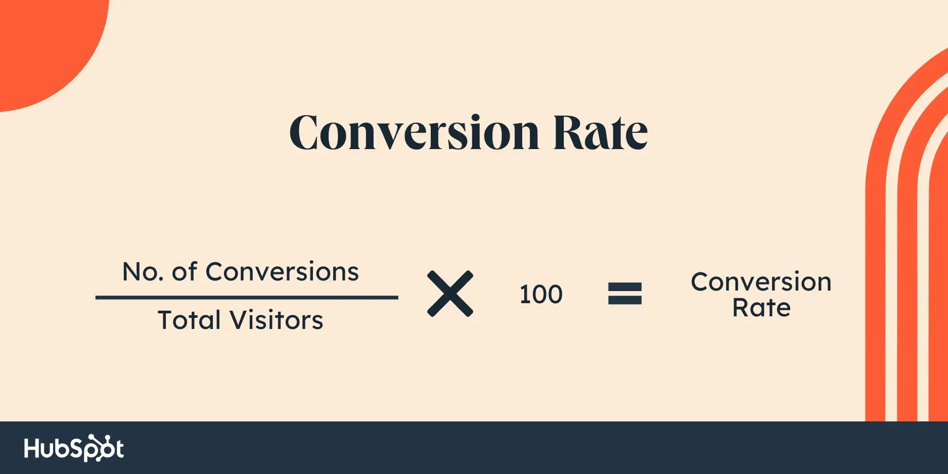
Let's say I’m defining a conversion as a newsletter opt-in, and I have an opt-in form on every single page of my website.
In that case, I’d divide the total number of newsletter form submissions by the total number of website visitors and multiply it by 100.
So, if I had 500 submissions and 20,000 visitors last quarter, then my conversion rate would be 2.5%.
I can repeat this process for every conversion opportunity on my site. I just need to make sure that I only count the number of visitors on the web pages where the offer is listed.
Alternatively, I can calculate my website's overall conversion rate by dividing the total number of conversions for every conversion opportunity on my site by the total number of visitors on my site.
CRO and SEO
As I mentioned before, CRO focuses on improving your website‘s performance to turn visitors into customers and boost conversions.
Search engine optimization (SEO) is the process of improving your website’s visibility on search engine results pages (SERPs) in order to boost organic traffic and sales.
While CRO and SEO take different approaches, the end goal is the same: increasing sales.
Where to Implement a CRO Strategy
Here are six areas of your website that have the potential to largely benefit from conversion rate optimization.
1. Homepage
In my experience, home pages are prime candidates for CRO.
In addition to making a first impression on visitors, the home page is also a prime opportunity to retain those visitors and guide them further into your website.
Some strategies for doing this include:
- Emphasizing links to product information
- Offering a free signup button
- Incorporating a chatbot that solicits questions from visitors
Pro tip: A/B testing on homepages has consistently shown that value-driven headlines and intuitive design improve user engagement and conversion rates.
Regularly test different headlines and imagery to see which combinations drive the most engagement and conversions.
2. Pricing Page
A website's pricing page can be the make-or-break point for many website visitors.
CRO can help a pricing page convert visitors into customers by modifying the pricing intervals (e.g., price-per-year vs. price-per-month), describing the product features associated with each price, including a phone number for visitors to call for a price quote, or adding a simple pop-up form.
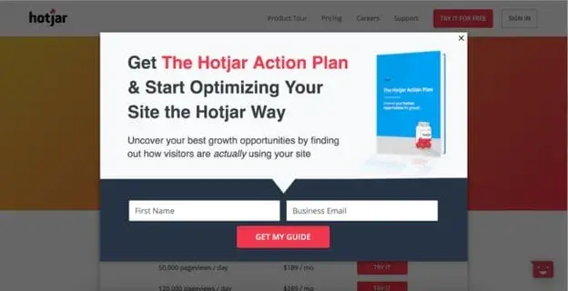
Hotjar, for example, added a simple email opt-in pop-up form on its pricing page and got over 400 new leads in just three weeks.
Pro tip: Simplify your pricing options and add social proof, such as testimonials or trust badges, to reduce anxiety around making a purchase decision.
Consider implementing a tiered pricing model with clear distinctions between each tier's benefits. A/B test different layouts and pricing structures to find the sweet spot that maximizes conversions.
3. Blog
A blog is a massive conversion opportunity for a website. In addition to publishing thoughtful and helpful content about your industry, a blog can use CRO to convert readers into leads.
This process often includes adding calls-to-action (CTA) throughout an article or inviting readers to learn more about a topic by submitting their email address in exchange for an ebook or industry report.
Pro tip: Content marketing studies indicate that contextually relevant CTAs within blog posts can significantly boost lead-generation efforts.
This could be a sign-up form for a newsletter, a downloadable resource, or a link to a relevant product or service page. Ensure that the CTA acts as a natural extension of the conversation of the blog.
4. Call-to-Action Buttons
CTAs are where the magic happens — they’re the gateway to conversions. Ensure your CTAs are prominently placed, visually distinct, and clearly communicate the action you want the user to take.
When Bombas updated their login CTA from an icon to text, logins increased by 36%, resulting in a 4.1% increase in orders placed.
Pro tip: Make your CTA buttons stand out with contrasting colors and compelling, action-oriented text that clearly states the benefit of clicking.
For example, instead of “Submit,” use “Get Your Free Quote Now.” A/B testing different colors, sizes, and wording of CTA buttons is essential to finding the combination that converts best.
5. Landing Pages
Since landing pages are inherently designed for people to take an action, it makes sense that they have the highest average conversion rate of all signup forms at 23%.
An event landing page, for example, can be optimized with a video of last year‘s event to encourage visitors to register this year.
A landing page that’s offering a free resource can be optimized with preview content from that resource to encourage visitors to download it.
Now that you know where you can optimize for conversions, you may be wondering how you know when your business is ready to start the process.
Pro tip: Keep landing pages focused and free of distractions. Each landing page should have one clear goal, whether it's collecting an email address or selling a product. Minimize navigation options, use bullet points to convey key information quickly, and ensure that the form or CTA is prominently displayed above the fold.
6. Forms
Whether it's a sign-up form, a contact form, or a lead generation form, make your CTAs as user-friendly as possible.
Minimize the number of required fields, use clear labels, and provide instant validation feedback to make it easier for users to complete the form.
Pro tip: Shorten your forms to only ask for essential information. The fewer fields a user has to fill out, the higher the completion rate.
If you need more information, consider breaking the form into multiple steps or using conditional logic to show fields only when necessary. Adding microcopy, like explanations for why certain information is needed, can also help reduce friction.
CRO Formulas
With conversion rate optimization, you‘ll get more out of your existing website traffic while ensuring you’re targeting qualified leads.
Although this is a straightforward concept, setting a conversion goal isn't as easy as saying, “This page converted 50 people this month, so we want to convert 100 people next month.”
You don't just want 50 more conversions from a webpage. Instead, you want 50 more conversions for every X amount of people who visit it.
(This is your conversion rate — the percentage of people who convert on your website based on how many people have touched it).
To provide a better understanding of your conversion rate at any point in time, here are three common formulas you can use to understand, analyze, and improve.
Featured resource: 8-Week Conversion Rate Optimization Planner
CRO Calculation 1: Conversion Rate
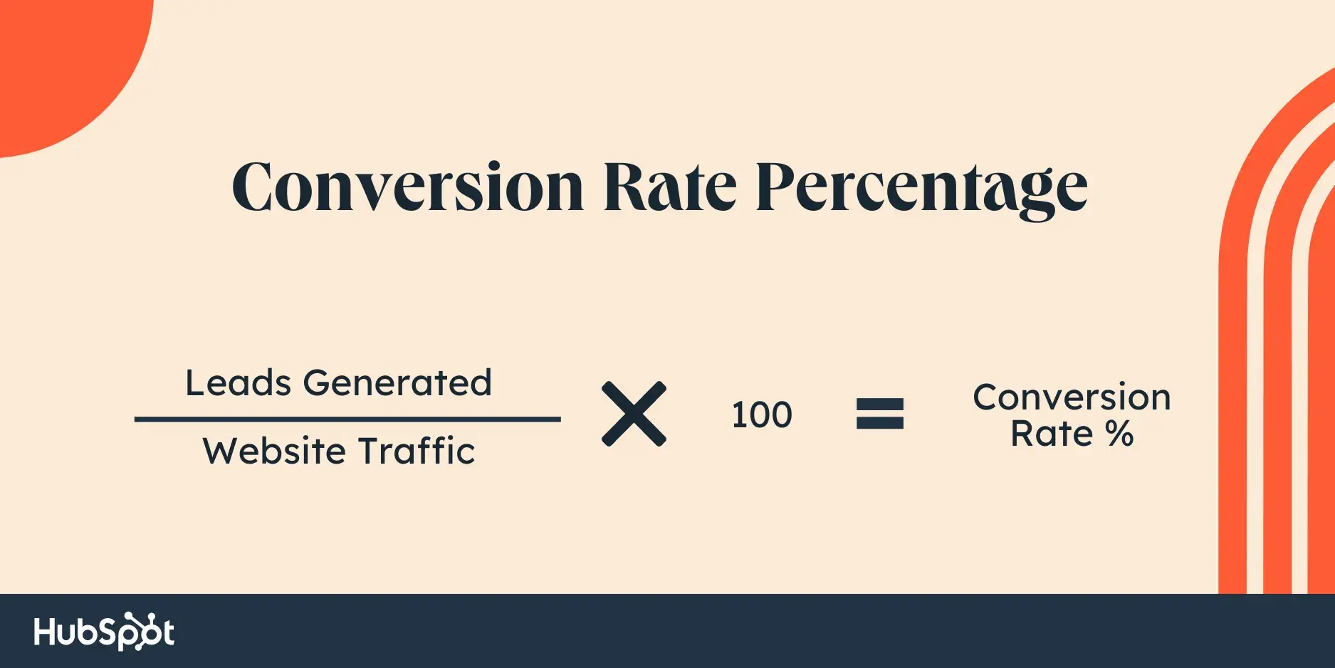
Calculating your conversion rate is as simple as dividing the number of conversions (or leads generated) by your number of visitors (or web traffic), and then multiplying that number by 100 to get the percentage.
CRO Calculation 2: Number of Net New Customers
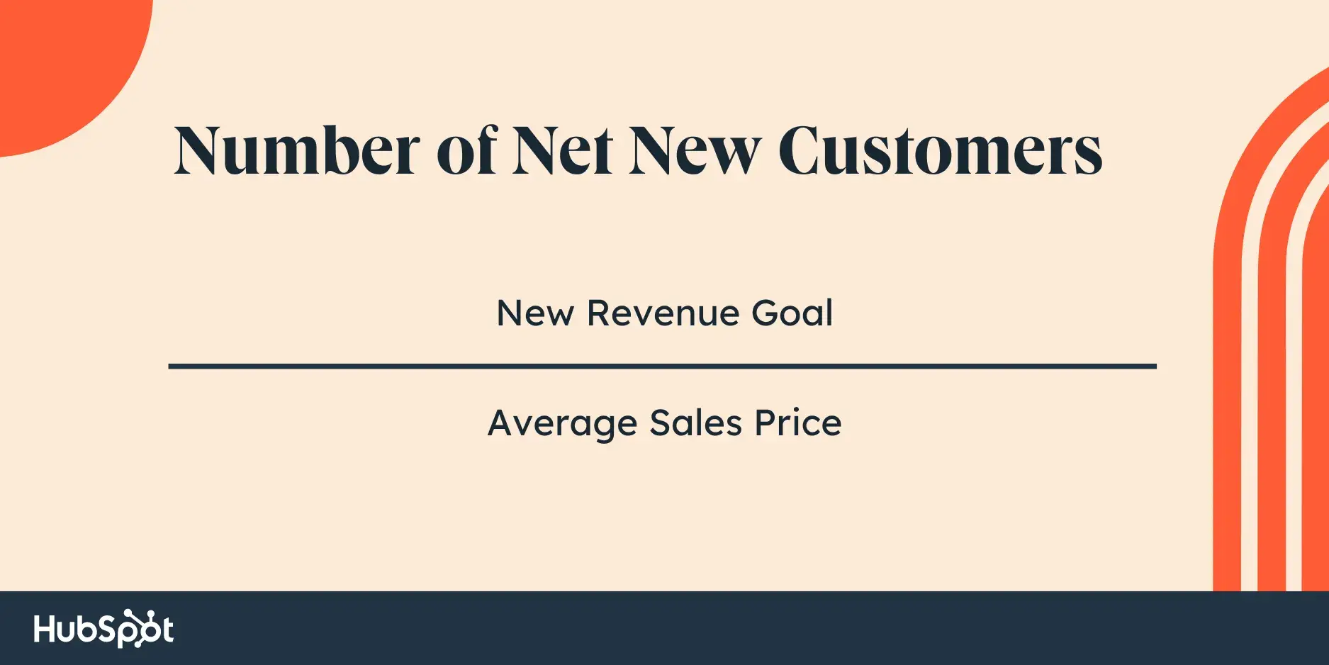
To calculate your number of net new customers, you'll want to divide your net revenue goal by your average sales price.
CRO Calculation 3: Lead Goal
And lastly, to calculate your lead goal, take your number of new customers and divide it by your lead-to-customer close rate (which is your total number of leads divided by total number of customers) percentage.
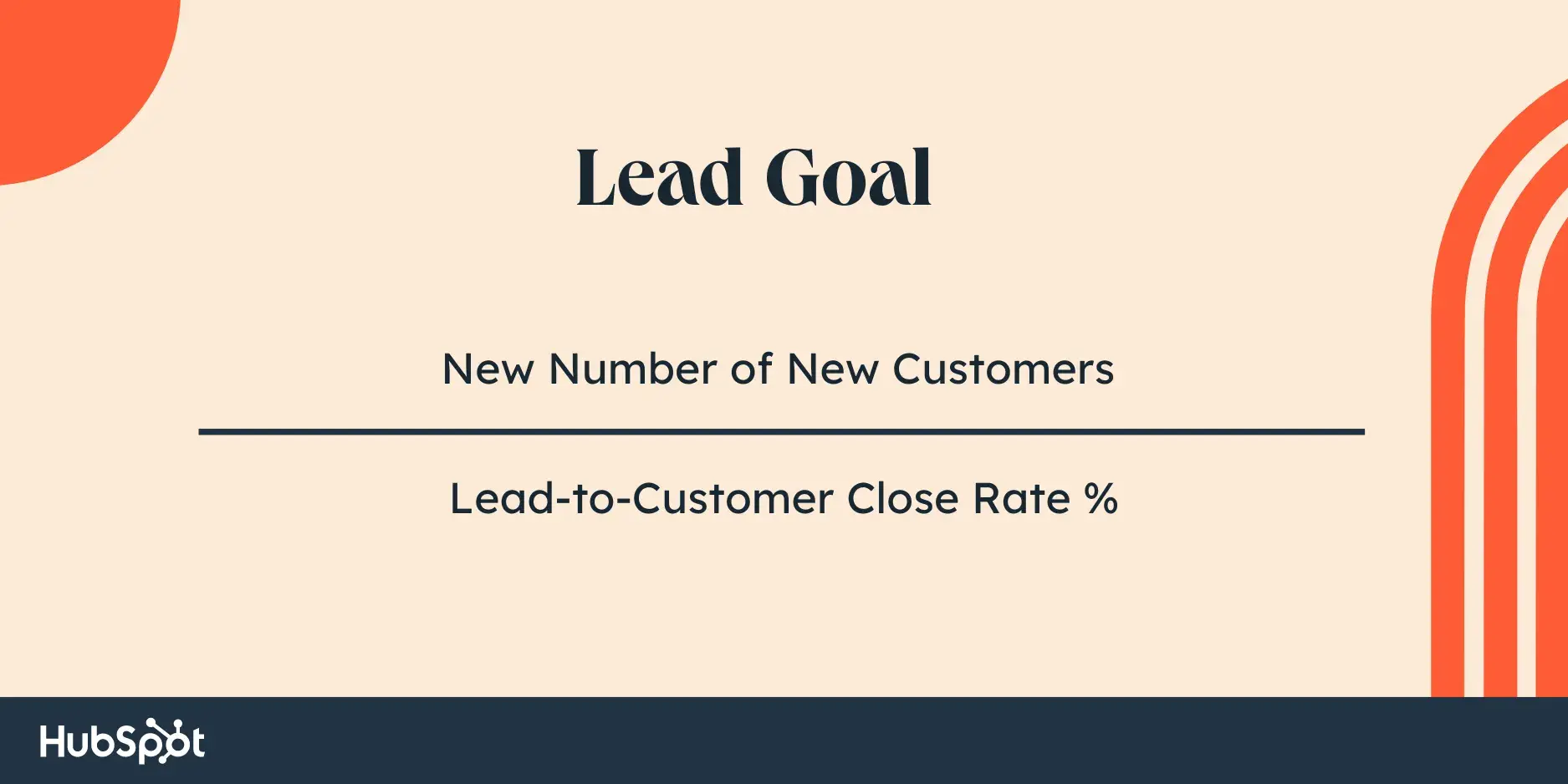
Here's an example of these formulas in action:
If your website has 10,000 visitors per month that generate 100 leads — and subsequently, 10 customers each month — the website visitor-to-lead conversion rate would be 1%.
What if you wanted to generate 20 customers each month?
You could try to get 20,000 visitors to your website and hope that the quality of your traffic doesn‘t decrease — although, that’s a risk you'll likely want to avoid.
Rather, you could obtain more leads from your existing traffic by optimizing your conversion rate. This is less risky and is more likely to produce better results for your bottom line.
For instance, if you increase your conversion rate from 1% to 2%, you‘d double your leads and your customers. The following table is proof of this — you can see the positive impact that results from increasing your website’s conversion rate:
|
COMPANY |
A |
B |
C |
|
Monthly Site Traffic |
10,000 |
10,000 |
10,000 |
|
Conversion Rate |
1% |
2% |
3% |
|
Leads Generated |
100 |
200 |
300 |
|
New Customers |
10 |
20 |
30 |
Notice the drastic increases in the number of leads generated and net new customers when you boost your conversion rate.
Not only that, but it‘s clear that generating more website traffic isn’t necessarily the right approach when trying to improve your conversion rate.
In fact, this chart shows you that you can grow your business substantially without increasing traffic at all.
Now that you understand conversion rate optimization fundamentals, you’re ready to take the first steps toward CRO at your company. I’ll outline some strategies below so you can start experimenting.
Conversion Rate Optimization Strategies
Here are some applicable conversion rate optimization marketing strategies to test and implement at your company.
1. Create text-based CTAs within blog posts.
While it's considered a best practice to include CTAs in a blog post, they sometimes fail to entice visitors to take your desired course of action. Why?
Banner blindness is a real phenomenon related to people becoming accustomed to ignoring banner-like information on websites. This lack of attention, coupled with the fact site visitors don't always read all the way to the bottom of a blog post (rather, they "snack” on content), means a different approach is required.
That's where the text-based CTA comes in handy. Here at HubSpot, we ran a test with text-based CTAs — a standalone line of text linked to a landing page and styled as an H3 or an H4 — to see if they would convert more traffic into leads than regular CTAs located at the bottom of a web page.
In HubSpot‘s limited test of 10 blog posts, regular end-of-post banner CTAs contributed an average of just 6% of leads that the blog posts generated, whereas up to 93% of a post’s leads came from the anchor-text CTA alone.
2. Add lead flows on your blog.
A lead flow is another conversion rate optimization element you can include on your site. Lead flows are high-converting popups designed to attract attention and offer value.
And if you’re thinking that popups are something to avoid, think again!
Campaign Monitor added a pop-up offer for a free guidebook that converted at 10.8% and captured 271 new leads in just one month.
Adding an ebook offer allowed HotJar to capture 70 new leads per month for their services with a 3.05% conversion rate to new trial sign-ups, which is significantly higher than the industry average.
You can select from a slide-in box, drop-down banner, or pop-up box, depending on your offer. Need help? Check out the resources in HubSpot’s Marketing Hub.
3. Run tests on your landing pages.
Landing pages are an important part of the modern marketer's toolkit and integral to conversion rate optimization.
That's because a landing page is where a website visitor becomes a lead, or an existing lead engages more deeply with your brand.
To optimize a landing page, run A/B tests to identify your best design and content features for audience members.
For instance, with A/B testing, you can quickly and easily test different versions of your website copy, content offers, images, form questions, and web pages to determine what your target audience and leads respond to best. You might see that a page or a form is too long and hinders conversions.
Thanks to A/B testing, China Expat Health was able to increase their lead conversion rate by 79%. One of the most impactful changes was swapping out the headline “Health Insurance in China” for “Save Up to 32% on Your Health Insurance in China,” which immediately conveyed a value proposition to visitors. This proposition was then supported by customer testimonials.
E-commerce businesses must continually optimize their websites to improve conversions as industry averages show only 2.5% to 3% of visitors become customers. Dynamic A/B testing is a disruptive way to increase user engagement and drive sales, allowing businesses to apply multiple variants to specific customer segments and use AI to determine the most effective combinations. Platforms like Vmax enable continuous optimization at scale through dynamic A/B testing.
Get everything you need to start effectively A/B Testing your website today.
4. Help leads become MQLs.
Sometimes, visitors want to get right down to business, skip parts of the typical buyer's journey, and immediately speak with a sales rep (rather than be nurtured).
There are specific actions you should encourage these high-intent visitors to complete so they can easily become marketing qualified leads (MQLs).
And they can take action through a combination of thoughtfully designed web pages, compelling and clear copy, and smart CTAs.
For instance, at HubSpot, we discovered that visitors who sign up for product demos convert at higher rates than visitors who sign up for free product trials.
So, we optimized our website and conversion paths for people booking demos or meetings with a sales rep.
Admittedly, this depends on your product and sales process, but our best advice is to run a series of tests to find out what generates the most customers.
Then, optimize for that process. The key here is to look for ways to remove friction from your sales process.
5. Build workflows to enable your team.
There are a number of automated workflows you can create to enable your team with the help of marketing automation software.
For example, with marketing automation, it's possible to send automatic emails with workflows. Then, leads can book meetings with reps in one click.
Meanwhile, reps receive notifications when leads take high-intent actions such as viewing the pricing page on your website.
If you work in ecommerce, you can send an email to people who abandon their shopping cart as a reminder.
According to research from Moosend, abandoned cart emails can be very effective. They have a high open rate of 45%. Of the emails that are opened, 21% are clicked. Half of the people who clicked make a purchase.
Here's an example of an abandoned cart email by the Dollar Shave Club.

6. Add messages to high-converting web pages.
Use live chat software to chat with your website visitors in real time and offer support and guidance as needed.
To increase conversions, add these messaging features to your high-performing web pages — such as your pricing and product pages — so leads get the information they want in real-time.
You can also make your messaging and chatbots action-based.
For example, if someone has spent more than a minute on the page, you may want to automatically offer to help and answer any questions they may have (again, a live chat tool, like HubSpot, makes this easy).
7. Optimize high-performing blog posts.
Publishing blog articles opens the door to a big opportunity for conversions.
Even more so if you already have existing blog content on your site. In fact, at HubSpot, the majority of our monthly blog views and leads come from posts published over a month ago.
To get started optimizing your blog content, identify your posts with the highest levels of web traffic but low conversion rates. (Possible causes of this issue may be related to SEO, the content offer you are promoting, or your CTA.)
In one instance, we at HubSpot added an inbound press release template offer to a blog post about press releases — as a result, we saw conversions for that post increase by 240%.
Additionally, look at your blog posts with high conversion rates.
You want to drive more qualified website traffic to those posts, and you can do so by optimizing the content for the search engine results page (SERP) or updating it as needed to ensure it's fresh and relevant.
8. Leverage retargeting to re-engage website visitors.
It doesn‘t matter what your key conversion metric is: The cold, hard truth is that most people on your website don’t take the action you want them to.
By leveraging retargeting on Facebook, Google, and other platforms, you can re-engage people who left your website.
Retargeting works by tracking visitors to your website and serving them online ads as they visit other sites around the web. This is particularly impactful when you retarget people who visited your highest-converting web pages.
The normal inbound rules still apply here — you need well-crafted copy, engaging visuals, and a compelling offer for retargeting to work.
Take United's retargeting campaign for example. Using insights from previous ad campaigns, United focused on reaching people who had viewed their ads and were already considering booking a vacation. To this select audience, they promoted a 15-second video ending in a call-to-action.
If viewers felt inspired enough to book their vacation, all they had to do was click on the CTA to be taken straight to the United website.
This proved to be a huge success. In just one month, 52% of conversions attributed to YouTube were click-through conversions directly from the ad.
(If you're a HubSpot customer, take a look at how the AdRoll integration can improve your conversion efforts.)
Now, let's talk about how you can get started with CRO at your company.
Expert Tips: How to Improve Conversion Rate Optimization
HubSpot's Content Growth Team Manager Pamela Bump has some helpful tips marketers should know to boost conversion rate optimization.
For one, marketers should leverage heat mapping.
“Take advantage of a heat mapping and scroll mapping tool to get a better understanding of user behavior on your web pages,” she said. “These tools can provide insights that help you identify optimization and testing opportunities.”
Speaking of tests, Bump says to base your tests on insights and not hunches.
"Past experiments, user research, chat transcripts, and website/conversion analytics are all great sources for helpful insights that could inform future, successful tests.”
Remember, A/B testing won‘t tell you the "why" behind visitors’ behaviors.
“Consider supplementing your CRO test data with qualitative user testing if you're trying to understand visitors' comprehension of your content,” Bump said, “or their motivations for converting (or not converting).”
Marketers should also be mobile-first when it comes to web content.
“Keep chunks of copy brief and consider how content renders differently on mobile devices when designing pages,” Bump suggests.
And while it‘s good to be knowledgeable about CRO best practices, Bump says it’s important to remember that what works for one business may not work for all.
How to Get Started with Conversion Rate Optimization (CRO)
Maybe you're wondering, "Where do I start with CRO?”
Enter the PIE framework. Before starting a CRO project, use the PIE framework to prioritize your efforts by ranking each element on Potential, Importance, and Ease.
Use the PIE framework to answer the following questions for every strategy outlined in the previous section. Then, assign a score between one and 10 (one being the lowest and 10 being the highest) to each strategy.
- How much total improvement can this project offer?
- How valuable will this improvement be?
- How complicated or difficult will it be to implement this improvement?
Total the numbers to see which projects or efforts will have the greatest impact. Then, work on the projects with the highest scores first.
The PIE framework isn‘t perfect, but it’s one of my favorite ways to evaluate impact against effort. Plus, it’s easy to understand, systematic, and offers a starting point for CRO collaboration and communication among colleagues.
I've covered a lot about conversion rate optimization, but there’s always more to learn. If you still have questions, then I invite you to check out answers to frequently asked questions below.
What is the purpose of conversion rate optimization?
The purpose of conversion rate optimization (CRO) is to improve the likelihood of visitors taking a desired action on a webpage.
What is a CRO strategy?
A CRO strategy is designed to convert more of your visitors into paying customers.
While each CRO strategy will vary company by company, the general steps will not. You have to identify key metrics and your target audience. Then, you have to collect user feedback and other data to decide what you’re going to test.
Finally, you’ll run A/B tests to improve different pages and parts of your site for conversion.
What are CRO tools?
CRO tools are designed to simplify or automate the process of optimizing your conversion rate. They might help with lead capture, research, analytics, mouse tracking and heat maps, feedback, or running experiments.
Begin Using CRO
I’ve found that the hardest part of CRO is that it never ends. Your audience is always changing, and so are your competitors. That means it’s never done.
So, if you’re looking for a one-time CRO project, I hate to burst your bubble.
There’s always room for improvement. With that in mind, there are a few takeaways I hope you keep in mind as you dive in.
- Focus on high-impact areas first: Think Home Page, Pricing Pages, and Landing Pages since they relate directly to conversion.
- Small changes can mean big results: Something simple like changing your “Submit” button to something hyper-specific like “Get Your Free Guidebook” can have a huge payoff.
- Test & iterate: Try different versions of headlines, CTAs, or even layouts to see what resonates most with your audience.
- User experience is everything: No matter how good your site is, if it’s a pain to use, people will move on.
Ready to roll up your sleeves and start tinkering with your own website?
Have at it!
Remember, it’s all about continuous improvement, so don’t be afraid to experiment and have a little fun along the way.
Editor's note: This post was originally published in January 2019 and has been updated for comprehensiveness.
Conversion Rate Optimization


.png)



![What We Didn’t Do Boosted Our Paid Ad CVR by 11% [Expert Interview]](https://53.fs1.hubspotusercontent-na1.net/hubfs/53/hubspot-labs-paid-ad-cvr.webp)


![What is a CRO Test? [+ the 5 Steps to Perform Them Yourself]](https://53.fs1.hubspotusercontent-na1.net/hubfs/53/conversion-rate-optimization-tests_4.webp)
