Close your eyes and picture a one-page, typed document -- maybe a résumé, or a letter -- that uses the font Times New Roman. Now, change the font of that document to Courier. Now to Comic Sans.
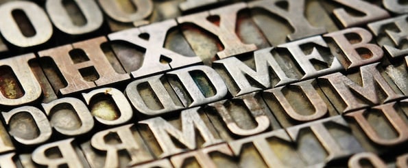
The look and feel of the document would change entirely depending which of those three fonts you employed, right? That's because different fonts were designed specifically for certain contexts.
I like the way Vincent Connare, the inventor of Comic Sans, put it: "A typeface is an answer to a question. Everything I've ever done [in typeface design] is a solution to somebody's problem."
Over time, the use cases for different fonts have evolved -- in some cases, away from their original intention. Let's take a look at the brief history of six iconic typefaces from their invention to how they're used today.

The History of 6 Iconic Fonts
1) Comic Sans
.webp?width=252&name=comic-sans%20(1).webp)
Ah, Comic Sans ... arguably the most controversial typeface in history.
Countless books on typeface design talk about it from both sides of the fence. In the past few years, designers initiated a campaign against it called "Ban Comic Sans," calling it "tacky" and an "epic fail." And according to the inventor of Comic Sans himself, the main designer at Twitter tweeted that the font takes up the second most server space used by complaints -- after airlines and before Justin Bieber.
But its original intent wasn't to polarize the masses; it was to appear in an application meant for young users. Remember those friendly little cartoon assistants that used to help you out on Microsoft Word? You know, the ones that would pop up with a speech bubble reading stuff like, "Looks like you're writing a letter. Would you like help?"
Well, it turns out the font Comic Sans was originally designed for the text inside the speech bubbles for one of the very first versions of those assistants.
Vincent Connare, who was working at Microsoft at the time, designed the font for the digital assistant Microsoft Bob, a comic software package designed for kids. Times New Roman was the original pick for the font that would go inside the assistant's speech bubbles, but Connare thought it looked strikingly inappropriate for the comic context. He wanted it to look more like comic book writing.
"It only took about three days to get the basic font down,"Connare told The Guardian. He consulted comic books and drew the letters with a mouse to get the "wonkiness" he wanted.
While Microsoft Bob didn't last, Comic Sans became a font option on Windows 95 and quickly gained popularity among young children in primary schools and other childcare organizations. The debates arose when other, more supposedly professional organizations began adopting it for use in documents, signage, and on their website. It gained popularity among "regular people who are not typographers or graphic designers,"said Connare.
To this day, whether or not Comic Sans is a viable font for professional organizations remains a controversial topic.
2) Times New Roman
.webp?width=347&height=80&name=times-new-roman%20(1).webp)
Whereas Comic Sans became famous for being funky and playful, Times New Roman gained its popularity from its normalcy and relative anonymity. It's been dubbed a serious font -- even what some call"quintessentially British."
The Times New Roman font can be found all over the place, from the default fonts of your word processors to the pages of your favorite books, and it would be pretty difficult to find someone who has never come across it before.
Far older than Comic Sans, Times New Roman was invented way back in the days of printing presses. In 1929, the Times of London (the font's namesake) hired a typographer named Stanley Morison to create a new text font for the newspaper. Morison worked with an advertising artist for the Times named Victor Larden, who was the one who ultimately drew the letterforms. Check out the image below to see how Times New Roman (left) compares to the font it replaced (right):

Image Credit: New York Public Library
You'll notice Times New Roman is a bit narrower than most text fonts, including the one on the left. That's because a narrower font is better for newspapers, as it can fit more text per line. During the design process, Morison's goal was to create a typeface that was narrow, but still easily readable.
Times New Roman was released in 1932 as the official typeface of the London Times. It took a while for others to adopt it, though, because it looked its best with more ink and a higher quality paper than many printers were willing to pay for. It wasn't until 1941 that it had its first big American client, Woman's Home Companion, followed by the Chicago Sun-Times in 1953.
After securing these deals, it quickly became popular among printers. Interestingly, although the typeface is now a popular default for books, the Times actually specifically noted that it wasn't appropriate for books. “It is a newspaper type -- and hardly a book type -- for it is strictly appointed for use in short lines -- i.e., in columns,"they wrote.
Since the advent of personal computers, the 83-year-old typeface remains one of the first fonts available for each new device.
3) Helvetica
.webp?width=197&height=69&name=helvetica%20(1).webp)
Helvetica is another font that appears virtually everywhere -- more often in branding and signage, rather than in books and newspapers. For example, famous brands like BMW, Oral B, IBM, Target, Staples, and Panasonic all use Helvetica for their logos. The U.S. Government uses Helvetica for all its official forms. It's the default font for Brussels' entire transport system, and became the font for the NYC subway system's signs and maps in 1970.
.webp?width=400&height=275&name=nyc-subway-signs%20(1).webp)
Image Credit: Kaneva
But where did Helvetica come from? It was actually a Swiss byproduct of post-war Europe, a time when European companies were searching for ways to modernize their brand, including the look and feel of their advertisements and signage. Previously, it'd been popular to use fancy, decorative typography, but many brands had begun searching for something more neutral, clearer, and edgier.
Enter Max Miedinger and Eduard Hoffmann, who invented the typeface that would become Helvetica in Switzerland in 1957. It was originally called "Die Neue Haas Grotesk," but in 1960, the name was changed to Helvetica (Latin for "Swiss) to make it more marketable internationally.
And it served as a solution for what companies were looking for in a modern typeface: It was entirely neutral. At its very core, Helvetica was intended "to not give any impression or have any meaning in itself,"according to Web Designer Depot.
Thanks to its neutrality, Helvetica is an incredibly adaptable font and can be used for a wide range of design projects -- especially when italic, bold, and other weights are added. Starting in the 1960s, it began to gain a reputation overseas, "particularly among the design executives on Madison Avenue," according to Fast Company.
Since then, it's become one of the most widely used fonts of all time; and its clean-cut, professional, and neutral style has made it timeless.
4) Arial

Arial bears a striking resemblance to Helvetica thanks to its simple, modernist look. But there are clear differences between the two, as you can see below in the characters "G," "Q," R," and "1":

Image Credit: I Love Typography
Some suspect that Arial, which was invented 25 years after Helvetica in 1982, was actually created to copy Helvetica directly as a way of using a popular font without forking over any money.
Here's how: Arial was originally designed by Robin Nicholas and Patricia Saunders specifically for IBM’s bitmap font laser printers. It became free with the release of Microsoft Windows 3.1, the popularity of which spurred widespread global use of the Arial typeface. But why did Microsoft choose Arial as their standard typeface instead of sticking with the classic Helvetica? Some say it's because Helvetica's license fee was too high, so this was Microsoft's way of supplying a Helvetica-like font without paying royalties to the folks who owned rights to Helvetica.
Regardless of what you believe, Arial still stands as one of today's most popular typefaces. It's used for a wide variety of design projects, including hotel and vehicle signage, Tommy Hilfiger products, and even all of UPS' stickers.

Image Credit: Design Work Plan
5) Calibri

In the mid-'00s, digital content consumption was on the rise, both on personal computers and mobile devices -- and businesses like Microsoft were noticing. To make on-screen reading more enjoyable, the folks at Microsoft released six new typefaces created especially for extended on-screen reading in a bundle called the ClearType Font Collection.
"The ClearType fonts, unlike some compromises and adaptations in modern typeface design, were conceived from the outset as a marriage of technology and the best in design expertise,"reads Microsoft's website.
Calibri is one of the six fonts from Microsoft's collection, and it replaced Times New Roman as Office's default body type in 2007. Unlike Helvetica and Arial, its rounded stems and corners give it a softer and friendlier vibe.
"The [Calibri] family has a generous width that makes reading easier by emphasizing the reading direction," said Lucas de Groot, the man who invented Calibri, in Microsoft's promotional booklet.
Every time you open up a new PowerPoint presentation, you'll see Calibri as the default typeface. While it's certainly a very readable font, it's a little predictable for PowerPoint and SlideShare presentations. If you want to spruce up your presentation a little bit, check out our list of 35 great free fonts you can download to use in your presentations and marketing.
6) Courier

Let's be honest ... The Courier font family isn't a particularly pleasant one to read. As a monospaced typeface, though, it's the picture of uniformity: Each letter takes up the exact same amount of space on a line. I always think of it as one of the default coding fonts and plain text emails.

Image Credit: Hivelogic
Despite being a bit difficult to read, Courier remains one of the most recognizable fonts out there -- even though the days of typewriters are long over. It has its uniformity to thank for its longevity.
Courier was designed in 1955 by Howard Kettler with the original name"Messenger." It's probably most recognizable as the default font for a typewriter because IBM and other companies used it for their typewriters at the time of its invention. (IBM failed to secure the rights to the design, though, and would later redesign the font for their famous Selectric typewriter series.)
By the 1960s, Courier had become the default typeface for official documents. Even the U.S. State Department made it the official font until 2004, when they replaced it with Times New Roman. When typewriters gave way to personal computers, Courier bridged the gap simply because of its popularity at the time.
Although many consider it a little plain, boring, and frankly illegible in comparison to other typefaces, Courier is still a symbol of bureaucracy and stability. Interestingly, it's also still the preferred typeface for screenplay drafts. Why? Because of the consistent character spacing: According to Screenwriter.io, standard screenplay format is designed so that one page of a screenplay is approximately equal to one minute of screen time, so that consistency is important.
So, there you have it. Every typeface has its own personality, and some have stuck far more effectively than others. Take a look at how typography is used around you, and soon, you'll begin to recognize the differences between each one and why they're used in different contexts.
Which of these classic fonts is your favorite? Which is your least favorite? Share with us in the comments.


![The Most Popular Font Types in America [New Data]](https://53.fs1.hubspotusercontent-na1.net/hubfs/53/most-popular-font-america.jpg)


![The Typography Trends Every Marketer Should Have on Their Radar [Infographic]](http://53.fs1.hubspotusercontent-na1.net/hubfs/53/typography-trends.jpeg)

![24 Typography Terms Every Marketer Should Know [Infographic]](http://53.fs1.hubspotusercontent-na1.net/hub/53/file-2007733825-jpeg/font-alphabet-typography-1.jpeg)
![A Handy Little Guide to Pairing Fonts [Infographic]](http://53.fs1.hubspotusercontent-na1.net/hub/53/file-1509533738-jpeg/mismatched-heart-socks.jpeg)
![How to Identify the Name of a Font [Quick Tip]](http://53.fs1.hubspotusercontent-na1.net/hub/53/file-436958930-jpg/fonts.jpg)