Excel charts and graphs are tried-and-true tools for visualizing data clearly and understandably. But for those who are not native tech gurus, it can be a bit intimidating to poke around in Microsoft Excel.
I’m here to share the foundational information you need, helpful video tutorials, and step-by-step instructions for anyone feeling like they are in over their heads.
Organizing a spreadsheet full of data into an accurate and attractive chart isn’t sorcery — you can do it! Let’s go over the process from A to Z.
![Download 10 Excel Templates for Marketers [Free Kit]](https://no-cache.hubspot.com/cta/default/53/9ff7a4fe-5293-496c-acca-566bc6e73f42.png)
What an Excel Chart or Graph is — and Why to Use Them
The first thing to know is that you can create different types of charts and graphs in the software.
The unique information in your data set(s) and the audience you are communicating to are factors that go into choosing the appropriate chart or graph for your project, so let’s chat charts.
What is an Excel chart or graph?
An Excel chart or graph is a visual representation of a Microsoft Excel worksheet’s data. These graphs and charts allow you to see trends, make comparisons, pinpoint patterns, and glean insights from within the raw numbers. Excel includes countless options for charts and graphs, including bar, line, and pie charts.
But why use them? Do you need to visualize data when you can just explain it? The answer is typically yes if you want to help an audience understand and retain the relevant findings.
I’ll never forget a particular graph from a TED talk I saw on parenting taboos — and I’ve never seen anything play out so accurately in my own life, either:
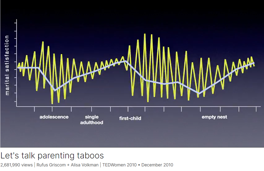
This chart from Rufus Griscom + Alisa Volkman shows a mean line of happiness in blue and more of a moment-by-moment breakdown in yellow of the data points that build the mean you see.
The highs and lows tend to be less erratic during single adulthood because you have more control over your environment and circumstances, they explain, but once you have kids? Chaos.
They joked about Grand, explosive moments of love accompanied by mind-numbing, soul-punching lows — usually around bedtime routines. (It’s no joke.)
From this, we can glean that it’s always a good idea to distill the information into something visually digestible so you can communicate clearly and efficiently.
The last thing you want is to lose your target’s attention in a sea of incomprehensible numbers.
Especially for large data sets, an Excel chart or graph gets to the heart of your findings in a way that is easy to see and understand at a single glance, especially when you incorporate comparisons.
If your data has more than one finding to communicate — such as a comparison or if you want to illustrate changes taking place over time — Excel charts and graphs offer several options for creating impactful visuals.
By the end, you’ll have some ideas about which charts could help you tell the stories contained within your data.
.png)
Free Excel Graph Templates
Tired of struggling with spreadsheets? These free Microsoft Excel Graph Generator Templates can help.
- Simple, customizable graph designs.
- Data visualization tips & instructions.
- Templates for two, three, four, and five-variable graph templates.
The 18 Types of Charts in Excel (So Far)
Whew, Microsoft has been busy! Last I did a deep dive, there were only nine types of charts, so it has doubled in the previous few years — which is excellent news for research communicators.
When you understand their uses, you can present material optimized to be highly valuable and insightful for your team’s projects.
We’ll go over the best, tried-and-true options thoroughly. Then, at the end, I’ll briefly summarize the advanced chart types and those that may not be as useful to marketers.
Excel Charts Most Useful to Marketers
1. Area Chart
Excel area charts allow you to see trends over time — or some other relevant variable. It’s essentially a line graph with colored-in sections emphasizing progression and giving a sense of volume.
You can also use stacked area charts. This denser area chart allows you to show more information at once, such as comparing trends in multiple categories or tracking changes across different variables.
Best for: Demonstrating the magnitude of a trend between two or more values over a given period.
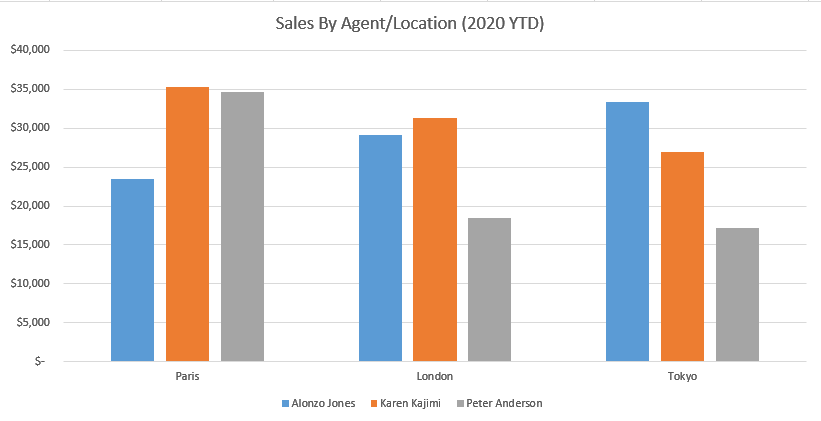
2. The New and Improved Bar Graph (Now Called a Clustered Bar Graph)
An Excel bar graph represents information horizontally and compares different data series. You can easily see the proportions between various categories or elements of your data.
For instance, you can use clustered bar graphs to compare the sales of different products, for example, in other store locations over months or quarters.
This can help you understand which products sell well in different geographies during the same time frame.
Best for: Comparing the frequency of similar values between different variables.
3. Ditto for Column Charts (Renamed Clustered Column Charts)
Column charts are similar to bar graphs, but they differ in one critical way: they’re vertical, not horizontal. The vertical orientation lends itself to helping viewers rank different data elements.
Like bar graphs, column charts compare data, display trends, and show proportions.
For instance, if you want to rank your sales teams’ numbers in different states across a quarter, you can visualize them in a clustered column chart and see which team in each state is in the lead — the tallest in the cluster.
You can also see which team is leading among all states — the tallest among all clusters.
Best for: Displaying various data elements over some time to rank them visually.
Pro tip: I’ve personally learned that column charts displaying T-bars of statistical significance are extremely useful in helping people in leadership dispel likely but ultimately untrue interpretations of data.
Sometimes, data showing meaningful change is still within normal parameters. Sometimes, what seems like a slight difference is significant.
Managers and directors may need help seeing these realities so they don’t oversteer at decision time.
4. Line Graph
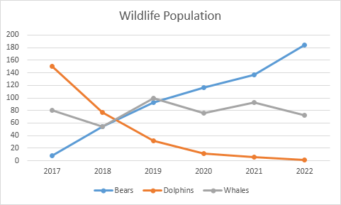
A line graph is a simple but highly effective way to see trends over time at a glance — even without the frills of bars, columns, or extra shading. You can also compare multiple data series.
For instance, the number of organic visits from Google versus Bing over a 12-month period.
You can also see the rate or speed at which the data set changes. In our Google vs. Bing example, a steep incline would mean you had a sudden spike in organic traffic. A more gradual decline means that your traffic is slowly decreasing.
Best for: Illustrating trends over time, such as spikes or drops in sales due to holidays, weather, or other variables.
5. Pie Chart
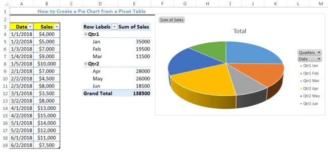
A pie chart is a helpful way of seeing how different data elements proportionally compare to one another. Curious what percentage of your organic traffic is from Google versus Bing?
Or how much market share do you have compared to competitors? A pie chart is a fitting way to visualize that information.
It’s also a great way to see and communicate progress toward a specific goal.
For instance, if your goal is to sell a product every day for 30 days in a row, then you might create a pie chart with 30 slices and shade a slice each day you sell the product.
Best for: Showing values as percentages of a whole and viewing data elements proportionately.
6. Radar Chart
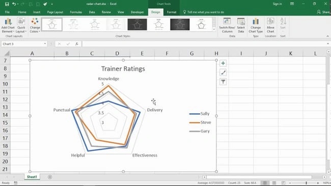
A radar chart might look familiar to you if you’ve ever taken a personality test, but it’s also useful outside of that industry. Radar charts display data in a closed, multi-pointed shape.
Each point is called a spoke, and multiple variables “pull” spokes of the shape. Then, shapes can be stacked up for comparison.
This type of chart is well-designed for comparing different data elements, such as attributes, entities, people, strengths, or weaknesses. It also helps you see the distribution of your data and understand if it's overly skewed one way or another.
Best for: Comparing the aggregate values of multiple data series at once.
7. Scatter Plot
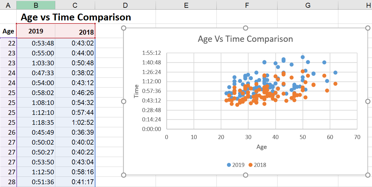
Scatter plots look similar to line graphs but with one critical difference: They evaluate the relationship between two variables, shown on the X- and Y-axes. This enables you to identify correlations and patterns between them.
For instance, you might compare the amount of organic traffic (X-axis) with the number of leads and signups (Y-axis).
If you see an upward trend in the dots where these two converge, then you’ll have an idea of how an increase in organic traffic affects your leads and signups.
If you have a leads/signups goal, you can then create a more data-driven plan for increasing your organic traffic.
You can even take it a step further to compare the number of leads and signups with daily sales or conversions to keep more programs on data-driven paths.
Best for: Visualizing positive or negative relationships between two variables.
8. Funnel Chart
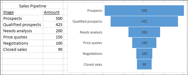
Funnel charts are extremely well-suited to marketers who want to optimize processes and pipelines.
In the image above, it’s clear that you drop the most candidates between Qualified Prospects and Needs Analysis, so that portion of your funnel may be interesting to look into more deeply to understand why.
Best for: Visually representing changes through processes helps to clarify where the biggest changes occur along the way.
Pro tip: My experience has taught me that if you only use two levels — especially if there’s not a great change between them, it’s easy to mistake this for a bar graph, which functions completely differently.
You’ll definitely want to use at least three levels so it’s more clearly distinguished as a funnel shape.
9. Histogram Chart
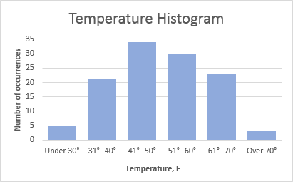
Histograms are a solid option when you want to explain data that occurs most usefully in ranges. Let’s say that you want to show your clients the buying habits of various age demographics in your product niche.
You may find that your target audience has moved, possibly even jumped a range up or down.
If your client has sold baby products for the last 100 years, you’d definitely see that the target audience of first-time parents is getting older as people wait longer to have children.
This may change your marketing strategies to meet the needs and issues of this older first-time parent demographic.
Best for: Demonstrating data findings that are most noticeable and useful when the data is grouped in ranges.
Free Excel Graph Templates
Tired of struggling with spreadsheets? These free Microsoft Excel Graph Generator Templates can help.
- Simple, customizable graph designs.
- Data visualization tips & instructions.
- Templates for two, three, four, and five-variable graph templates.
Advanced Excel Charts
It’s smart for you to know that the following chart types exist, but they may not be the best place to start if you arrived here today a bit overwhelmed.
They are more complicated and better suited to audiences who can already read advanced-level charts:
- Box and whisker chart.
- Pareto chart.
- Surface chart.
- Sunburst chart.
- Treemap chart.
Industry-Specific Excel Charts
The remaining Excel chart types don’t typically lend themselves to marketing. But, hey — if your niche calls for it, these charts are there to support you:
- Stock chart.
- Waterfall chart.
- Filled map chart.
- Combo chart.
Summarizing the Charts
That was a ton of information. If you’re still not sure which to choose, here’s a concise comparison of the Excel charts I find to be most useful to marketers:
|
Type of Chart |
Use |
|
Area |
Area charts demonstrate the magnitude of a trend between two or more values over a given period. |
|
Clustered |
Clustered bar charts compare the frequency of values across different levels or variables. |
|
Clustered |
Clustered column charts display data changes over a period of time to make clear visualizations of rank among data sets. |
|
Line |
Similar to bar charts, they illustrate trends over time. |
|
Pie |
Pie charts show values as percentages of a whole. |
|
Radar |
Radar charts compare the aggregate value of multiple data series. |
|
Scatter |
Scatter charts show the positive or negative relationship between two variables. |
|
Funnel |
Funnel charts excel at visualizing changes to one data point over various processes. |
|
Histogram |
Histograms show variations in data that are best represented as a range of values. |
If you’re looking for a deeper dive to help you figure out which type of chart/graph is best for visualizing your data, check out our free ebook, How to Use Data Visualization to Win Over Your Audience.
How to Create a Graph in Excel
The steps to build a chart or graph in Excel are relatively simple. I encourage you to follow the step-by-step instructions below or download them as PDFs if that’s more efficient for you.
Most of the buttons and functions you'll see and read are very similar across all versions of Excel.
Download Demo Data | Download Instructions (Mac) | Download Instructions (PC)
How to Create a Graph in Excel
- Enter your data into Excel.
- Choose one of the graph and chart options to make.
- Highlight your data and click 'Insert' your desired graph.
- Switch the data on each axis, if necessary.
- Adjust your data's layout and colors.
- Change the size of your chart's legend and axis labels.
- Change the Y-axis measurement options, if desired.
- Reorder your data, if desired.
- Title your graph.
- Export your graph or chart.
Featured Resource: Free Excel Graph Templates
Before we jump in, it’s time for another pro tip. You need not start from scratch. You are welcome to use these free Excel Graph Generators. Just input your data and adjust as needed for a beautiful data visualization.
It’s a great time-saver if you don’t need something as custom as building your Excel charts and graphs up from zero.
When you do need to create and customize from the very start, here’s how to tackle it:
1. Enter your data into Excel.
First, you need to input your data into Excel. You might have exported the data from elsewhere, like a piece of marketing software or a survey tool — or maybe you're inputting it manually from spreadsheets. I don’t judge!
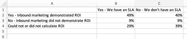
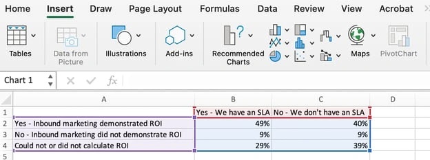
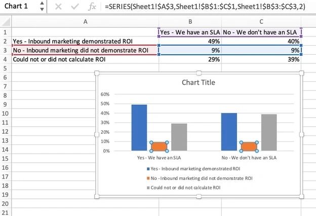
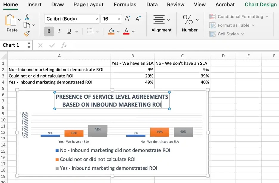
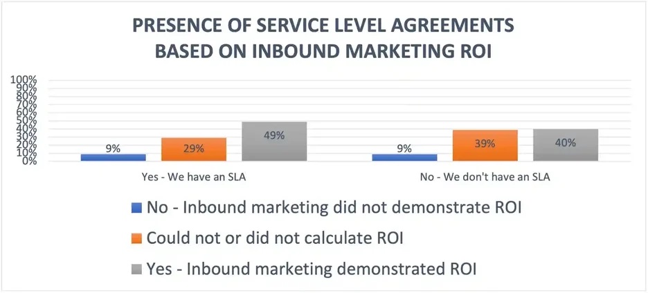
In the example below, in Column A, I have a list of responses to the question, “Did inbound marketing demonstrate ROI?” and in Columns B, C, and D, I have the responses to the question, “Does your company have a formal sales-marketing agreement?”
For example, Column C, Row 2 illustrates that 49% of people with a service level agreement (SLA) also say that inbound marketing demonstrated ROI.
2. Choose from the graph and chart options.
In Excel, your options for charts and graphs include column (or bar) graphs, line graphs, pie graphs, scatter plots, and more. See how Excel identifies each one in the top navigation bar, as depicted below:
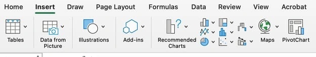
To find the chart and graph options, select Insert.
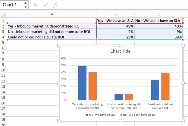
3. Highlight your data and insert your desired graph into the spreadsheet.
In this example, a bar graph presents the data visually. To make a bar graph, highlight the data and include the titles of the X- and Y-axis. Then, go to the Insert tab and click the column icon in the charts section.
Choose the graph you wish from the dropdown window that appears.
I picked the first two-dimensional column option because I prefer the flat bar graphic over the three-dimensional look. See the resulting bar graph below.
However, if I were reporting statistics about skyscrapers to a builder’s union, I’d definitely pick the three-dimensional look to customize the chart to look like built structures.
There are optimization choices to make along the way to best fit your data and audience.
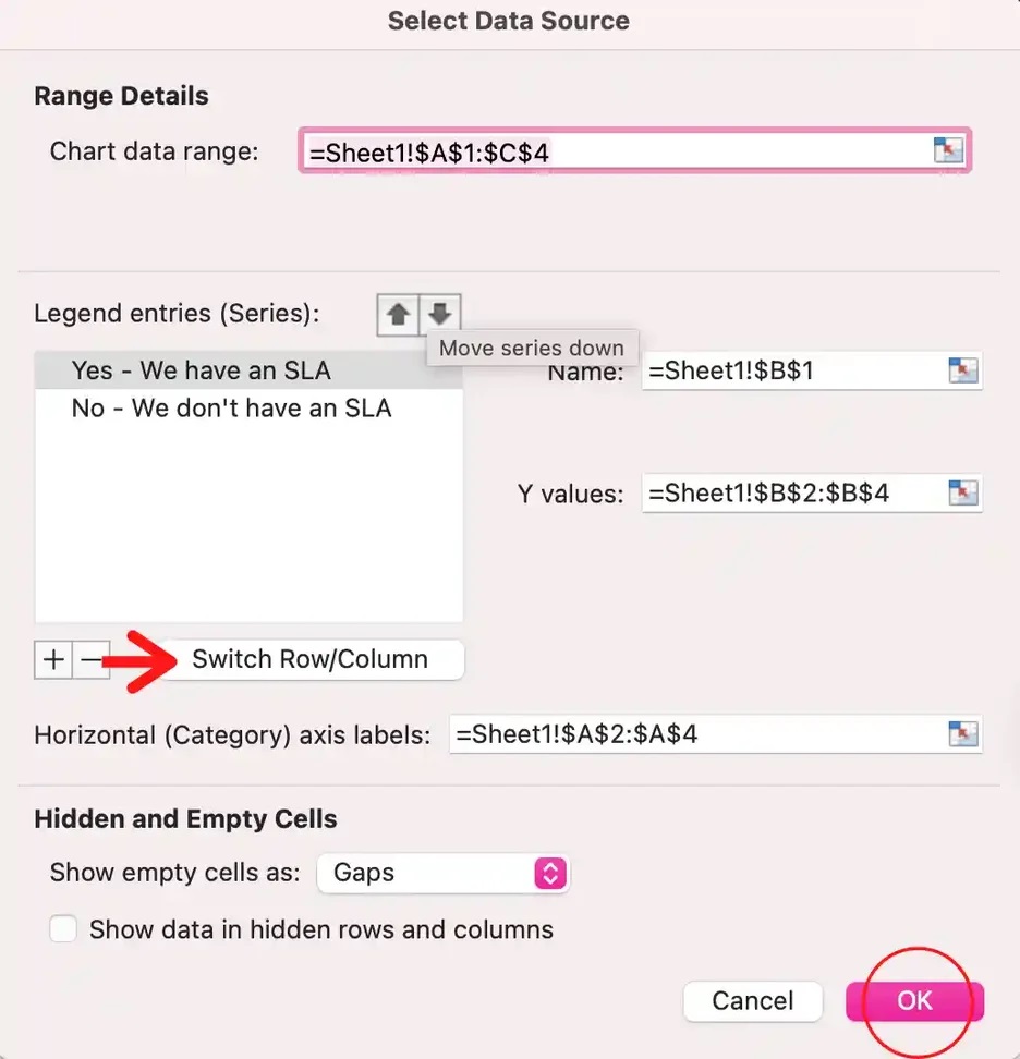
4. Switch the data on each axis, if necessary.
If you want to switch what appears on the X and Y axis, right-click on the bar graph, click Select Data, and click Switch Row/Column. This will rearrange which axes carry which pieces of data in the list shown below.
Sometimes, you’ll see that your information just presents better one way versus the other. In this case, I think the first X and Y orientation is easier and simpler to understand.
Keep in mind, though, that it’s not about me.
If the presentation focuses on SLAs and executive decisions on whether or not to secure one, a Yes/No SLA configuration (the second XY orientation) is likely a better fit for the audience and their needs. When finished, click OK at the bottom.
The resulting graph would look like this:
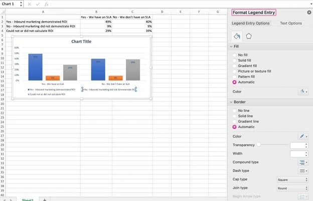
5. Adjust your data's layout and colors.
To change the labeling layout and legend, click on the bar graph, then click the Chart Design tab. Here, you can choose which layout you prefer for the chart title, axis titles, and legend.
In my example below, I clicked on the option that displayed softer bar colors and legends below the chart.

To further format the legend, click on it to reveal the Format Legend Entry sidebar, as shown below. Here, you can change the fill color of the legend, which will change the color of the columns themselves.
To format other parts of your chart, click on them individually to reveal a corresponding Format window.
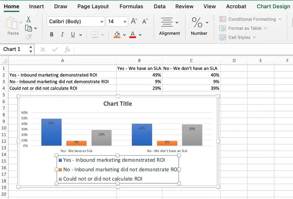
6. Change the size of your chart's legend and axis labels.
When you first make a graph in Excel, the size of your axis and legend labels might be small, depending on the graph or chart you choose (bar, pie, line, etc.)
Once you‘ve created your chart, you’ll want to size those labels up so they're legible.
To increase the size of your graph's labels, click on them individually and, instead of revealing a new Format window, click back into the Home tab in the top navigation bar of Excel.
Then, use the font type and size dropdown fields to expand or shrink your chart's legend and axis labels to your liking.
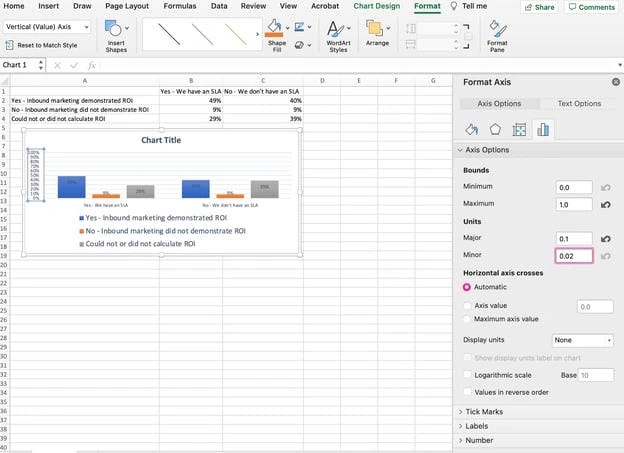
7. Change the Y-axis measurement options if desired
To change the type of measurement shown on the Y-axis, click on the Y-axis percentages in your chart. This reveals the Format Axis window.
Here, you can decide if you want to display units located on the Axis Options tab. You can change whether the Y-axis shows percentages to two decimal places or no decimal places.
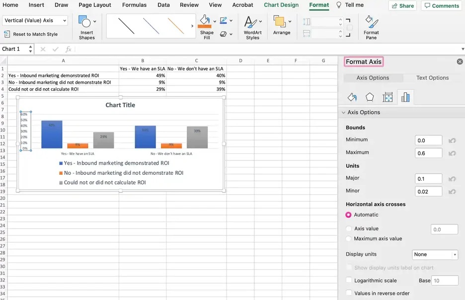
Because my graph automatically sets the Y axis' maximum percentage to 60%, you might want to change it manually to 100% to represent data on a universal scale.
To do so, you can select the Maximum option — two fields down under Bounds in the Format Axis window — and change the value from 0.6 to one.
The resulting graph will look like the one below (In this example, the font size of the Y-axis has been increased via the Home tab so that you can see the difference):
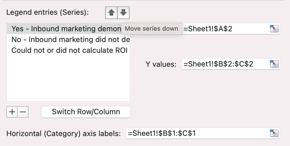
8. Reorder your data, if desired.
To sort the data so the respondents' answers appear in reverse order, right-click on your graph and click Select Data to reveal the same options window you called up in Step 3 above.
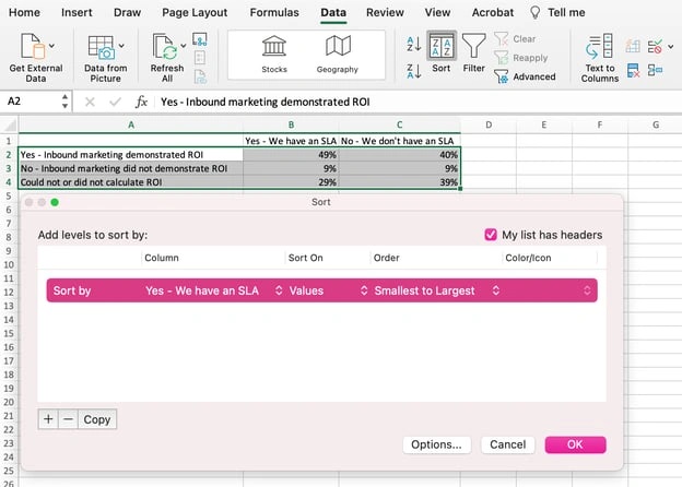
This time, arrow up and down to reverse the order of your data on the chart.
If you have more than two lines of data to adjust, you can also rearrange them in ascending or descending order. To do this, highlight all of your data in the cells above your chart, click Data, and select Sort, as shown below.
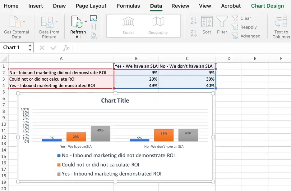
Depending on your preference, you can choose to sort based on smallest to largest or vice versa.
The resulting graph would look like this, which is tremendously better. Why? Because it shows your audience the progression of results and becomes visually persuasive.
9. Title your graph.
Now comes the fun and easy part: naming your graph. By now, you might have already figured out how to do this. Here's a simple clarifier.
Right after making your chart, the title that appears will likely be “Chart Title” or something similar, depending on the version of Excel you‘re using. To change this label, click on "Chart Title" to reveal a typing cursor.
You can then freely customize your chart’s title.
When you have a title you like, click Home on the top navigation bar, and use the font formatting options to give your title the emphasis it deserves. See these options and my final graph below:
10. Export your graph or chart.
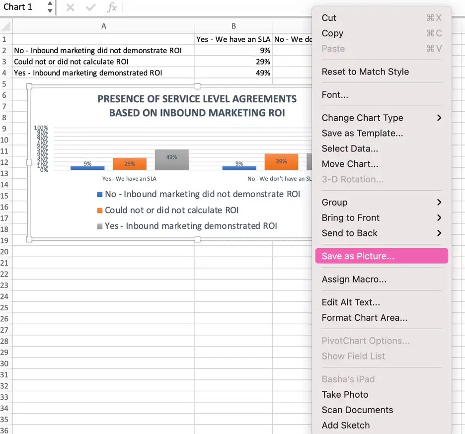
Once your Excel chart or graph is exactly the way you want it, you can save it as an image without screenshotting it in the spreadsheet.
This method will give you a clean image of your chart that can be inserted into a PowerPoint presentation, Canva document, or any other visual template.
To save your Excel graph as a photo, right-click on the graph and select Save as Picture.
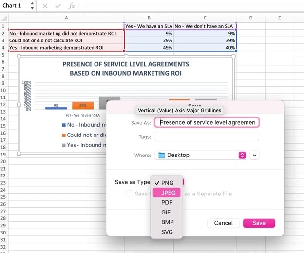
In the dialogue box, name the photo of your graph, choose where to save it on your computer, and choose the file type you’d like to save it as. In this example, it’s saved as a JPEG to a desktop folder. Finally, click Save.
You’ll have a clear photo of your graph or chart that you can add to any visual design.
Visualize Data Like A Pro
Ready for one final step to make this whole process faster? You can now swap your data into various graph types — like a pie chart or line graph — to quickly and more easily determine what format best tells the story of your data.
Here’s how you do it:
Step 1. Select the chart.
Look at your Excel chart or graph to find a blank spot within it. Click on a blank spot. Once the chart is highlighted all around the border, you’ll know it’s selected.
Step 2. Right-click or go to the Chart Design tab.
Once the chart is selected, the ribbon above will show a Chart Design tab. You can go click on that or simply right-click your selected chart to save time. Either way, you’ll see various chart options to choose from.
Step 3. Change the chart type.
When the chart options pop up — either on the ribbon or under your cursor if you right-clicked — you’ll next click Change Chart Type. A menu will pop up with a variety of chart type options on the left.
To the right will be a visual example of the chart type you click on.
Step 4. Shop for your chart.
The last bit is the most fun! You can click the Recommended Charts tab or the All Charts tab and start clicking your way down the list of chart types. As you see ones that interest you, click the Okay button.
Your originally selected chart will change types before your eyes. Give it a look and make sure all the data and labels make sense to you. Still curious?
Select your chart again and repeat the process to see your data on as many types of charts as you’d like.
No sorcery, as promised. Keep these step-by-step tutorials handy. You’ll be able to create charts and graphs that quickly, cleanly, and clearly visualize your data for presentation.
Editor's note: This post was originally published in June 2018 and has been updated for comprehensiveness.


![How to Use VLOOKUP Function in Microsoft Excel [+ Video Tutorial]](https://blog.hubspot.com/hubfs/VLOOKUP-hero.webp)