Now more than ever, businesses are focusing on creating delightful mobile website experiences.

Google has been heavily favoring mobile-friendly websites since 2015 when it updated its ranking algorithm, then started indexing mobile sites in March 2018, and has conducted mobile-first indexing since 2019. This is crucial, as there have been more search queries on mobile devices than on desktop for several years now.
Going forward, Google will only continue to raise the bar for what it considers to be mobile-friendly (including page load time) in its algorithm updates. So, if you haven't been focusing on improving your mobile experience, you should start now or see your search ranking fall off.
![Get Inspired: 77 Examples of Exceptional Web Design [Free Download]](https://no-cache.hubspot.com/cta/default/53/c791aced-6180-48a5-916d-b2d76cec1836.png)
To help inspire any mobile website design changes you'll be making, here's a list of 21 companies who really nailed their mobile web experience.
.png)
Free Website Design Inspiration Guide
77 Brilliant Examples of Homepages, Blogs & Landing Pages to Inspire You
- Agency Pages
- Ecommerce Pages
- Tech Company Pages
- And More!
Best Mobile Websites
- Shutterfly
- Google Maps
- Typeform
- Etsy
- Adrian Zumbrunnen
- Elf on the Shelf
- BuzzFeed
- Evernote
- Pixelgrade
- Huffington Post
- Express
- Nationwide Insurance
- Squaredot
- Zappos
- ABC
- Lean Labs
- SAP
- KISSmetrics
- idig Marketing
- IndiaMART
- Pipsnacks
1. Shutterfly
Why it works: Shutterfly's mobile website is easily navigable, highly visual, and intuitive for new visitors and experienced customers.
Shutterfly is an online service that allows users to create photo books, personalized cards, stationery, and other similar products. Because more and more people are taking photos and then accessing them using their smartphones, Shutterfly recognized the need to create a great mobile experience for their customers.
Shutterfly accomplishes two key goals on their mobile website. First, it's easy for users to find out information about their offerings. Second, this information is complemented by beautiful imagery.
When you arrive on the mobile site, you'll see Shutterfly's latest promotion front and center as well as a finger-sized top navigation menu, neither of which overpower the user experience.
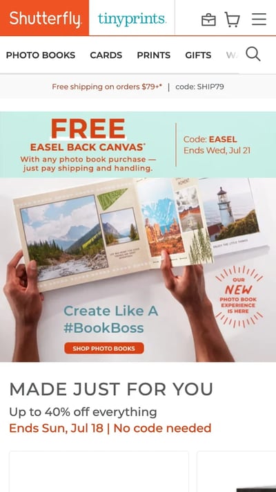
Scroll down and you'll see large buttons that make it easy for users to quickly select which type of product they're interested in. Once users click through to one of those options, they're greeted with large photos showcasing what Shutterfly is capable of for easy browsing.
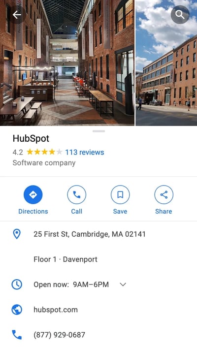
2. Google Maps
Why it works: The mobile website for Google Maps brings the same functionality, visuals, and performance as its mobile app counterpart.
Everyone has their favorite map or directions application. Mine is Google Maps, which I use whether I'm walking, driving, biking, or taking public transportation. What's special about its mobile website is that it's virtually indistinguishable from their downloadable mobile app.
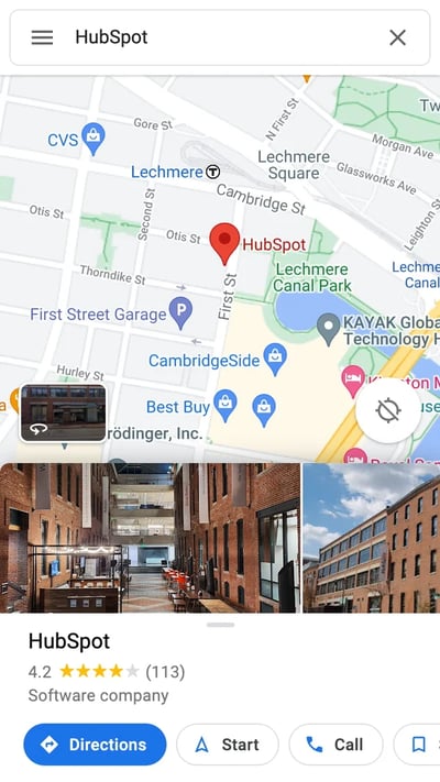
These screenshots below are taken of their mobile website, but if you're familiar at all with the app, you'll notice they look exactly the same. Not only is the appearance identical, but the mobile website has the speed and functionality of the app.
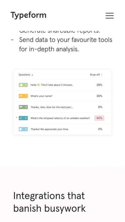
3. Typeform
Why it works: Type form simplifies their mobile website to improve load times and deliver a simpler user experience.
Typeform is a Barcelona-based tech company with one simple mission: to "make forms awesome." Their desktop website is beautifully designed, greeting visitors with succinct copy, relevant animations, and other complex design components.
But for mobile users, Typeform recognized that this complex design could significantly affect page load time, among other difficulties. That's why they actually removed many of them, decluttering the site and simplifying the overall mobile experience. The mobile site is a simpler version of the desktop website, and it's still beautifully designed.
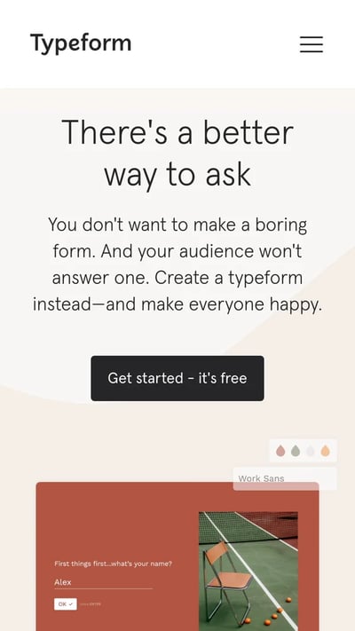
Take note of the large buttons on their menu page -- perfect for tapping with your finger on a mobile screen.
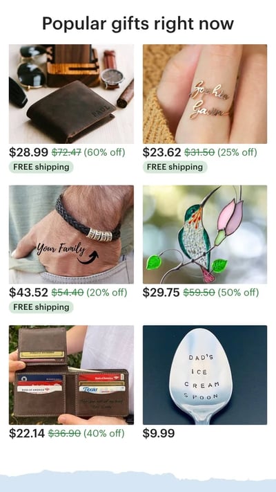
4. Etsy
Why it works: This mobile site pushes its most important features — site search, item categories, and trending products — on the homepage while avoiding clutter.
Etsy is an ecommerce website where people can buy and sell vintage or handmade items. Most buyers who visit Etsy's website are there to do one of two things: Either they're searching for a specific item, or they're browsing items in categories that interest them.
The mobile website caters to both types of visitors from the very beginning. When you first go to their mobile website, you're greeted with an option to search for specific items, shops, or categories.
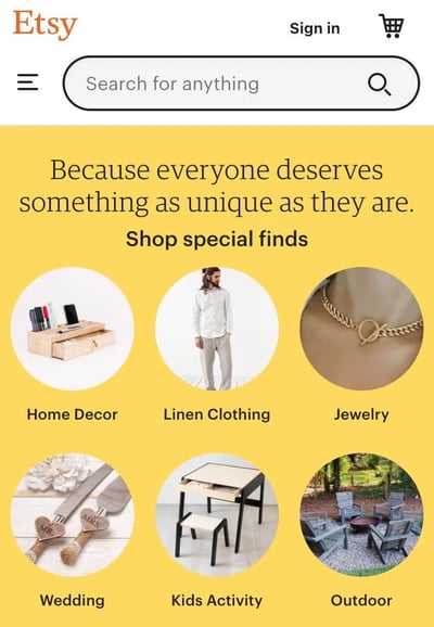
Immediately below are thumbnail images of trending items that showcase some of the most popular things you can buy on Etsy. Mobile users can view these trending items in a collage format, and the images are large enough to easily tap with a finger.
5. Adrian Zumbrunnen
Why it works: Adrian Zumbrunnen takes a unique approach to the personal website, creating an experience that is entirely tailored for mobile users.
This is the personal website of Adrian Zumbrunnen, a UX designer, writer, and speaker. When you visit his website, you'll notice right away there's something very unique about it: It's a conversational website.
Free Website Design Inspiration Guide
77 Brilliant Examples of Homepages, Blogs & Landing Pages to Inspire You
- Agency Pages
- Ecommerce Pages
- Tech Company Pages
- And More!
It almost looks like a text message conversation you'd normally have on your phone, including the ellipsis to show he's "typing." Users are given two response options at the end of every exchange, so it's akin to a "choose-your-own-adventure" experience.
While the mobile and desktop experiences are similar, the desktop website feels like it was made primarily for mobile — which could be the direction sites will go in the future.

And if you'd prefer not to engage in the conversation-like exchange, you can simply scroll down for details.

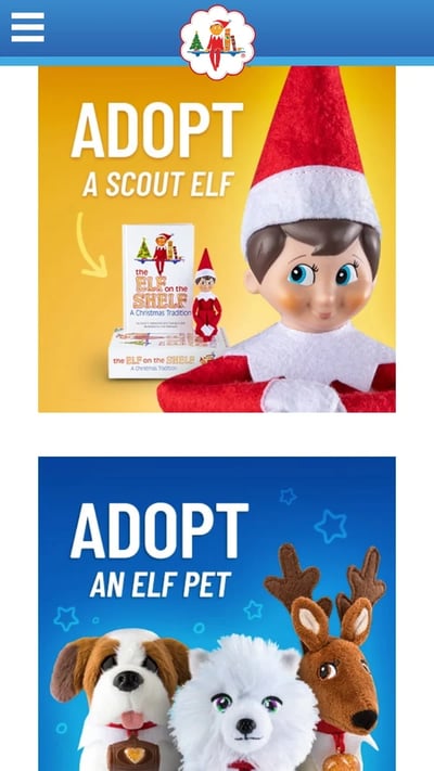
6. Elf on the Shelf
Why it works: The Elf on the Shelf mobile site makes its wide selection of products visible from the get-go and uses emotional, highly visual product displays to win visitors over.
Elf on the Shelf is, relatively speaking, a fairly new Christmas tradition based on a children's book. If you're unfamiliar, the basic premise is this: The book tells the story of Santa's scout elves, who are sent by Santa to watch over children in their homes all over the world and report back to Santa.
Parents can purchase an elf figurine, which they'll subtly place somewhere in their house where their kids can see it. Every night leading up to Christmas, parents move the elf to a different location around their house to "prove" that the scout elves are real and always looking over them.
When you arrive on Elf on the Shelf's website, you'll see there are actually numerous products you can purchase. But instead of forcing users to scroll through each product individually, the web designers package each product into a large, enticing tile describing the goal of each buyer's journey, with the featured item displayed on the front.
You're not buying your own elf or pup, you're adopting it. It's a truly empowering experience on such a small screen.
7. BuzzFeed
Why it works: BuzzFeed caters to its mobile users with a website that directs them to their topics of interest.
BuzzFeed is known for its viral content and popular quizzes. It also happens to be one of my favorite sources of entertainment during my commute to and from work.
And where do you think I'm checking BuzzFeed during my commute? You guessed it: my phone. BuzzFeed knows that a lot of their visitors are visiting their site on mobile, so they've taken great care to create a smooth experience for their on-the-go readers.
When you arrive at BuzzFeed's mobile website, the first thing you'll see is some of their most popular pieces of content displayed in a simple, collage-like format using large images that are easy to tap.

For users interested in specific categories, there's a menu at the top of the screen that lists out all the post categories. Each category has its own directory page with clickable filters along the top.

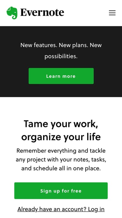
8. Evernote
Why it works: With a clear conversion path and clean design carried over from desktop, Evernote's mobile site makes clear what it does and how you can join.
Evernote is an application that allows you to store notes, images, and web articles and then access them across all your devices. Because users tend to download the app or access the website on multiple devices including desktop computers, smartphones, and tablets, it's essential that Evernote gets the mobile experience right.
If you look at Evernote's homepage on your desktop computer, you'll notice how clean the design is. The value statements are short and to the point, and the graphics add to the brand's positioning but don't clutter the page.
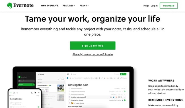
When you look at Evernote's mobile website, you can see they've kept their color palette and general brand style entirely intact. The company's mobile website is clean, simple, and doesn't detract at all from the value of the app. Evernote's conversion path is obvious from the centered call-to-action: "Sign up for free."
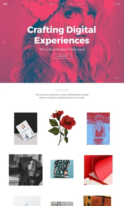
9. Pixelgrade
Why it works: Pixelgrade's WordPress themes are mobile-friendly, minimal, and sleek. Specifically, the Pile theme is perfect for WordPress portfolio websites.
Pixelgrade's Pile theme allows you to properly showcase your services and previous work and doesn't sacrifice mobile design. The theme is optimized for mobile devices while delivering on your content's intended message and aesthetic at the same time.
10. Huffington Post
Why it works: The well-known publication condenses its content to better fit mobile screen dimensions and serve readers on the move.
The Huffington Post is a news outlet that reports everything from politics and current events to entertainment and technology. What makes their mobile website unique is that they actually alter their headlines slightly for mobile users so their content is more easily scannable.
If you compare the desktop versus mobile websites, you'll notice that the mobile website has fewer words on the homepage. The headlines are shorter and much more digestible -- perfect for someone skimming or reading on a small screen.

There's also a clickable menu in the top left-hand corner of the screen listing out all the post categories.

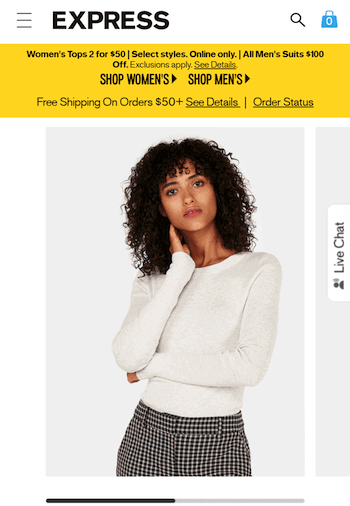
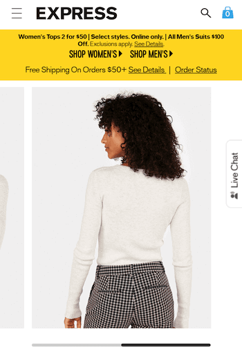
11. Express
Why it works: Express cleverly utilizes images to create a more realistic product viewing experience — users simply swipe to view products from different angles before committing to a purchase.
Free Website Design Inspiration Guide
77 Brilliant Examples of Homepages, Blogs & Landing Pages to Inspire You
- Agency Pages
- Ecommerce Pages
- Tech Company Pages
- And More!
Express is a clothing store that caters to young men and women. Because their audience often comes to their website to browse clothing, it's important for their website to include big, clear images of their clothing — especially on mobile devices, when users will need to tap items on the screen with their fingers to click through for purchase information.
Express takes its mobile experience a step further than most online retail sites. If you slide your finger from left to right across an image showing a piece of clothing, the image will change so you can see the clothing in a different view. In other words, users don't have to load another page to see multiple pictures of the same article of clothing.
Look at the image on the top right in the following two images to see how it changes when you swipe to one side:
12. Nationwide Insurance
Why it works: This mobile site serves two different types of clientele and divides its mobile website accordingly. Whether you're an individual or a customer, it's clear where you should go.
Nationwide Insurance provides insurance and financial services. You might think a financial company would have a complicated website, but on mobile, Nationwide Insurance nails the simple user experience.
When you arrive on Nationwide's mobile site, you'll see two tabs at the top allowing you to identify as one of two types of users right away to customize your experience: Personal or Business. Or, alternatively, you can "Find an Agent" or "Find a financial advisor" to learn more information about their services.
Although limiting the experience to these two options excludes Nationwide's more in-depth features, it makes for a much easier experience for visitors using small screens. This is a great technique to lead potential customers in the right direction if they're not yet account-holders and are visiting the website for the first time.
.webp?width=400&height=711&name=mobile-website-design-examples-nationwide%20(1).webp)
13. Squaredot
Why it works: This mobile site nails the color palette, font choices, and interactive elements on the homepage. It's simple, engaging, and playful.
Squaredot is an agency based in Dublin, Ireland that helps marketers build out their inbound marketing strategies. Their mobile website is colorful, simple, and makes for easy navigating.
What sticks out to me most is the visually pleasing color combinations as well as the large clickable menu that expands to reveal each of the organization's services.

Farther down the page, there are entirely swipeable regions. The one pictured below presents client success stories and adds another dimension to the mobile site.
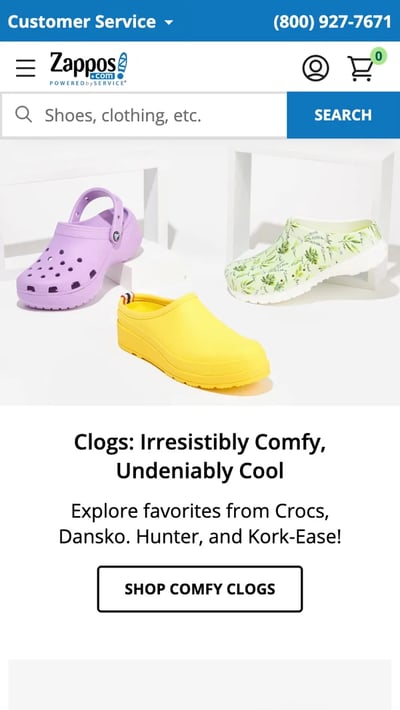
14. Zappos
Why it works: The Zappos mobile website is very easily searchable, which is critical given its huge inventory. The latest offerings are also clear on first page load.
Zappos is an online vendor for shoes and clothing known for its stellar customer service. Their top priority on mobile is to help users search easily for the items they're looking for on their website, so they've put a large search bar at both the top and bottom of their mobile website to make it super easy for them.
This is what the top of their mobile site looks like:
15. ABC
Why it works: This mobile site's dark theme is a contrast to many other popular mobile sites, bringing a theater-like feel to the experience. The highly navigable pages help viewers find their content of choice or simply browse.
ABC is a television broadcasting company known for popular shows like The Bachelorette, The Rookie, and General Hospital. Users visiting ABC's desktop website are greeted with these options and more. View the network's television schedule, check out the most recent Emmy winners, watch some of your favorite television shows, or even look at entertainment news relating to those shows.
But because nearly every household today is a multi-screen household, ABC knows its experience on a mobile device should be both simple and ready for viewing.
When you visit the ABC website on a mobile device, you'll see a dark background for a theatre-like experience with tiles for each program you might want to stream. Users can scan through these options and click into any show they want based on genre, alphabetical order, what's popular, and similar categories you'd also find on your TV's streaming platform.

16. Lean Labs
Why it works: Lean Labs utilizes fly-in animations and distinct content sections to tell a story as users scroll down.
Lean Labs is a marketing agency that creates engaging, responsive, and high-conversion web solutions. (They were also featured on the hit TV series Shark Tank.) The folks there do a great job of providing a smooth experience for mobile users, especially with regard to their design techniques.
Notice how Lean Labs' mobile website uses scale, contrast, and typeface to distinguish certain elements of their page. It even incorporates fly-in animations for its images to enhance the scrolling experience.
17. SAP
Why it works: Despite its plethora of offerings, SAP reigns it in on its mobile website and simplifies its CTAs and menus.
SAP is an enterprise software company that manages business operations and customer relations. The business enhances its mobile experience by condensing information and combining some of their calls-to-action into sliders, whereas their desktop website has these CTAs laid out horizontally.

This helps keep things simple so mobile users aren't overwhelmed with a lot of information at once, and it also ensures none of the CTAs are too small to read.
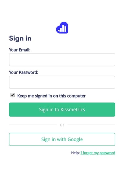
18. KISSmetrics
Why it works: KISSmetrics uses color to separate content sections from each other and to create prominent CTAs that stick out, even on smaller mobile screens.
Free Website Design Inspiration Guide
77 Brilliant Examples of Homepages, Blogs & Landing Pages to Inspire You
- Agency Pages
- Ecommerce Pages
- Tech Company Pages
- And More!
KISSmetrics provides analytics software for businesses. On their homepage, there's a lot of information explaining what the software does along with a testimonial.
But their mobile site is displayed a little differently: On a mobile device, the information on their site is shown in a list with alternative dark and light modules. This makes it easy for users to skim the page without getting lost in text.

They've also made the text and fields on their forms large and easy to read:
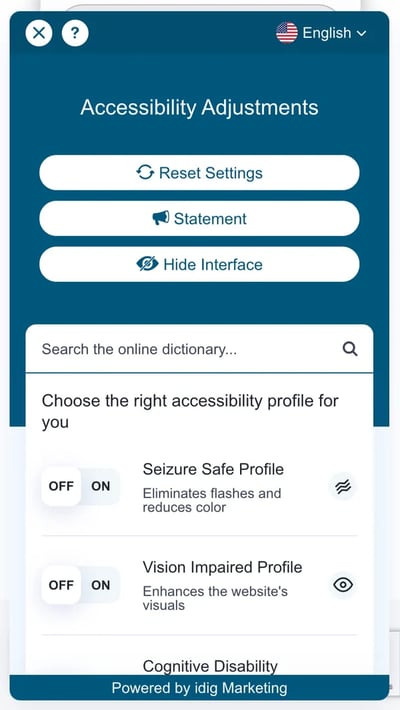
19. idig Marketing
Why it works: idig prioritizes accessibility on its website, presenting a sticky accessibility menu where users can adjust various display options.
idig Marketing is a development and communications provider. Their mobile website is laid out similarly to their desktop website, but I especially liked the readily available accessibility options menu on the right side of the screen.
Tapping this blue icon reveals a menu where users can adjust settings like enhanced visuals.
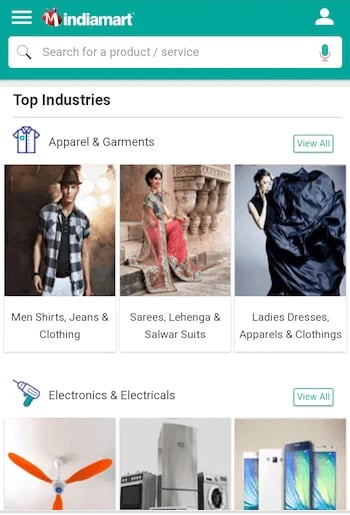
20. IndiaMART
Why it works: This company's mobile website is both conveniently browsable and searchable, depending on what visitors are looking to do on the site. It displays trending items prominently as well.
IndiaMART is the largest online B2B marketplace in India, and its simple category-based mobile store makes it one of the best mobile websites we've ever seen in the ecommerce industry.
The company's mobile homepage puts the search bar right at the top so you can always retreat to a custom search if browsing no longer suffices to find the item you're looking for.
But, IndiaMART makes it easy to peruse its digital aisles by sorting each item by item type, and then sub-types within each item type -- a smart design move to encourage users to explore your site further. Under "Apparel & Garments," for example, you have easily clickable tiles to check out more specific categories of clothing, such as menswear, women's dresses, and even suits, sarees, and similar garb native to India.
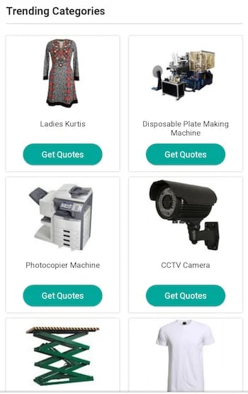
Underneath IndiaMART's browsing tiles, the company has its own trending section specifically for merchandise people are paying most attention to -- similar to a trending list of news on a social media platform. Each trending category has a mobile-friendly call-to-action button allowing users to get price quotes for the product they're interested in.
21. Pipsnacks
Why it works: Finally, the mobile website for Pipsnacks doesn't sacrifice its visuals for smaller screens. Even on your smartphone, you're immersed in the snack food company's lighthearted branding.
To close out our list, Pipsnacks brings the vibrant colors and textures of their desktop site to the mobile screen. Products are listed as large, clickable images that bring you to their respective product pages, and the mobile site is enhanced with minimal but effective animations that add to the experiences without hurting load time.

Mobile Websites to Inspire Yours
These days, having an effective mobile website isn't just a nice perk — it's a necessity, at least if you want to rank in search results and get found. If you neglect your mobile site, that might just put off half your audience.
Fortunately, today's website builders and platforms let anyone make a site that's both desktop-ready and mobile-friendly. But, it's the little details you add on top that will make yours truly exceptional.
Want more information on how to optimize your business with a creative mobile web design? Download the free kit on mobile marketing below.
Editor's note: This post was originally published in October 2018 and has been updated for comprehensiveness.


![Why You Need a Responsive Web Design and How to Do It [+ Examples]](https://blog.hubspot.com/hubfs/responsive-web-design-1.jpg)


![The Definition of Responsive Design [In Under 100 Words]](https://blog.hubspot.com/hs-fs/hub/53/file-597040093-jpg/Blog-Related_Images/Homepage_Images/responsive-design-1.jpg)