
How to Optimize Your Emails for Mobile in Five Steps
1. Leverage responsive email design.
Let's kick off with the superhero of mobile optimization for emails: responsive design. Responsive email design means to ensure that your emails are adaptable regardless of the email client, or in this case, screen size that they are viewed on.
Mobile preview features are a crucial tool in the realm of responsive design. This feature allows you to get a sneak peek of how your email will appear on various devices before hitting the send button.
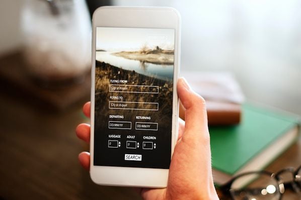
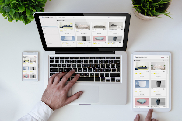
For instance, if you have a promo email featuring a variety of cool products, on a desktop, it might arrange them side by side, looking snazzy. However, on a mobile device, it seamlessly transforms, arranging them in a single column for easy scrolling.
No fuss, no mess — just a smooth, engaging experience that keeps your readers hooked. The mobile preview feature lets you fine-tune these adaptations, ensuring your email looks polished and performs optimally across all devices.
2. Employ a simple layout.
Mobile screens are akin to cozy studio apartments—limited space demands a clutter-free approach. To achieve an effective mobile email design, consider the following key elements:
- Clean, Uncomplicated Layouts: Think of your email as a well-organized bookshelf. Opt for a single-column layout, akin to neatly aligning books in a row. This simplicity makes it easy for readers to navigate without getting lost, providing a clear roadmap for a seamless experience.
- Embrace White Space: White space is your best ally in the mobile design world. It offers your email breathing room, preventing it from feeling cramped. Creating space around elements enhances readability and overall visual appeal.
- Clear Hierarchy: Establish a clear hierarchy using different font sizes and formatting. This acts as a guide, directing readers' eyes smoothly through your content. Picture it as the GPS that keeps them on track, ensuring a focused and enjoyable reading experience.
By incorporating these principles into your mobile email design, you create a user-friendly and visually appealing experience, enhancing engagement and readability across various devices.

3. Always prioritize concise copy.
Now, we get it; sometimes, there's much to say. You want to share all the good things coming to your brand, product line, or improvements, but remember your users are on the move.
It's said that we have 8 seconds to catch our reader's attention, and this becomes especially important for mobile users who have, at any given moment, 15 other apps to rush to. Your copy needs to be quick, snappy, and easy to scan.
Short and Punchy Subject Lines: Use short subject lines that get straight to the point. For instance, “50% Off Today Only!” is way more effective than a long-winded explanation. Why does this work?
- Quick Grasp: The subject line provides instant information. Readers know there's a limited-time offer and the discount percentage, encouraging them to open the email promptly.
- Urgency and Exclusivity: The phrase “Today Only” adds a sense of urgency and exclusivity. Mobile users are more likely to take immediate action if they feel they might miss out on a special deal.
Example of a Subject Line that Doesn't Work: Consider a subject line like "Our Latest and Greatest Products Unveiled - A Detailed Look at What's New and Exciting in Store for You Today!"
- Issue: This subject line is too long and lacks immediacy. Mobile users, in their rush, may not engage with such a lengthy and vague message.
- Lost Attention: The key information, such as what's new or exciting, gets lost in the verbosity. Users might not grasp the urgency or importance of the message in the brief time they dedicate to scanning emails.
In the email body, think of bite-sized content. Break your message into short paragraphs or bullet points. Mobile users often skim, so make sure the important stuff stands out. Use bold headers to break up content that guides readers to the good stuff (and eventually to take action).
4. Optimize your images and graphics.
Images and graphics are like the icing on your email's cake. But here's the catch: big image files can slow your email's loading time on mobile. In today's fast-paced digital world, a slow-loading email usually means a deleted email.
Image Optimization: The Key to Swift, Engaging Emails
Image optimization involves compressing files without sacrificing quality. This reduces the file size, making sure your email loads lickety-split on mobile.
But it's not just about speed; it's about being inclusive. Alt text for images helps visually impaired readers understand your images. Being inclusive isn't just a feel-good move; it also expands your email's reach.
How Image Optimization Enhances the Mobile User Experience
Consider you're a restaurant owner promoting a special holiday menu through an email campaign. Your email features mouthwatering images of festive dishes you want to showcase in all their glory. Here's how image optimization can enhance the mobile user experience:
Efficient Loading
- Without image optimization, your high-resolution images might lead to slow-loading emails on mobile devices.
- Users may abandon the email before even seeing your delectable dishes.
- By optimizing these images, you ensure that your email loads swiftly, captivating readers from the moment they open it.
Alt Text for Descriptive Clarity
- Each image in your email, whether a succulent roast turkey or a decadent dessert, deserves a thoughtful alt text description.
- This description is like a chef's recommendation that enhances the dining experience.
- For example, “Roast Turkey with Cranberry Glaze and Herbed Stuffing” provides a vivid mental image for all recipients, including those with visual impairments.
Balancing Quality and File Size
- Image optimization strikes a delicate balance between visual quality and file size.
- It's akin to presenting your culinary creations on elegant plates.
- You want them to look exquisite, but you also want to ensure they reach the table promptly.
- Optimization achieves this balance, ensuring that your images are both visually appealing and mobile-friendly.
By optimizing images in this scenario, you not only entice readers with your holiday menu but also ensure that their mobile experience is smooth and enjoyable.
5. Have clear call-to-actions.
Your call-to-action (CTA) is the heartbeat of your email. It's the button that guides your reader to take action, whether it's making a purchase, signing up, or learning more.
When designing for mobile view , CTAs must be clear, touch-friendly,and enticing.
Using large buttons with your brand colors to makes them pop on a mobile screen, like a neon sign in a dark alley.

Placement of you place your CTA matters; ensure plenty of space around it to prevent accidental taps on other elements.Let's dive into an example. Suppose you run an online fitness coaching business, and your email aims to encourage subscribers to sign up for a free trial of your workout app.
Here's how you can optimize your CTA for mobile:
Clarity in Copy: Your reader should never be confused on what steps to take next. The text on your CTA button should leave no room for ambiguity. Instead of a vague “Click Here,” use specific language like “Start Your Free Trial.” Mobile users appreciate clarity; they want to know precisely what will happen when they tap the button.
Color Contrast: Ensure the CTA button stands out from the rest of the email. If your email predominantly uses one color in your brand kit, try using another brand approved color for the CTA. This contrast makes the button visually compelling.
Strategic Placement: Position the CTA where it naturally fits in the email's flow. For instance, if your email explains the benefits of your workout app, place the CTA just below this section. Guide readers to take the next step after highlighting the app's advantages.
Touch-Friendly Size: Remember that mobile users interact with their screens using their fingers. Make your CTA button large enough to be easily tapped. An ideal size is around 44x44 pixels, ensuring a comfortable and accurate touch target.
By optimizing your CTA in this manner, you're more likely to see a higher conversion rate. They'll appreciate the straightforward approach and find it easy to take action.
The Future Is Here, and It's Mobile
While optimizing emails for mobile can be a complex task, tools like Beefree can help simplify the process. With its Mobile Design Mode and extensive library of responsive email and landing page templates, Beefree allows you to create stunning, mobile-optimized email designs without needing to code.
Additionally, you might consider testing out HubSpot's new AI email writing assistant to ensure you're creating high-quality, engaging content within your emails.
Mobile optimization is not just a nice-to-have; it's a must in today's mobile-centric world. By implementing responsive design, simplifying your layout, writing concise copy, optimizing images, and crafting clear CTAs, your emails will survive and thrive in the mobile era.
Whether you're just starting or looking to improve your current email campaigns, remember to use all the resources and tools available. Remember, the goal isn't just to make your emails look good on mobile. It's about delivering value to your audience in a way that suits their habits, preferences, and needs. Embrace the mobile revolution and take your email campaigns to new heights.

Mobile Optimization


![10 Best Mobile Friendliness Tests [+ What Does it Mean to be Mobile Friendly?]](https://53.fs1.hubspotusercontent-na1.net/hubfs/53/mobile-friendliness-test.jpg)