1. Email CTAs get an average click-through rate (CTR) of 3-5%. (Databox)
CTAs are the bread and butter of email marketing. Over the last few years, the Databox team discovered that email CTAs got an average click-through rate of 3-5% for over 40% of their contributors.
 Image Source
However, this doesn’t imply that surpassing the 5% CTR is impossible. Although challenging, over 15% of Databox’s contributors mentioned that email CTAs helped them achieve a click-through rate of more than 10%.
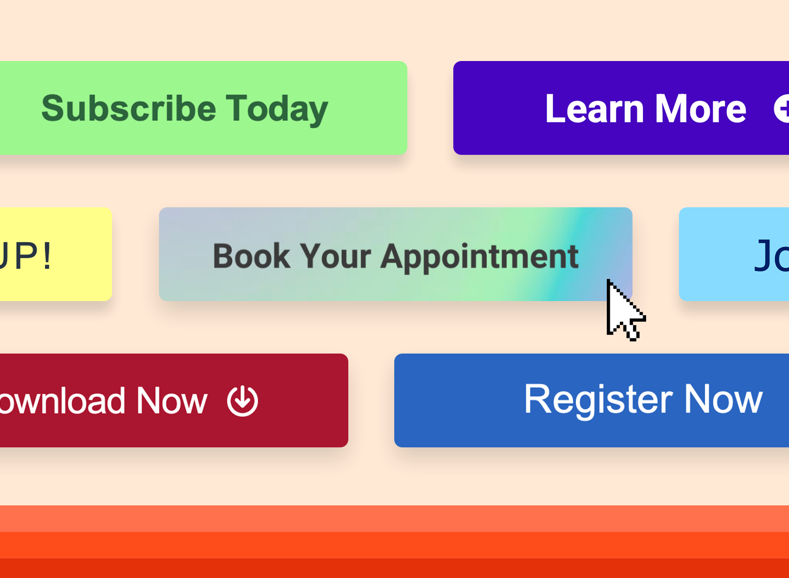
2. 43% of marketers use only one CTA per email, whereas 30% use two per email. (Databox)
If your first instinct is adding as many CTAs to your emails, you need to rethink your strategy. According to Databox’s findings, more isn’t always better.
Of marketing respondents, 43% mentioned using only one CTA per email. On the other hand, 30% said that they use two CTAs per email.

A similar finding by Wordstream indicates that emails with a single call-to-action can increase clicks by over 371% and sales by around 1617%.
Last, Omnisend’s analysis of 229 million emails sent during the Black Friday to Cyber Monday period revealed that emails with three or more CTAs have lower click-through rates than emails with less than three CTAs.
28 Free Call-to-Action Templates
Increase website conversions with these free templates.
- Bottom-of-Post CTAs
- Form Button CTAs
- Sidebar CTAs
- And More!
Download Free
All fields are required.
Form not available
3. Personalized call-to-actions perform 202% better than basic CTAs. (HubSpot)
After analyzing and comparing more than 330,000 CTAs over a six-month timeframe, we discovered that personalized CTAs convert 202% better than basic CTAs.
 That’s because, when it comes to personalized CTAs, you’re putting content in front of your audience that aligns with their buyers’ journey and resonates with their interests.
With HubSpot's CTA tool, you'll be able to tailor CTAs to each visitor.
Get started with HubSpot's CTA tool
Get granular by personalizing CTAs to anonymous and first-time site visitors based on location, device, referral source, or language.
4. Customers are 16x more likely to share news about their purchase on social media if they see a CTA button on the post-purchase page. (Digital Oasis)
There’s nothing better than customers spreading the word about your business. And if you want to encourage customers to share news about their latest purchase on their social media handles, ensure they can do so within a few clicks.
Embedding a CTA button on the post-purchase page can be highly effective. Customers are 16x more likely to share news about their purchase on social media if a CTA on the post-purchase page asks them to do so.
It’s a great way to encourage customers to spread the word about your business.
5. The red CTA button consistently outperforms the green one. (CXL)
The color red is often associated with negative emotions. Despite that, red CTAs outperform green ones consistently.
CXL covered this comprehensively in one of their articles, where they referred to several studies, including ones conducted by Dmix and HubSpot (that’s us), and VWO.
But don’t go painting your CTA buttons red just yet.
What if the red CTA button looks forced on your landing page? What if it doesn’t go well with the design? That’s why it’s critical to consider the page's visual hierarchy.
6. Michael Aagaard, a conversion optimization consultant, increased the conversion rate of a long landing page by a staggering 304% by placing the CTA button at the bottom. (CXL)
In marketing, the golden rule is to position your call to action above the fold. However, that shouldn’t always be the case, as having only one CTA at the top of the landing page may be too early for the user to take action.
Huge, in one of their reports, mentioned that regardless of the design cues, almost 91-100% of people scroll beyond the fold.
There’s very low engagement at the top of the page, so having just a single CTA at the top of the page may not be the most effective strategy for driving conversions.
Michael Aagaard, a freelance CRO consultant, loves experimenting with call-to-actions. In one of his experiments, he placed the CTA button at the bottom of a very long landing page.
.webp?width=818&height=653&name=cta-stats-cxl%20(1).webp)
Doing this helped him increase the conversion rate by a staggering 304%.
However, it’s important to note that what worked for Michael won’t necessarily work for you. As with all things in the conversion optimization world, testing different variations of CTAs yourself is highly recommended.
7. PartnerStack increased its conversion rate by 111.55% after tweaking its homepage CTA copy from “Book a Demo” to “Get Started.”
PartnerStack, a partner ecosystem platform, managed to increase its conversion rate from 6.66% to 14.09% (+111.55%) by tweaking its homepage CTA copy from “Book a Demo” to “Get Started.”
Before:

After:

Joe Kevens, director of demand gen at PartnerStack and Founder of B2B SaaS Reviews mentioned:
“My best guess as to why ‘Get Started’ delivered better results than ‘Book a Demo’ is that ‘Get Started’ feels like we’re trying to help our customers solve their problem, whereas ‘Book a Demo’ feels like we’re trying to get them into a sales cycle.”
By tweaking its CTA copy, PartnerStack shifted its focus from a sales-driven approach to a customer-centric one.
8. Grow & Convert conducted a comprehensive study on conversion rates of an email capture form across different locations on a landing page (Grow & Convert).
Recently, Grow & Convert explored and estimated rough conversion rates by placing email capture forms across different locations on a landing page. See results from the study below.
Placement |
Rough Conversion Rate |
|
Sidebar CTAs |
0.5% – 1.5% |
|
Generic end of post CTAs |
0.5% – 1.5% |
|
Pop-ups |
1% – 8% |
|
Sliders and bars |
1% – 5% |
|
Welcome Gates |
10% – 25% |
|
Featurebox |
3% – 9% |
|
Navbar |
Varies |
9. Including social proof under its landing page CTA helped Augmentive increase its conversion rate by 68%.

Ryan Scollon, a freelance PPC consultant and CRO specialist, implemented a simple review widget under Augmentive’s landing page call-to-action button.

After a few weeks of testing, it was clear that including social proof under their landing page CTAs contributed to the increase in conversion rate by 68.02%.
This indicates that adding social proof below your call-to-actions can be a great way to build trust.
10. Including doubt removers under CTAs helped Nomad Cooks increase their conversion rate by up to 124%.
Including doubt removers under call-to-action buttons can be a game-changer.
If you’re wondering what a doubt remover is, it’s a small piece of text below a call-to-action button to remove any concerns or potential points of friction that may be stopping your audience from taking the desired action.
It can also be a great place to mention the emotional benefits of your product/service.

After implementing doubt removers under call-to-actions, Nomad Cooks witnessed increases of up to 124% in conversion rates, with the original conversion rate of 9.5% jumping up to 21.3% over four weeks.
11. CTAs surrounded by less clutter and more white space can increase conversion rates by 232%. (VWO)
As reported by VWO, Open Mile witnessed a whopping 232% jump in conversions after removing the clutter and adding white space around their landing page CTA.
Removing distractions and unnecessary elements from the surrounding area around your CTA can help create a sense of clarity and focus.
12. Getting rid of the email field helped Kommunicate increase clicks to their CTA button by 25.5%. (VWO)
With people being picky about who they share their emails with these days, removing the email submission field from your CTA button is advisable.
Kommunicate did the same.

As reported by VWO, Kommunicate witnessed a 25.5% increase in clicks on their “Try for free” CTA after removing the email submission field from the CTA button.
13. Switching from text-based to button-based CTA and making it more visible helped The Vineyard increase their CTR by 32.12%. (VWO)
The Vineyard, a luxury hotel based in the UK, wanted to increase the number of people visiting their room booking page.
Initially, their call-to-action was in text-based format and hidden at the bottom of their page, making it very hard to be noticed by potential customers and visitors. So, they decided to make the CTA more visible by:
- Switching to button-based CTA.
- Moving it up, making sure it’s more visible.
Before:

After:

This slight change helped the Vineyard team increase click-through to their room booking page by a staggering 32.12% - which is an impressive number.
14. Making their CTA button larger and darker helped Demio increase its conversion rate by 57.79%.
Demio helps businesses create, manage and launch live, recorded, and automated webinars.
In February 2023, the Demio team implemented a test on their thank you page, which is put in front of people after they attend a webinar or event hosted on Demio.
They made their CTA larger and darker for the variant. They ran an A/B test for 13 days, and the results were incredible.
The original version had a 1.59% conversion rate, whereas the variant had an impressive 2.53% conversion rate. Ultimately the variant had a 57.79% higher conversion rate than the control.
 This is another case of making your CTA button easily noticeable and visible.
15. Adding a human touch to their CTA copy helped Mailmodo more than 2x their conversion rate.
The Mailmodo team has been experimenting extensively with their CTAs to improve their conversion rate. Recently, the team changed the generic “Book a demo” on the brand's homepage to “Talk to a Human,” which delivered impressive results.

Mailmodo witnessed a 110.35% increase in conversion rate, from 0.29% to 0.61%. Tarun Agarwal, VP of growth at Mailmodo, mentioned, “I believe adding a human touch to your CTAs tends to work better than using transactional copies.”
In short, it’s a good practice to level up your marketing game by switching your focus from the same-old transactional and generic CTAs and giving them a human touch.
Crafting the Perfect CTA
A well-crafted and implemented CTA can distinguish between a visitor bouncing off your website or taking the desired action. The tiniest details can have a severe impact, whether it’s the color, placement, or text.
By taking the fifteen CTA statistics mentioned in this post as inspiration and with continuous testing and optimizing, you can significantly craft effective CTAs that’ll help you improve your click-through and conversion rates. HubSpot's free CTA tool can lead you to your conversion goals.

Conversion Rate Optimization