Every industry has its buzzwords, and web design is no different. If your head is spinning from seemingly endless jargon, or if you’re getting ready to redesign your company website and want to inform yourself on the most common technical terms in modern web design, then this is the list for you.


Here are 37 of the most popular technical terms and buzzwords we hear (or use) as we do website redesigns, organized from A to Z. Do you see one you’ve heard lately on this list?
"Above the Fold"
Ironically enough, “above the fold” is a term taken from newspaper design. If elements of your website are “above the fold,” then people don’t have to scroll down to see them.
Just like in newspaper design, most designers will put the most important information above the fold. This term has lost a lot of relevance in modern web design, though, because the “fold” is almost never in the same place because of different screen sizes and resolutions.
Analytics
Analytics is a term that refers to numerical tracking of your website visitors. With analytics, you’ll be able to see how many people are visiting your website, which pages are most popular, where people visit from geographically, and much more. Analytics will tell you what is happening on your website, but not why.
Backend
A website “backend” (pronounced “back end”) is a way to refer to a website’s content management system or server. This is where you log in and make changes to your website’s content or pages, write blogs, or review form entries. “Backend” code handles technical things like redirects for pages that are no longer on your website or your website’s templates.
Browser testing
Once a designer turns a mockup into a template using code, the template has to be tested because there are literally hundreds of web browser combinations. You may not know that all of the combinations of operating systems and browser versions can render websites very differently.
Throw in different mobile devices and platforms, and, well, that’s a lot of testing. Before your new website is made public, it has to be tested with different browsers to ensure it will show up properly.
Call to action (CTA)
Call to Action, or CTA, is a button, graphic or text link that encourages your visitor to take an action. This might include subscribing to your blog, signing up for monthly email updates, or requesting a product demo.
Content Development
Creating a graphic design for your website is only part of a website design project. Writing content is also a significant and often overlooked part of the website redesign process.
Content development can refer to coming up with words and narratives for your website that communicate your unique selling proposition and your products’ or services’ benefits in a way that your target market will respond favorably to. It can also mean creating video content, infographics, or other forms of information that your visitors will want to consume.
Content Management System
A content management system, or CMS, is a program that lives on a web server. Its function is essentially twofold. First, it allows you to log in and make changes to your website, usually with little or no code knowledge.
Second, it stores that content in a database and combines it with web template files to create web pages that make up your website. We wrote a 2-article series on how to choose a content management system that’s right for you if you are considering a new content management system during your website redesign.
Conversion Rate
Conversion rate is an incredibly important metric to understand your website’s effectiveness. It’s the number of visitors divided by the number of leads or contacts you receive from the website. The higher your conversion rate, the fewer visitors you need to get the same number of leads.
Designers care about creating your website to “convert” as many visitors as possible into leads or sales. The process of optimizing your website for better conversion is called Conversion Rate Optimization (CRO).
CSS
CSS stands for Cascading Style Sheet, which is a file that dictates how things will be displayed on your website. Contained in these files are information about font color, font size, page margins, backgrounds and much more. CSS files are “called” by HTML files to tell your web browser how things should be arranged on screen.
Customer Personas
Customer personas are detailed descriptions of your ideal customers. They are fictional representations, but represent a segment of your target market. Customer personas may contain information like demographics, goals, challenges, frustrations, key marketing messages, common quotes, what they read, where they work, where you can find these people, and much more.
They are created to help designers and writers understand the key messages for your website redesign, and what things matter most to your target audiences.
Domain Name
Domain name is your website address, most commonly ending in .com, .net or .org. You purchase domain names through a domain registrar, and these domain names point to web servers that contain your website.
A domain name is essentially a memorable “shortcut” to your website, because without it, people would need to know a series of numbers (called an IP address) to visit it.
Flat Design
Flat design is a type of website design characterized by the lack of shadows, bevels and gradients. Flat design is often minimal, clean and simple. These designs will not look 3-D or have shadows.
The opposite of flat design is called “skeuomorphic” design, which is designing to make things look 3-dimensional with shadows, bevels and gradients of color.
Front End
A website’s front end is the part of the website that you’d see when you visit a website on a computer or mobile device. When a designer “creates the front end,” they are essentially creating graphic designs or coding those designs in HTML and CSS.
FTP
Short for File Transfer Protocol, FTP is how a designer connects their computer to the web server to transfer files that will ultimately run your website.
Grid System
A grid system is simply a structure of pages on your website, comprised of columns and rows. They are used to lay out and align web page content to make it more readable and manageable.
Hosting
Hosting, or “web hosting,” is the method of making your website available to the public on a web server, a computer that’s always hooked up to the Internet. You’ll need web hosting to make your website available to the public, and you’ll have the choice between “shared hosting,” “managed hosting,” or “dedicated hosting.”
Shared hosting is the least costly but requires sharing a server with other companies. Managed hosting means that a hosting company has server engineers available to manage your server for you. Dedicated hosting means that your website or websites are on their own server, which is more secure.
HTML
Short for HyperText Markup Language, HTML is a simple web programming language that tells web browsers like Google Chrome how to render the words, pictures, audio and video on your web pages.
Infinite Scrolling
Infinite scrolling is a method of loading a web page on a visitor’s screen whereby content will load as you scroll down the page. This technique can present more information on a page without requiring someone to click a “next” button.
It can also speed up the time it takes pages to load since the web browser doesn’t have to load the entire page of content at once.
Information Architecture
Information architecture sounds complicated, but it’s simply organizing and labeling your content. Information architects are people that take all of your website content and arrange it in a way that’s easy to find.
Included in that process are things like deciding what pages and sections will be called, how large or small sections should be, designing “paths” through your content to points where people would become leads, and deciding how pages should link together.
.webp?width=600&height=450&name=lina_ia%20(1).webp)
Jquery
Jquery is a JavaScript “library” that includes several commonly-used javascript functions. Jquery can be used for things like making sure your web forms are filled out properly or not left blank, creating complex animations, handling page transitions and much more.
Landing Page
The term “landing page” can have different meanings to different people. Some people call your homepage a landing page because that’s where people visit first. Advertisers may call a page on your website that people visit first a landing page.
From a marketing standpoint, a landing page is a lead-generating page -- a page that has a single purpose, which is to get someone to become a lead. People become leads by filling out forms, so a landing page will always have a form.
Lead Form
Lead forms are forms that can be placed on any page of your website. People fill out these forms to download something or to request information.
Localization
If you do business internationally, you’ll want to localize your website. More than just translating, localizing your website means that your designer will change messaging and photographs and cultural references to be more appropriate in the international markets you are targeting.
We recently wrote an in-depth article on website localization called “Website Localization: 7 Handy Tips For The Enterprise Website” that you can read to learn more.
Meta Tags
Meta tags can have many uses, but they are most commonly thought of in a search engine optimization context. The two types of meta tags that most people refer to are called “meta keywords” and “meta description” tags. Many think they influence your search engine rankings, but actually they don’t.
Mobile First
Mobile first is the mindset that you should design a website with the mobile experience in mind before you design for the screen. Here, a designer may first design a smartphone view of a website that contains just essential information, then a tablet view, then a screen view.
The mobile first methodology is the opposite of the “subtraction method” which is where a designer starts with a design for a computer screen then removes, or subtracts, lower priority things as the screen gets smaller.
Mockup
A mockup is a picture of how your website will look on a screen when it's finished. It’s not a working version of what you’ll see, just a picture of what it will look like. Mockups can be “high fidelity” or “low fidelity.”
High fidelity mockups will have exact wording, photographs and literally will be a picture of how your website will look when it's finished. A low fidelity mock up may have words or photographs for placement purposes only to show where certain elements will be placed on the screen.
Parallax Scrolling
Parallax scrolling is where a background image moves slower than the foreground image or text, creating an illusion of depth as a visitor scrolls down a page.
Photoshop
Photoshop is a computer program made by Adobe that is the industry standard for creating website mockups and designs. This program allows designers to easily create the graphics and page layouts that make up your website.
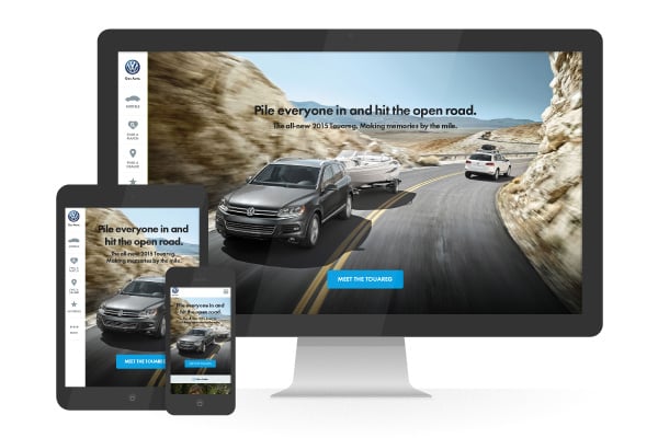
Responsive Design
Responsive design is a design and coding technique that makes your website mobile friendly. It enables your website to “respond,” or reformat itself, to the screen size it is being viewed on. Responsive designs are a must for modern websites because they make your website readable and usable on smartphones and tablets.
Without a responsive design, your website would appear miniature or compressed when viewed on a smartphone or a tablet, creating a less than optimal viewing experience for people on mobile devices. For a more detailed explanation, you may want to read this blog post or this blog post.
QA
Quality assurance, or QA, involves more than just testing your website on web browsers. Different features of your website have to be tested to ensure they work as intended.
Sometimes this involves a written test plan for a technically advanced website, but if you want your website visitors to be pleased during their visit, things need to be tested so they work as intended.
SEO
Short for Search Engine Optimization, SEO is the practice of optimizing your website and overall web presence (including social media) so that your business can be found on Google, Bing and other search engines.
Sitemap
A sitemap is an outline of how your website content will be organized. This can take the form of a Microsoft Word outline or an Excel document. It shows the high-level naming structure and hierarchy for your website and were each page will live under that structure. It also can show cross-linkages between related pages.
SVG
SVG stands for Scalable Vector Graphics, which allows code to create high resolution artwork on your website without loading graphics files, which speeds up the performance of your website. SVG can be important to websites with responsive design because at any size or resolution, these graphics remain sharp and clear.
Template
A template is code that tells your content management system how to render pages on your website. The website will probably be comprised of several templates since different pages may have different looks. The term “template” can also refer to a pre-designed website “theme.”
UI Design
User Interface, or UI, is a way to describe the page that visitors will see. When a designer does UI design, they are designing the pages that visitors will interact with. In simpler terms, UI design is all about aesthetics and layout.
UX Design
UX design, or User Experience design, is a strategic way to look at web design. UX design considers your visitor’s needs and abilities, the technology or device, as well as the ultimate goals that you want a visitor to take.
UX design put simply is making the “desired path” more prominent and relevant so a visitor will do what you want them to do, whether that’s navigating to several pages in succession, downloading something, or filling out a form.
Whitespace
Whitespace is the amount of padding or margin around key pieces of content on a web page including paragraphs and images. A cluttered website is the opposite of the website with plenty of whitespace.
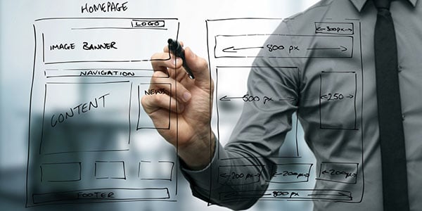
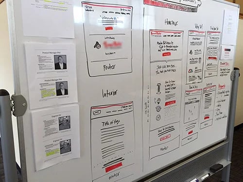
Wireframe
Wireframes are early stage designs that don’t include all the detail that a mockup would. Wireframes can be page layouts drawn on whiteboards like the ones shown here, or digital drawings with lines, boxes and words, but no photography or color.
The idea behind a wireframe is to organize content and the structure of pages before designing them graphically.
There you have it, 38 of the most common buzzwords that you’ll hear during your next website redesign.![Blog - Website Redesign Workbook Guide [List-Based]](https://no-cache.hubspot.com/cta/default/53/4b5bb572-5d0e-45b8-8115-f79e2adc966b.png)