.png?width=112&height=112&name=graphic-ads__1_-removebg-preview%20(1).png)

While most of us have a pretty good idea of what advertising looks like, we often struggle to nail down exactly what it means — and how to do it well.
From the printing press to pop-up ads, advertising has certainly changed with the times. Despite this, the need for advertising hasn’t changed, and neither have the techniques and best practices that make for quality advertising.
That’s what I’ll cover in this guide.
What is advertising?
Advertising is the act of creating messages and using different psychological techniques to persuade and motivate someone to take action, most likely to buy a product or service.
Advertising is one of the oldest types of marketing and aims to influence the actions of its audience to buy, sell, or do something else.
Good advertising is designed to be highly influential, memorable, and, at times, risqué.
But how does advertising work?
.png)
Free Advertising Planning Kit
Plan and launch an effective and profitable advertising campaign with this guide and set of templates.
- An Overview of Popular Advertising Methods
- The Pros, Cons, and Costs of Advertising Types
- A Planning Template to Outline Timeline, Budget, and Goals
- A Project Pitch Presentation Deck to Share With Stakeholders
Download Free
All fields are required.
How does advertising work?
Advertising has a simple principle — get people interested in a product being sold.
After arousing interest, the goal is to persuade people to purchase the product, even if they hadn’t previously considered buying it. Ads work by using psychology to influence the way people think and feel about a product or service.
Depending on the goals of your ad campaign, advertising can work for your company in a variety of ways:
- To raise awareness of your brand
- To drive potential customers to your business
- To promote sales for both new and existing products
- To introduce a new product or service to the market
- To differentiate your product from your competitors
Advertising can also be executed in various ways. Radio commercials, billboards, branded T-shirts, and social media endorsements all count as advertising, as we'll discuss later in this guide.
What are advertisers?
Advertisers are the people at a company who are responsible for advertising a product or service. They promote messages about a brand’s products and services to build public preference for the brand.
“Advertiser” can also refer to the entity that's paying for advertising on a billboard, in a magazine, or through a website or mobile application.
Advertisers are important because the whole business of advertising is dependent on them. It’s the advertiser that incurs the cost of advertisements, so if they decide it’s not worth running ads, then the advertisement industry will be in big trouble.
All advertisers are marketers, but not all marketers are advertisers. Let's dig deeper into the differences between advertising and marketing.
Advertising vs. Marketing
Marketing constitutes the big picture of how a company plans to raise awareness of its brand and convince customers to make a purchase. Advertising is the act of communicating messages around these broad goals.
Advertising is a subset of marketing, which is the umbrella term for communicating with your audience.
Marketing includes a number of different channels, such as:
- social media
- email marketing
- public relations
- SEO
- paid advertising.
Alternatively, advertising is just one component of marketing.
A company’s overarching marketing strategy will typically include an advertising plan. The advertising portion zooms in on the specific process of creating and publishing persuasive messages to get customers to take action.
Download our free advertising plan kit, which includes templates and a guide.
A Brief History of Advertising
Advertising is one of the oldest segments of business, save for currency and trade. Once products and services arose, so did the need to make them known.
A piece of papyrus from 3000 B.C.E. is widely considered the oldest confirmed piece of advertising — though calling it “advertising” obscures the horror and gravity of the circumstances. Technically, it was a print “ad” in ancient Egypt that offered a reward for the capture and return of an enslaved person named Shem.
Let’s fast-forward about 4,000 years. Here’s a brief look at the past five centuries of advertising:
1472: The first poster advertisement is placed on church doors in London.
1650: The first newspaper ad — a reward for 12 stolen horses — is published. (What’s with these reward-based advertisements?)
1704: The Boston News-Letter prompts its readers to place ads in its paper.
1870: The Powers style of ad copy is born. This style packed a punch — it was short, to the point, truthful, and convincing. Powers said the focus should be on why the consumer should buy your product or service — a message that still resonates for good reason today.
1880: Postcards become one of the hottest new ways to reach customers.
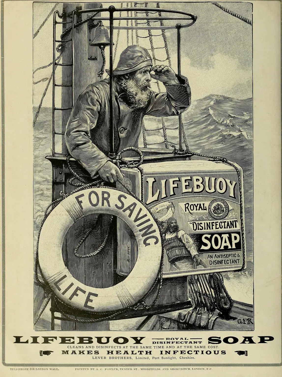
1902: Unilever begins the “longest client-agency relationship in advertising history” when it hires J. Walter Thompson Company to advertise its Lifebuoy Soap.
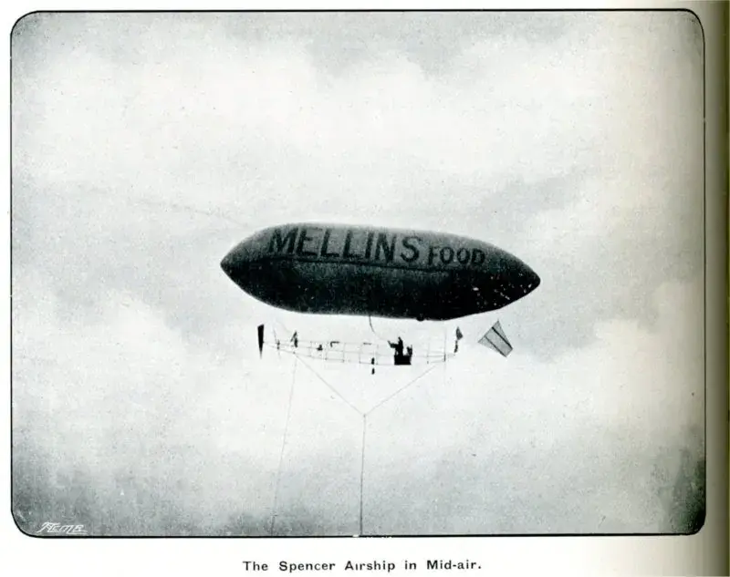
1902: Mellins Food advertises on 25 airship flights, becoming the first brand to take this approach.
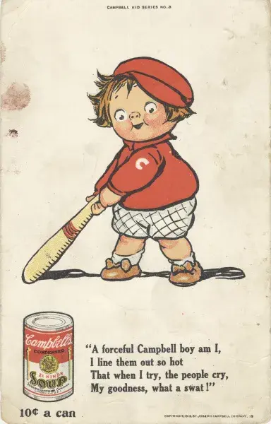
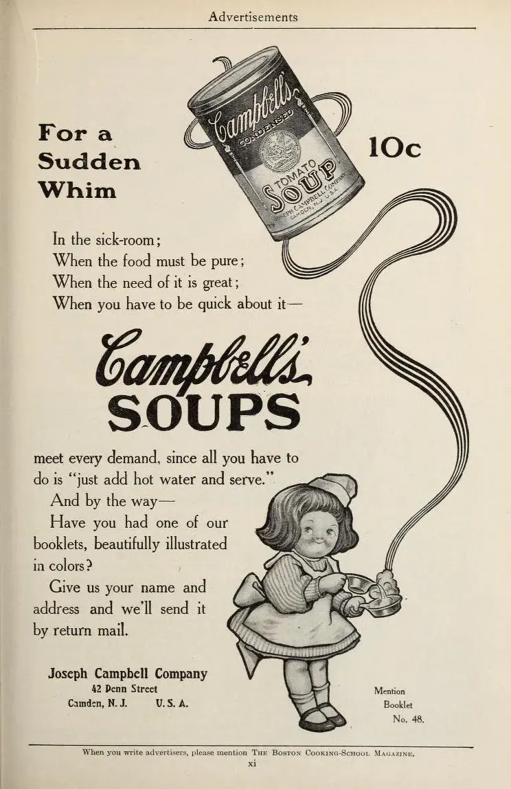
1904: The Campbell’s Kids are created, piloting the change in advertisement focus from a single ad to an entire campaign.
1922: Radio ads are born, and businesses purchase 10 mins for $100. Two years later brands would increase their investment by sponsoring an entire radio show, a concept that eventually became known as “sponsored content.”
1925: Advertisers appeal to emotions, focusing on what pleasure customers would receive from their product or service. This old Ford ad exemplifies this perfectly.
1975: VCRs are introduced, and consumers begin to record shows — and fast-forward through advertisements.
1990: Computers become more popular and accessible at home, with over 5 million homes connected to the internet.
1994: The first email spam campaign launches. Banner ads are also introduced.
1995: Search engines like Yahoo! and Alta Vista are born. Ask Jeeves and Google would follow in 1997 and 1998, respectively.
2000: Brands begin to recognize the importance of having an online presence. Procter and Gamble pilot the concept of the content hub with BeingGirl.com.
2005: Facebook expands from Harvard to 21 universities around the world; YouTube posts its first video.
2012: Online videos reach almost 170 million viewers.
2013: Sites like Pinterest and Instagram join the social network scene.
2020: Advertising soars on digital platforms, including social media, podcasts, pay-per-click (PPC), and more. Customer data plays a larger role in advertising targeting and retargeting. Lastly, a rapid increase in mobile devices boosts mobile ads and SMS marketing.
History teaches us that advertising is an ever-changing concept, just like shopping habits and how and where consumers spend their time.
Whereas almost 140 years ago, postcards were the newest form of advertising, brands today are building chatbots for Facebook Messenger and websites and integrating artificial intelligence into their marketing and sales platforms.
Things in the advertising world move fast. Now, let's take a look at how advertising methods have changed and what marketers and advertisers are using today.
Free Advertising Planning Kit
Plan and launch an effective and profitable advertising campaign with this guide and set of templates.
- An Overview of Popular Advertising Methods
- The Pros, Cons, and Costs of Advertising Types
- A Planning Template to Outline Timeline, Budget, and Goals
- A Project Pitch Presentation Deck to Share With Stakeholders
Download Free
All fields are required.
Traditional vs. Nontraditional Advertising
Traditional advertising evolved before the ubiquity of the internet: think billboards, handouts, and print ads.
Even though traditional advertising relies on people not being buried in their phones 24/7, it’s not going anywhere.
Billboard ads still punctuate thousands of miles of highway, direct mail in the U.S. is a nearly $40 billion market, and posters are still wheat-pasted on the sides of buildings announcing movie or album launches.
“Nontraditional” is a bit misleading, especially if you’re a digital native for whom this all seems perfectly commonplace: think paid search advertising, social media advertising, and native advertising (affectionately known in some circles as SponCon, or sponsored content).
The line between traditional and nontraditional advertising isn’t quite as cut-and-dried as Before Internet and After Internet, though.
Posters and handouts might include QR codes that you scan with your phone, native advertising might appear in a print newspaper or magazine, and you’ve probably watched TV ads while streaming your favorite show over the internet.
Traditional advertising includes:
- Print ads (magazines, billboards, flyers, etc.)
- Broadcast (TV and radio)
- Salespeople (face-to-face advertising may well be the OG traditional ad tactic)
Nontraditional advertising casts a wide net — it’s basically everything that doesn’t fall under the umbrella of traditional advertising.
In addition to digital marketing and all its subsets, here’s a few favorite campaigns that leverage nontraditional tactics:
- Anti-marketing. Conventional wisdom? Never heard of her. Volkswagen hadn’t, either, when it ran its “Think Small” campaign for the 1959 VW Beetle. Focusing on the car’s small size was, in the company’s own words, “a risky move because at that time most car companies were emphasizing power and luxury oversized and practicality.” Liquid Death is another brand that has successfully employed this technique.
- Experiential marketing. 2023 summer blockbuster Barbie ran a marketing campaign that moviegoers could experience from the comfort of their own computing device. The website BarbieSelfie.ai lets users step inside the Barbie set by uploading a selfie; using AI, the site places you next to Margot Robbie (Barbie) and Ryan Gosling (Ken) at memorable moments in the film.
- Influencer marketing. We all know the drill: Person becomes internet-famous, brands reach out to person, person starts recommending that brand’s products. When done right, it’s a great way for brands to connect with an authentic, trusted voice and boost their visibility. In 2020, when TikToker Charli D’Amelio became one of the platform’s earliest megastars, Dunkin’ Donuts jumped on the opportunity, naming D’Amelio’s go-to drink after her as part of their partnership.
AI and Advertising
Like everything else it touches, artificial intelligence is changing the game for advertisers.
And although marketing and advertising have the highest rate of AI adoption at 37%, that means a majority of marketers and advertisers aren’t using AI.
AI isn’t just enhancing advertising—it’s redefining it. With the ability to generate high-converting ad creatives, optimize messaging, and scale campaigns effortlessly, AI eliminates guesswork from marketing. For example, AdCreative.ai leverages proprietary AI models to craft data-driven visuals and copy, ensuring every ad is built for performance. In an era where attention is everything, brands using AI-driven creativity gain a powerful competitive edge
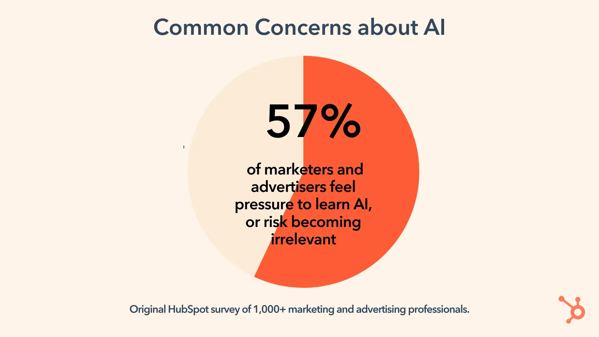
In a HubSpot survey of more than a thousand marketing and advertising professionals, 57% of respondents said they felt pressure to learn AI — or risk becoming irrelevant.
That’s Scott Brinker’s impression as well.
The HubSpot VP of platform ecosystems tells me that AI usage “is bifurcated” — some advertisers are “really actively trying to experiment and learn” how AI works, but the majority are still just talking about it.
Brinker says that wider adoption “won’t be one big hype curve — it’ll be dozens of mini hype curves.”
For instance, many marketers (and consumers) are already comfortable with customer-facing chatbots.
These agents are “autonomously and dynamically generating content,” Brinker says, and as we see lower and lower rates of exceptions and errors, the next logical step is for broader adoption of AI-generated personalized emails.
“AI agents for customer service are working,” he adds. “And when we trust them enough, they can do more than just customer service — they also do customer marketing.”
Brinker also offers a word of caution: “We throw a lot in the AI bucket.” And there’s a big difference between, for instance, generative AI that creates content and machine-learning AI that analyzes data, like Google Performance Max.
Katie King, the CEO of AI in Business and the author of AI Strategy for Sales and Marketing: Connecting Marketing, Sales and Customer Experience (a new edition is coming in 2025), tells me she’s been in the industry for 30+ years and says that “in all layers of advertising and public relations and marketing, everything used to be really manual,” recalling having to use fax machines and wait for responses (Ooof.).
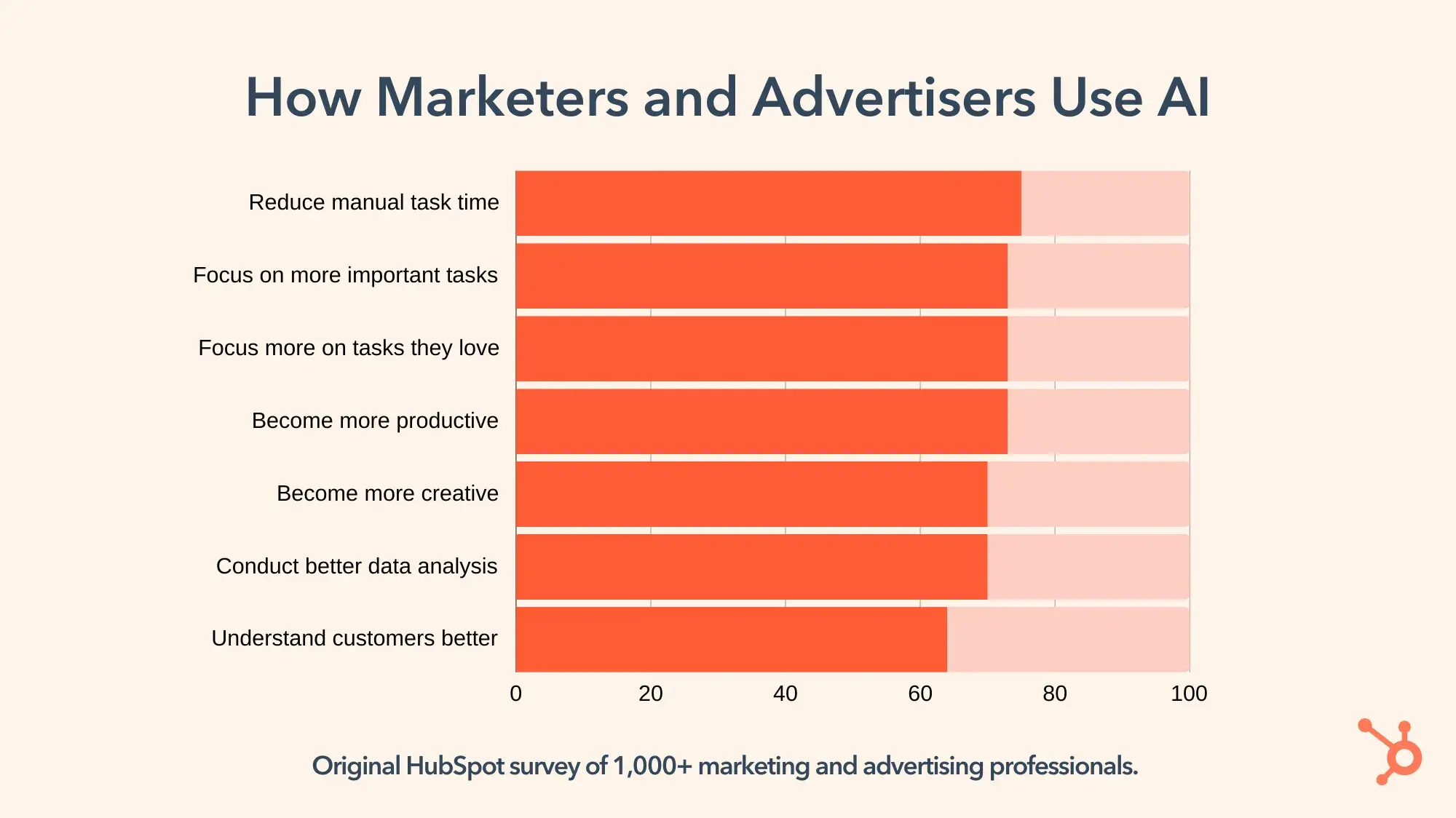
King says that AI is now acting as a “copilot” or assistant for advertisers, automating repetitive tasks and freeing up time for more strategic, creative thinking. This reinforces what we found in a HubSpot survey of more than a thousand marketing and advertising professionals.
Of the people already using AI, most use it as a time-saver so they can focus on other things, like creativity and doing tasks they love.
And speaking of strategy: King says using AI should make advertisers even more strategic, because it “takes away the finger-in-the-air guesswork. AI can help us understand, ‘Yes, this is who I should be targeting. This is what will resonate.’”
Before AI, advertisers’ best source of this information often came through focus groups. And although focus groups are still important to many marketers and advertisers, AI has transformed how they work.
Now, King says that “the selection for the focus group is often done by AI bots, which can help you understand and identify who should be in them.”
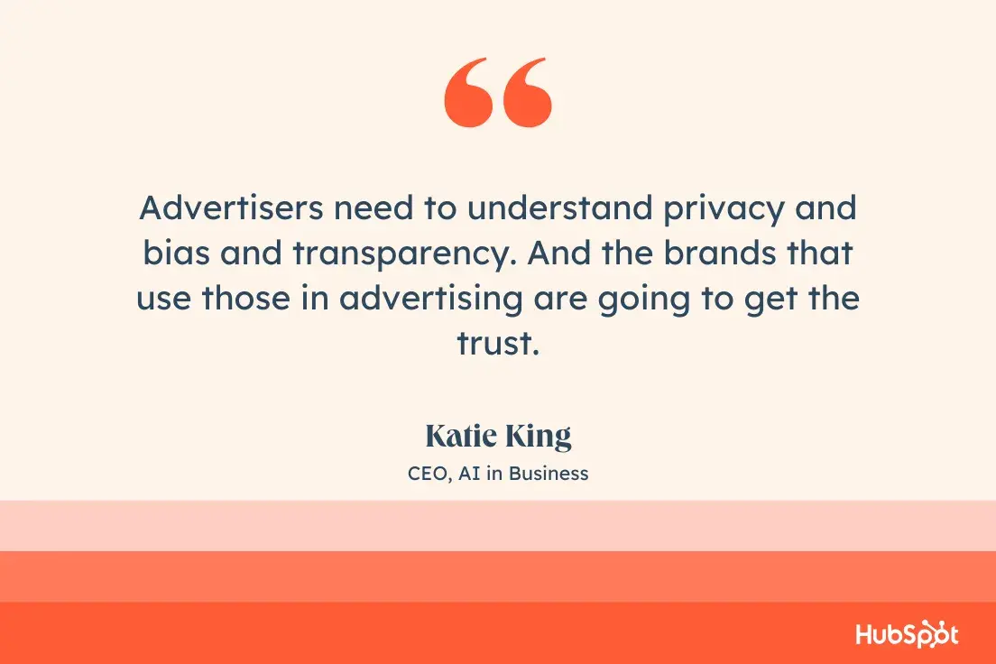
When I ask King what she wishes advertisers knew about AI, she stresses that this is happening now — not in five years, not in 10 years — and it’s imperative to understand the ethics of AI and advertising.
“You need to understand privacy and bias and transparency,” she says. “And the brands that use those in advertising are going to get the trust.”
Advertisers need to understand that “if we over-personalize, we can creep into invading somebody’s privacy. But if the consumer or the client gives consent to use their data, then the brand no longer needs to treat people as a big homogenous mass.”
Advertising Methods
- Print Advertising
- Billboards and Public Transit Ads
- TV Commercials
- Radio
- Event Advertising
- Direct Mail
- Digital Advertising
Advertising can look like many different things. Here are the different advertising types and channels advertisers have been using over the years, with examples.
1. Print Advertising
Print advertising refers to posters, bulletins, flyers, and other physically printed promotions. It also refers to newspaper and magazine ads.
How we design and consume print advertising has changed over the years, but it‘s been a steadfast advertising medium — especially as digital advertising has evolved (which we’ll cover next).
Unlike digital media, print advertising can't be tracked and analyzed as clearly. Fortunately, brands have found brilliant ways to incorporate print advertising into broader digital campaigns.
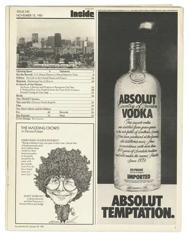
Absolut Vodka
One of the most recognizable and longest-running print ad campaigns was born in 1981, just a few years after Absolut Vodka entered the U.S. market after a century in Sweden. The very first ad, “Absolut Perfection,” played with the brand’s name and added an angelic halo of light above the bottle.
Those two simple elements — the word “Absolut” and an artful photo of the bottle — left plenty of space for decades of variations on the theme. Absolut collaborated with well-known artists, elevating the brand with the likes of Andy Warhol, Keith Haring, and Annie Leibowitz.
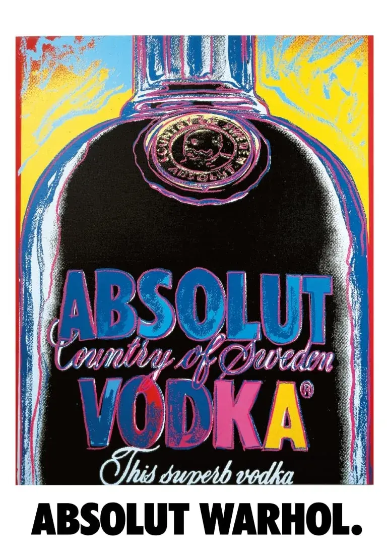
The sheer number of variations, all cleverly designed and executed, prompted people to begin collecting them. (If you are of a certain age, there’s a solid chance that either you or somebody you know lovingly plastered their college dorm room with Absolut ads.)
Takeaways:
- Simplicity can give you a lot of space and time to flex your creativity. The iconic Absolut campaign ran for 25 years, producing more than 1,500 print ads — that’s a little more than one new ad a week for a quarter of a century.
- Brand consistency, especially over the course of several decades, can expand your market reach.
- Creativity — including collaborations outside your usual wheelhouse — can elevate your brand.
2. Billboards and Public Transit Ads
Billboard advertising encompasses print advertising on a much larger scale. Due to their size, the design, placement, and cost of billboard and public transit ads are different from typical print advertising.
For example, billboards are typically designed with few to no words so that viewers have time to process the message while passing by in a car or train. Also, these ads are used for brand awareness, so they often only include a brand name or phone number (versus a website).
National Geographic’s Shark Bus
Public transit ads are probably my favorite form of traditional advertising, because there’s so much opportunity to have fun and make people laugh — which in turn makes your brand more memorable.
National Geographic’s Shark Week (now SharkFest) needs no introduction, and so a 2005 ad wrapped on city buses used minimal text and maximum teeth.
A realistic image of a shark was wrapped around an entire city bus, with the shark’s mouth — and its extremely long, extremely sharp teeth — centered on the side door. Everytime the bus doors opened and passengers went in and out, it looked to passersby like people were emerging from or disappearing into a shark’s gaping maw.
Takeaways:
- Evaluate unique opportunities within a medium. What worked as a bus wrap won’t work as a TV ad, so don’t expect a TV ad to be easily translatable to a billboard or public transit ad.
- Make people laugh. The unexpected delight of seeing public transportation users walk in and out of a shark’s mouth isn’t something you’re going to forget by the time you walk back inside your office.
Free Advertising Planning Kit
Plan and launch an effective and profitable advertising campaign with this guide and set of templates.
- An Overview of Popular Advertising Methods
- The Pros, Cons, and Costs of Advertising Types
- A Planning Template to Outline Timeline, Budget, and Goals
- A Project Pitch Presentation Deck to Share With Stakeholders
Download Free
All fields are required.
3. TV Commercials
TV commercials are short advertisements developed and paid for by companies and organizations looking to capture the audience of a TV show or network program. TV ads have been around since the invention of the television and have changed drastically with the birth of streaming TV.
TV ads have a wide reach (millions) and provide viewers with a multi-sensory ad experience — something print ads and some digital ads can't quite do. Alternatively, TV ads are expensive, avoidable by your audience, and hard to target as accurately as other channels.
John Lewis Christmas Ads
Department store John Lewis has become famous for its heartstring-tugging Christmas ads (or adverts, since it’s a British brand). The two-minute spots tell stories about the power of giving, like this 2022 ad ostensibly about a 40-something guy trying to teach himself to skateboard.
Grab some tissues:
Dr. Annemarie Hanlon, a senior lecturer in digital and social media marketing at Cranfield School of Management, wrote in an article, “The trend John Lewis started works because they have transformed the advert from something we want to ignore or fast-forward into something we want to watch.”
Hanlon also writes, “John Lewis has historically been seen as an expensive shop, but their festive adverts position the brand as offering little Christmas treats, encouraging people who wouldn’t normally shop there to treat someone they love at John Lewis this year.”
By backgrounding the consumerism that’s so often rampant in holiday ads and foregrounding a meaningful story, John Lewis has expanded its brand recognition.
Even people who might not normally shop there — like Americans — now look forward to the annual Christmas ad.
Plus, by exercising a kind of scarcity mindset and only releasing one such ad a year, John Lewis builds anticipation among its target audience.
Takeaways:
- Give the customer what they want, not what you want. John Lewis presumably wants to boost its holiday sales, but instead of running ads promoting luxury gifts or special sale prices, it gives its audience a story. And like “The Beginner” ad above, there’s often a twist or reveal at the end that keeps you tuned in.
4. Radio
Radio advertising refers to spoken advertising spots aired on radio channels between music and other programs. This method dates back to 1920 when commercial radio first aired.
Radio advertising is particularly powerful for local and regional advertising. Nowadays, podcast advertising is a similar but more effective method, especially for national audiences.
Dove’s “Autotune” Campaign
Radio is a difficult medium for advertisers to conquer in this day and age. If you listen to terrestrial radio at all, you’ve probably learned to drown out shouty ads between DJ patter and Top 40 bops.
And if you don’t listen to terrestrial radio, you’re probably listening to podcasts, where you can fast-forward through toothbrush ads you’ve heard a hundred times already.
Dove’s “Autotune” ad is a notable exception in this category, as it uses the audio-only medium to its advantage.
A woman sings, “Magazine model / with immaculate skin / so perfectly curved / and impossibly thin,” as her voice gets increasingly AutoTuned. At the end of the 45-second song, an announcer declares, “Real beauty isn’t a trick of technology.”
Dove has become known for its Real Beauty campaign, which began in 2004, and more recently released an installment denouncing AI-generated images.
The radio spot works as both a standalone ad and an extension of the Real Beauty campaign, with a clever twist on how technology is often used to cover up or unrealistically enhance beauty.
Takeaways:
- As with public transit ads, consider opportunities that are unique to radio.
- Consistent messaging. Even though Dove goes in a different direction with AutoTune than we’re accustomed to seeing in its print or video ads, the message stays the same: Dove stands against unrealistic beauty standards and the technology used to enforce them.
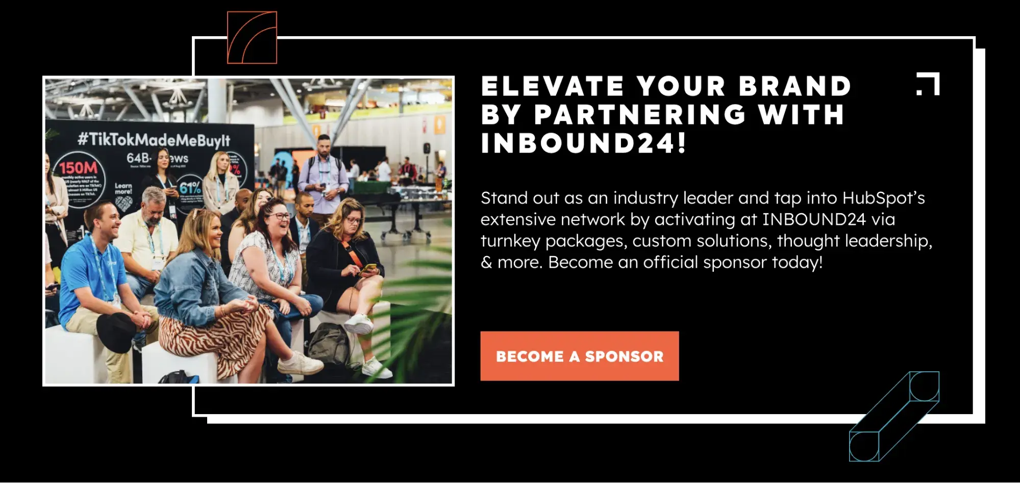
5. Event Advertising
Events (both in-person and virtual) are opportunities to connect with your audience while promoting your brand and products. You can host your own event in the form of a conference, webinar, roundtable, or luncheon.
Another form of event advertising is sponsoring an event or purchasing a booth at a conference or trade show. This is less expensive than hosting your own event, but you still get to engage audience members and promote your brand.
INBOUND
The 2024 INBOUND in Boston convened 12,000 of the best minds in marketing, sales, CX, and tech. It’s an opportunity for HubSpot to show off our products (and announce new ones, like Breeze), but it also gives other companies an opportunity to engage with marketers and promote their brands.
6. Direct Mail
Direct mail advertising includes postcards, pamphlets, and catalogs mailed directly to the homes of your target audience.
A direct mail advertising strategy is more personal than others on this list, but it's also very costly. (Consider the cost of postage alone.)
Another direct mail strategy is electronic mail, typically through email newsletters or promotions. This overlaps with our next section — digital advertising. That‘s what we’ll unpack next.
KitKat Chunky
It’s hard to stand out in a category that’s littered — literally — with minimalist luxury catalogs, brightly colored political ads, and dozens of foil-wrapped credit card offers.
So Nestlé blended in instead.
In 2012, the U.K.-based direct mail campaign sent mail that mimicked a Royal Mail “sorry we missed you” card. The reason? Too chunky.
Recipients could take the card to their local newsagent (convenience store) to exchange for a KitKat Chunky chocolate bar.
Takeaways:
- Stand out in a congested advertising channel by taking something familiar and giving it an unexpected twist.
- Reward engagement. In this case, recipients of the cleverly disguised ad could get a free candy bar and actually try out the product.
Digital Advertising: How to Advertise Online
As of today, there are over 5 billion internet users. This number is up 427% from 2005. Point being, internet usage is skyrocketing, and it’s not stopping.
If you’re not advertising online, you’re behind the curve. Not only does the internet offer you direct access to more than half the global population — including more than half of your target audience — but it also provides so many different advertising types and channels on which to advertise.
Free Advertising Planning Kit
Plan and launch an effective and profitable advertising campaign with this guide and set of templates.
- An Overview of Popular Advertising Methods
- The Pros, Cons, and Costs of Advertising Types
- A Planning Template to Outline Timeline, Budget, and Goals
- A Project Pitch Presentation Deck to Share With Stakeholders
Download Free
All fields are required.
Marketers now have the flexibility to reach their target audiences on multiple fronts, in multiple ways, for multiple budgets. There are also a number of tools (many of which are free) that can help you execute your advertising strategy.
Here are the most common ways to advertise online:
Paid Search Advertising
Whether Google, Yahoo, or Bing, all search engines have their own paid advertising. This is referred to as pay-per-click, or PPC, and involves bidding on keywords and placing ads at the top or sides of search results.
When someone performs a query using one of those search engines, advertisers have the ability to display ads above organic search results. That’s what makes PPC so powerful — it gives your advertisements prime real estate in front of people already searching for relevant topics.
Here’s an example on Google:
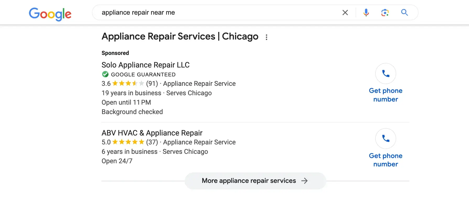
The top listings in the red box are advertisements. Organic search results — the ones that came up as a result of SEO — are below the map snippet.
Use our free AI Google Ads copy generator.
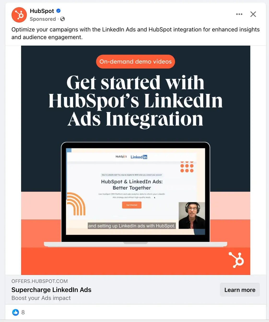
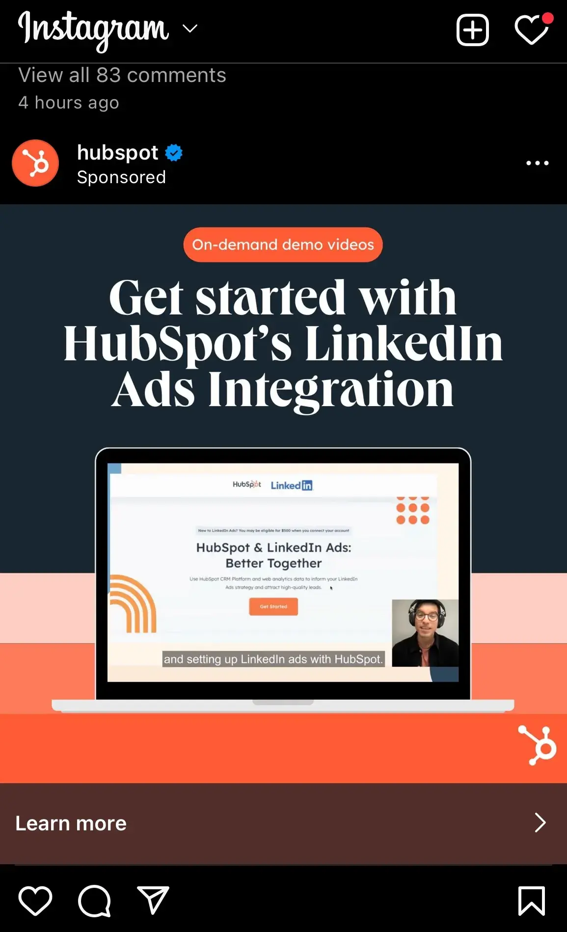
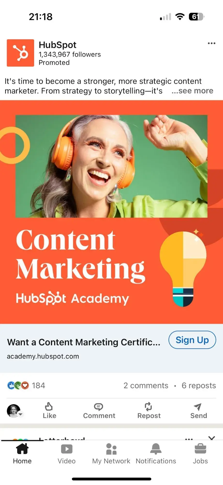
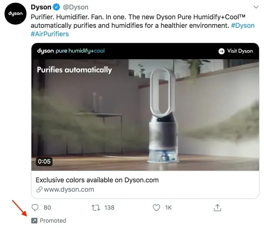
Social Media Advertising
Social media platforms know how valuable their content is, and that’s why they offer the option to sponsor or boost posts.
Social media ads put your message in front of your target audience and encourage them to engage, click-through, and buy.
More and more, social media sites are prioritizing ad space over organic content to bring in more revenue.
Whether you’re a budding or brand-new business, consider running some social media advertisements. These will not only advertise your products and services but also promote your social media pages and grow your following.
Platforms like Facebook, Instagram, LinkedIn, and X each have their own version of ads like these.
Here’s how they appear on their respective feeds:
Download our free lookbook of 50 Facebook Ad Examples We Actually Clicked.
Download our free guide on How to Run Successful LinkedIn Ads.
X
Download our free guide on How to Use Twitter for Business.
Native Ads and Sponsored Content
Sponsored content has been around since 1922, when brands would sponsor entire radio shows. Today, sponsored content refers more to native ads and blog or article content subsidized by brands. Native ads are cohesive with surrounding content and easily blend into any design.
Have you ever read a Buzzfeed article that heavily referenced or recommended a certain product or service? It was likely sponsored by a certain brand.
Check out 10 Reasons To Put Away Your Phone On Your Next Trip, promoted by agoda, a hotel or destination booking site. Does it blatantly promote agoda’s services? No. Its primary purpose is to entertain and inform, although agoda is referenced a few times throughout the content.
At the top, the byline reflects agoda’s sponsorship. And as you scroll down the page, another ad sits within the content.
Sponsored content is a great way to promote your brand in content your audience is already familiar with.
Banner and Display Ads
Banner and display ads are an extension of search ads and follow a similar PPC model. But instead of a text-based ad, consumers see a more visual advertisement.
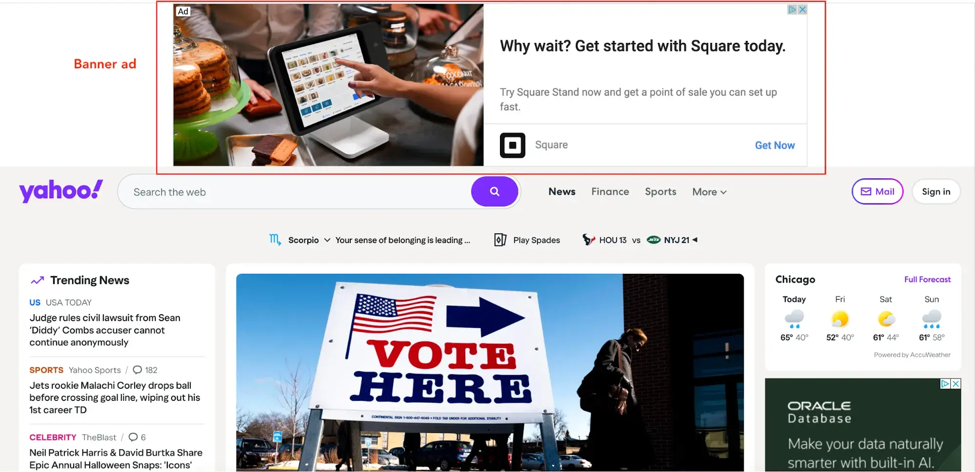
Banner ads are typically horizontal boxes on top of a web page, whereas display ads are smaller and shown on the side (like in the screenshot above).
Whether you opt for traditional print ads in magazines or subway stations or choose online promotion on social media or search engines, there are a few rules that make for great advertising.
Below are some advertising best practices to apply to all your ads.
Advertising Best Practices
There are a lot of best practices, tips, and tricks when it comes to advertising. It’s an art that’s been perfected over the years, and with the rise of modern types of advertising channels and new media, best practices continue to manifest.
These advertising best practices are:
- Appeal to emotions
- Create positive associations
- Establish a bandwagon effect
- Focus on benefits over features
- Leverage storytelling
In this section, though, we’re going to cover these five famous advertising concepts that still work today — regardless of what type of advertising method or medium you’re using.
When used correctly, these advertising techniques will do wonders for your brand and products.
Appeal to emotions.
While you may not consider the ASPCA a business, their unforgettable Sarah McLachlan commercial is the perfect example of using emotional appeal to entice people to take action.
For most of us, the images in that commercial are hard to watch — we may even turn away. But since it tugs at our heartstrings, we’re more likely to donate to animals in need after seeing the horrors they’re going through.
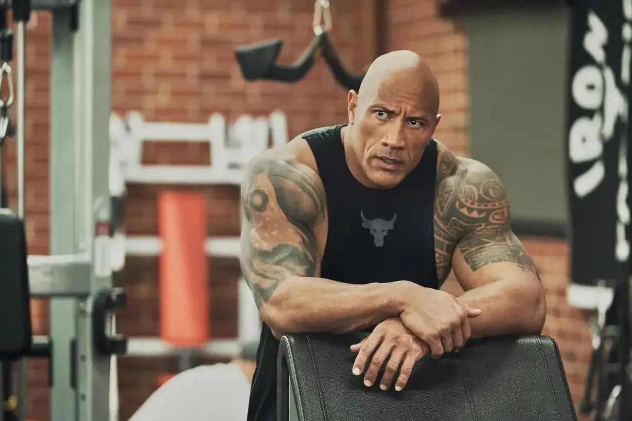
Create positive associations.
When consumers associate your product with a feeling of happiness, state of achievement, or an accomplished goal, they’re more likely to take notice, remember your product or service, and make a purchase.
You may have been on the receiving end of this before without even realizing it. Have you ever seen your favorite celebrity or Instagram influencer posing with a product or brand and found that you wanted to be, do, or look the same?
Companies create this subconscious connection in advertising, hoping you associate your positive feelings with the product or service they’re promoting.
For example, Under Armour uses Dwayne “The Rock” Johnson to create a subconscious connection with customers. It apparently works, since his Rock Delta shoes were the fastest-selling Under Armour shoes of 2017.
Catchy songs like “Nationwide is on your side" is an example of helping people associate friendliness with the Nationwide brand.
Coca-Cola has a brand advertising campaign that associates its product with friends, family, and fun. When you consider what refreshments to serve at a party or bring on a picnic, Coca-Cola wants you to think of it.
As you create your advertisements, consider what feelings, desires, or goals you want your brand to be associated with. Weave these feelings or goals into your advertisements through stories or videos.
Look for influencers who align with your brand’s core values and demeanor and include them to promote positive association.
Establish a bandwagon effect.
People want to fit in. It’s human nature. Neither you nor I are immune to it.
And it’s this human need for belonging that makes the bandwagon effect so effective. People don’t want to be left out. They find value in their peers’ opinions and don’t want to be the only ones not using the latest and greatest product.
Brands like Maybelline understand this concept well and use it to their advertising advantage. One tube of their top-selling mascara is purchased every five seconds, a statistic that establishes social proof and further supports their claim of “America’s Favorite Mascara.”
Free Advertising Planning Kit
Plan and launch an effective and profitable advertising campaign with this guide and set of templates.
- An Overview of Popular Advertising Methods
- The Pros, Cons, and Costs of Advertising Types
- A Planning Template to Outline Timeline, Budget, and Goals
- A Project Pitch Presentation Deck to Share With Stakeholders
Download Free
All fields are required.
Use customer testimonials, survey data, or shareable content to advertise your brand as one worth following or buying into.
Take another approach by promoting a discount for sharing your brand with a friend or family member — so your audience will do the selling for you. Either way, use your advertising to create an inclusive environment that people want to join.
Focus on benefits over features.
Features and benefits are two very different things.
Features are the details of the product or service you’re selling, such as the measurements of a couch or the ingredients of a protein bar.
Benefits, on the other hand, explain why a person should buy a couch or protein bar from you and how their life would benefit from such a purchase.
Advertising should focus on the benefit your product or service brings, not explain what you’re physically selling.
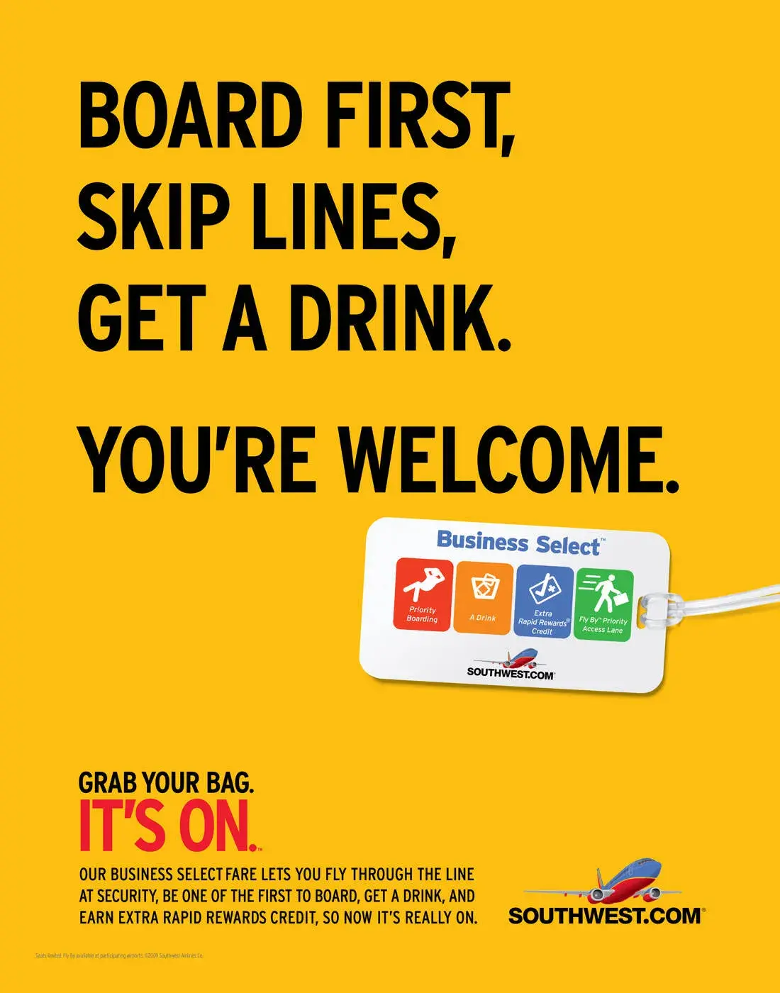
Consider how Southwest Airlines advertises. Instead of explaining, line by line, what a Business Select ticket offers, Southwest paints a picture of what life would be like if you made a purchase. In this advertisement, they focus on the benefits.
Rather than wasting precious ad space on your product specifications or service details, talk about how a purchase might positively impact your customers.
If you do it right, your creative, benefit-packed advertisement will inspire them to research the features on their own.
Leverage storytelling.
Not unlike our desire to fit in is our penchant for a good story.
Storytelling helps paint a bigger picture of a brand or company, not simply promote a single product or service. Also, when stories resonate with someone, it’s far easier to motivate him or her to take action.
Storytelling is a technique you should try to infuse in all your advertising. In fact, if you haven’t started crafting your brand’s overall story, you should definitely do so.
Consumers are more likely to remember facts if they’re part of a story, and storytelling is a more persuasive way to connect with customers and sell your product.
Dove employs storytelling in its campaign partnership with Operation Homefront. The videos feature real stories of military men and their families being reunited. The advertisements don’t directly promote Dove products, but instead tell the Dove brand story (and pull on a few heartstrings, too).
Determining your brand story will help you learn how to best discuss your brand in all marketing efforts, not just advertising.
Next, let’s take a look at some of the most memorable ad campaigns, a few of which put these best practices in action.
5 Memorable Ad Campaigns
The best advertisements are the best teachers. Whether it’s the copywriting, design, medium, or target audience, well-executed campaigns can always teach you something new about advertising or positioning.
Here are five campaigns that left a noticeable mark on advertising history.
1. Nike: Just Do It
In the late 1980s, Nike launched its “Just Do It” campaign.
At the time, Reebok was outselling Nike, and Nike needed to act fast to compete against the sneaker conglomerate.
But it wasn’t just the three-word phrase that earned global attention. Their new ad campaign also focused on real people wearing and working out in their products, as opposed to simply featuring clothes and sneakers themselves.
This powerful combination of people plus product helped Nike go from $800 million in 1988 to $9.2 billion just 10 years later.
2. The Absolut Vodka Bottle
Yep, Absolut gets two spots in our guide — its advertising is just that enduring.
Absolut’s “Bottles in the Wild” ad series is the longest uninterrupted campaign in history.
An attempt to grow Absolut’s name internationally, especially throughout the United States, it featured the Absolut bottle in different cities and countries worldwide.
It launched in 1985 and ran until 2000 — lasting an impressive 25 years.
Absolut’s campaign helped grow the company from a tiny slice of the vodka market share (2.5%) to over half the U.S. imported market share.
To this day, the Absolut brand is the fourth largest spirit company, thanks to its focus on the overall story, not just the product itself.
3. Miller Lite
The folks at Miller Lite used differentiation to reach its goal: getting “real men” to willingly drink light beers.
With its “Great Taste, Less Filling” campaign, it maintained a leading position in the light beer market for several decades after this first campaign aired.
4. Always #LikeAGirl
Always’ #LikeAGirl campaign kicked off in 2014 to “tackle the things society were doing that could harm a young girl’s confidence at puberty.”
The multimedia campaign sought to change “like a girl” from insult to admiration by asking men and women to show them what it meant to run like a girl, throw like a girl, and fight like a girl.
They asked the same questions of girls; invariably, men and women interpreted “like a girl” negatively, and the girls saw it as neutral or positive.
Even though Always’ period products aren’t mentioned in the ads, it aligns the brand with positive associations — and sends a powerful message to viewers.
5. Dos Equis
With its edgy, cool, and sophisticated aesthetic, it’s no surprise that “The Most Interesting Man in the World” campaign put Dos Equis on the map.
This campaign created a positive association between the Dos Equis beer and the feeling of sophistication and poise. Sales quickly jumped by 22% after the campaign launched.
Even more impressive was how Dos Equis found success in a time when craft beers grabbed a foothold in the market and imported beer took a 4% hit. This campaign was a major component of that success.
To learn how to grab the attention of your audience, learn from the professionals. These campaigns are a great example of how brands have used real stories, real people, and real talk to grow their businesses.
Advertising Helps You Grow Better
Equipped with a dense, dynamic history, advertising is an incredible tool to add to your marketing toolbox.
Between print ads, radio sponsorship, TV commercials, and social media promotion, the opportunities to advertise and promote your brand are endless.
To best connect and engage with your audience, speak your customer’s language, appeal to their emotions, and tap into their desire to be a part of a community, create a clear and authentic brand story to illustrate how your brand aligns with their values.
By applying these tried and true practices to your advertising, you’ll build a magnetic brand that attracts customers, establishes a following, and generates revenue.
Do this and your brand will grow into a household name that stands the test of time — just like advertising itself.
Free Advertising Planning Kit
Plan and launch an effective and profitable advertising campaign with this guide and set of templates.
- An Overview of Popular Advertising Methods
- The Pros, Cons, and Costs of Advertising Types
- A Planning Template to Outline Timeline, Budget, and Goals
- A Project Pitch Presentation Deck to Share With Stakeholders
Download Free
All fields are required.
Advertising


![How Marketers Can Use Retail Media Networks to Get In Front of Customers [Expert Tips]](https://53.fs1.hubspotusercontent-na1.net/hubfs/53/retail%20media%20networks-hero%20(598%20x%20398%20px).webp)

![How Much Does a Super Bowl Ad Cost [& Does It Get ROI]? A Data-Backed Deep Dive](https://53.fs1.hubspotusercontent-na1.net/hubfs/53/how-much-does-a-super-bowl-ad-cost-1-20250120-9019772.webp)
![How to Make an Advertisement: A 15-Step Guide [+Expert Tips]](https://53.fs1.hubspotusercontent-na1.net/hubfs/53/how%20to%20make%20an%20ad.png)
