
A logo is the most recognizable element of a brand. But even more important than the symbol, words, and typography are the colors.
Think about it: When you scan the aisles of a grocery store, what do you look for? Typically, people register the color prior to confirming the name and logo. Color is a way for our brains to filter and hone in on what we want and need when there is an overwhelming number of options.
Paula Rúpolo recently updated her creative experiment that shows just how important color is to logo design and recognizability. She pitted competing brands against one another and swapped their color schemes to better understand how color affects our emotional response to a brand and how the color associated with a brand begins to condition certain responses in the viewer.
![Free Kit: How to Build a Brand [Download Now]](https://no-cache.hubspot.com/cta/default/53/814dd420-0d49-40e0-b59c-f01066e186c1.png)
Check out how your favorite brand would look if it took on its competitor's hue:
Subway vs. McDonald's

Starbucks vs. Dunkin' Donuts

Coca-Cola vs. Pepsi

Heineken vs. Budweiser

FedEx vs. UPS

Sprite vs. 7 UP
![]()
Microsoft vs. Apple

Ferrari vs. BMW

eBay vs. Amazon

Google vs. Yahoo

Playmobile vs. Lego

Unilever vs. P&G

Canon vs. Nikon

Mastercard vs. Visa

Oral-B vs. Colgate

Facebook vs. Twitter

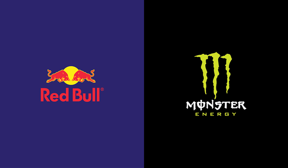
Red Bull vs. Monster


![The Surprising Science Behind Behind How Our Brains Recognize Logos [Infographic]](http://cdn2.hubspot.net/hub/53/file-2054684135-jpg/blog-files/neuromarketing-300x225.jpg)