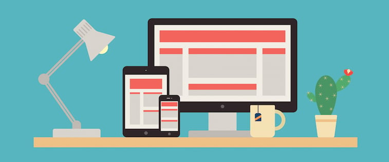
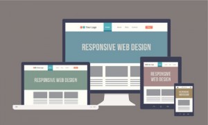 How can designers account for the multitude of devices that access the web? Accommodate for different screen sizes by creating a responsive website. Here we offer six important design and development techniques to ensure a successful web experience for all users from desktop to mobile.
1. Prioritize Content
Getting content in advance helps prioritize what needs to be rearranged when the browser window changes. As the screen size narrows, the mass of content is reduced. Not everything on desktop needs to be on the mobile version. A good method is to collapse into dropdown navigation so it is only seen when the user wants it.
2. Mobile-First Approach
 Think of the mobile-first approach as designing around smaller screens first. But, the mobile first approach is also a mindset; the realization that your viewers are most likely going to be in a “mobile” state while viewing your site as opposed to sitting at a desk. They may be outside, doing the laundry, watching TV, etc., so it’s critical that the website is consolidated and focused.
The Mobile First (from the Book Apart series) by Luke Wroblewski is a great reference explaining the mobile-first approach.
As an example, we used the mobile-first approach on our Growth Spark site. The site, whether viewed on mobile devices or a desktop, is linear. This approach directs the readers’ attention, creating a more focused message.
3. Design for Fingers, Not Just Cursors
This is not just for tech-savvy grandmothers. Everyone can appreciate a good-sized button that works the first time they click. On the other hand, besides creating larger buttons on mobile, making the content area a clickable link is another way to solve the problem. Also, keep in mind that there is no hover effect on touch devices (at least not yet). If we rely on hover effects to indicate a link, it may be overlooked.
4. Compress Files for Low Bandwidth
 No matter how cool your site is, if it doesn’t load fast enough, the user won’t be impressed. Your site needs to respond to the low bandwidth.
Here are a three ways to do this.
- Use media queries. In a mobile-first approach the core of the code loaded is used for mobile and media queries are used to load more for larger screens.
- Compress images. There are many sites that can help compress images sizes. TinyPNG is one.
- Use a plugin that will delay image loading instead of having all the images load when the page is opened.
We encountered this problem working on the Aerolife site. The site, especially the homepage, is a collage of beautiful, high-resolution images. However, it would take a great toil to load on a mobile phone. We used a combination of the Lazy Load plugin and media queries to load smaller image files for mobile screens.
5. Use a Fluid Grid Framework
Using a fluid grid framework provides many advantages. One being that a lot of work is done for you. Frameworks have all the popular breakpoints built-in to use as design guides. It also allows one to rapidly create prototypes and concentrate on the user experience and how to rearrange content when it responds to the browser.
Check out popular frameworks such as Foundation, Gumby, and Skeleton. This article includes a comparison table of 13 responsive frameworks.
6. Use Flexible Images/Video
With a flexible grid, we also want images that respond to browser size accordingly. We do this by using percentages. Specifying images with a max-width:100% will resize it to 100% of its actual dimensions and not stretch beyond, whereas width:100% will fill the container and stretch the image.
In some cases, mobile devices will render icons or images pixelated because these mobile devices have a higher ppi (pixel per inch) than desktops. In this situation, opt to use SVG (scalable vector graphic) files or icon fonts. Or generate your own icon font. An application like Fontastic makes it easy, generating the code and the necessary files to turn your icons into fonts.
7. Think Responsive
There is an on-going learning process when building responsive websites. There will always be more than one solution to any challenge. If we keep in mind that a website will not always be viewed the way you view it, it brings up important questions and forces the designer to prioritize, which is the benefit of being responsive – it leads to a more focused site design.