Whether writing blog posts, drafting lead nurturing emails, or shooting videos for their YouTube channel, successful inbound marketers are master content creators. But when you think about landing pages, most people jump to conversions. How often are people abandoning my form? Which treatment performed better? What's the page's bounce rate? How good all these metrics look, however, boils down to what you already do well: writing remarkable content.
But writing effective landing page copy is a little different than writing, say, a blog post. There are some landing page copywriting nuances that, though seemingly minor, have a huge impact on conversions. So if you're looking for the quickest way to create a great landing page, invest your time in creating copy that follows these landing page copywriting best practices.
1) Use Action-Oriented Language
Just as with your call-to-action copy, writing with action verbs is crucial to the success of your landing page copy. Landing pages are particularly susceptible to the blink test -- the commonly accepted 3 seconds you have to orient visitors to a new page they click through to on your website. If within 3 seconds, a site visitor can't glean what exactly they can do on that page, they click the back button. On a landing page, that means you could be losing new leads or reconverts, not just regular site traffic. And those are high stakes!
But when you write with verbs, you're giving stronger, more definitive instruction for visitors that helps them learn what they are supposed to do on that page -- in other words, how they can pass the blink test. Consider the copy on this landing page from our ebook, Beyond the Facebook Business Page, for example:
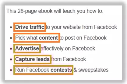
Notice those action-oriented phrases? They tell a reader exactly what they will be able to do once they download the ebook. Consider how much less impactful it would be if instead of "Drive traffic to your website from Facebook," it read "Website traffic comes from Facebook." The latter positions the web traffic as a result of something Facebook is doing, not something the reader will be able to do.
2) Use Value-Oriented Language
The value is the "so what?" of your landing page copy. Use language to convince visitors that the time they'll spend filling out your form is worth it for the offer they'll receive. You can do this by working in a heading on every landing page you create similar to the one shown in this example.
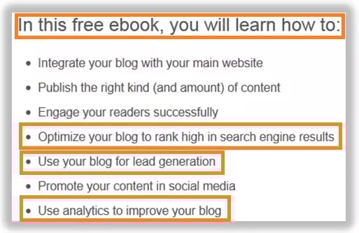
If you make it a rule to include a header that explains the benefit -- "With this coupon, you will get" or "With this consultation, you will learn" -- it will force you to pinpoint the real value of your offer to both yourself and your visitors.
It's also crucial to not just explain features, but also the benefits of those features. The three bullets called out in orange in the example above do this well. Let's take the first bullet that is called out in orange, "Optimize your blog to rank high in search engine results." The feature of the ebook that is being highlighted is the ability to learn how to optimize your blog. So what? Why would someone want to do that? Because it helps them rank higher in search results. The act of optimizing your blog alone isn't what readers want to do -- they want to do it so they can get higher search rankings. Your readers know this intrinsically already, but on a landing page, it's your job to call that out loud and clear. Don't make them think!
3) Use Reader Keywords
What is a reader keyword? It's a phrase I just made up to describe the keywords a reader -- not a search engine, a reader -- will look for while scanning your page to understand what the page is about. This is just as important for passing the aforementioned blink test as using action-oriented language. Readers will assume the page they clicked through to are related to the page and call-to-action from which they just came. Confirm that for them. For example, take a look at this call-to-action to get The State of Inbound Marketing in 2012 free webinar and report from a blog post about the report.
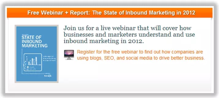
When a reader clicks that CTA, they are going to expect to reach a landing page that uses similar keywords in prominent places on the page. Let's take a look at the landing page that accompanies that call-to-action.
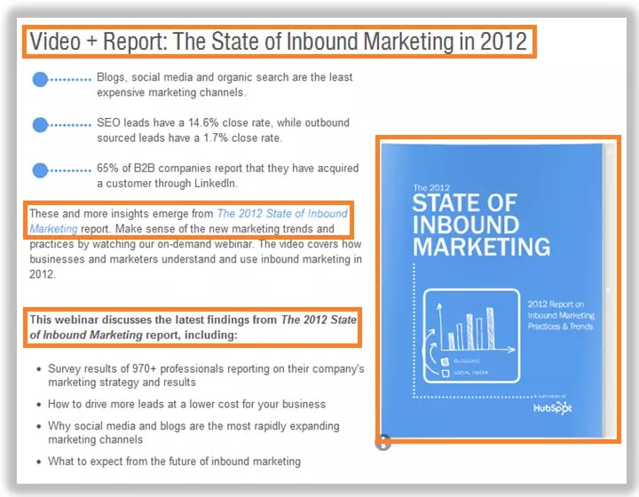
Notice how the keywords used in the call-to-action align with those found on key parts of the landing page -- the places a reader's eye naturally scans to discern meaning when first arriving on a landing page. By using the phrase (or close variations) of The State of Inbound Marketing in 2012 in headlines, images, bolded copy, and hyperlinks, the reader can quickly be oriented when scanning through the landing page copy.
4) Write Using the Second Person
This is a simple best practice to remedy, but easily overlooked. Writing in the second person means instead of saying "I," you speak in your readers' terms by saying "You" and "Your."

Look for opportunities to use these pronouns to help forge a stronger connection between the reader and your offer. Doing this will also help you successfully demonstrate the value of your offer, because it helps readers visualize how they can use the offer and how it will impact their lives -- not an abstract person.
5) Go for Clarity Over Creativity
You're on a timer. It's set for 3 seconds. There's no time for fluffy language.
Think of the most direct way to say what you're trying to say, without the use of jargon and literary flair that detracts from the meaning of your sentence. Once you're done crafting the copy for your landing page, read over it, and cross out every single word, phrase, and sentence that is not absolutely necessary to clearly convey meaning.
One way to concisely say what you mean is to make use of data. You know the saying, "A picture's worth a thousand words"? Sometimes, so is a data point when you're trying to convey the value behind a complicated concept. Let's take a look at this snippet of landing page copy, for example:

Instead of detailing the many reasons landing pages are important for all companies, this compelling MarketingSherpa data point helps hammer home why they are important in just one straightforward sentence. Regardless of whether you make use of data points in your landing page copywriting, be sure to re-read what you've written, and ask yourself whether your copy is as concise as it can be without impacting meaning.
6) Format
Great landing page copy has as much to do with word choice and sentence structure as it does with presentation. No matter how wonderful your copy, if it isn't visually palatable for readers, they won't consume the information and will click 'back' in their browser -- to a less overwhelming spot on the interwebs. Let's take a look at a well formatted landing page that uses visual cues to help readers more easily consume written information.
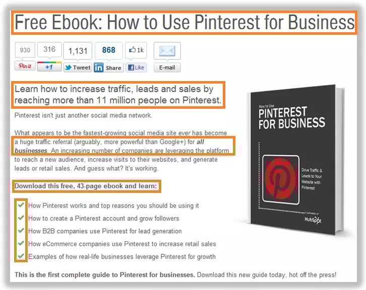
The landing page copy is never longer than 5 lines, and it is all broken up with a headers of varying sizes, bold text, parentheticals, italics, and checkmarks (easily replaced with bullets, if you prefer) to make the content easier to consume. Visitors won't read every word you put on the page. So put your most important points at the beginning of chunks of text, or formatted with bolds, bullets, or the other noted formatting devices to ensure what information your visitors should read gets its due attention.
7) Proof for Consistency
Finally, when you've written your amazing landing page copy, edited for brevity, and formatted for easy readability, go back with a fine-toothed comb to proofread your copy. This is a crucial last step, because you're using your landing page copy to convince people to give away their personal information to you; visitors will be far less likely to do this if your landing page copy is riddled with errors. Look for accuracy in spelling, grammar, consistency, and facts. Here's an example of what we looked at on our Google+ ebook page, for example.
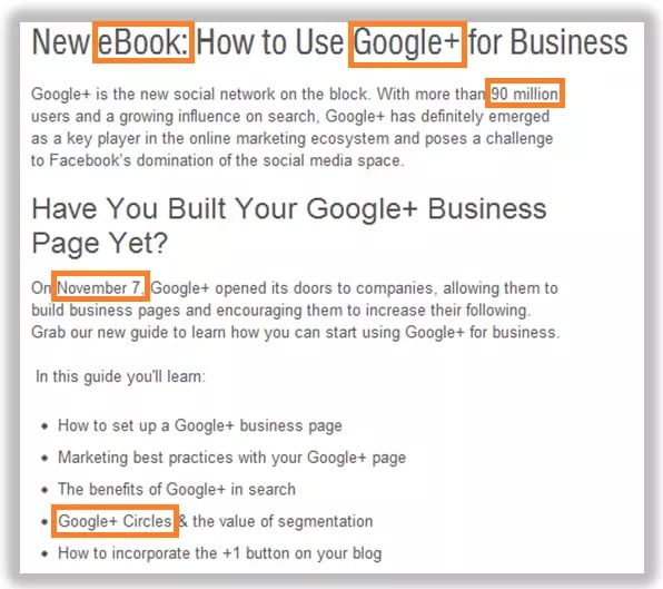
Aside from general spelling and grammatical proofing, on this page one should ask themself:
- Did I spell "eBook" the same way everywhere on this page? Did I use a lowercase "b" anywhere else on the landing page, for example?
- Did I consistently spell the social network "Google+", not "Google Plus"?
- Is 90 million users an accurate data point?
- Is November 7th the accurate launch date?
- Did I consistently refer to "Google+ Circles" as a proper noun on this page?
If your landing page copy looks cohesive and error-free, users will feel more comfortable trusting you with their personal information.
As with all aspects of landing page optimization, you should always be testing. Following these landing page copywriting best practices will help you start with an effective landing page that, with A/B testing, just gets better and better as you learn what copy tweaks help increase your conversion rate.
What components of your landing page copy do you find to be effective? Share your recommendations in the comments!
Image credit: olarte.ollie




![Why You Need to Create More Landing Pages [Data + Tips]](https://53.fs1.hubspotusercontent-na1.net/hubfs/53/create%20more%20landing%20pages.png)
.png)


.jpg)
