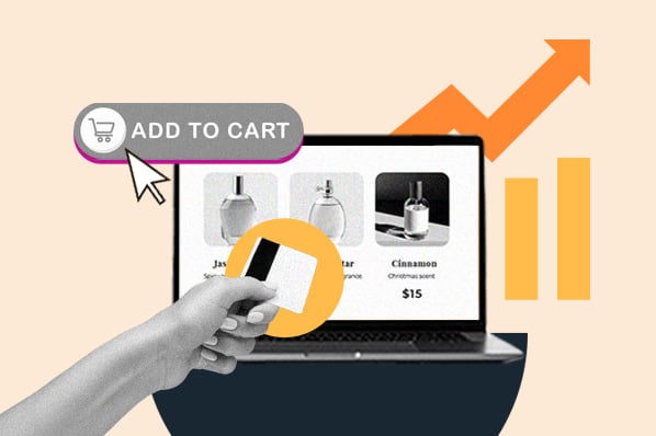
What is the checkout process?
The checkout process is the sequence of steps a shopper completes to make a purchase on an ecommerce website. The steps typically consist of product viewing, adding items to a cart, reviewing the cart, entering billing and shipping information, entering payment information, final order review, placing the order, and receiving an order confirmation.
Seems straightforward enough, especially if you’re using an ecommerce platform like WooCommerce or Shopify to help you. In reality, however, there’s a lot of room here for both frustration and optimization. You’ve done so much work to get the user to this point, why drop the ball now?
So, let’s now review 12 best practices for ecommerce checkout that will increase delight and reduce friction for your customers:
Checkout Process Best Practices
- Don't require registration or login.
- Let shoppers save personal information.
- Make it short and simple.
- Give indicators of progress.
- Make complementary product recommendations.
- Set up forms in a logical flow.
- Offer rush processing and shipping.
- Keep your contact information handy.
- Call attention to mistakes quickly and clearly.
- Let customers review and modify their order before placing.
- Reassure buyers that you're secure.
- Make it mobile-friendly.
1. Don't require registration or login.
I already gave this one away, but it's so important that it's worth reiterating.
When someone is excited about a purchase, they want it, and they want it now. What a bummer to think you're minutes away from completing an order, only to find out you have an additional few minutes of required registration ahead of you.
Or worse, you've already been through the registration process and you can't remember your login information, so you have to go through the rigamarole of confirming your high school math teacher's last name to retrieve your login credentials.
While it is more convenient for your lead nurturing to establish a login, this is a significant barrier to purchase and will deter a good chunk of potential first-time customers. A guest checkout option ensures you won’t lose a customer and revenue today.
Instead, give the option to register after the customer has received a purchase confirmation. Now that you’ve secured the purchase, this puts less pressure on the buyer and presents an opportunity to expedite future purchases from your site. You can also use this information to track shoppers’ interactions using an integrated CRM like HubSpot for WooCommerce.
2. Let shoppers save personal information.
On the flip side, shoppers that do choose to register with your site before completing their purchase should be able to reap the benefits of a faster checkout. That means you've saved certain pieces of personal information with their permission, like name, address, and credit card information.
On the sites I visit and purchase from often, I like to create a login and save my information for future purchases. And let me tell you, it feels great to complete an order with a click.
3. Make it short and simple.
Even if your checkout experience seems quick and easy to you, it might not feel that way to a shopper. Fortunately, there are a couple of tricks you can employ to keep visitors from becoming overwhelmed.
First, break up the checkout experience into steps across multiple pages or page sections. You might start with just basic information, like name and email address, then encourage the shopper to click through to the address step, then the payment step, etc. Working in phases like this not only helps a shopper feel closer to their purchase — it also lets you capture lead information that, should the shopper abandon their shopping cart, enables you to recover the sale through automated email offers.
Note that this isn't a license to add as many steps as possible. Only include the essential stages of your buying process to limit distractions and barriers along the way.
Also, the fewer fields a visitor needs to fill out, the better. Like your landing page forms, only ask for information you absolutely need. You can also eliminate steps by offering shortcuts like a checkbox that lets them indicate that their shipping and billing addresses are the same.
4. Give indicators of progress.
A multi-step checkout approach does have some pitfalls when not executed well. If a shopper has no idea how many steps are involved, they'll assume that they're so far from the end they can't even see the finish line.
Instead, take a cue from clothing e-retailer ModCloth, which breaks up its checkout into four steps:
.webp?width=1500&height=304&name=2%20How%20to%20Create%20an%20Ecommerce%20Checkout%20Experience%20Shoppers%20Dont%20Hate%20(update).webp)
Each step is clearly numbered and labeled, but the current step is highlighted to reinforce progress. Plus, the Continue button is designed like a good call-to-action: A bright, contrasting color signals what to do next, and gives shoppers a feeling of control over the process.
Other design elements, like an accordion or a progress bar, can achieve the same effect, as long as the current step and number of remaining steps are evident.
5. Make complementary product recommendations.
You might think of cross-selling and upselling as opportunities because they drive more revenue. You're right, but it also makes for a happier customer if they choose to take advantage of your recommendation.
Just look at what Amazon recommends I purchase based on my addition of decorating bags to my shopping cart:
-1.webp?width=1500&height=720&name=3%20How%20to%20Create%20an%20Ecommerce%20Checkout%20Experience%20Shoppers%20Dont%20Hate%20(update)-1.webp)
Good call, Amazon. Buying a ton of decorating bags wouldn't be that useful if I didn't have the tips to go with them. Or, maybe I already have the tips at home, but after decorating a bunch of cakes I've realized how annoying it is to keep switching between multiple icing bags. Good thing they have that handy dandy decorating bag holder!
If I don't purchase any of these additional items, that's okay. It didn't hinder my checkout experience in any way to see the recommendations. But if you recommend complementary products so I can enjoy my purchase more, I'll be a happy camper...and you will be too once you're rolling in all that dough (baking pun intended).
6. Set up forms in a logical flow.
Most shoppers come to their carts prepared to divulge a lot of information, but their willingness to complete the process weighs on whether you collect the information in a logical way. Online shoppers are accustomed to a certain checkout flow, something like you see in the ModCloth example above:
- Contact information including name, email address, and phone number
- Shipping information, or the physical address to which the order will be shipped
- Billing information, typically your credit card information and an affirmation that the contact information and address provided before are associated with that card
There are more steps involved in most other checkout processes, but this is the basic information any ecommerce site will require, presented in the order that most of us expect. Don't start off asking for credit card information, then move to phone number, then ask for their billing address, and then, well, you get the picture.
Also, remember that this flow should go both ways with the help of a “back” button. If a user needs to undo a step, make it obvious how to do it. A user shouldn’t need to restart the entire process if they punch in the wrong credit card info.
7. Offer rush processing and shipping.
When you offer rush processing and multiple shipping options, you're providing another win-win for you and your customer. If necessary, they get their order processed and shipped quickly, and you get the benefit of earning a little extra money from their purchase.
But, importantly: This only works if you're clear about the additional cost associated with these services before the customer opts-in.
Imagine you found a great deal for that trip to New Orleans on a site that had a smooth checkout, and then decided to go shopping for a new bathing. You found one you love, added it to your cart, and saw the e-retailer offered rush shipping. You think to yourself, “Self, I should probably get this rush shipped in case it doesn't look good, and I need to return it and order a new one before the trip.”
You select the rush shipping option, which offers no indication that it costs more than the regular shipping option. You click to review and complete, and...hold on, rush shipping costs $35?! You decide you'd rather spend $35 on Bourbon Street, and cancel your order.
Long story short, tell shoppers the cost of your rush processing and shipping costs up-front so they don't suffer sticker shock and abandon the whole purchase.
8. Keep your contact information handy.
This is a basic, yet oft-overlooked change to your checkout process. Include customer service contact information in every stage of your checkout, so shoppers can contact someone for help if necessary. The alternative is confused or reticent shoppers abandoning their shopping carts before completing a purchase.
This information could take the form of a phone number, email address, contact form, and/or live chat directly to a support team member. If possible, avoid sending the user off to a different web page, as this distracts from their goal.
9. Call attention to mistakes quickly and clearly.
When filling out the required fields, many shoppers will mistype information. It happens, we're all human. Do your part as an awesome ecommerce business by alerting them (nonjudgmentally) as soon as possible.
For example, if someone enters only 9 digits for their phone number, they probably just slipped up. But don't wait until the end of the checkout process to flag the error — tell them right away!
Even worse, don't make it impossible to find and understand the mistake. Warnings should be in big, bright, bold letters with explanatory text so shoppers don't have to troll through all of the fields to find and correct the problem. For instance:
-2.webp?width=400&height=126&name=4%20How%20to%20Create%20an%20Ecommerce%20Checkout%20Experience%20Shoppers%20Dont%20Hate%20(update)-2.webp)
10. Let customers review and modify their order before placing.
Too many shoppers have been burned by ecommerce companies that tack on surprise taxes, shipping costs, or other surcharges unannounced. Some of those companies don't even provide a chance to review your purchase before it is submitted, which means a shopper will pay more than they intended.
I'm sure you're not going to pull a fast one on your customers on purpose. But, this review screen helps them ensure all the little details are correct, like shipping address, order quantities, and credit card information. If a change needs to be made, like a product removal or swap, make this possible on the same screen. Also, product info and photos help them review their order at a glance.
A quick final review will make customers more likely to return, and decrease the need for returns and customer service attention.
11. Reassure buyers that you're secure.
People are increasingly wary of providing personal information, and there’s a good reason for this. In 2018, over $20 billion was stolen due to credit card fraud, and this number is climbing year over year. Thousands of ecommerce transactions occur every second, and each one is an act of trust between buyer and seller.
First — and this is essential — acquire an SSL certificate for your entire website if you haven’t already. An SSL certificate means your site conforms to HTTPS protocol (the “S” means “secure”), which is the secure connection standard for modern websites. If you don’t have one, browsers like Google Chrome might warn your visitors — this will obviously deter some from finishing.
.webp?width=1500&height=499&name=5%20How%20to%20Create%20an%20Ecommerce%20Checkout%20Experience%20Shoppers%20Dont%20Hate%20(update).webp)
Next, assuage your customers’ concerns by placing visible indicators of security in your checkout. Don’t overdo it — a single third-party trust seal in each step will do the job, and consider placing a link to your privacy policy for those extra-scrupulous shoppers. Also, a well-designed website overall will instill more trust in your business, and therefore your security.
12. Make it mobile-friendly.
It’s official: More people are conducting their online shopping on mobile devices than desktop. A quick glance at Google Analytics or another reporting tool might even confirm this on your own website.
This probably doesn’t come as a surprise. However, it does mean every page of your site, including your checkout pages, must be responsive in its design. Essentially, your pages should detect the size of the viewing screen and display elements appropriately.
Of course, all of the practices in this guide also apply to the mobile checkout experience. But if a user can’t conveniently navigate from page to page and enter their info with ease, you’re going to see a lot of abandoned carts. So, accommodate for eyes and thumbs. Larger buttons and text, greater spacing between page elements, and intuitive navigability all impact your user experience and conversion rate.
Don’t Zone Out at Checkout
If you’re just starting a business, just getting visitors to the buying stage is the hardest part, and it’s a huge accomplishment! Now, all you need to do is streamline the experience and get them to the “Place order” button as smoothly and safely as possible.
As you implement more recommendations from our checkout checklist, keep a close eye on how these changes affect your purchases, abandoned carts, and any requests or common problems among your customers. Every business is different, so whether you’re selling clothing, cake decor, or a New Orleans vacation, it’s crucial to listen to your customers and see how to best implement these practices on your unique site.

Ecommerce Marketing
![How to Write an Ecommerce Business Plan [Examples & Template]](https://53.fs1.hubspotusercontent-na1.net/hubfs/53/ecommerce%20business%20plan.png)


.jpg)
![How to Start an Ecommerce Business [Steps + Must-Follow Tips]](https://53.fs1.hubspotusercontent-na1.net/hubfs/53/how%20to%20start%20an%20ecommerce%20business.jpg)