What makes a website "beautiful"? Is it the first picture you see? Is it your loyalty to the company? Or is it simply whatever looks the most like Apple's website?
A company's website is one of its most important assets. If a lead or customer comes to your website and it looks like you didn't put a lot of time into making it attractive, they may leave the site. Even more important, however, is a website's functionality; if your website is beautiful but customers are unable to find what they're looking for, you can bet your buttons (pun intended) they'll click away from your site in a heartbeat.
But can't a marketer have both? Why not have an aesthetically pleasing website that also provides an excellent user experience? Well, you can have both, and we've found 10 companies that we think prove it with their stellar websites. If you're considering a website redesign or just launching a brand new website for the first time, here are 10 companies that nail both form and function from which you can draw some inspiration.
Patagonia
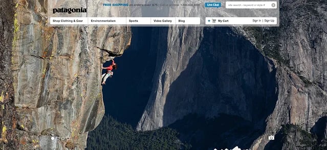
Patagonia has two goals for visitors that reach their homepage: drive them towards a purchase, or solidify their brand image. They achieve those goals by using beautiful pictures on the homepage to get their visitors' attention, while also making sure that their stance for environmentalism is well known. A series of four images displays on the homepage that you can scroll through to learn more about environmentalism; or, you can simply go to the navigation at the top to learn more, or start shopping. There aren't too many navigation options, making it easy to find exactly what you're looking for: information on environmentalism or clothing.
Takeaway From Patagonia's Website: Don't give visitors too many options. Keep the homepage simple and beautiful so your audience can easily find what they're looking for, all while being enthralled by captivating images.
Ford
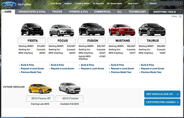
When you go to a car dealership, you do one of two things. You either purchase a car that's already on the show floor, or you research the ideal features you want in a car so you can purchase it at a later time. Ford gives you that exact same in-person experience on their website. Right from the homepage, you can choose the type of car you want and begin building it, providing a website experience that gets visitors excited about owning a Ford car.
Takeaway From Ford's Website: Try to give your website's visitors the same experience that they would get if they visited you in person.
Rdio
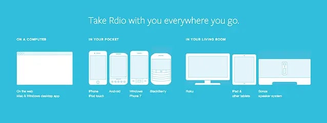
Rdio competes against Spotify and Pandora. But what it has that the competitor websites don't is a homepage with beautiful content visualizations explaining exactly what you can do with Rdio, and customer testimonials explaining why people should use it. The visualizations are full of beautiful images that are easy to digest and understand -- critical for a new service that needs to explain not only what it is, but why it's valuable to new site visitors.
Takeaway From Rdio's Website: Instead of relying on text, use images that explain your company's purpose and value so customers understand what they can do with your product or service.
Sony
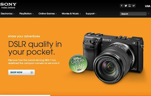
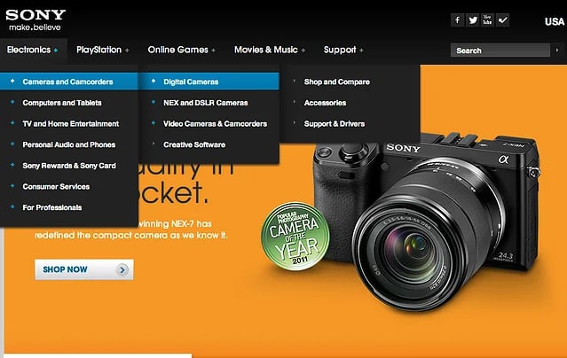
Sony has thousands of products, so it's at serious risk of creating a confusing, overwhelming site experience for visitors -- where on earth should they go to find that one specific camera? To solve that, Sony invested some serious time on their site's information architecture to ensure their navigation made sense for visitors, sorting products into their most logical categorization. Their navigation also carries over the same elements in every drop-down menu -- "Shop and Compare," "Accessories," and "Support & Drivers" -- so visitors know they can perform the same actions regardless of product.
Takeaway From Sony's Website: Think through the most logical categorization of the items in your navigation, and utilize drop-down menus to sort those items so visitors don't struggle to find what they need.
Nest
Nest uses beautiful images on their website to explain the functions of its product. On their page "Living with Nest," for example, they use visuals to walk visitors through what to do with their product during the first year.
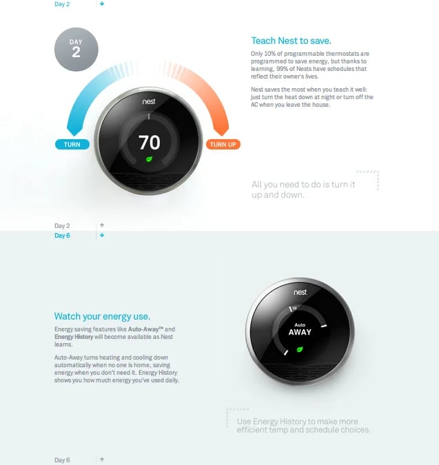
As you scroll down, the circle with the "Day" number scrolls from 2 to 6 to give the website visitor an understanding of the time it takes to see a difference with their product.
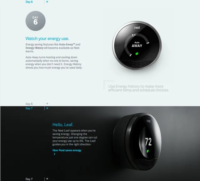
Takeaway From Nest's Website: Use visual elements to tell a story about your company that helps visitors understand the experience of working with your product or service.
Apple
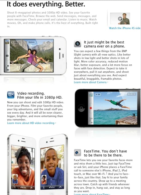
Ahh, Apple. The golden child of beautiful and functional websites. The homepage makes it easy to select from their different products and find out more information about its features and prices. One part of Apple's website that makes it stand out from many others, though, is the way they lay out their product pages. These pages go into extreme detail to explain what the features of their products do, including high resolution graphics that show the features on the product's screen. Take a look at the iPhone product page, for example -- it really brings the product to life for a visitor!
Takeaway From Apple's Website: Don't skimp on the detail on your product pages. If you're selling a product, explain every feature of that product and what they do, using both text and graphic elements to do so.
FreshBooks
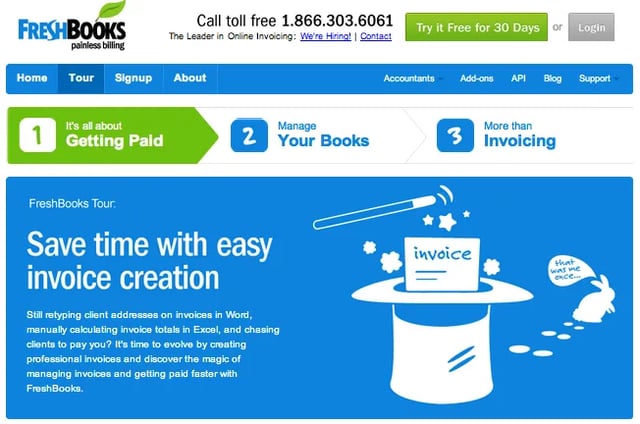
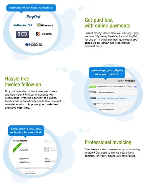
FreshBooks takes site visitors through a visual journey on their website, making it easy to understand the steps necessary to actually use the website. If you click on the tour button at the top of their homepage, it brings you to a page that gives you a visual tour of their service! The arrows at the top of the page demonstrate the three key steps to the service, while the icons below explain the purpose of the company.
Takeaway From FreshBooks' Website: Use directional images and icons, like arrows and numbers, to give a step-by-step walk-through of your product or service to website visitors.
Foursquare
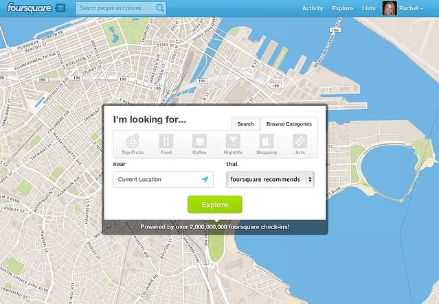
Foursquare's website excels at creating a personalized experience for site visitors. The 'Explore' feature allows visitors to search for places in various categories including food, nightlife, and coffee, and combines that with visuals to help you explore new locations. For example, it shows an image of you and all of the other coffee shops to help users figure out exactly where they want to explore next. Plus, it shows where your friends have been, and what they have said about each location.
Takeaway From Foursquare's Website: Do what you can to create a personalized experience for site visitors, leveraging past actions, behaviors, and lead intelligence to deliver the type of content they're interested in.
Adidas
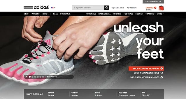
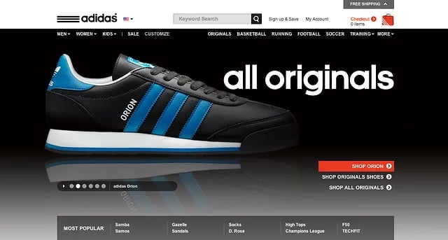
What makes Adidas' website stand out from its competitors are the beautiful visual elements on the homepage. Adidas uses a slider to showcase some of its top products to enthrall the visitor from the second he or she is on the page. I'm sure we've all come up against those sliders out there that aren't easy to click-through or that scroll too quickly, too ... but Adidas has nailed the timing and flow of images on their homepage slider!
Takeaway From Adidas' Website: If the homepage slider is right for your company, use it. It will allow you to showcase the most noteworthy aspects of your company all in one place.
Square
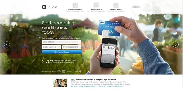
The Square website keeps things simple, giving you just three options: sign up for Square and get a card reader; sign up your business to turn your iPad into a cash register; or pay with Square to download the apps on your mobile device or tablets. Square uses the mentality that simplicity is key. And wisely so! With new products like Square, it can often be confusing for visitors to figure out exactly what steps to take to set it up. Square's website makes it easy by getting right to the point, and limiting the different avenues a site visitor can take.
Takeaway From Square's Website: Keep it simple. If you only need a few options to explain your company's function or direct site visitors to take a certain action, don't overload the website visitor with more than that.
What websites out there do you think nail both form and function?
Photo Credit: Neeraj Sharma Web Designer

Website Design Examples
.png?width=112&height=112&name=Image%20Hackathon%20%E2%80%93%20Vertical%20(50).png)
