Who knew Disney (Walt, not the corporation) was such a prognosticator of things to come?
Visionary, yes. Impresario, of course. But who knew that “It’s a Small World,” that cloying little ditty you can’t get out of your head for hours after taking a 12-minute motorized gondola ride, would foretell the future of marketing?
For digital marketers, even as the opportunities expand, the playing field is shrinking -- to a space about 2 inches by 3 inches: the smartphone screen. Also shrinking is the time to reach consumers: 75 percent of online searchers take an action within a few hours, and 36 percent of them take an action immediately.
Yes, the market for tablet devices is growing rapidly, but the latest figures show more than 6 billion smartphones in use worldwide, about 90 percent of the world’s population. And, regardless of which analysts’ predictions you believe, 2014 or 2015 -- the time when mobile access to the Web will outpace wired access -- is almost here.
So as a lead generating inbound marketer, you must master optimizing your landing pages for mobile marketing, too. I mean, do you really want to lose out on lead generation opportunities with your mobile audience -- an audience that's getting bigger day by day? I think not. So this post is going to tell you the best practices for optimizing your landing pages for mobile devices -- it'll be a handy checklist to ensure you don't miss out on that on-the-go audience of yours!
Master the fundamentals of mobile marketing using this free guide.
12 Things to Remember When Creating a Mobile-Optimized Landing Page
1) Be Visible
Flash, PNG-24 images, and a host of plug-ins make much of your content inaccessible on many mobile devices. Use alternate means to get your content onscreen, such as HTML5, jQuery, or JPGs so mobile devices have an easier time rendering your content. After all, you can't exactly expect a ton of conversions if no one can see your landing page content in the first place.
2) Scale to Size
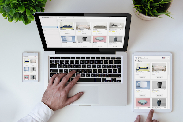
Use responsive web design to determine what type of device consumers are using to access your landing page, and scale the content appropriately for them. Don’t forget to program the page to load and scale properly based on both portrait and landscape mode -- you never know when someone's going to flip on ya!
3) Be Concise
Six-word headlines are so last year. Three- to four-word headlines are all the rage. Write your landing page copy, then cut it in half. Every word must contribute, must matter, on a mobile landing page. Not only are the screens too small for extraneous words, a mobile reader's attention span is far less than that of a desktop viewer.
4) Be Available
Adding click-to-call capability -- the ability for users to literally click on your phone number on your mobile landing pages -- will help you with mobile conversions. They are, after all, on their phone. Include a phone icon, call-to-action text such as “Call Now,” highlight the link in a complementary color, and offer something useful in exchange for the call, such as a guarantee or a promotional rate.
5) Think "Two Thumbs Down"
Make sure the items on your landing page a user needs to click on are thumb-friendly. For most devices, this means the clickable area should be somewhere between 38X38 pixels to 44X44 pixels. Add padding to your links, make sure there’s some margin (negative space) between clickable links to avoid misclicks, and use plug-ins with touch swipe gestures (such as Flexslider or Photoswipe), where possible.
6) Be Slim
Present your content in a single column and, whenever possible, keep your call-to-action above the fold, which is within the top 100 pixels for smartphones. If your CTA doesn’t fit above the fold, include a prescriptive teaser, such as “Scroll Down for Special Offer.”
7) Think Local
Smartphones and other untethered devices may mean its user is on the move, but that doesn’t mean you don’t know where they are; in fact, quite the opposite. Even the broadest of geotracking systems locate users within 5 to 20 miles of where they are, so use the local nature of mobile to make your landing pages more relevant to consumers. Include a link to your nearest outlets, such as “Stores near Seattle,” customize headings with the city or area name, and prepopulate location fields -- or better yet, zip codes -- on web forms to make it easier for users to get to the “Buy Now” button.
8) Use Simple Forms
Keep your forms to the bare minimum needed to get the job done. The simpler the form, the fewer the fields, the better. Longer forms tend to lead to lower conversion rates in general, but it's even more true with mobile devices -- some estimates put the conversion rate as much as 50 percent lower. If you cannot fit everything you need on a single page, split the form into two pages to make it look less daunting.
9) Be Fast
The data on your mobile pages should be lean, lightweight, and under 20 kilobytes so your pages load in 5 seconds or less.
10) Get to the Point
The fewer actions a user has to take to get to their reward, the better. If you can limit those actions to three or four at the most, you will no doubt improve your conversion rates. Each action a user takes should be not only easy to complete, but compelling and bring them one step closer to completion.
11) Be Legible
Don’t sacrifice size for content. Content that’s too small for users to read is essentially no content at all. Having to zoom in to read content is just one more needless thing for a user to have to do, and may prove to be one reason too many to continue on to conversion.
12) Don’t Trust. Test.
A/B test your mobile landing page. Don’t trust that what works for your desktop landing page will work for your mobile landing page. Mobile marketing is not desktop-lite marketing, it’s a whole different game with a different set of rules.
The bottom line to making the most of your mobile landing pages is to keep your end goal in mind. What are you truly looking to get out of your mobile efforts? You won’t be able to include everything on mobile that you’re able to on desktop/laptop/tablets, so ask yourself (and your team) what the core focus is going to be around. In terms of the effectiveness of your mobile efforts, keep a keen eye on simplicity, usability, and performance. Keep your pages fast and your content clean and lean so people on the go can get what they want as quickly and easily as possible.
What else helps landing pages convert better for a mobile audience?
Image credit: JD Hancock

Mobile Optimization


![10 Best Mobile Friendliness Tests [+ What Does it Mean to be Mobile Friendly?]](https://53.fs1.hubspotusercontent-na1.net/hubfs/53/mobile-friendliness-test.jpg)


