 This post originally appeared on the Marketing section of Inbound Hub.

Last year, Trip Kucera from Aberdeen projected 2013 to be the year of personalized content.
However for many companies, personalization has stayed largely in the realm of targeted email marketing. But what happens when someone clicks through that targeted email only to end up on a static, generic website?
The natural progression of personalized emails should lead to a personalized website. For example:
- According to Janrain, nearly three-fourths (74%) of online consumers get frustrated with websites when content appears that has nothing to do with their interests. Tweet This Stat
- After looking at data from more than 93,000 calls-to-action over a 12 month period, HubSpot found that CTAs targeted to the user had a 42% higher view-to-submission rate than calls-to-action that were the same for all visitors. Tweet This Stat
- A 2013 Monetate/eConsultancy Study found that in-house marketers who are personalizing their web experiences (and able to quantify the improvement) see on average a 19% uplift in sales. Tweet This Stat
Given these figures, getting started with a multi-channel personalization strategy in the next few years should be among marketers' top priorities. HubSpot is working on tools that help you provide a personalized experience for your website visitors.
Let's look at a few examples of HubSpot customers at the forefront of this strategy who are leading the way with personalized content, blogs, and websites.
Intuit QuickBase Keeps Their Blog Fresh With Adaptive Calls-to-Action
Content offers like ebooks and webinars are a mainstay of good inbound marketing. Someone comes to your site, sees an interesting piece of content, converts on a landing page, and downloads it to become a lead. But what happens when a lead comes back to your site and sees the exact same content offered again? Odds are, they're going to ignore it. The relationship between a company and its prospective customer is a living, breathing thing. It should evolve over time. Every time you show your leads content they've already consumed, you're missing an opportunity to move them further down the funnel.
Intuit QuickBase, a cloud-based workspace for customizable business apps, recognizes the role fresh content plays in developing relationships and is one company at the forefront of creating a blog that evolves along with the customer. Here's one example of this strategy in action.
When a visitor is new to their blog and hasn't converted yet, Intuit QuickBase offers them a helpful ebook on effective change management. This ebook is perfectly matched to where they are in their research process. It's not pushing a sale. It understands that at this point the visitor may just be gathering information.
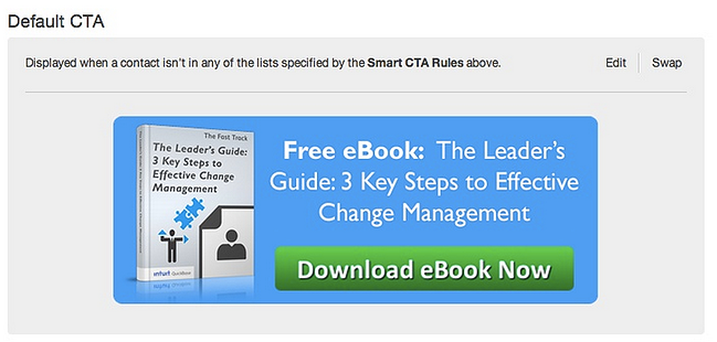
Once a lead has read that ebook, they're probably not interested in downloading it again, so Intuit QuickBase uses "Smart Content" -- Content Hub -- to replace that call-to-action banner on their blog with a new piece of content. You can see below, they've set a rule that whenever a website visitor is a member of the "Change Management ebook Submissions" list, meaning they've already downloaded that piece of content, they should be presented with a new CTA banner for an on-demand webinar series on effective project planning.
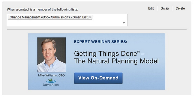
This personalization strategy helps Intuit QuickBase to keep their blog relevant to returning visitors. As a result, they're enjoying clickthrough rates higher than 10% on personalized CTAs and click-to-submission rates of close to 100%.
How to Do This in HubSpot
All professional and enterprise customers have the Smart CTA tool and can add dynamic calls-to-action that can change based on whatever criteria they set.
1. To do this, first create a Smart list to collect the people who download your ebook. You could make the list based on "Form Submission" and use the criteria: Contact has filled out >> any form >> on your ebook landing page. See the example below. You'll use this to target your second CTA.

2. Then hop over to the CTA tool and select "Smart CTA" and base your CTA on Contact List.

3. Build your default CTA to promote your ebook. This will be the main variation people will see.
4. Then select "+ Add a Smart CTA Rule" and pick your list from step one. Create your CTA, and you're done! Now when someone downloads your ebook, they won't have that ebook promoted to them anymore.
Lynton Web Adapts Their Homepage to Reflect Visitors' Readiness and Needs
Lynton Web is an inbound marketing agency and HubSpot partner headquartered in Houston, Texas. They understand that the interests and needs of their website visitors are going to evolve the more they get to know the agency. So, when a visitor first arrives at their site, the call-to-action is a bit softer and more educational. They don't push first-time visitors to sign on right away -- instead, they invite them to "Learn About Inbound."
The Default, Impersonal Homepage

When the visitor then returns to the website as a lead, the CTA becomes more direct and points to services Lynton Web offers. They encourage the now-educated website visitor to "Start Your Project Today." Lynton even adjusts the text for returning visitors who have mentioned in a previous form submission that they use HubSpot software. Now the homepage is tailored both to the visitors' interests and to better fit where they are in their decision process.
Personalized Homepage (After Converting as a Lead)
The personalization on Lynton's website doesn't stop at the homepage. They also personalize content to reflect a visitor's company name and other characteristics. Throughout these efforts however they are very careful to use personalization in places where it can be most helpful to the website visitor. You can read a thoughtful breakdown of Lynton's personalization strategy over on their blog.
How to Do This in HubSpot
The way they personalize entire website pages is by using COS Smart Content. Customers with the COS can customize entire content modules, similar to the targeted Smart CTAs.
1. If you are using the COS, any of your rich text modules will have the option to be "Smart" or have different versions targeted to different people. To make a new version, click "Make Smart" on the top right-hand corner.

2. From there, similar in the previous example, you can choose to target to either a Contact List or a Lifecycle Stage. In this case, pick a Lifecycle Stage so you can make a version of your page that only leads will see.
3. Then, select your lifecycle stage you are personalizing your website for, in this case leads.

4. Now you can add whatever you would like to that content module. Only leads will see it! You can be sure, because it will say Rule 1: Lead. (You will have as many rules as you set, in the event you wanted a version for leads, customers, and more.)

Sales Benchmark Index Personalizes the Whole Experience
One of my favorite examples of personalization beyond email comes from Sales Benchmark Index. Sales Benchmark Index helps B2B companies master sales and marketing processes. In their work, they deal with a number of different roles from HR to Marketing. They had a challenge: How do you speak to each different persona without giving your website a personality disorder?
They worked with New Breed Marketing, a HubSpot partner, to redesign their website, develop personas, and create a personalization strategy that spoke to each one. The result is much more than dropping a company name into a page, it's an entire personalized experience from email to webpage to blog. Let's take a look.
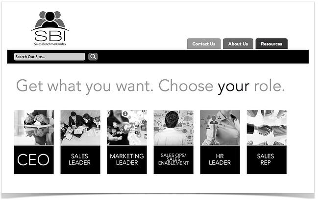
The Default, Impersonal Homepage
When you arrive at Sales Benchmark Index for the first time, you're asked to choose a role that best describes you. In personalizing content on your site you can either be ascribed or elective. Ascribed personalization takes a visitors past behavior and characteristics to ascribe content you think will be relevant to them. Elective puts that choice in the visitors' hands. There are cases for each approach, but wanting to give control to its visitors, Sales Benchmark Index took an elective approach.
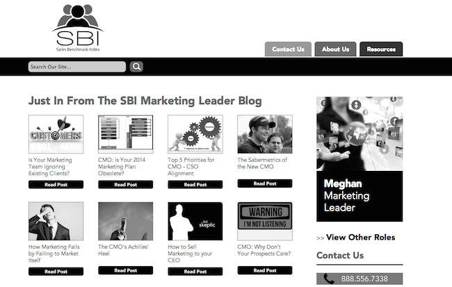
Personalized Homepage (After Converting as a "Marketing Leader")
Once you choose a role, the next time you return to Sales Benchmark Index the entire experience is personalized. Note below that the content is now all relevant to marketers and the site recognizes me by name and persona.
But wait, there's more to the strategy ...
When I download a piece of content, not only does the thank-you page continue to recognize me, the email it triggers also suggests content based on my interests and what's commonly liked by marketers on their site.


As a visitor learning about Sales Benchmark Index, I get an experience that stays consistent across channels and gets more relevant over time. I'm no longer having to weed through materials targeted for other roles to find what has the most resonance for me.
How to Do This in HubSpot
You can get this level of personalization by taking similar steps as the Lynton Web example, except by targeting your content to Smart Contact Lists (like the Smart CTA tip) instead of by Lifecycle stage.
Heading for a website redesign? Visit the custom match program to get paired with a partner agency that has experience with building personalization into website redesigns on the COS.
Sales Benchmark Index is clearly an advanced example of running the thread of relevant content throughout the online experience, but you can get started by identifying one or two useful places to target your content. For example, Prestige Resorts, a travel site selection firm, has started off with personalization on a single page -- their events listing -- to alert people to events in their region. They're experimenting to see if geographic personalization makes the research experience easier for their website visitors.
Whatever you try, think primarily about the goals of your site and the way your visitors use it. Then identify a targeted place where personalization could help ease friction. Website personalization shouldn't be a parlor trick. Each of the examples above had a clear purpose and moved the website visitor down the marketing funnel in a meaningful way. Understand the points of friction in your marketing funnel, and you'll understand where to begin with your personalization strategy.
