When you log in to your HubSpot account today, you'll notice a pretty exciting change awaits you. As of this morning, we've refreshed the header section of the HubSpot application, including the logo and navigation bar. This post explains exactly what we changed and why we changed it.

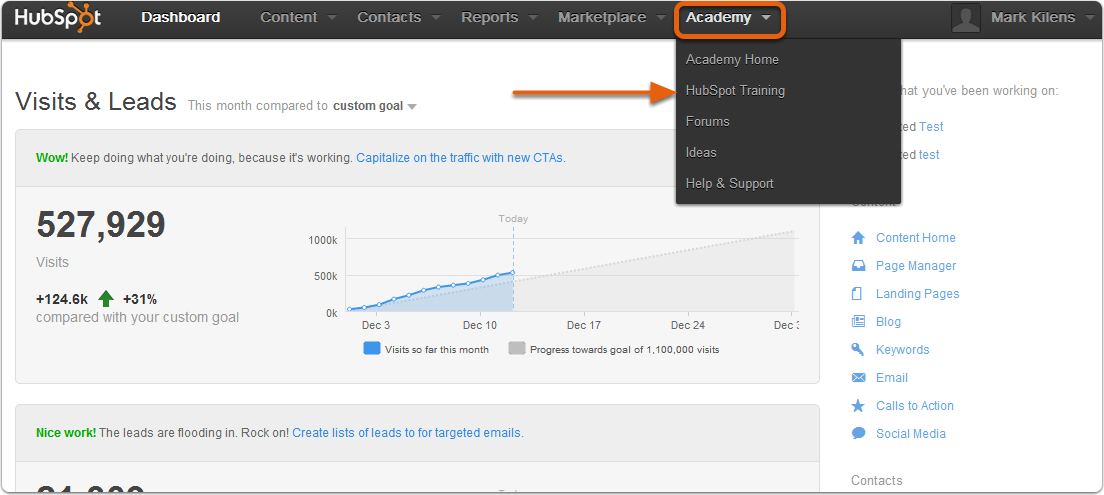
The previous navigation bar has been with us for some time. It is a standard tabbed interface, one that you've probably seen on many other websites and applications. Here is what it looked like before today's change:

However, this tabbed interface was a little different from most others of its kind. As you can see in the screenshot above, we had also introduced a second-level navigation flyout layer that showed more options when the tab was hovered over. Some people had no problem with this, but many more people either didn't know that the flyouts were there, were surprised by them, or found them awkward to use. In truth, flyouts really don't really belong under tabs. Tabs make better sense when they serve as a means of navigating to a new tab rather than as a means of navigating into subareas within tabs.
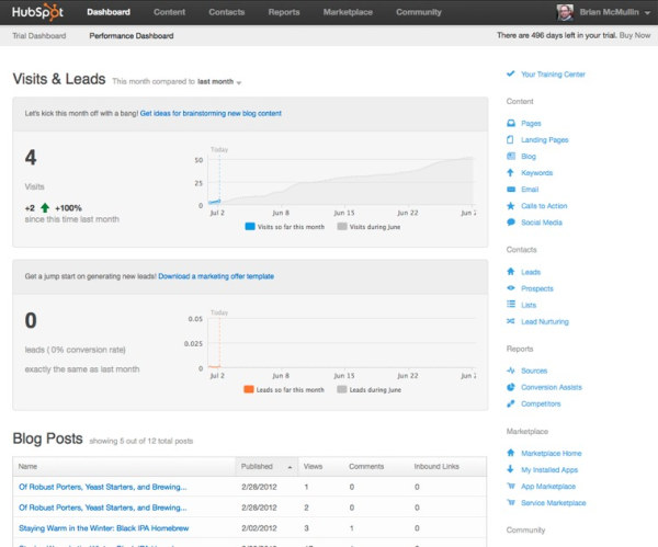
To fix this problem, we redesigned the interface and introduced a subtle but important navigation clue (a downward arrow) that suggests to people using HubSpot that there are indeed different options beneath each top level navigation item. We removed the design element of the tabs and replaced them with more button-like options. You can see that the small arrow that now resides beside each option indicates that there is a flyout to be found there. You might recognize this type of navigation display on sites like Flickr and Amazon, and we believe that it is more appropriate on HubSpot as well.
Here is what it looks like now:

The old application banner also had a large, unused area in the navigation that took up a lot of vertical space, pushing the more valuable page content just a little bit further down the page. We've taken back that space and tightened up the interface, so that more of your content is displayed on every screen. This is a small difference, but over time these things add up. We're going to continue to try and save you space wherever we can, so that your marketing content can be more visible and accessible on each screen you access within your HubSpot applications.
2) We've introduced a new, experimental feature with this new navigation bar. You'll notice that as you scroll, the dark bar remains at the top of the page, always visible, no matter how far down the page you scroll. We did this because we noticed that people were doing a tremendous amount of scrolling as they used HubSpot. They would access a screen, scroll down the page for a while, and then have to scroll all the way back up to the top before going elsewhere within the application. This new feature removes that unnecesary step and allows you to move around your site more quickly and easily. In our initial testing with users, this floating navigation feature seemed to work well. However, we're going to continue to monitor the usability of the floating navigation bar and consider it an experiment for now, as we realize that it's a big change for most of our users.
3) The overall style of the old navigation was no longer consistent with changes we had made to the HubSpot visual design over the last year or so. So the new navigation banner features a dark grey background and white logo, consistent with current HubSpot brand standards you'll find elsewhere in the product. It's also easier on the eyes, as it is now bolder and contrasts more effectively with the rest of the page. Oddly enough, the increased contrast and boldness allows users to more easily ignore it at the top of the page, as your eyes are naturally drawn to the contrasting white space below that contains your content.
4) What we did not change -- HubSpot customers will notice that we did not change the existing navigation options. The links that you're used to using to navigate throughout your HubSpot applications are all still in the same places that they were before the new navigation was put in place.
So that's the new banner and navigation bar changes in the HubSpot app. We're working hard on some other UX improvements that you should see coming out soon. Stay tuned and let us know what you think!
