 We've been working hard lately on another big improvement to your HubSpot application, and we're finally ready to share a special peek at it as we get closer to unrolling it to all customers.

We've redesigned the navigation within the product to make it easier for you to move around between the interconnected apps you use every day. The product navigation menu is changing, and will focus more on the core groupings of applications within the HubSpot product, bringing all of your Content, Contacts, and Reporting applications together in one easy-to-use interface.
As of today, we will begin rolling the new navigation to Beta testers of the new Email and Contacts apps, and will release to all customers in the coming weeks.
What's changing?
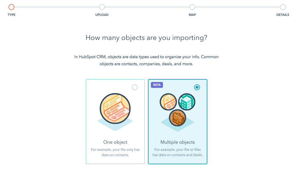
The biggest change is we're moving away from the old organization of apps based on the inbound methodology (Get Found, Optimize, Convert, Promote, etc.) to more of an object-based organization. "Object-based" navigation simply means we've organized things according to the "thing" it is you're trying to work on. So the main categories in the new navigation are "Content," "Contacts," and "Reports," because these are the three main "objects" you tend to work with when you're in the HubSpot product.
The bottom line is that the new arrangement will make it much easier for you to do what you need to do in your HubSpot. We're arranging things so that they're linked up more intuitively, and so that the connections between all of your marketing puzzle pieces are much easier to see.

We're also bringing all of your user and account information into one centralized location in the application. By clicking on user name in the top menu bar, you'll reveal a drop-down menu that will give you quick access to your account settings, and will allow you to easily toggle between different HubSpot accounts and logins. If you manage several different domains within your portal, you'll find those links here.

Why make this change?
Let's go back in time a bit. Back in the not-so-distant past, HubSpot co-founders Brian Halligan and Dharmesh Shah developed the basic structure of the inbound marketing methodolody. And since they were building the software that would deliver on the promise of inbound marketing as a philosophy and practice, it made sense to organize the software around those basic principles.
So we arranged the HubSpot product around the five core ideas behind inbound marketing: Get Found, Optimize, Create, Promote, Convert, and Analyze. And for a long time, this worked pretty well. One of the most exciting things this did was it helped teach the basic principles of inbound marketing to a whole generation of marketers.
But now marketing has evolved, and so have we. These days, most marketers understand the basics of what they have to do to succeed in inbound marketing. And the HubSpot software itself has grown and expanded to the point where it no longer makes sense to categorize the various components under those five headings. Quite simply, the HubSpot product is so integrated and interconnected, it's become almost impossible to decide which one column to place things in.
It's kind of a good problem to have.
Basically, this means that we're continuing to deliver on the promise of an integrated, all-in-one solution for all of your inbound marketing operations. The more integrated our applications become, the harder it is to silo them out into separate functions.
So the new navigation is designed to reflect that. Now you'll be able to move seamlessly and swiftly through creating content, deploying it, promoting it to your contacts, and analyzing its effectiveness, all without having to think about where you can do this, or how you can do that.
And the new design is based directly on your feedback. The HubSpot User Experience team asked our customers how they used our product, how they wanted to use our product, and discovered how the product could be better designed to suit their needs. We redesigned your navigation menu specifically in response to this data.
Let's get down to brass tacks
So when will you see the new navigation? Well, for the next two weeks we will be rolling this new navigation out to a sizeable Beta group for feedback. Customers in the Beta group will be able to use the new nav to their heart's content, and will give us their honest feedback as they go along. Want to join the Beta? Apply here.
We'll be watching this feedback extremely closely while we make the finishing touches to the new nav, confirm that it's designed in a way that will thrill and delight you, and that it's truly making life easier for you. Once we're satisfied that you're going to be satisfied, we'll roll it out to all customers. The whole process should take about two or three weeks, barring any major upsets or obstacles.
So what do you say? Are you as excited about the new nav as we are? Ready to give it a whirl? Let us know what you think in the comments.


