A full-width banner with an image is a great way to add some color to your web page and make the user experience pop. There are two methods to add this type of banner to your templates, and we'll walk through both.

The two methods for adding banner to your pages are:
- Adding an image directly into the page
- Adding the image using the background-image CSS property.
But which method should you choose? Here are a few things to consider when deciding whether to use an image vs. a background image:
- Do I need this image to be discoverable by search engines? – Image in page
- Do I want the user to see the whole image for any width? - Image in page
- Do I want content on top of the image? – Background Image
- Do I want that content to be responsive? - Background Image
Still unsure of which method to use? Below are more detailed explanations for the benefits of each method as well as how to implement either into your pages.
Using a Full-Width Image
Using an image that spans the full width of the page has accessibility advantages. For example, the <img> HTML tag allows screen readers to read the alt attribute in the tag. That alt text can also have SEO benefits by increasing the accuracy of search engines indexing your content.
The full image method also works well if you intend to have the image contribute to the context or topic of the page. An image banner will span the full width of the area that it’s in, but that also means it will shrink with the rest of the web page if it’s resized. You can implement this method by following the instructions below:
- Insert an image module into your template. Avoid having it added to an area that is grouped because you’ll want the image to be independent of any parent containers that might contain the image.

- Choose the image you want within the module options options area. Also add a CSS class to the CSS options area of the module. In this example, the class is full-width-banner

- Style your image to be full width by adding the following CSS declaration in your stylesheet: .full-width-banner img { width: 100% !important;}

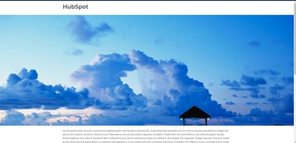
Voila! You should now have a full width banner image, similar to our example below:
Want more content like this? Subscribe to the User Blog.
Using a Background Banner Image
When you want to have an image span the full width of the page and have content on top of that image be readable in multiple widths, use a background image. A background image changes the amount of the image visible depending on how wide the viewport is and how much height is required in the parent element. This makes it better for responsive designs.
Think of the parent element as a window overlooking your backyard and the background image as the lawn. You can change the window size, but the size of the lawn will remain the same size. This can be useful if you’re intending to use a visually appealing image in the background that makes the content on top stand out. This method should be used if the image itself is not as important as the content on top of it. You can position the image into different areas using other CSS declarations, but unless you make specific changes to the background image based on the width of the page through a separate property, the background image will typically stay in the same place.
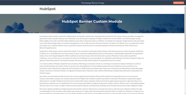
Here is an example of a full-width background image banner:
To create your own custom module with a background image in the template, follow the steps below:
- Start by creating a new file in the design manager and selecting the custom module type.

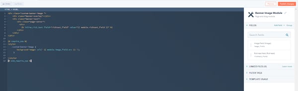
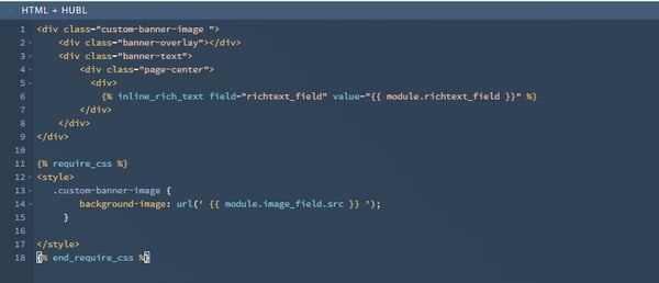
- Paste this code into the HTML + HUBL section of your module:
<div class="custom-banner-image ">
<div class="banner-overlay"></div>
<div class="banner-text">
<div class="page-center">
<div>
[PLACEHOLDER FOR RICH TEXT FIELD]
</div>
</div>
</div>
<style>
.custom-banner-image {
background-image: url('here is where you place the background image URL');
}
</style>
3. In the right sidebar of the module editor, add a field for the image you want to use. Then, select the default image.
4. Enter the following CSS into your custom module:
<style>.custom-banner-image { background-image: url('HERE IS WHERE YOU PLACE YOUR IMAGE URL'); }</style>
5. In the right sidebar of the module editor, add a rich text field to the module.
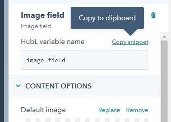
6. Copy the snippet from the image field and paste it into the URL function of the background-image declaration. Remember to keep the quotation marks intact.
6. Paste the snippet into the HTML + HUBL area. It should look like:
.png?width=600&name=image10%20(1).png)
7. Delete all additional code beside what is inside the src=”” area.

8. Copy the Rich Text snippet and paste into the placeholder.
9. Paste this code into the CSS section of the module:
.custom-banner-image {
background-repeat: no-repeat;
background-size: cover;
background-position: 50% 50%;
position: relative;
width: 100%;
height: auto;
display: block;
}
.custom-banner-image .banner-overlay {
position: absolute;
top: 0;
left: 0;
width: 100%;
height: 100%;
background-color: rgba(0, 0, 0, 0.5);
}
.custom-banner-image .banner-text {
padding: 50px 0;
color: #eee;
text-align: center;
position: relative;
z-index: 1;
width: 100%;
font-family: sans-serif;
}
.custom-banner-image .banner-text{
color: #fff;
}
@media (max-width: 767px){
.header-container.container-fluid .row-fluid .page-center {
padding: 0;
}
.custom-banner-image .banner-text {
padding: 50px 15px;
}
}
10. Publish the changes.
You should now have a functional full width banner from scratch. You can implement this custom module into your template in the same way that you would add any other module to your template. With this full-width image banner in place, your page will look that much more professional and eye-catching.
A quick note here about selecting the right background image: a good rule of thumb is to use an image that fits the natural size of the screen in pixel dimension, as this helps with the final appearance.
But why stop here? Check out the following resources to learn more:
To stay up-to-date on design tips and tricks or to share some of your own, swing by the HubSpot Design Community.
Happy coding!