
Over many B2B SaaS roles, I learned that tracking traffic alone can‘t answer the question every exec asks: "Is our marketing actually working?" I’ve sat in countless meetings where no one had a clear answer.
Most teams are stuck in the “more traffic is better” mindset, but traffic only tells part of the story. If you want to know what's really driving results, you need to go beyond the basics.
In this post, I'll share the digital marketing analytics I rely on to make smarter decisions, prove impact, and confidently answer that executive question. Bookmark this guide and jump to what you need most.
Table of Contents
- What are digital marketing analytics?
- Digital Marketing Analytics vs. Web Analytics
- What is a digital marketing analysis?
- How to Use Digital Marketing Analytics Effectively
- Digital Advertising Analytics
.png)
A Beginner's Guide to Email Marketing
How to execute and measure successful email marketing campaigns
- Growing an email list.
- Remaining CAN-SPAM compliant.
- Using email automation.
- Segmenting your audience.
Download Free
All fields are required.
Form not available
What are digital marketing analytics?
Digital marketing analytics are the translation of customer behavior into actionable business data. Digital analytics tools can help companies understand what consumers are doing online, why they’re doing it, and how this behavior can be converted into digital marketing campaigns.
Digital marketing analytics help you make sense of what your audience is doing online — and whether those actions are helping your business grow.
I think of digital analytics as the thing that helps me read between the lines. It’s one thing to know someone clicked or filled out a form — but I want to know what that tells me about what’s working.
Web analytics mostly stick to site-level metrics — page views, bounce rates, and session times. But digital marketing analytics go further. They pull data from across your channels — email, ads, social — and help you understand how your overall marketing is performing and where it’s driving genuine results.
Digital Marketing Metrics to Know
Early on, I was glued to page views and social impressions. They looked great in a report — but didn’t tell me if we were bringing in leads, closing deals, or growing the business.
We were pulling in traffic and checking all the usual boxes — but none of it was turning into leads. At some point, I stopped trying to make the reports look good and started asking: is any of this actually working? That’s when I began focusing on metrics that showed real impact, not just movement.

Below are the metrics I’ve found most valuable across different areas of digital marketing — starting with the basics.
Best Metrics for Website Marketing Analytics
These are the site-level metrics I track most often to understand how content and UX are performing:
Visitor
I focus on unique visitors because it shows me how many individual people are coming to the site — not just refreshes or repeat views. When I’m checking content performance, this is one of the first things I look at.
Page View
Every page load counts as a page view. It’s not the most insightful metric on its own, but it helps spot trends and identify content that’s getting attention.
Session
A session includes everything a person does on your site in one visit — clicking around, reading multiple pages, maybe filling out a form. It ends after 30 minutes of inactivity. I use sessions to get a sense of how deep someone’s engagement goes beyond a single page view.
Traffic
I rarely look at traffic in isolation. I track it over time and in context with other metrics — especially conversion rate — to understand if the traffic we’re getting is valuable.
Traffic by Channel
This shows where your visitors are coming from — search, social, email, direct, etc. I use it constantly to figure out which channels are performing well and where we need to shift focus.
Traffic by Device
This tells me whether people are browsing on mobile, desktop, or tablet. I always check this when optimizing content layout or troubleshooting drop-offs — especially if conversion rates are low on one device type.
Ratio of New Traffic to Returning Traffic
This metric compares first-time visitors to people who‘ve been to your site before, shown as percentages. I love this metric because it shows whether you’re growing your audience (new traffic) while keeping existing visitors engaged (returning traffic).
Time on Page
This metric helps me figure out if people are sticking around. If the time is high, it usually means the content is useful or engaging. If it’s low, I take that as a sign to revisit the intro, formatting, or value of the page.
Interactions per Visit
I look at how many actions people take on average during a session — clicking CTAs, downloading content, watching videos. It gives me a sense of whether we’re offering enough value or opportunities to engage.
Bounce Rate
I track bounce rate to see how many people leave after viewing just one page. Sometimes a high bounce rate is fine — like if someone finds exactly what they need on a landing page. But when I see unexpected spikes, it usually means there‘s an issue with the content or the page isn’t loading correctly.
Core Web Vitals
These are Google’s signals for user experience — things like load speed, layout shift, and responsiveness. I keep tabs on them not just for SEO reasons, but because no one sticks around for a page that loads like molasses or jumps all over the place.
Scroll Depth
I track how far visitors scroll down our pages to understand content engagement. If people aren‘t scrolling past the fold, I know the opening content needs work or the page design isn’t drawing them in.
Best Metrics for Lead Generation
These are the metrics I use to track my lead generation efforts:
Call-to-Action (CTA) Click-Through Rate
I look at CTA clicks to gauge whether the content is doing its job. It’s a quick gut check: If a post is getting solid traffic but no one’s clicking “Get the Guide,” that tells me something’s not landing — either the content didn’t connect or the offer needs reworking.
Submissions
Submissions count the number of people who complete a form after clicking a CTA. If we have high CTA clicks but low submissions, that usually points to friction — maybe the form is too long, or the offer doesn’t feel worth it.
Conversion Rate
Conversion rate tracks how many people take a desired action (like signing up or downloading something) compared to total visitors. I track this across content types and channels to see what’s converting — not just what’s getting attention.
Cost Per Lead (CPL)
CPL tells me how much we’re spending to generate each lead. I break this down by channel and campaign to figure out which ones are efficient and which ones are draining the budget without results.
Lead Velocity Rate
This measures how quickly leads move through the funnel — from new lead to MQL, or from MQL to customer. If the pace slows down at a particular stage, I know it’s time to revisit our nurturing strategy or look for friction.
Free Trial Conversion Rate
If you're running a free trial model, this one’s critical. It shows how many people who start a trial become paying customers. I use it to connect top-of-funnel content to actual revenue and flag where prospects might be falling off.
Pop-Up Conversions
Pop-up conversions track how many visitors fill out forms triggered mid-browse. While pop-ups can be annoying, I’ve found that well-timed, relevant ones can move the needle — especially when tied to intent.
Ratio of Generated Leads to Marketing-Qualified Leads (MQL)
This metric compares total leads to those that are actually a good fit. I track this to evaluate the quality of leads we’re bringing in and how well our content aligns with our ideal customer profile.
Leads to Close Ratio
The leads to close ratio shows what percentage of your leads turn into paying customers. It’s one of the clearest ways to gauge content effectiveness — if a certain offer or campaign brings in leads that never close, it’s time to pivot.
Best Metrics for Email Marketing
Email’s been one of the most consistent performers in every role I’ve had. It’s straightforward, flexible, and still delivers when done well. These are the metrics I look at to figure out if an email campaign is doing its job.
Open Rate
This tells me how many people opened an email out of everyone I sent it to. I use it to test subject lines and timing. If open rates dip below our usual baseline, I dig into whether the content felt relevant — or if it even made it to the inbox. For B2B SaaS, I generally aim to hit at least 20%.
Opens by Device
This shows which devices (mobile, desktop, tablet) people are using to read emails. Most folks check email on their phones, so I always make sure our design works well on mobile first.
Click-Through Rate (CTR)
CTR tracks how many people clicked a link inside the email. I’ve seen huge differences here based on personalization and list segmentation. The more targeted the message, the better this number usually looks.
Bounce Rate
Bounce rate tracks how many emails didn’t make it to someone’s inbox. I watch it to catch list issues early. If it spikes, I remove outdated or bad addresses.
Unsubscribe Rate
If more people are leaving than joining, I take it as a sign we’re either sending too often — or just not giving folks a good enough reason to stick around.
List Growth Rate
This metric shows whether our list is trending up or down. If more people are unsubscribing than signing up, I take a closer look at our content or our sending frequency.
Best Metrics for Social Media
Follower counts might look impressive in a slide deck, but they don’t pay the bills. Here are the social media metrics I track to understand whether our efforts are working:
Engagement Rate
I calculate this by taking all the likes, comments, shares, and clicks, then dividing by our total followers. A high engagement rate tells me people aren’t just seeing our content — they care enough to interact with it.
Follows and Subscribes
This metric tracks how many people choose to follow your social accounts because they want to see more of your content. While follower count isn't everything, I track growth to understand whether our content strategy is attracting the right audience.
Shares
Shares are one of the strongest signals of content value. If someone’s willing to repost something under their name or brand, that means it hit the mark.
Audience Growth Rate
I use this to track how quickly our following grows over time. I calculate it by dividing new followers by total followers, then multiplying by 100. It’s a more honest view than just watching the number tick up.
Post Reach
Post reach tells me how many people saw a piece of content. I track this as a percentage of total followers to get a sense of how well we’re navigating platform algorithms and timing.
Potential Post Reach
This metric estimates how far our content could go based on who shared it and the size of their audiences. I don’t put too much stock in this number alone, but it helps measure brand amplification. Potential reach is typically 2-5% of this total.
Share of Social Voice
This metric compares how often people mention us versus competitors. I track both direct mentions (with @handles) and indirect ones (brand name only) to see how we’re showing up in conversations that matter.
Approval Rate
Likes are the simplest form of validation, but they still matter. I use this metric to track positive reactions across campaigns and make sure our tone is landing as intended.
Best Metrics for Ecommerce
Even if you’re not running a full-on online store, these metrics still matter if you’re selling anything through your website:
Shopping Cart Abandonment Rate
I track how many people add items to their cart but don’t complete the purchase. When this number creeps up, it usually means something’s off — maybe the checkout process is clunky, or the pricing catches people off guard at the last step.
Sales Conversion Rate
This shows me how many site visitors become customers. I also pay attention to micro-conversions — like product page views or add-to-cart actions — to see where people are dropping off or getting more serious about buying.
Email Marketing Opt-in
I track how many people sign up for emails while browsing or checking out, and I break that down by traffic source. It’s an easy way to spot which channels are bringing in subscribers who want to hear from us again.
Customer Acquisition Cost
Customers don‘t always come cheap. I calculate our total marketing spend divided by the number of new customers acquired to understand our actual cost per customer. The higher the number, the more we’re spending and the narrower our profit margins.
Average Order Value
This one’s simple: total revenue divided by number of orders. I use it to see if people are buying more expensive items or adding extras to their cart. Sometimes, just tweaking bundles or offering free shipping thresholds can help bump it up.
Revenue by Source
This metric tells me which marketing channels are driving sales — not just traffic. Social might bring in volume, but if search or email drives more purchases, that’s where I double down.
These metrics cover the most important digital marketing analytics across different channels. Depending on your marketing tools and channels, you might track additional metrics specific to your business.
But why are digital marketing analytics so much more powerful than basic web analytics?
A Beginner's Guide to Email Marketing
How to execute and measure successful email marketing campaigns
- Growing an email list.
- Remaining CAN-SPAM compliant.
- Using email automation.
- Segmenting your audience.
Download Free
All fields are required.
Form not available
Digital Marketing Analytics vs. Web Analytics
The most significant difference between web analytics and digital marketing analytics comes down to scope.
Web analytics tell you what’s happening on your website — page views, bounce rate, time on page. That’s helpful, but it doesn’t tell you whether those visits are turning into leads or customers.
Digital marketing analytics go further. They help you connect all your marketing efforts — email, social, ads, blog content — and see how they work together to drive results. Instead of just looking at what people do on your site, you get a clearer view of how they found you, what influenced their decisions, and what led to revenue.
I’ve seen teams get stuck optimizing for web metrics that look good on paper, but don’t lead to any business outcomes. I’ve done it myself — spending months trying to improve blog performance based on time on page, only to realize those posts weren’t attracting the right audience or creating meaningful engagement.
If we’d been using digital marketing analytics from the start, we would’ve seen that we hadn’t aligned our content with our goals — or the buyer’s journey.
That’s why I always come back to the marketing and sales flywheel. It’s not just about top-of-funnel traffic. It’s about how everything works together — attracting, engaging, and delighting people at every stage. Digital marketing analytics make it easier to track that cycle and figure out what’s legitimately helping your business grow.
Web analytics gives you the puzzle pieces. Digital marketing analytics help you put them together.

What is a digital marketing analysis?
Marketers deploy digital marketing analysis to understand how their current digital channels are performing. This process also unearths new opportunities to reach and engage their target audiences.
A digital marketing analysis is the first step to developing a strong digital marketing analytics strategy. I use this process to structure a business goal into outcomes based on three broad categories:
- The relationship between different marketing channels
- People-centric data on the buyer's journey
- Revenue attributed to specific marketing efforts
Let's highlight these main differentiators.
1. The Relationship Between Marketing Channels
Digital marketing analytics provides a solid look into the direct relationships between your marketing channels. It‘s great to be able to see how each of your channels (e.g., social media, blogging, email marketing, and SEO) is performing. Still, the true power of analytics comes into play when you can easily tie the effect of multiple channels’ performances together.
For instance, let's say you sent an email to a segment of your database. Digital marketing analytics not only tells you how many people clicked through from your email to your website, but also how many of those people converted into leads for your business when they got there.
Furthermore, you can compare the impact of that individual email send with other marketing initiatives. Did that email generate more leads than the blog post you published yesterday? Or was the content you shared via Twitter more effective?
2. People-Centric Data on the Buyer's Journey
As we mentioned earlier, a key differentiator between web analytics and digital marketing analytics is that the latter uses the person — not the page view — as the focal point.
Digital marketing analytics enables you to track how your prospects and leads are interacting with your various marketing initiatives and channels over time. How did the lead first come to find your website? From Google? Facebook? Direct traffic? Is that lead an active part of your email subscriber base, clicking and converting on marketing offers presented via email? Do they read your blog, and have they downloaded any content offers that could indicate an interest in your products/services?
Full-stack digital marketing analytics can tell you all of this and more, providing you with extremely valuable lead intelligence that can help inform the direction of your future campaigns.
Looking at all of this information in aggregate can help you understand trends among your prospects and leads and which marketing activities are valuable at different stages in the buyer's journey.
Perhaps you find that many customers' last point of conversion was on a certain ebook or white paper. Having this data makes it possible to implement an effective lead management process, enabling you to score and prioritize your leads and identify which activities contribute to a marketing-qualified lead (MQL) for your business.
3. Revenue Attributed to Specific Marketing Efforts
One of the most valuable functions of marketing analytics is its ability to attribute specific marketing activities to sales revenue. Sure, your blog may be effective in generating leads, but are those leads turning into customers and making your business money? Closed-loop marketing analytics can tell you.
The only requirement here is that your digital marketing analytics system and customer relationship management (CRM) platform are connected.
Having this closed-loop data can help you determine whether your marketing initiatives are contributing to your business's bottom line. Through it, you can decide which channels are most critical for driving sales.
Perhaps your blog is your most effective channel for generating customers, or conversely, you see that social media is only as powerful as an engagement mechanism, not a source of sales.
You’ll set better, more outcome-driven goals when you measure how your channels work together, track behavior across the buyer’s journey, and connect revenue back to specific marketing efforts.
Now, let’s talk about how to use these marketing analytics effectively.
How to Use Digital Marketing Analytics Effectively
I’ve had campaigns with solid traffic and decent engagement — but nothing to show for it. That’s when I realized surface-level metrics weren’t telling me what I truly needed to know.
I’ve been there. The dashboards look fine, but when someone asks, “Is it working?” — I don’t always have a clear answer.
For me, it usually means one of two things: the goals are fuzzy, or we’re measuring things that don’t matter.
Here’s how I’ve learned to cut through the noise and use analytics to make better, more confident decisions.
Master SMART Marketing with our free, goal-setting Excel template.
S.M.A.R.T. Goals
I’ve spent way too much time staring at dashboards without really knowing what I was supposed to take away from them. Traffic’s up — so what? If I can’t explain what that means for the business, the number doesn’t help me much.
Before diving into data, I try to get specific about what I’m aiming for. “More traffic” isn’t a real goal — something like “grow organic visits from X pages by 20%” gives me a direction and something I can check back on.
I use the S.M.A.R.T. framework to shape goals that are actually useful:
- Specific – Instead of “get more traffic,” I’ll set a goal like “increase organic traffic from our target keyword group by 25%.”
- Measurable – If I can’t put a number on it, I won’t know if I’m making progress. I always establish a baseline first.
- Attainable – I try to stretch, but not to the point of setting myself up to fail. Past performance helps me stay realistic.
- Relevant – I tie every goal to a bigger outcome — whether it’s generating pipeline, improving retention, or increasing revenue.
- Timely – Every goal gets a deadline. Otherwise, it’s just a wish list.
A good goal gives me something to measure, something to optimize toward, and something to share when someone asks, “How’s that campaign going?”
In my experience, most marketing goals fall into one of three buckets:
- Traffic growth and channel diversity – Bringing in consistent visitors from multiple sources
- Lead generation – Turning that traffic into real prospects
- Revenue attribution – Tracking which marketing efforts contribute to actual sales
Getting to those insights isn’t always easy. Most teams — mine included — are pulling data from five or six different platforms: email metrics from one tool, social stats from another, blog performance from the CMS, and so on.
When everything’s scattered across different tools, it’s tough to connect the dots — or figure out where to spend your time.
I’ve found it way easier to get clarity when I use an all-in-one marketing and reporting platform that brings all our reporting together. Instead of bouncing between tools, I can see the full picture and make quicker calls about what’s worth doubling down on — or ditching.
Campaign Reporting
Instead of looking at each traffic source or channel in isolation, I use custom reporting capabilities to build campaign-level views. That way, I can see how a campaign performs across all platforms — not just how one blog post or email did. I want the whole picture, from first touch to final conversion.

I’ve used HubSpot's Marketing Hub to create campaign-level views that combine data from blog posts, emails, CTAs, landing pages, and ads. These reports have helped me spot what’s driving results and what needs adjusting.
Here are a few I rely on most:
Web Traffic by Original Source
I use this to see where visitors are coming from — search, email, social, etc. — and how those sources perform over time. It’s invaluable for spotting which channels are most effective at turning traffic into leads or customers.
For example, I might discover that while social media drives a lot of traffic, search engine traffic converts to leads at three times the rate. That insight completely changes how I approach content distribution strategy.
First Conversion by Original Source/Persona
This report shows me which content offers or CTAs led to someone’s first conversion — and where they came from. I also segment by persona when I can. That helps me understand which audience groups respond to different types of content.
Contacts Funnel Report
This report helps me track how leads progress through the funnel — from contact to MQL, SQL, and eventually customer. If a large percentage of leads are stalling at one stage, it usually means something’s missing — like a nurture email, better content, or a clearer handoff.
Marketing Contribution to Revenue
This report is key to connecting the dots between marketing and closed revenue. I use lifecycle stages to see which leads became customers and their value. If I can tie a blog series or campaign to revenue, that’s the kind of stat leadership pays attention to.
Customer Acquisition Cost
You can track customer acquisition cost in HubSpot using calculated fields or custom properties to show total marketing spend per new customer.
Content marketing often comes with higher upfront costs, but over time, I’ve found it leads to lower acquisition costs compared to paid channels. These closed-loop reports help me track business outcomes — not just vanity metrics. But all the insights in the world don’t mean much unless you use them.
The real value of digital marketing analytics isn’t just proving marketing’s worth to leadership — it’s using those insights to optimize your performance across every part of your system.
With closed-loop reporting, I can also show how marketing supports sales — by delivering leads that are more likely to convert.
Digital Advertising Analytics
I’ve worked with companies that poured serious budget into paid ads — but couldn’t say whether those ads were bringing in qualified leads or just clicks. And I get it. It’s easy to report on impressions or cost-per-click. It’s a lot harder to track what happens after someone clicks.
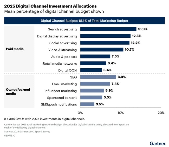
According to the Gartner 2025 CMO Spend Survey, digital channels now account for 61.1% of total marketing spend, with seven out of 10 sectors investing more than 60% of their budget in online channels.
But surface-level metrics like click-through rate only tell part of the story. You can’t measure actual performance unless you connect ad data to outcomes — leads, customers, revenue.
To avoid that blind spot, I always make sure our ad data connects directly to the CRM.
One thing that surprised me early on was how differently various ad types behave. Paid search and social media ads might drive fast conversions, but display ads are more about visibility and long-term brand awareness. People might not click at all — but later, they’ll search for your brand or come back directly. If you’re only measuring direct clicks, you’re missing the impact.
The biggest shift in my overall digital marketing strategy came when I stopped treating ads as a silo. Now, I look at them as just one part of a larger, integrated marketing system. When I measure them in context — alongside content, email, and everything else — I get a much clearer picture of what’s working and how to spend smarter.
Grow better with digital marketing analytics.
After more than a decade in marketing, I’ve learned that traffic and clicks only tell part of the story.
What I care about now is whether our work is creating momentum — bringing in the right leads, shortening the sales cycle, and supporting the bigger business goals. That’s where digital marketing analytics come in.
I use them to spot what’s working, what’s not, and where to focus next. It’s less about building perfect dashboards and more about having enough clarity to make good decisions and explain them to the team (or your boss).
For me, it starts with clear goals, simple reporting, and metrics that actually tie back to outcomes I care about — like leads, revenue, or customer retention.
And once I can see how our efforts connect across channels, it’s so much easier to plan our next steps.
Editor's note: This post was originally published in February 2019 and has been updated for comprehensiveness.
A Beginner's Guide to Email Marketing
How to execute and measure successful email marketing campaigns
- Growing an email list.
- Remaining CAN-SPAM compliant.
- Using email automation.
- Segmenting your audience.
Download Free
All fields are required.
Form not available

-Dec-04-2025-05-17-34-7864-PM.webp)


![What is a marketing plan & how to write one [+ examples]](https://53.fs1.hubspotusercontent-na1.net/hubfs/53/marketing-strategy-examples-1-20240801-4880441-1.webp)