Launched at Partner Day 2018 as part of Service Hub, the Knowledge Base Product has come a long way. What started out as a very minimal product, the knowledge base is now at a point where it is almost fully featured and always delighting our customers. This post gives an outline of how the product has matured from its infancy to today.

MVP
Like any new product at HubSpot, our first release was very much a Minimal Viable Product (MVP). At its core, a knowledge base should do two things:
- Allow users to publish answers to their customers’ questions online
- Enable customers to be able to find answers to their questions online
Our aim for the MVP was to enable our customers to do these two things as simply as possible.
The MVP consisted of:
- A simple editor, providing users with a focused writing experience
- Article categories to provide information architecture
- Basic insights (article views) to allow users to see the value that it was providing to their customers
- Basic design (colors and logo) to allow users to align the knowledge base with their brand
The MVP was well received by our early customers, with many launching their knowledge bases within a couple of weeks, but one common question we would hear from prospects/customers was, “Why would I use a Knowledge Base instead of a Blog or Website Pages?”
Access the Inbound Certification Course in Your HubSpot Account
It was a fair point — we had grand plans for the future of this product but as it stood, our customers could not see its value.
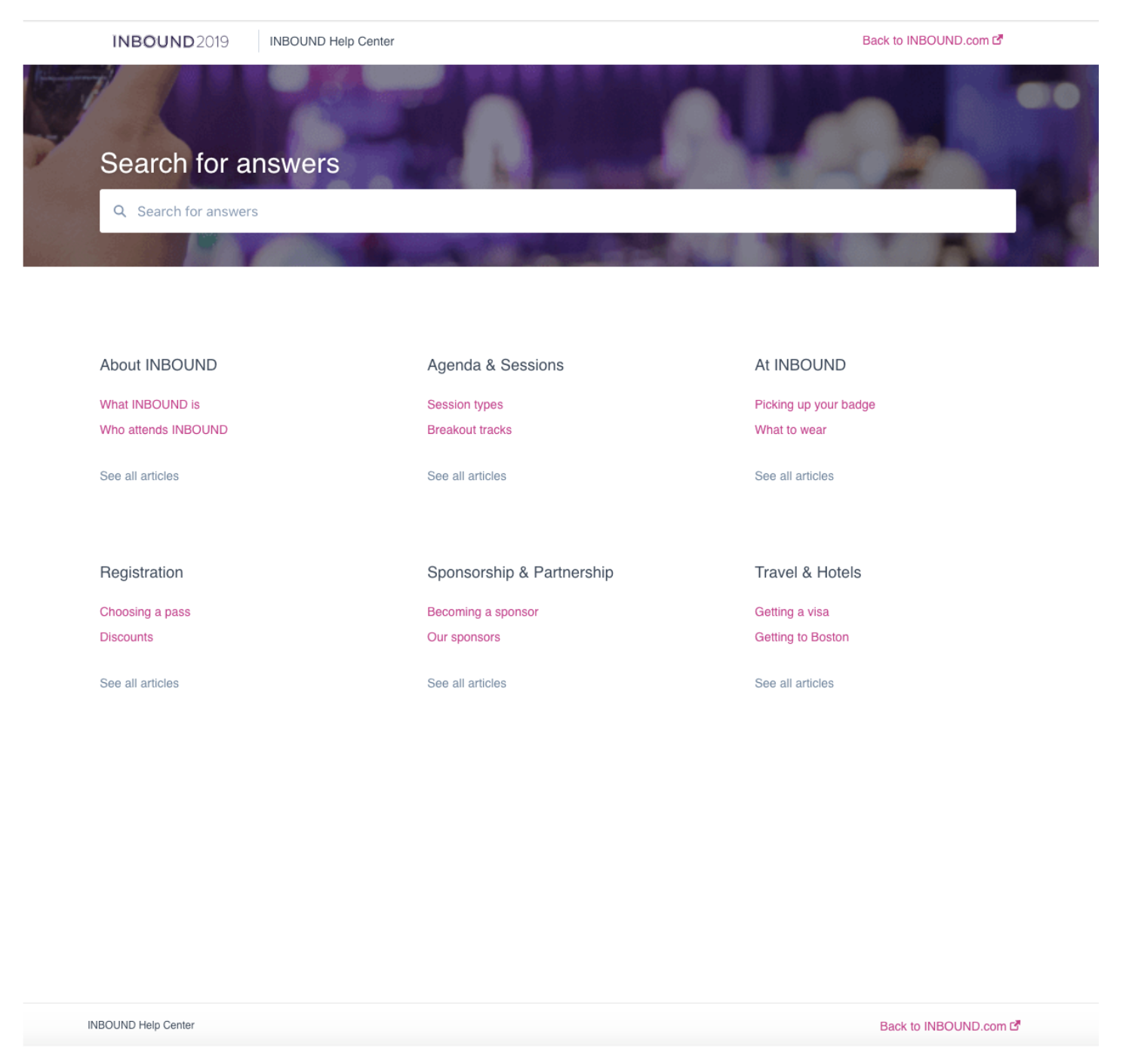
Inbound Help Center was the first live knowledge base
Kevin Hancock, CEO, Frame My TV:
Our business of making decorative frames for televisions is quite unique and often requires coordination of many different details with a client to help them fully understand the process. Hubspot’s Knowledge Base tool has been the perfect solution allowing our team to work from one cohesive and familiar environment by easily managing the info from working Hubspot while also eliminating the need to switch from one cloud app to another to easily edit/add content as compared to other past solutions we’ve used.
We particularly like how well it’s integrated with the CRM for when sending emails to clients. Hubspot has taken great care in thinking through all the details carefully so we can operate more productively while still providing our clients great user experience.
Differentiating the Knowledge Base
The next step was to really address this question and differentiate Knowledge Base from our other content products. We decided to address this question in two ways:
- Double down on article categories
- Deliver key insights that would improve the performance of knowledge base
Doubling down on article categories
The information architecture of a knowledge base plays a huge role in its performance and the value that it provides to end customers. Most of the time when customers land on a knowledge base, they’re trying to troubleshoot an issue they’ve run into. They can be stressed and under time pressures — the quicker they find their answer, the better experience they’ll have.
Categories play a key role in optimizing the browsability and findability of answers in a knowledge base by grouping together related articles. We decided to double down on helping our customers visualize this information architecture and providing an easy way for them to adjust it. We achieved this with the release of the drag-and-drop organize editor.
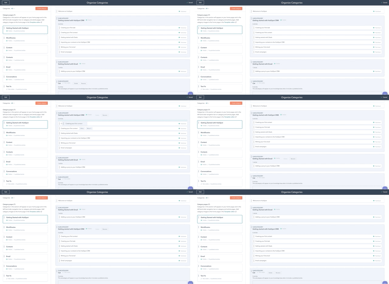
Drag and Drop Organize Editor
Delivering key insights
We wanted to deliver insights that really matter to our users to help them understand what areas of the knowledge base add value to the customer and what areas need to be improved. The insights that we decided to focus on were:
Article Health
Demonstrating the value of a knowledge base can be tricky. Unlike in marketing content, there is no conversion point such as filling out a form, clicking a CTA or subscribing. Ultimately, value is provided if the customer has solved their problem. To demonstrate value, we added a feedback module to each article allowing customers to indicate if they found an article helpful or unhelpful. Not only did this contribute to demonstrating value, but it also surfaced articles that needed to be improved. All of these feedback insights are presented to users in the Article Health report. The report appears front-and-center in Knowledge Base to encourage users to track these important insights.
Search Insights
The second insight we delivered focused on search. We wanted to show our users what their customers search for and highlight the search terms that are not delivering helpful information. This insight has been hugely successful for encouraging customers to create new content for weak areas of their knowledge base.
By focusing on these two areas, our customers now realized the benefits of publishing help articles on the Knowledge Base as opposed to publishing this information on the Blog.
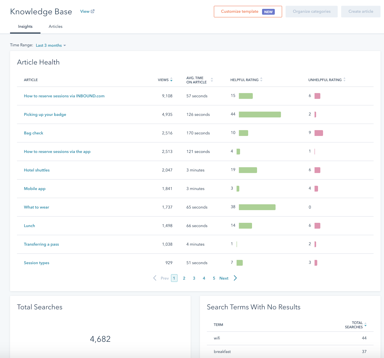
Knowledge Base Insights
Improving Adoption
After understanding the value of the Knowledge Base, the next area we wanted to focus on was adoption. We spoke to countless customers, as well as internal teams within HubSpot (such as Implementation Specialists and Sales and Support), to figure out the roadblocks early on in the adoption process. We found there were two main barriers to people adopting the knowledge base:
- Moving over from an existing knowledge base was time-consuming and committing to undertaking this task was delaying adoption.
- Many users were fearful of their competition having access to their help content and only wanted their customers to have access to it.
Import
We tackled the migration issue by introducing an import feature allowing users to import a knowledge base from the most popular platforms in just two clicks. Users can simply enter the URL of their existing knowledge base and we handle the rest. You can read all about that here.
Restricted Access
For the second issue, we extended the new Content Membership feature to Knowledge Base. This allows businesses to securely share their help content with their customers. This feature is in beta and is already a huge hit with our customers.
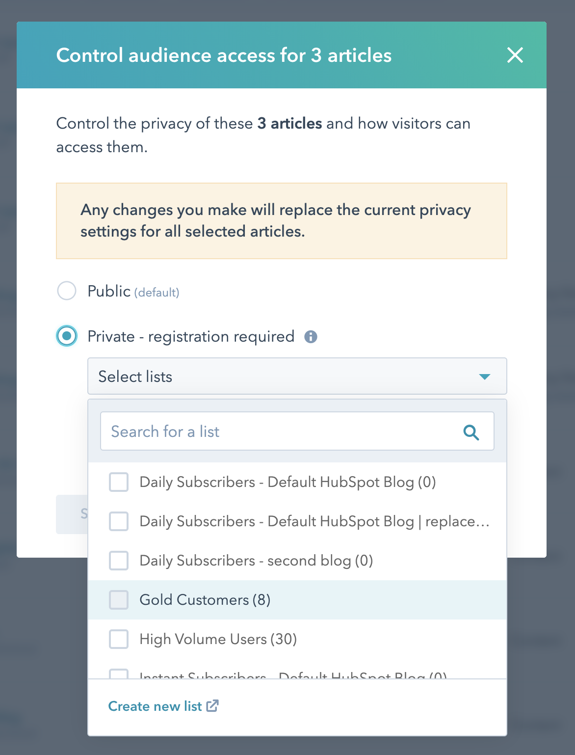
Controlling access to knowledge base articles
Richard Walker, Head of Customer Success, Cloud Depot:
What we like best about the HubSpot Knowledge Base is they have thought through all the challenges of maintaining a knowledge base. Simple things like a quick edit widget to enforcing formatting standards amongst pages. We have noticed a direct drop in support tickets since we have moved over to HubSpot and attribute that mostly to the fact that the Knowledge Base is easy and friendly for our customers to use.
Cleaning House
At this stage, our adoption numbers increased — we had removed two big roadblocks for our users. We decided, at this point, to take a breather from building features and instead focused on improving what we already had. We spent a substantial time improving the performance of the entire product, in particular the Organize and Insights screens. As well as improving performance, we also spent a lot of time digging into our users biggest pain point: the article editor.
Rebuilding the Article Editor
Unsurprisingly, writing articles is where our users spend most of their time in Knowledge Base. For quite a while, we had been hearing about different areas in this experience causing our users pain. Examples include users being unable to:
- Paste images into the editor
- Indent items in lists
- Add images to ordered lists
- Add code formatted areas
- Embed 3rd party videos
- Add tables
- Add anchors
Given the amount of pain that our users where experiencing, we took a long, hard look at our editor stack and evaluated whether we should persist with our current stack or move toward a more mature stack that would eliminate a lot of these pain points. In the end, we decided to make the change and moved from Draft.js to TinyMCE. We completely rebuilt the editor from the ground up, moving toward an editing experience more consistent with other content tools within HubSpot. Moving to TinyMCE eliminated a lot of these issues, and we wanted to build upon this new foundation and really level up our writing experience.
Leveling up the Writer Experience
Our users were happy with the improved editing experience but there was still some out-standing issues that had to be solved:
- Tables
- Anchor links
- Code formatting
- Highlighting
Over time we added these features to the editor, creating new experiences for tables and anchors as well as introducing callouts to allow writers to highlight important areas to their readers.
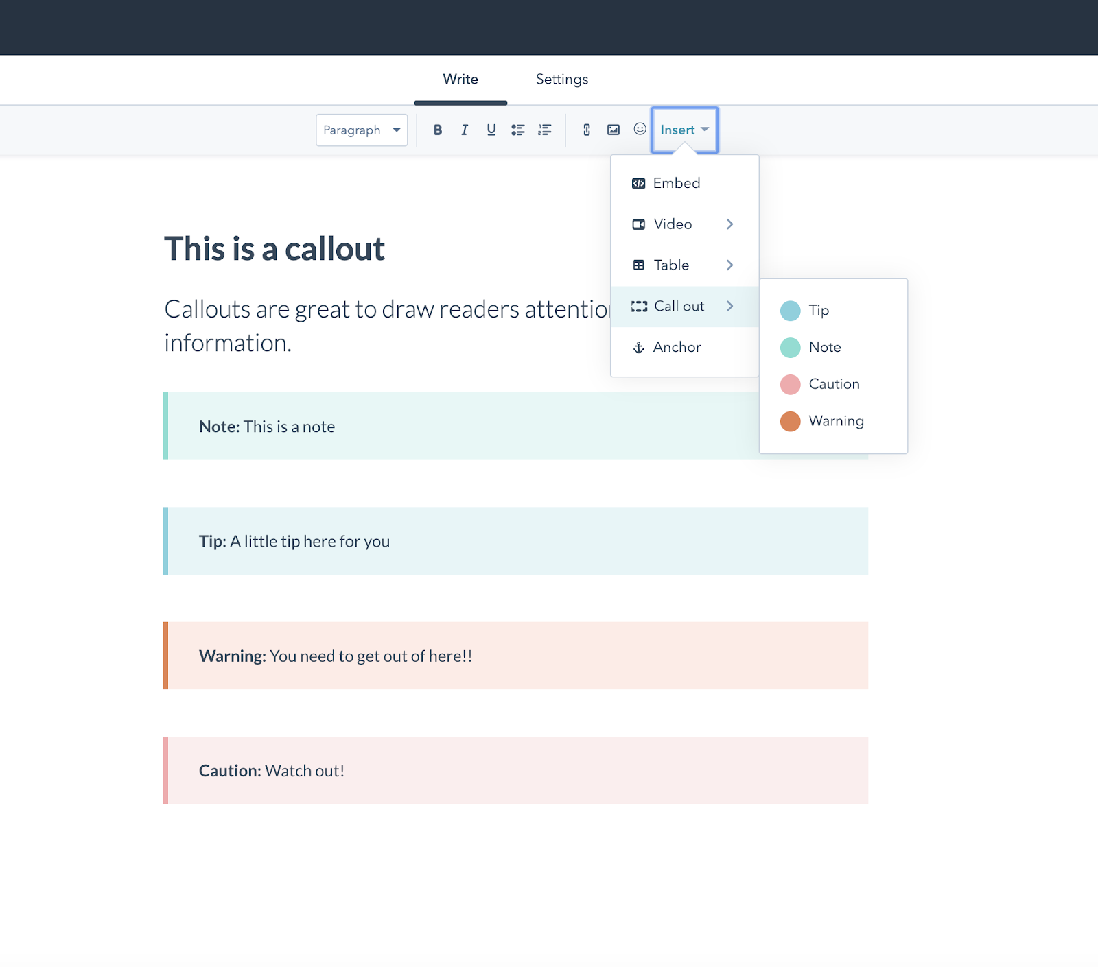
Callouts help to highlight important areas of an article
Improving Design Options
From day one, one of users biggest pain points has been the lack of design control, with many users being frustrated that they were unable to represent their brand on the Knowledge Base in a way that was consistent with their website. We repeatedly heard the need to choose fonts and their own imagery for categories.
When digging in further with our users, many presented us with a design they had in mind for their Knowledge Base. After a number of interviews, some very clear patterns began to emerge. For example, a very common template we saw was the Tiles pattern with many customers pointing to the Slack Help Center.
Thinking through how to solve this problem, we considered simply opening up Knowledge Base’s template code. But we saw that a large proportion of our users didn’t possess the skills needed to create a beautiful Knowledge Base through coding. Opening up the code at this point would leave a lot of our users behind.
We set about creating an experience that would allow any user (technical or nontechnical) to implement a beautiful Knowledge Base in minutes by giving them all of the popular Knowledge Base templates straight out of the box. This new experience was released as Customize Template in October 2019.
This new experience is very much in its infancy and will be improved over the coming months. As well as improving the experience, we plan to open up Knowledge Base template code so that designers and developers can customize the Knowledge Base in any way they wish.
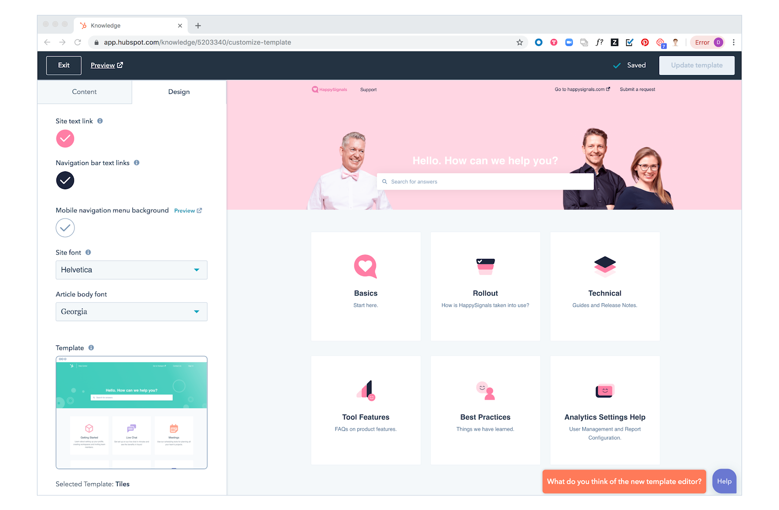
Template editor using Tiles design
Vojtěch Plášil, Support Engineer, Simple Hardware:
We greatly appreciate the new KB design options and functionality in general — it provides a quick and reliable way for our customers to get the information they require to answer their questions. Adding articles is fast and the editor now supports more features useful for creating content that leaves a good impression on the clients and is easy to navigate through.
What’s Next For Knowledge Base
While the Knowledge Base has come a long way, there is still a lot of room for improvement. Over the next number of months, we plan on adding a bunch of new features, many of which are focused on solving for larger companies: Multiple Languages, Multiple Knowledge Bases, and Full Design Control. As well as adding new features, you can expect every aspect of Knowledge Base to continuously improve — no product is ever done.
To keep track of all new updates coming to Knowledge Base and other areas of HubSpot, be sure to check out our product updates blog.