Think back to elementary school when you got assigned your first book report. Remember thinking how big of a deal that the assignment was, and probably putting more effort into it than your regular homework and projects?

Let’s assume (you know what they say about assumptions, right?) that you’re all grown up now, and you’ve been tasked with getting metrics on x, or presenting y to your boss. You think to yourself, “Self! I need to make a report.” In some cases, you’ll be right, but within HubSpot you may come to realize that all you really need is a list.
Reports are great at showing trends over time but aren’t always going to give you the granularity you need. The beauty of HubSpot is that as you nurture your contacts from a lead to a full-fledged customer you can collect more and more data about them. The more information you have, the greater your ability to slice and dice your contacts database.
With Lists, you can say something like “tell me a list of contacts who have opened but not clicked email x, AND who have viewed my landing page y during the last month only.” Because the Lists tool is one that bridges all parts of the HubSpot platform together, you can then begin the process of nurturing your contacts through additional HubSpot tools, like email campaigns or workflows.
Performance Section of the List Tool
While it’s great to be able to get detailed information about your contacts’ actions, what if you want to know about their actions over time? Let’s say that you know Jimmy and Susan had at least one bounced email and you want to see if a particular email send correlates with a high number of bounces in your portal?
By clicking into the List, and clicking Performance on the left-hand side, you can see how the size of your list changed over time, choosing from a preset 30- or 60-day date range, or customizing it completely. What’s really cool is that if a major event occurred in the list, a black circle will be drawn over the particular date, and you can hover over this circle to learn what happened on that date, such as if list criteria were updated.

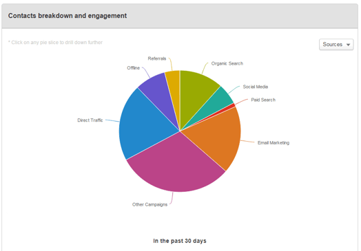
Our Professional and Enterprise subscribers can dig in a little bit deeper by scrolling down a bit further on the page until you see “Contacts breakdown and engagement.” Here you can choose between three breakdown options: Source, Country, and Lifecycle Stage. Alternating between these three options will change the way that the chart looks. If you choose Sources, you’ll see a breakdown by color of the Original Source of the contacts in your list. Countries will identify in which Country your contacts reside, and Lifecycle Stage will tell you the current Lifecycle Stage of the contacts in your list.

Below this pie chart, you’ll see 5 smaller rings under “In the past 30 days”. This will tell you how many of your contacts have visited your website, had a conversion, opened an email sent through HubSpot, clicked on an email, or clicked on a social media link published through HubSpot - all during the last 30 days. Having this information available on one screen makes it incredibly easy to glean valuable information about your contacts without having to create separate Reports or Lists.

Next time you are thinking of creating a Report in HubSpot based off of your Contacts’ actions, I encourage you to take a step back and say “maybe I should make a list instead!” Personally, I am constantly amazed at the wide range of functionality that the List tool includes, which is why it is my favorite part of the HubSpot platform. If for some reason you find that you’re looking for more information from your list, don’t forget that it is always possible to have HubSpot generate an export of your List, which can include all of your Contact Properties, which will be sent to your email in an Excel file.
Curious if you should be using a list or a report? Just ask in the comments below. Thanks, and Happy HubSpotting!

![3 Service-focused Workflows to Empower Your Support Team [Support Series]](https://53.fs1.hubspotusercontent-na1.net/hubfs/53/service%20button.jpeg)
![How to Add Your Branding to a Marketplace Template [Support Series]](https://53.fs1.hubspotusercontent-na1.net/hubfs/53/Support/Support%20Series%20User%20Blog%20folder%20copy%202.png)
![Creating a Custom Date-Based Property Report [Support Series]](https://53.fs1.hubspotusercontent-na1.net/hubfs/53/Support/HubSpot%20Support%20Series%20Horizontal-603978-edited.png)
![Advanced Troubleshooting: The Network Tab [Support Series]](https://53.fs1.hubspotusercontent-na1.net/hubfs/53/HubSpot%20User%20Blog/HubSpot%20Support%20Series%20Horizontal.png)
![How to Update an Incorrect PDF Title [Support Series]](https://53.fs1.hubspotusercontent-na1.net/hubfs/53/HubSpot%20User%20Blog/Photo%20editors%20using%20laptop%20in%20meeting%20room%20at%20office-1.jpeg)
