 There’s no question a call-to-action is one of the most important aspects of your ecommerce site. Your job is always to create buyer excitement through your products and landing pages, but the only way to lead those buyers where they need to be is with a great CTA. With an average of almost 99% of website visitors not buying on their first visit, you need a large inventory of targeted CTAs to help people through their buying cycle. Unfortunately, not everyone can afford to hire a professional graphic designer, but that doesn’t mean you can’t create those CTAs on your own. Believe it or not, you already have the tools available. It’s just a matter of learning how to use simple programs to build compelling calls-to-action.
Create a Basic CTA in 5 Steps
PowerPoint has all the features you need to get started with a basic call-to-action. Whether you use a PC or a Mac, you can put together something sharp and eye-catching. Just note that these screenshots are taken from a Mac, so some of what you see on your PC might be a bit different.
Step 1
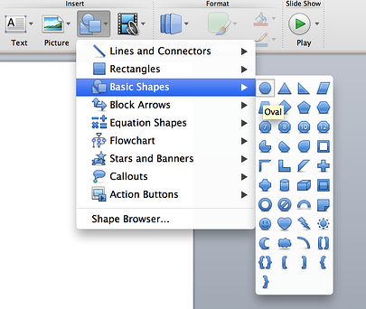
Choose Your Shape
Any shape will do. Just be sure it fits your site’s overall design and that you’ll have enough room for any necessary text.
Step 2
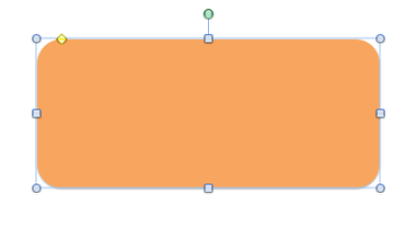
Choose Your Colors
These colors should fit your particular brand, unless you’re creating a secondary CTA. In that case, the color should be complimentary while still bold enough to stand out. I'd recommend that you resist the urge to make the CTA perfectly match the surrounding colors - you want this baby to stand out!
Step 3
Choose Your Text
Your text should tell buyers where the CTA will lead them. If it’s to download a buyer's guide, receive a free sample, or go ahead make a purchase, the call-to-action should say so. To do this, choose the Text Box tool, and then click inside the shape to begin typing. You can change the font and colors by highlighting the text and making new choices in the toolbar.

Step 4
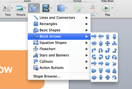
Choose an Additional Shape
Studies show adding an arrow to your CTA increases clicks by 12.9%. You can choose the arrow from the shape menu, insert into your primary shape, and adjust the color and size in the toolbar.

Step 5
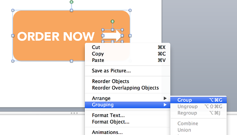
Choose Group and Save
When your design is complete, select every part of the CTA by clicking on it. Then right click and select “Grouping.” When the elements are grouped, right click again and select “Save as Picture.”
Congratulations! You’ve created a call-to-action. Now, if you want to spice things up a bit, you can. Adding logos and other images is almost as easy as creating the simple CTA. Read on for a bonus step if you have something a little more complex in mind.
Creating CTAs with Brand Logos
Bonus Step: After creating your shape, insert an image of the brand logo on top. You’ll do this by selecting “Insert Image.”

When you’ve placed everything, repeat the Group and Save step from above.
Now you can create your own calls-to-action in PowerPoint. Maybe you’ll need a few practice rounds before you get it right, but soon you’ll be able to develop new designs for every CTA you need.
Don't want to invest the time? Go ahead and download our free templates as a starting point.


photo credit: f1uffster (Jeanie) via photopin cc

