Word on the street is there's a new kid in ecommerce town.
Sellvana, an open-source ecommerce platform designed for small and medium-sized businesses, recently received a whopping $5 million in seed investments. While it hasn’t unveiled what’s under the hood, Sellvana seems determined to overturn the old shopping cart our ecommerce ancestors have passed down for many generations.
Download our free marketing tool that helps you generate more leads and learn about website visitors.
Sellvana’s creator, Boris Gurvich (the original Lead Technical Architect of the eComm heavy weight Magento) is quoted on the Sellvana Blog as saying:
"The established generation of open source ecommerce platforms have not aged gracefully - they have not looked after themselves or their community. Give them their credit, these platforms triggered a revolution in their time, but it was a long time ago. Modern ecommerce development requires faster, more flexible, more agile solutions."
With an open-source mindset and the potential for an ecommerce community, Sellvana seems to be primed to break the “status quo” in the ecommerce world.
As another tool for online shopping rises, and with the marketplace seeping with ecommerce platforms begging to host your shopping cart, the question is this: What sets apart the good ecommerce platforms from the best?
For any ecommerce website to be successful, it’s not enough that they solve for your needs. The platform to support it must now find ways to solve for the needs of your buyer. Ecommerce platforms must step up to the plate with fundamentals that go above and beyond for you AND your customers.
Given the latest developments in ecommerce, here are five ecommerce tips to live by when implementing a platform:
How to Master Ecommerce for Small Business
1. Responsive Design & Mobile Optimization
As more and more transactions are occurring on mobile devices, there are no excuses for ecommerce platforms to NOT offer optimization for smaller screens.
"But, I have a mobile site! Surely that’s enough."
Quite frankly, no. It’s not enough. And I hate to break it to you, but Google hates your mobile site. With the smartphone and tablet markets each respectively seeing new screen sizes and resolutions, AND the release of wearable devices such as Google Glass and Samsung Galaxy Gear, it would be next to impossible to allocate the time and resources needed to develop and maintain mobile websites for each of these respective screens/resolutions. Not to mention how much money your company would be hemorrhaging to support the operational costs of running such an elaborate strategy.
If all of that wasted time, money and energy wasn’t enough of a reason for you to stop spinning your wheels on a mobile website, websites with responsive design see:
- Lower bounce rates
- Increased page rank
- Increased conversions
Still looking for specifics in optimizing your responsive design, pick up a few tips from a Magento expert about building and designing a responsive website.
2. Conversion-Oriented User Experience
Without realizing it, the user experience (UX) on your website may be the driving factor in your low conversion rates. As much as we would like to believe even our most our loyal customers would stick with us through thick and thin, they ultimately want an experience that is simple and effortless.
If there are too many steps, or if they can’t even FIND the next step, your potential customers are going to bounce and pick up the product elsewhere.
For ecommerce websites, a conversion-centered design is absolutely paramount at the Add-to-Cart and Checkout stages. Subtle details such as image placement, text alignment, color selection, and even movement will engage your customers and further progress them in their purchasing process. When executed properly, your website will naturally progress a lead to the next step, while also effortlessly expressing the uniqueness of your brand.
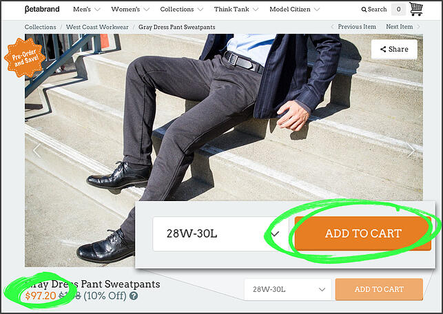
To show what a conversion-oriented user experience looks like, let's head over to BetaBrand:

By using a bright-orange color to contrast with their rather simplistic color scheme, your eyes are automatically drawn to two things: the price of these pants and the "Add to Cart" CTA. Using a contrasting color, when executed well, will trigger a primal response in our amygdala -- or the part of our brain that contains the "fight or flight" response.
Because the amygdala has been evolving for hundreds millions of years, we cannot help our instinctual reaction to bright colors, shapes, and/or movement.

Capitalizing on this knowledge of our auto-response to movement, Betabrand activates a turbo shopping cart animation after you have added something to your cart. Because of this tiny movement, our eyes can't help but be drawn to the upper right hand corner of our screen, encouraging us to proceed to the checkout. Additionally, this fire breathing cart gives us a sense of the playful and unique culture Betabrand is creating.
These small, yet impactful design elements are the essential tools lean, mean conversion machine.
Experiences are what make for a lasting impression on a customer: Long gone are the days off the one-off transactional relationships with our customers. The subtle details of Betabrand’s custom shopping cart, to personalization for your logged-in visitors, are what will make your company stand out as an experience for your customers.
3. Simple User Interface
The User Interface (UI) of your website -- or the simplicity of which someone can use the software on your website -- is a surprisingly overlooked element of an ecommerce platform. Ideally, your customers shouldn’t need a Masters in computer science to place an order on your website. In fact, if we're really looking to optimize our conversion opportunities here, your customers shouldn't even need a high school diploma.
Your user interface laced with a conversion-centered UX will need to be painfully simplistic. Stick to the "KISS" methodology: Keep It Simple, Stupid.
A successful ecommerce user interface will allow customer to find an item, put it in their shopping cart, and check out in as FEW steps as possible. Let’s take a look at a company who has made the ecommerce user interface easy enough for a kindergartener: SuperDry.

With a very simple and easy to follow steps, I was able to purchase a new jacket in only FOUR steps.
4. Open Source
Conventional shopping cart systems are excellent for the small business or startup that needs to get up and running and start generating sales. However, if you’re a developer or designer with some killer UX/UI ideas or a “take-it-apart-and-fix-it-myself” kind of person, you’re going to want an ecommerce platform that is open sourced.
Open sourcing -- or making the original source code of a software available for modifications or redistribution -- is an increasingly popular approach to software development. This new "it takes a village" approach to software development has paved the way for amazing projects such as GitHub and Twitter’s ever popular BootStrap.
Your internal dev team can save you time and money by building a shopping cart integration that merges seamlessly with the design and user interface of your core website. An open-source ecommerce platform enables your development team the flexibility to create your own unique experience for your customers.
5. Support System & Active Community
When you have a problem with one of your product pages or merchant account, you shouldn't have to resolve an issue by yourself. Your ecommerce platform should have a robust and active support system and community.
Who better than resident experts and members of the development team to field any and all of your questions and help you when you’re having problems.
Features to look for in from a platform should be:
- Developer Documentation.
- Video Tutorials.
- Forums.
- Knowledge Database / Library.
- Support Team.
- Live Support.
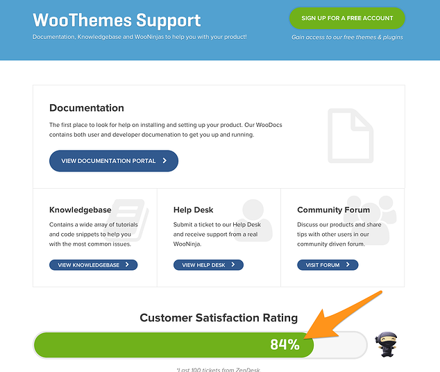
WooCommerce, a popular shopping cart integration for WordPress sites, even has a "Customer Satisfaction Meter" that displays the average satisfaction level of their last 100 tickets.

This example of transparency and dedication to your success is what elevates the playing field. It may go without saying, but any ecommerce platform worth considering will have their Support Team and Community prominently displayed and easily accessible on almost every page of their website.
Your ecommerce website is extension of your brand. A partnership with the right platform could either make or break your company. The wrong ecommerce platform will enable the "transactional relationship" we as ecommerce marketers work hard to prevent.
Instead, the right ecommerce platform will go above and beyond to facilitate a legendary experience visitors will crave.


