.png?width=112&height=112&name=Image%20Hackathon%20%E2%80%93%20Vertical%20(84).png)

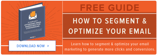
To get your brainstorm started, check out the comprehensive list of email list segmentation ideas below. (Then, download this email marketing planning template to keep all of your email efforts organized.)
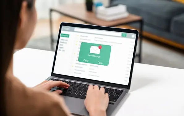
30 Ways to Segment Your Email List for More Targeted Email Marketing
The whole point of segmentation is to provide more relevant content to your email recipients. To do that, you'll have to take the time to craft targeted campaigns that take into account not just list segments, but also lead data, and trigger events that help customize your email campaigns further. (Our marketing team uses the Email App and the Lists App in the HubSpot Marketing Platform in combination with HubSpot CRM to accomplish this.)
Bear in mind that while some of these recommendations will work wonderfully on their own, many of them are at their absolute best when crossed with other segments, triggers, and lead intelligence data.
1) Geography
Knowing where your contacts live can be seriously powerful information. If you're a brick-and-mortar business, you wouldn't want to send in-store offers to out-of-towners, right? Or let's say you're a national franchise -- you better be segmenting by zip code to ensure you're not infringing on someone else's territory, or worse, marketing to a location that your organization doesn't even service yet.
Here's a geographically-segmented email I received from Vamoose, a bus service I've used frequently to travel between New York and the Washington, D.C. area. (I can't believe it's already time to start planning travel for Thanksgiving.)

2) Age
People of all ages have access to the internet these days, which means you could be emailing a college student, a retiree, or even a little kid. You may find knowing the general age range of the people on your list helpful to remove those not in your target audience, or to adjust the messaging of your email communications.
3) Gender
Just as you'd speak to a retiree and a college student differently, you might adjust your messaging and offers based on gender, too. If you have a wide product offering that extends across genders, consider segmenting your list in this manner -- and beefing up the segmentation with other demographic and psychographic details as well.
4) Persona
Speaking of demographics and psychographics, you should have buyer personas that include information of this nature, as well as more detailed explanations of what makes these folks tick and why your solution provides value for them. If you don't have buyer personas created already, use these free templates to create your own -- and then segment your list based on them. Because each persona has different needs and value propositions, they're all going to require different email content for the best clickthrough and conversion rates.
5) Organization Type
Do you sell to other businesses? Are they franchises? Non-profit organizations? Ecommerce companies? Enterprise organizations? Small businesses? They all have different needs, and as such, their email content should be different -- so segment your list accordingly.
6) Industry
If you're selling to other businesses, you may encounter leads and contacts across many different industries. Knowing your lead's industry will allow you to add another level of personalization to your email marketing.
7) Job Function
As a B2B marketer, your email list could contain a whole melee of different job functions -- office personnel, salespeople, marketers, consultants, developers, customer service, accountants ... the list goes on. Considering the breadth of job roles within any given organization, doesn't it make sense to segment your list accordingly?
8) Education Level
You could segment your list based on how many degrees they hold, or how educated a lead or contact is regarding your brand and the subject matter you discuss. If you segment your list based on the level of understanding they have on the topics you write about, you can tailor your lead nurturing content to speak at the right level.
Here's an email I received from Idealist, which they sent to me based on my previous indication that I had already earned a Bachelor's degree:

9) Seniority Level
There are different job roles, and there are different levels of seniority. Perhaps your contact said they work in marketing, but is she the VP of marketing, or a marketing coordinator? Those two contacts will differ in years of experience, salary level, pain points, decision-making potential, and a whole host of other differences that make segmentation critical for effective email marketing campaigns.
10) Past Purchases
If a segment of your list has purchased from you before, use that information to send them emails catered to that which interests them. Then make your bottom line bigger by identifying upsell opportunities with additional services or complementary products they'd enjoy based on their past purchases.
Here's Casper, the maker of my bed made of clouds, shooting me an email about the other products they offer:

11) Purchase Interests
You can infer someone's purchase proclivities from past buying behavior, or you can just ask. My colleague, Lindsay Kolowich, highlighted companies who do this in creative ways -- such as with surveys -- in a recent blog post about awesome email marketing campaigns to help them create better targeted emails.
12) Buying Frequency
Segment your email list based on how often someone purchases. Not only can you try to increase shopping frequency for some, but you can also reward frequent shoppers with an invitation to your loyalty program to make your brand even stickier. (Download this free guide to learn how to more effectively use and measure customer loyalty programs for your business.)
Here's a customer loyalty email I received from my mobile provider, AT&T, about early ticket access to a concert they're hosting. (Do you think they somehow know I attended a Panic! At the Disco concert when I was in middle school? This is embarrassing, readers.)

13) Purchase Cycle
Do certain customers come to you on a weekly, monthly, yearly, or quarterly basis? Or perhaps they only need you at a certain time of year -- a pool cleaner might see upticks in spring and fall, for example. Segment your list based on customers' purchase cycle so you can be there right at their point of need.
14) Content Topic
Here at HubSpot, we've noticed that some of our leads and contacts are far more interested in certain content topics than others. There's one segment that's extremely interested in sales and marketing alignment, while another is far more interested in Snapchat for business. So it only makes sense that we segment our list based on the topics our contacts have showed interest in. Take a look at what content gets people clicking, and segment your list based on that.
Here an example of an email I received from Twitter featuring suggestions for who to follow next (and it worked):

15) Content Format
You may find that specific content formats are more appealing to certain segments of your database -- some like blogs, others prefer ebooks, and some may only show up when you put on a webinar. For example, in a recent HubSpot Research survey, 43% of respondents wanted to see more video content in the future. If you know how certain segments of your list prefer to consume content, you can deliver the offer content in your emails via their preferred format.
16) Interest Level
Just because someone converts on a content offer, doesn't mean they actually liked it. Segment your list based on how interested leads are in your content. For example, we might email a segment of webinar attendees that stayed engaged for 45 minutes or more with a middle-of-the-funnel offer to help move them along in the sales cycle, while those that dropped off before 10 minutes might receive another top-of-the-funnel offer -- or even a feedback survey to gauge what specifically lost their interest.
17) Change in Content Engagement Level
Have you noticed an increase or decrease in the amount of time leads are spending with your content? This is an indication of their interest in your company, and should be used to either reawaken waning interest, or move leads along through the sales cycle while they're at their height of engagement with your content.
Here's an example from Udemy, who segmented their email list to try to re-engage inactive users (I still highly recommend Udemy's online classes):

18) Change in Buying Behavior
Similar to a change in content engagement, a change in buying behavior can indicate a lead is becoming more or less interested in your company. Leads that decrease purchasing frequency, for example, might need a little extra love -- and thus, a dedicated lead nurturing campaign.
I typically buy glasses and contact lenses at Lenscrafters once yearly with my vision insurance benefit, but I haven't yet this year, so they wisely sent me this nurturing email with a gentle reminder to purchase from them:

19) Stage in the Sales Cycle
I've mentioned it a little bit here and there, but the stage a lead is at in the sales cycle should determine which email segment they fall in. At the very least, set up separate lead nurturing tracks for those at the top of your sales funnel, in the middle of your sales funnel, and at the bottom of the sales funnel.
20) Email Type
There's a lot you can tell by someone's email address. You design your emails for different email clients if you're really into sophisticated email design, or if they're Gmail clients, responsive email design.
21) Satisfaction Index
Many businesses use satisfaction indexes to determine how happy their customer base is -- Net Promoter Score (NPS) is a very popular one. If you're measuring satisfaction numerically, consider sending an email segmented based on your customers' level of happiness with your organization. Those with a high NPS score, for example, might provide opportunities to gather reviews, referrals, or even upsells. Those with lower scores, however, may get emails that give them access to educational materials that will make them happier and more successful customers.
Here's Wayfair 's email asking me to review how a recent purchasing and delivery experience went:

22) Customers Who Refer
Consider creating a list segment full of those customers who repeatedly refer new business your way. These are your biggest brand advocates, and should receive emails targeted towards loyalty programs, refer-a-friend discounts, even possibly trials for new products or services you're releasing to get honest feedback before widespread rollouts.
23) Customers Who Haven't Reviewed
You should always be trying to get more positive reviews of your business, so why not create a list segment that targets those customers who haven't written a review yet? You could combine this list segment with, say, those that are also social media fans and have a high NPS score. Think about it ... you know they follow you on Twitter and their NPS score indicates they love you. That's just begging for an online review email campaign. (Check out this case study guide + template to help you successfully reach out to potential participants and engage them in the process.)
Here's LinkedIn 's email asking me to participate in a feedback survey:

24) In-Store vs. Webstore Visitors
If you have both a brick-and-mortar location as well as a website, segment your list based on where your customers like to shop. You can give invites to in-store events to those customers that give you foot traffic, while those that only visit your webstore might receive offers that should only be redeemed online.
25) Shopping Cart Abandonment
After analyzing 34 online studies of ecommerce shopping cart abandonment, Bamyard Institute determined that, on average, 68% of shopping carts were abandoned prior to purchase. Yikes. If you run an ecommerce webstore, you absolutely must have an abandoned shopping cart email program, and you should be segmenting your contacts based on this behavior.
26) Form Abandonment
Not an ecommerce company? You still have abandoners on your site -- form abandoners. If someone starts filling out some forms on your website and then loses interest, gets busy, has a lousy internet connection, gets eaten by a zombie ... you know, whatever ... segment out those leads for nurturing aimed at bringing them back to your website to complete the form. The offer was interesting enough at one point in time to pique their interest, so why not try to recover some of those form abandoners?
27) Usage
Whatever it is you offer, there are some customers who you could consider "power users." These are the ones that totally get how to navigate your website, use every feature in your software, and make the most of their relationships with your service providers. Then there are the rest of us. Segment out the power users and the strugglers, frequent users, and infrequent users; then send email content that teaches them how to be more successful with your product or service. The more customers use your product, the more likely they are to stick around: Bluenose found that lack of use was the number one driver of software customer churn.
Here's a use-segmented email I received from MapMyRun. I feel misleading including it because I truly can't remember the last time I went running, but it's still a good example of list segmentation:

28) Event Attendance
Does your organization host book signings, conferences, or social events? Don't miss the opportunity to reach out to leads and potential customers you've already made a positive connection with. Segment your email list depending on the type of event, the topic or theme of your events, or even to RSVPs who didn't make it out. You'll be able to keep inviting them to events while sharing relevant content offers based on what you learned about them from past events. (P.S. - Have you registered for INBOUND 2016 yet?)
29) Page Views
You can tell a lot about your contacts from their behaviors, and the web pages they're browsing are no exception. Are there certain blogs they're reading or questions they're asking when they come to your website? Experiment with lead nurturing campaigns dedicated to different topics your website covers to appeal to your site visitors' patterns.
30) Call-to-Action Clicks
A clickable call-to-action is what takes your website content to the next level because it helps you generate leads and contacts. (Download 50 customizable call-to-action templates here.) You can tell which types of language work on your contacts based on what makes them click, or not click, on your CTAs. Are they more inclined toward time sensitive offers to "act now" or "try this month," or do they prefer more explicit offers of "free" or "discounted" products? Use their clicking habits to determine how you segment your email list, and what language you use when reaching out.
I hope this list has given you ideas for ways to segment your own lists, and most importantly, sparked some creative email campaigns you can run as a result of this new segmentation.
So what about you -- what other ways can you think of to segment your email lists? Which of these segmentation ideas could you combine with others for really epic results?
Editor's Note: This post was originally published in May 2012 and has been updated for freshness, accuracy, and comprehensiveness.


![Email Analytics [Research]: 8 Email Marketing Metrics You Should Track](https://53.fs1.hubspotusercontent-na1.net/hubfs/53/Untitled%20design%20(51).jpg)
![How to Embed Video in Email [Quick Tip]](https://53.fs1.hubspotusercontent-na1.net/hubfs/53/embed-video-in-email.jpg)
![23 Email Marketing Tips to Improve Open & Clickthrough Rates [+HubSpot Blog Data]](https://53.fs1.hubspotusercontent-na1.net/hubfs/53/make-emails-more-clickable_8.webp)