Done right, B2B content marketing can certainly match -- and sometimes, maybe even rival -- the creativity and appeal of the best B2C ones. And we want to recognize the brands that are breaking that mold and creating great content that grows fervent, dedicated audiences.
Below, you'll find a few of our favorites, all with their own B2B marketing strategies that you can take with you.
10 Exceptional B2B Content Marketing Examples
1. CB Insights: Newsletter
What It Does Well
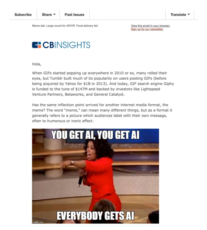
There are two things I love about the CB Insights newsletter. First, it's surprisingly funny (the subject lines alone make it worth it). Second, you learn a lot just by reading the newsletter, no need to click through a bunch of links.”
- Janessa Lantz, HubSpot Senior Marketing Manager
We love how this newsletter illustrates the willingness of CB Insights to not take itself too seriously. Yes, it shares some of the finest insights on technology, venture capital (VC), and emerging businesses, but it does so with fun images that ultimately relate back to the subject -- e.g., the above photo of Oprah that’s been adapted as a meme, since, well, that was the topic of the newsletter.
But the messaging remains relevant, even among the hint of silliness. After all, CB Insights designs technology for people in the VC space, so it’s tasked with creating content that will appeal to a broad audience: customers, prospective customers, tech enthusiasts, and investors. And so, under such subject lines as “so sad: tough to have a VC dad,” it includes relevant data. Yes, gifs are hilarious -- but in some contexts, they’re also worth $147 million.
Takeaway for Marketers: Remember Your Buyer's Goals
When you’re dying to create truly unique, cutting-edge content, it’s easy to stray from your organization’s mission and focus.
So, while it’s great to think outside of the box, use clever subject lines, or even write every email with an overarching humorous tone -- keep it relevant and include the information that the people reading it signed up to receive in the first place. Then, keep it human.
2. Mattermark: Raise the Bar
What It Does Well
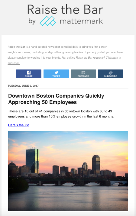
Raise the Bar rounds up the best stories about a variety of different industries, giving me a great snapshot of trends to watch and news stories to follow without having to search for them myself."
- Sophia Bernazzani, Editor, HubSpot Customer Success Blog
One of the best things about well-curated content -- especially the kind that pertains to your line of work -- is that it eliminates a lot of work. Keeping up with news and trends is never easy when you’ve already got a full plate, so when someone else is able to hand-pick the things you need to know, it can feel like you’ve struck gold.
That’s what Raise the Bar does, by compiling a “daily digest of timely, must-read posts on sales, marketing and growth engineering.” And, that was the intent all along. In a 2016 blog post announcing the launch of the newsletter, Mattermark’s Co-founder and CEO, Danielle Morrill, wrote, “We’re turning our focus toward sifting through the mountains of content out there around sales, marketing, and growth to help the community of DOERS who grow companies.”
Takeaway for Marketers: Educate Your Buyers
Think about the problems that your product or service already aims to solve for customers. Then, turn that into relevant content that’s going to both save time for and inform your audience -- and make it easy for them to access it.
3. MYOB: Tax Time
What It Does Well
MYOB, a provider of business management solutions in Australia and New Zealand, helps companies manage their finances, in part by connecting them with bookkeepers and financial services professionals. It has two main buyer personas:
- Small businesses that are just learning the ropes
- More established companies that need greater insight into all facets of their operations.
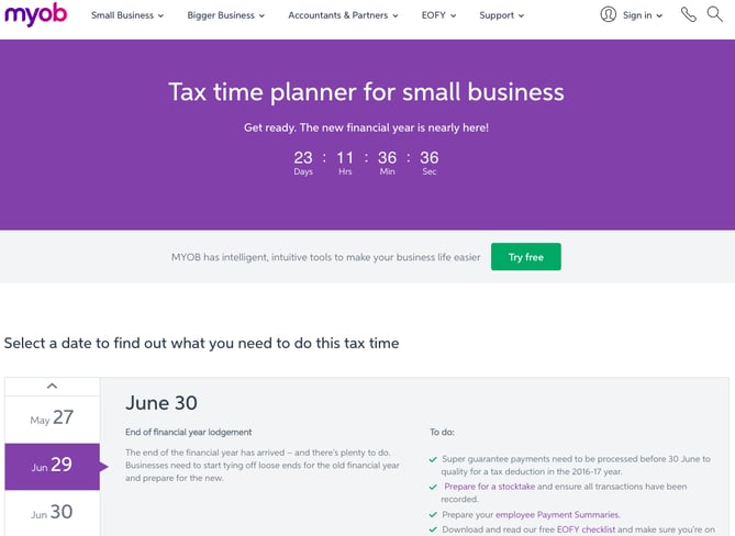
Each audience has its own set of concerns and corresponding hub of information on MYOB.com -- and MYOB has built a B2B content marketing strategy for each one that shows how much it understands its customers.
MYOB recognizes that many businesses are figuring out accounting and financial decisions as they grow, so it’s created content that positions the brand as a go-to resource to help those businesses navigate each stage of their development. The Tax Time center, for example, is angled to fit the needs of both customer groups, providing tips for those just starting out, and guides for breaking through new stages of development.
Takeaway for Marketers: Grow With Your Buyers
When you begin to brainstorm and map out ideas for content, ask yourself, “Do I really understand my audience?” If you have any doubts as to how the idea will benefit or be useful to your audience, the answer might be “no” -- and that’s okay. Like everything else, audiences (and people) evolve, so it’s okay to go back to the drawing board in instances like these for a refresh.
4. Unbounce: Page Fights (R.I.P.)
What It Does Well
If you’ve ever seen a growth marketer on the heels of a successful optimization experiment, you know that her energy is electric. Unbounce, a landing page software company based in Vancouver, understands that excitement and decided to leverage it to create an engaging microsite, Page Fights, in collaboration with optimization company Conversion XL.
The project came to a close after one year, but during its existence, Page Fights contained live streams of marketing optimization expert panels who critiqued landing pages in real time. It was content that expanded far beyond the written word -- and that was one thing that made it so great.
Sure, Unbounce has a successful blog, but it saw Page Fights as an opportunity to expand beyond that copy. It knew that the web -- especially within marketing and web design -- was becoming increasingly crowded with content. To address that, it diversified the format of its expertise, to keep its audience engaged and learning.
Takeaway for Marketers: Diversify Your Channels
The internet is only going to become more crowded. And as the human attention span dwindles, that makes it even more important to create content that engages and maintains your audience’s attention.
So while we don’t recommend abandoning blogs completely -- after all, written content is still vital to SEO -- we do emphasize the importance of diversifying content formats. Marketers who incorporate video into their content strategies, for example, have seen 49% faster revenue growth than those who don’t. And remember that tip to “keep it human” we mentioned earlier? That’s a great thing about live video in particular -- it can help portray brands (and their people) as candid and genuine.
5. Deloitte Insights
What It Does Well
Deloitte is a professional services company specializing in consulting, tech, auditing, and more. It works with a massive cross-section of industries, from government agencies to life sciences -- and that broad range of knowledge is a major selling point. That’s why creating informed, useful content for individual, specialized audiences is core to its marketing strategy.
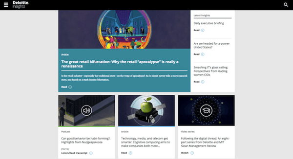
But Deloitte has also used that wealth of knowledge to position itself as a resource for those who want to know what it knows. So, among its specialized hubs are educational content centers, including Deloitte Insights (formerly branded Deloitte University Press).
Much like some of the other remarkable B2B content we’ve come across, it curates not only different pieces of highly helpful content -- but also a variety of content formats. From blog posts, to webcasts, to podcasts, Deloitte Insights has a bit of everything for those who want to learn about its specialties and the industries it works with.
Takeaway for Marketers: Separate Your Buyer Personas
Creating a content strategy to please a wide-scale audience like Deloitte’s is challenging. It can quickly become unfocused. But if your company has a number of specialties, creating content microsites for each of them is one way to keep that information organized, discoverable, and easy to navigate.
Plus, it can never hurt to establish your brand as a go-to resource. So, as you create these content hubs, consider adding a “knowledge center” among them that’s dedicated to teaching your audience the valuable things it wants to learn.
6. First Round Magazines
What It Does Well
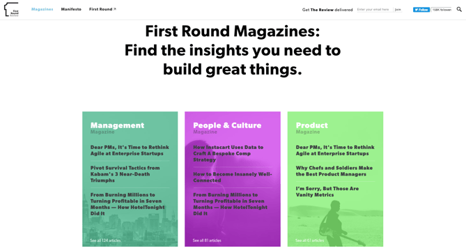
Here’s another example of a brand that does a great job of leveraging different categories of knowledge. First Round, an early-stage VC company, recognized the knowledge among entrepreneurs and leaders that wasn’t being shared -- knowledge that could be highly beneficial to their peers -- and created the First Round Review as a place for it to be shared. It serves, reads the manifesto, to liberate the ideas and expertise that are “trapped in other people's heads.”
But liberating that much-untapped knowledge can lead to the same problem we alluded to above -- an unfocused mass of content that makes it difficult to discover exactly what you’re looking for. That’s why First Round organized the Review into a collection of nine online magazines, each specializing in a different aspect of building a business.
Takeaway for Marketers: Work With Thought Leaders
If you’ve ever wondered how to leverage the wealth of knowledge outside of your organization -- and inside your professional network -- here’s a great example.
Don’t be afraid to reach out to the entrepreneurs and leaders you’ve met, or simply just admire, to figure out how they can work with you to create content with teachable experiences that your audience will value. Sharing useful, relatable first-hand accounts conveys empathy, which helps to invoke trust among readers.
7. NextView Ventures: Better Everyday
What It Does Well
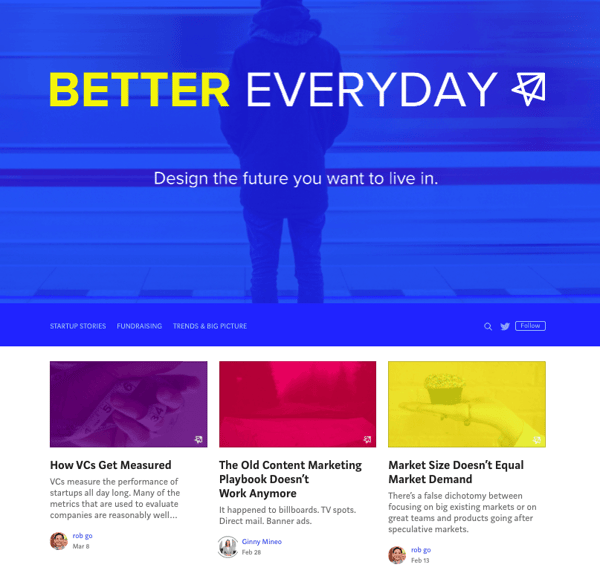
We absolutely love stumbling across B2B companies with an active presence on Medium. A great example is VC firm NextView Ventures' Better Everyday, a Medium publication that focuses on “stories, analyses & resources to help seed-stage founders redesign the everyday.”
But why would NextView want to create an entirely separate blog that isn’t even on its website? Well, it’s an exercise in creating off-site content: the material you own but doesn’t live on your website. When executed correctly, it can give publishers a huge boost in discoverability, variety, and quality, especially when making use of a highly popular platform like Medium.
Because Better Everyday isn’t attached to the company’s main URL, it provides an opportunity for NextView to experiment with different tones, voices, and stories -- all from a variety of experts that might already be using Medium to discover and contribute unique content. Plus, with Medium’s built-in ability for people to recommend, highlight, and search internally for relevant content, it makes the work published there that much more shareable.
Takeaway for Marketers: Publish Off-Domain Content
Take advantage of the availability of off-site content platforms. As my colleague, Sam Mallikarjunan, writes in “Why Medium Works,” it can take up to six months of consistent publishing on your company’s blog before it gains significant traction. (And we’re not discouraging that -- stick with it, and find ways to supplement those efforts.) But off-site content diversifies your audience by engaging readers who might not have otherwise found your website.
Medium, for example, connects your content with the people most likely to read it. Plus, you’re creating a publication on a platform that comes with a built-in audience of at least 6.3 million users.
8. Wistia: Instagram
What It Does Well
At risk of sounding like a broken record, we can’t emphasize enough the importance of B2B brands maintaining a human element. That’s why we like it when companies use social media channels to give audiences a “look inside” at the people who make the great products and services they love.
Wistia, a video hosting platform, does that particularly well by sharing visual content on Instagram that lifts the curtain on its people -- and dogs. It not only aligns with its brand -- after all, the company does provide technology to businesses that want hosting solutions for their visual content -- but it’s also just smart. Among its other advantages, visual content can help boost a viewer’s retention of things like brand information.
Takeaway for Marketers: Incorporate Visual Content
Please, please, please don’t neglect to incorporate visuals into your content strategy. Of course, having a presence on visually-focused channels like Instagram and YouTube is vital -- but when it comes to your written content, don’t afraid to use visuals there, as well. After all, articles with an image once every 75-100 words got double the number of social shares than articles with fewer images.
But if you can also create content that aligns with the core of your product or service, that’s also great. As we mentioned before, Wistia creates visual content technology -- so it makes sense that it would have unique visual content. Identify what your business does particularly well, and then make the most use of the channel that best aligns with your strengths.
9. Zendesk Engineering
What It Does Well
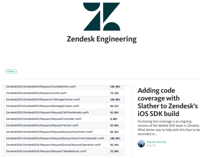
Yes -- more offsite content. This time, it’s from Zendesk, a maker of customer service software that’s done something unique with its Medium publication, Zendesk Engineering.
Zendesk might be an expert in the solutions provided by its product, but behind that product is a chorus of highly skilled experts -- the people who build and engineer the software. The company realized that there’s an audience to be tapped that’s seeking insights and expertise on the technical side of the product, so it used that to build an entirely independent content property.
Takeaway for Marketers: Tell Your Brand Story
Dig beneath the surface of the solutions your company provides. You offer solutions -- but what is your process? What have you learned that makes you do what you do so well, and how did you get there?
Sure, topics like engineering might be traditionally “unsexy.” But when leveraged and communicated in a storytelling manner, they can make for remarkable content.
10. Hexagon: Annual Report
 Image via App Annie
What It Does Well
Who says written content needs to be two-dimensional?
For Hexagon, an industrial IT solutions provider, "AR" doesn't just stand for annual report. With that in mind, the company recently "augmented" a presentation to its investors in a creative way.
Hexagon used augmented reality (AR) to spruce up their written company report, giving investors a more interactive experience when learning the latest updates on the company. How does it work? A mobile app, based on technology from Samsung and zSpace, displays a virtual demonstration of a product when readers hold their mobile device over a "trigger image" of that product within the report.
Takeaway for Marketers: Challenge Your Buyers
It's easy to feel limited by your medium as you create content -- especially for a business audience who you've all agreed is comfortable with that medium.
But in order for content to convert readers and incite growth, it needs to occasionally disrupt its audience's point of view. A company doesn't work for its content; content works for its company. If you need to say something that a blog alone can't, the business demands that you make it work -- whether that means starting a YouTube channel or seeing how you can integrate an AR tool into your next ebook.
And the List Goes On
We’re optimistic that the digital realm is full of strong B2B content marketing efforts -- and, we want to hear about them. But even more than that, we want to hear how these examples inspire you. As they show, there's a world of content opportunities out there, just waiting for creative B2B marketers to take on.
B2B Marketing


.png)
![How to Nail B2B Marketing in 2025 [+ Pro Tips, Tactics, & New Data]](https://53.fs1.hubspotusercontent-na1.net/hubfs/53/b2btrends.webp)

![48 B2B Marketing Stats to Know This Year [+HubSpot Data]](https://53.fs1.hubspotusercontent-na1.net/hubfs/53/b2b%20marketing%20stats.png)
