Sometimes, when it comes to advertising, we feel as talented as Don Draper in Mad Men — one of the best (fictional) advertisers in the game. However, advertising has evolved since the 60s, and that's partly thanks to how expansive the internet has gotten with commerce.

Banner ads, for example, weren't around until recently. But for prime ad placement, banner ads are the way to go and have cemented their importance in revenue gain for marketers.

So what exactly are banner ads and how do they work? We've got a simplified version you can use to explain them to anyone.
What are banner ads?
A banner ad, also known as a display ad, is similar to a digital billboard in that it uses imagery (hence the term "banner") to attract attention with the goal of driving traffic to the advertiser's site.
Banner ads are placed in high-traffic locations on web pages, creating brand awareness and generating click-throughs, purchases, and leads. These high-visibility locations include the front, bottom, or the side of a webpage; places where the eyes of browsers usually wander.
A great banner ad grabs the reader's attention and invites them to learn more about what's being advertised. They're bright, welcoming, and don't have much text, instead using images or multimedia to convey a message. Check out this banner ad as an example:

LinkedIn's banner ad was found in the sidebar of a webpage I was browsing. It was large enough to catch my eye and inviting enough to make me linger on the ad.
How Banner Ads Work
Let's say you're a publishing outlet. You are able to drive a lot of traffic to your content because it's helpful and valuable, but you have no way to monetize your efforts. However, your site does have a lot of valuable real estate that advertisers could capitalize on.
This makes selling that space an attractive proposition. To do that, you can sign up with a display network. A display network helps to connect you with advertisers by providing a script that you can add to your website. This script will populate display ads automatically without you having to lift a finger. AND you get paid a "commission" for each click on the ad that comes from your website. Monetization... success!
Now let's look at it from the other side of the coin. Let's say you're an advertiser. You want to increase more visibility for your brand, so you want your ads to show up on high-trafficked websites that your target buyers visit. You pay the display network directly (rather than the publishing outlet) for ad placements, and you get to choose the types of websites your banner ads will display on. If effective, you get low costs per click, and this turns into real ROI for your business.
A win/win for the publishing outlet and the advertiser!
Are Banner Ads Effective?
Banner ads fall into the category of digital advertising, one of the most lucrative ways to generate revenue. In fact, in 2019's first quarter, revenue from digital ads reached a landmark high of over $28.4 billion.
Banner ads are lucrative because of programmatic advertising, a term that describes how advertisers place ads. The software of these programs matches ads with the interests of website browsers.
To illustrate, let's say LinkedIn's ad team wanted to use Google AdSense as their display network. Google AdSense would then sell LinkedIn a sidebar space on websites professionals are more likely to visit, such as Investopedia. This ensures more potential for overall revenue earned for LinkedIn.
In order to determine if banner ads will be effective for you, it's important to understand how cost is broken down with this method of advertising.
Banner Ads Cost
Because it's an auction-style system, the cost of a banner ads campaign will vary according to the display network you choose, the ad's size, how competitive your vertical is, the popularity and the nature of the website placements you earn, and more. However, according to WordStream, the cost per click for a banner ad on the Google Display Network averages around $0.58.
There are two different pricing models for banner ads:
- Cost per mille (CPM) - The price for 1,000 impressions (i.e. it has been "seen" 1,000 times)
- Cost per click (CPC) - The price for each ad click
Pricing structures vary between each display network, but they typically use an "auction" style system where you bid for your ad placements. In many cases, you can choose whether you bid based on a CPC or CPM model. The former is better for conversions while the latter is better for brand awareness and visibility.
With this in mind, the better your bid, the easier it will be to meet your advertising goals. In many cases, the display network will help you optimize your budget and timeframe to get the most out of your ads.
Now that you have an idea of average banner ad price tags, you can imagine that ad placement and banner size have a big impact on how often your ads are seen and clicked on. Let's take a closer look at these two variables below:
Banner Ad Placement
The display network you choose should have transparent information on which sites or publishing outlets your ads will appear on. For example, here's Google's page on the topic.
Ideally, you want your ads to be placed in front of your ideal audience (rather than just anyone) so that you get the right traffic, which has a higher potential to convert into genuine leads for your business. With this in mind, you'll want to be well-versed in the targeting capabilities your display network provides so that you can control this effectively.
While advertisers get a lot of latitude on which sites they appear on, they may not have a lot of control over where they appear on that site. On-page ad placement is in the hands of the publishing outlet. However, they do have a financial incentive to place ads in high-value locations. Remember, they get a "commission" from the display network. With that banner ads perform best when they're:
- Close to the content
- Above the fold
- On the left-hand side
More within an advertiser's control is the size and design of the ads they choose to create.
Standard Banner Ads Sizes
One of the major factors on your campaign's effectiveness is the dimensions you choose for your ad(s). The right size and design can have a major effect on the click-through rate and overall effectiveness of your ad. Here are the most common ad sizes chosen by advertisers:

- Medium Banner: 300 x 250
- Leaderboard: 728 x 90
- Wide Skyscraper: 160 x 600
- Half-page: 300 x 600
- Large Leaderboard: 970 x 90
- Billboard: 970 x 250
- Large Rectangle: 336 x 280
- Skyscraper: 120 x 600
- Small Square: 200 x 200
- Square: 250 x 250
- Vertical Banner: 120 x 240
- Full Banner: 468 x 60
- Half-Banner: 234 x 60
- Portrait: 300 x 1050
It’s crucial to know the necessary sizes for your banner ads — but it’s not your only consideration. In order to make sure your banner ad is effective to target audiences, we have some tricks to keep in mind while you're designing yours.
How to create banner ads
- Incorporate a CTA.
- Add your brand.
- Make sure to use keywords.
- Choose high-quality visuals.
- Keep things simple.
Let's say you have all the tools for creating your banner ad in place. While the actual execution of the design is up to you, it's important to incorporate these elements in your ad to make sure it's effective, and not just something that crowds up a webpage.
To illustrate steps, let's use this 300 x 200 banner ad from Mailchimp on Entrepreneur's website.
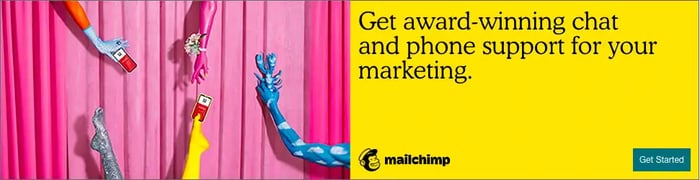
1. Incorporate a CTA.
A call-to-action (CTA) is what invites prospective buyers into discovering more about your product or service. This is what gets them to click on the ad and interested in learning more. Mailchimp's CTA is the blue "Get Started" button at the bottom of their ad.
A bright, eye-catching CTA points your target audience in the right direction, and linking to your product page is a good way to get clicks on your website.
2. Add your brand.
If your logo isn't visible, how will people know what your business is? Mailchimp's logo is at the bottom of the ad in a clear spot. The logo doesn't have to take up the entire ad or interrupt the flow of the rest, it just has to be recognizable among the rest of the ad's imagery.
3. Make sure to use keywords.
Using keywords and action items will not only optimize your ad for search engines but has a better chance of browsers interacting with your ad because your service sounds right for them. Mailchimp uses words like "award-winning," "support," and "get started."
If I were looking for marketing tools to make my life easier, award-winning software that offers support sounds right up my alley. If getting started is as easy as clicking a button, there's no reason not to at least check it out.
4. Use high-quality visuals.
To keep your ad professional, any visual elements, such as images or GIFs, should be high quality. While moving images are a way to keep ads interesting, static images are just as effective.
Mailchimp's imagery is fun and gets the point across. Their logo is also a way to convey imagery, making sure their brand stays in their audience's memory.
5. Keep things simple.
A crowded ad is nothing but a nuisance to web browsers. An effective ad has minimal text, one or two images, and a CTA. Mailchimp's ad is one sentence and includes large text.
Some banner ads don't even have text or images at all, just a logo and a CTA. Though your ad doesn't need to be that minimalist, it doesn't need to have as much information as you may think. If your ad has more than one short sentence, it may be too much.
Best Banner Ad Examples
Let's look at some excellent uses of banner ads and why they're effective.
1. Pottery Barn
This desk ad from Pottery Barn is a good example of how a little goes a long way. Using a showroom photo to highlight the practicality of desks, it gives way to how easily their furniture could fit into a space.

With the logo, an engaging call to action, and a simple design, all five points of an incredible banner ad are covered, and it's effective. For students browsing Amazon or professionals building their home office, this ad would be an excellent cater to them.
2. Blue Bloods
CBS's banner ad for one of their shows has an awesome CTA. "Try 1 Week Free" entices the audience to check out their new streaming service, CBS All Access.

Using a show that's already popular, and having all episodes streaming, pulls in binge watchers. This ad also incorporates the show's logo and star. It also gives viewers all the information they need without appearing too crowded.
3. SEMrush
Popular SEO extension SEMrush used the small rectangular banner ad choice, which is not only pocket friendly, but useful for ads that don't require a lot of information to get the point across.

In this ad, SEMrush lets you know exactly what their service provides in less than 20 words. Keywords "UX," "SEO," "Time," and "Page Speed" are all golden here. They're effective in grabbing the attention of companies looking to heighten their analytics.
4. Chevy
Providing all the specs of a car on a banner ad isn't possible without the ad looking too busy. Chevy chose to play with text in order to keep the information there without being overwhelming. Moreover, they chose essential information and wording to make sure the impact would be as great as it can be.
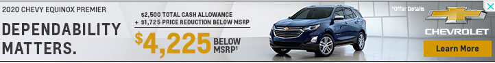
Chevy also made it a point to incorporate color into the most important words. The discount on this car and the CTA are both in yellow, bringing the attention straight to those two elements of the ad.
5. The New Yorker
Minimalism goes a very long way, and The New Yorker knows this.

The magazine has a promotion going on that includes a free tote bag with a subscription. Imagery of both products a new subscriber will receive is a good way to use imagery, and the price here is bolded, meaning it's of importance.
6. AT&T
Good advertising often comes down to how we can compel the user to take action.

In AT&T's case, what better way to do that than dangle the opportunity to get something of value completely free? This piques interest ("What do I have to do to qualify?") and incentives the user to take the next step.
7. Best Buy
Convenience is also an important concept to keep in mind. How can we create offers while reducing the friction our prospective customers face when taking advantage of those offers?

Best Buy does this exceptionally well in this banner ad. They likely knew that one barrier to buying a phone online from Best Buy is needing to activate it in store. In this ad, they assure their audience that this isn't necessary, making the implication that "Buying from us will be convenient, so shop without worry." This is particularly timely when people may be actively avoiding hectic holiday shopping.
8. Coca-Cola
This ad shows a partnership between Coca-Cola and an NFL team, positioning the beverage as a great choice on game day.

There are two things that are particularly striking about this ad:
- The natural use of Coke's product placement in the image
- The offer is not a salesy "Buy Now" but rather an invitation to get some value from Coca'Cola's website
9. Conversica
Here's another great example of an ad that strays away from the salesy.

By offering something of value (research on sales capacity), Conversica is positioning the conversation around how they can help. This puts the focus on the buyer's needs rather than "me me me" type of selling.
10. Dale Carnegie Training
This ad does really well with the small horizontal format.

In addition, the ad capitalizes on the existing brand recognition of Dale Carnegie to make a compelling statement that essentially boils down to "Learn from the Best in the Business."
11. E*TRADE
The bold color in this ad goes well with its bold statement.

With the copywriting on this ad, E*TRADE is reducing friction by asserting this idea: "If you open an account with us, you'll get something (up to $600) with no risk ($0 commissions)." As a result, that $600 figure seems like a sweet deal.
12. Instapage
This banner ad's genius lies in its simplicity.

Instapage makes a bold claim, which piques interest, then deposits that the user must click to get validation for why that bold claim is true. In addition, they do it in few words, which allows for clean, bold typography and illustration.
13. Lendingtree
In some cases, like the one below, a banner ad can even include animation and interactivity.

Lendingtree uses this to their advantage by incorporating a slider that the user can use to calculate a mortgage amount. The button then guides them to complete the next step by clicking the ad and going to their website. There's a clear utility in this ad, which is why it's so impressive.
14. Popeyes
Banner blindness, or the idea that people simply don't notice ads anymore, is a real concern. However, the way to get around that is with eye-catching design.
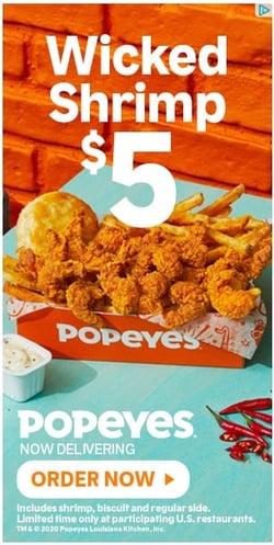
Popeyes does this well with contrasting warm and cool colors combined with big, bold typography. Placing the food in the center draws the eye and lets the image speak for itself as well.
15. Shutterfly
People love coupons, and this ad capitalizes on it.

The simple exchange of doing holiday shopping while saving money doing it is a simple message... but extremely effective.
You've probably interacted with a ton of banner ads with minimal knowledge of them. The truth is that they're a great asset to boosting visits to your site and expanding your audience. Not that complicated, right?
With the right advertising plan combined with stellar ad design and copy, you'll be well on your way to generating ROI for your business with display advertising.
Editor's note: This post was originally published in October 2019 and has been updated for comprehensiveness.


![How to Create Banner Ads That Get Results: A 10-Step Guide [Free Ebook]](http://53.fs1.hubspotusercontent-na1.net/hubfs/53/banner_ads-1.jpg)
![Are Display Ads Worth Your Time? [Flowchart]](http://53.fs1.hubspotusercontent-na1.net/hubfs/53/display-ads.jpg)