In this article, I’ll share tips about what your signature should include and how to get your signature just right. Then, I’ll look at some of my favorite signatures to inspire you.
Table of Contents
What is an email signature?
Like the signoff on a letter, an email signature appears at the end of your email messages, sharing a little more about who you are and how to reach you. It's like a digital business card, leaving your reader with your social handles, phone number, and external website. A well-crafted signature typically consists of your name, job title, company, phone number, address, and website link.
What to Include in a Professional Email Signature
- First and Last Name
- Affiliation Information
- Secondary Contact Information
- Social Profile Icons and Links
- A Call-to-Action
- Booking Links
- Industry Disclaimers or Legal Requirements
- Photos or Logos
- Pronouns
1. First and Last Name
This is the only non-negotiable element. People want to know who they're talking to. Plus, you can save yourself some time. You can sign off your post with a nickname and have your email signature default to your full name.
Adding name pronunciation to email signatures is a simple yet impactful way to ensure that your name is pronounced correctly, fostering a more inclusive and respectful environment.
By incorporating this feature, individuals can Create a Culture of Inclusivity With Name Pronunciation in Email Signatures.
Four steps for success:
- Choose your font wisely. Font impacts function. Pick a hard-to-read font and your name becomes an unreadable mess. Your email recipients — especially those you’re contacting for the first time — aren’t going to invest effort in trying to separate what your name is from what it looks like. Pick a font you like that’s easy to read and stick with it.
- Check and double-check your email address. It seems like a simple thing: If you attach a link to your name that goes to your email, make sure it’s the right one. Sure, it’s convenient if customers can simply click on your name and send you a message, but it’s not so great if that message isn’t going to the right place.
- Keep it consistent. Your first and last name should match the style of your overall email signature. While you might make your name a bit bigger or bolder, it shouldn’t be so markedly different that it looks out of place.
- Consider the overall design. Since your name is often the first part of your email signature, make sure it flows well from the body of your email to the rest of your signature details.
Pro tip: I recommend starting your email signature with your name. Everything else can follow.
2. Affiliation Information
After your name, add your affiliation information in your email signature. That may be your job title, your department, or the company where you work. This allows your readers to quickly see which organization you represent.
In my opinion, affiliating yourself with a larger organization lends you more credibility, especially if it's a recognizable organization.
Four steps for success:
- Use your most current title. If you’ve changed roles recently, use your most current job title. If you use multiple email services, change your title in all of them to ensure consistency.
- Keep titles short and sweet. If you can easily abbreviate some of your title, do it. For example, shortening “Doctor” to “Dr.” keeps the messaging the same but cuts down on the space required.
- Avoid redundancy. Some tiles contain redundancies that don’t serve a purpose in email signatures. If you’re the Chief Finance Officer of the Finance and Compliance department, you can dispense with the department's mention to keep things short and sweet.
- Update as necessary. After any promotion, lateral move, or title change, update your signature. If customers call and ask for you by your old title, they may get sent to the wrong staff member, which could hurt your chances of making successful first contact.
Pro tip: When writing an email signature, I recommend using your formal job title, ideally the one on your LinkedIn profile. Avoid using vague or inflated titles, which may confuse recipients about your role.
Create a new, on-brand email signature in just a few clicks — it's free.
3. Secondary Contact Information
Email isn’t the only way to reach me. I’ll also respond to phone calls and texts. If there are other ways for people to get in touch, include that in your email signature.
Four steps for success:
- Include your most-used contact. If you’re not big on phone calls, include your number but specify text messaging. If email isn’t the best way to reach you, make it clear that other methods will have more reliable results.
- Be ready to respond. Whatever contact method you choose, be ready to respond. For example, if you say you’re available for phone calls but never pick up and don’t return messages, chances are any potential contacts won’t try another channel just to get your attention.
- Consider trying different approaches. Don’t have a contact preference? Try a few different approaches in your email and see which one produces the best results. Then, update your email signature.
- Update, update, update. Got a new phone number? Change it. Modified your social handles? Change them. Any time your signature is outdated, you’re at risk of missed connections.
Pro tip: If you work in sales, consider including your direct phone number so leads can connect with you directly. You can cut out automated phone systems and other gatekeepers.
If you don't want to cough up your direct line, you can promote your website as another way to get in touch.
4. Social Profile Icons and Links
Looking to reinforce your brand? Consider including links to your social media pages in your email signature. Not only is this another way to market your social channels, but you’re also providing your contacts with another way to reach you.
When crafting a professional email signature, I recommend using social media icons over plain text links. A list of URLs will appear cluttered, and most people already know which icons relate to each social platform.
Beyond that, images are more engaging. Research from NeoMam Studios shows that color visuals increase a person's willingness to read the content by 80%.
Four steps for success:
- Pick your best profile. Maybe you’re an Instagram aficionado. Perhaps you prefer LinkedIn or Facebook. Whatever your platform of choice, put it front and center. Social media is all about interaction — only list the accounts you actively use.
- Keep handles consistent. Wherever possible, keep your social handles consistent. While it may not be possible to have the same handle across every platform, do your best to create names that are similar in style and spelling.
- Separate personal and professional. Although the lines between business and personal lives are blurring, you’re best served listing your business accounts in your email signature. That way, if you change jobs or roles you can create new profiles to connect with prospective clients.
- Consider corporate accounts. If you’re not much for social media, consider linking to corporate accounts. This provides recipients with a way to interact with your brand without putting you in the social spotlight. Make sure to highlight in your signature that the account is run by the company.
Pro tip: Before you connect your X account or Instagram, be mindful of your online presence. You may need to clean up your profiles before linking them in your signature.
5. A Call-to-Action
As a marketer, my team always has a new project to report. When I want to give my work an extra boost, I add it as a CTA in my professional email signature.
Choose a CTA that aligns with one of your current business goals, and update it when those goals change. The best email signature CTAs are simple, up-to-date, non-pushy, and in line with your email style.
Four steps for success:
- Keep it simple. Your CTA should be short, to the point, and direct recipients to a new or recent promotion. Never include outdated CTA links.
- Make it timely. While CTAs can be a permanent part of your signature, they’re not static. This means taking the time to update your signature so it aligns with corporate strategies and product launches.
- Just add one. One CTA is enough. One link, one page, or one service. More than one makes your signature seem like a sales pitch, which is not what recipients want.
- Measure its impact. If you choose to include a CTA, take stock of its impact. You can do this by creating a unique link that’s only used in your email signature. The more visitors that click on that link, the better it works.
Pro tip: Remember, less is more. If your email signature already has multiple contact methods and a laundry list of social media channels, your CTA will be lost in the clutter. If your main goal is to drive clicks via a CTA, reduce other links in your email signature.
6. Booking Links
If you have a client-facing or meeting-oriented role, include a booking link in your professional email signature. You can avoid a lengthy email thread to schedule a meeting, making scheduling a breeze.
Clients can then know exactly when you’ll talk next.

Four steps for success:
- Set up alerts. Create alerts so you’re notified whenever you get a new booking. While booking links make it easier for customers, they’re no good if you don’t get the message and don’t show up for the meeting.
- Make sure you’ve got time. If you’re crazy busy and don’t have time to take on appointments, don’t bother with a booking link. Customers won’t come back if they click on your link and find you have no slots available for weeks or months.
- Include at least one other contact method. Not everyone wants to book an appointment after their first email exchange. To ensure recipients have options, include at least one other way to get in touch.
- Send a follow-up. Get a booking? Great! Now, send a follow-up to confirm with the client and thank them for their time.
Pro tip: Use HubSpot’s free meeting scheduler to help keep your calendar organized. You can easily share your personalized meeting link with anyone you want to book a meeting with.
7. Industry Disclaimers or Legal Requirements
This email signature element may be required in some roles and completely unnecessary in others. That all depends on the role you have.
The legal, financial, and insurance industries have specific rules about email usage and etiquette to protect private information. Email signatures for these industries may require disclaimers to ensure compliance.
Here's an example of an email disclaimer that can serve as a starting point:
“The content of this email is confidential and intended for the recipient specified in the message only. It is strictly forbidden to share any part of this message with any third party without the written consent of the sender.
If you received this message by mistake, please reply to this message and follow with its deletion so that we can ensure such a mistake does not occur in the future.”
Four steps for success:
- Keep the language simple. Disclaimers use legalese, but they can still be simplified. Don’t use five words where one will do, and if there’s a simpler version of the same word, use it instead.
- Respond to disclaimer replies. If someone sends a return email indicating that they’ve been sent your email in error, respond with a thank you. While they may not be your current customer, they might consider it down the road if their experience with you was pleasant.
- Consider your recipients. Who you’re sending emails to impacts your disclosure. For example, if your business operates in the EU, you need to ensure that your disclaimer reflects GDPR requirements.
- Use a consistent format. All email disclaimers across your organization should follow the same format. This provides an auditable digital paper trail in the event that a legal challenge occurs.
8. Photos or Logos
Looking to add a personal touch? Add your picture to your email signature.
Your contact can then visualize what you look like, which may be helpful if you meet in person down the road.
Make sure your image is professional, showing your face and body only from the shoulders up. The picture should also be high-quality to avoid pixelation.
Alternatively, you can feature your company's logo in your email signature. This can increase brand awareness and create a more cohesive visual identity.
Some companies even make special logos for employees to use during celebrations like Pride Month. Make sure the logo in your email signature reflects your company’s current branding.
Four steps for success:
- Minimalist backgrounds. Think white, grey, or blue. Consistent colors and shades that don’t take away from your image but instead enhance it. Backgrounds that are too busy can distract from your photo.
- Look like yourself. If you’re using a headshot or picture from the waist up, do your best to look natural. The point of the photo is to provide a measure of recognition. If you don’t look like yourself, this defeats the point.
- Get logo approval. Using a company logo can help improve brand recognition. The caveat? Get legal approval first. Not all logos are for use in all situations, so make sure you have permission.
- If it’s not clear, don’t use it. Before adding a photo to your signature, ask yourself a question: Is it clear and obvious? If you have any confusion about the photo, your recipients will have that much and more, meaning it’s not a great choice.
9. Pronouns
Adding your preferred pronouns to your signature is helpful, especially if you’re working with people you’ve never met. A simple “she/her” or “they/them” takes ambiguity away, and so people know how to refer to you.
This is also an easy way to build a more inclusive environment so everyone feels accepted by your business.
Three steps for success:
- Make it a matter of course. You don’t need to put pronouns in bold or italics or make them bigger than other parts of your signature. Instead, they should operate as a matter of course — as a natural part of every signature that’s expected and respected.
- Include pronouns even if they’re “obvious.” You may not feel the need to include pronouns because the answer seems obvious. But that’s not the case for everyone, and there’s a growing focus on asking rather than assuming. By including pronouns across your company, you can create a more inclusive culture.
- Create a consistent approach. If you adopt a pronoun email signature policy, make sure everyone in your company is doing it the same way. This means listing pronouns in the same order, using the same font, capitalization (or not), and letter size. Consistency creates confidence.
How to Make an Email Signature
- Emphasize your name, affiliation, and secondary contact information.
- Keep the colors simple and consistent.
- Use design hierarchy.
- Make links trackable.
- Use space dividers.
- Include an international prefix in your contact number.
- Make your design mobile-friendly.
- Use an email signature generator.
- Check your new email signature for quality.
Now that you know what goes into a professional email signature, let’s talk about how to make your own.
1. Emphasize your name, affiliation, and secondary contact information.
Step one of creating a professional email signature: Prominently feature your name, affiliation, and contact information.
That includes your job title, company, or any other organization relevant to your role. You can use this information to establish credibility and provide context.
The sample email signature below hits on all three points.
Kevin's email signature includes his first and last name, along with his affiliation with the University of Connecticut. He also promotes his personal website so his recipients have another outlet to see his work and contact him.
Want to write a signature like the one below? Use HubSpot's Email Signature Generator.

2. Keep the colors simple and consistent.
When designing email signatures, it's crucial to maintain consistency in your branding. That involves limiting your color palette.
A splash of color helps your email signature stand out. Too many colors or clashing hues distract from your message.
In my opinion, most of the text in your email signature should be dark. Most people will read your email over a light background. Then, I recommend choosing one to two accent colors.
Use subtle highlights to match your logo or branding, like Brittany Hodak does in her email signature below. Notice how her social media icons are the same blue hue as the ZinePak logo.

3. Use design hierarchy.
Here’s the funny thing about design: Great design often goes unnoticed. However, poor design creates a huge distraction. Making logical design choices helps your email signature look professional and convey information effectively.
Remember: A professional email signature is essentially a list of information. Use design hierarchy to help guide readers' eyes to the most critical elements.
For example, your name should be the largest element. Your title should be underneath in a smaller font. Your reader then knows exactly what to look at first.
Pro tip: Scale your name to a larger font to attract the most attention, like you would on a resume. Then, pick and choose information to bold and color based on importance.
4. Make links trackable.
So, you put a few links in your email signature, including your CTA and your social media icons.
How can you tell if anyone is clicking on them? That’s where tracking links come in. You can then see how much traffic comes from your email signature.
Additionally, HubSpot's free email tracking software takes the guesswork out of your inbox. HubSpot notifies you when a prospect opens your email and clicks a link. You can understand exactly who's engaging with your emails and what their interests are.
These interactions are then saved in your HubSpot Smart CRM database, so you can personalize your follow-ups and build meaningful connections with leads.
Pro tip: Occasionally, switch up the format of your signature or the wording inside your signature to see what drives the most clicks.
5. Use space dividers.
Want to pack a ton of details into your email signature without sacrificing style? HubSpot's email signature generator lets you easily add space dividers!
These nifty design elements can help you fit a lot of text into a compact area, while keeping your email signature sleek and organized. Take a look at this example signature created using HubSpot's tool.

Pro tip: Another option is to use glyph dividers, those cool vertical bar symbols (you know, these things: |). They're a great way to separate different pieces of information in your business email signature without taking up too much space.
6. Include an international prefix in your contact number.
If you’re collaborating with people from all over the globe, remember to include your country’s international prefix with your contact phone number in your email signature.
It’s easy to overlook this step if you’re not used to dialing international prefixes.
However, it’s helpful for your overseas colleagues and clients.
7. Make your design mobile-friendly.
According to Truelist, over a third of professionals open emails on their phones.
Here’s what that means to me: Mobile users should be top-of-mind when I’m writing emails — including my email signature.
One significant way to make your email signature mobile-friendly is to ensure the design is easy to read and click for mobile users.
Scale is key here. Make sure your text is large enough to read on small mobile screens and that your buttons can be easily tapped on a phone.
Pro tip: The email signature below takes the “less is more” approach and manages to pull off readability, clarity, the simplicity of a single CTA, and a link straight to Instagram (which brings me back to my mobile-first point).

8. Use an email signature generator.
Want a professional email signature quickly? Try a free email signature generator to do the heavy lifting for you instead.
Rather than choosing the colors, fonts, and layout yourself, this generator gives you several combinations to choose from.
Simply add your info, photos, and links. Then, choose your colors. Once you're satisfied, you can easily add it to your email account.
Pro tip: When reviewing email signature examples from a generator, consider how well they align with your brand's visual identity and the overall tone you want to convey.
9. Check your new email signature for quality.
After implementing the steps to create a professional email signature, test and evaluate the final results. Be sure your new signature looks polished and displays correctly across various email clients and platforms.
Pro tip: Some email clients, such as Microsoft Outlook, may not recognize background images, so try to avoid using those in your email signatures. Specific email clients don't load images by default, so your signature may initially appear as plain text until the recipient allows image rendering.
Professional Email Signature Examples
Any time I update my email signature, I like to review examples from my colleagues and peers for inspiration. Before you start your refresh, check out my favorite role models.
1. Vertical Email Signature Example

Create a professional email signature like this one with HubSpot's free signature generator.
If you'd like your email signature to be low-effort and high-impact while drawing attention to a call-to-action, this is a great option.
What I like: Set in a vertical layout, this email signature uses a yellow box to draw users toward the CTA. Beyond that, the narrow width is mobile-friendly. This business email signature is ideal if you know your recipients prefer checking their emails on mobile.
2. Beige Email Signature Example

Here’s a beautiful, image-based email signature example. While you might not want to use image files for your signature, it still deserves a spot on this list.
What I like: The layout, fonts, and colors of this template are great. The primary benefit of using an image as an email signature is that the fonts don’t change, allowing you to create a stronger branding story. Just remember, they can be less accessible to recipients using screen readers or other assistive technologies.
3. Shorthand Email Signature Example

Here's a simple email signature example using HubSpot’s free email signature generator. It uses icons to identify each piece of the sender's contact information, making it easy for recipients to quickly find the details they need.
What I like: Using icons in your email signature is a trendy move that can help your signature stand out from the rest. It‘s a great choice if you’re in a more informal or casual industry.
Pro Tip: You can also use shorthand to identify each piece of information, such as “e” for email and “m” for mobile phone.
4. Business Professional Email Signature Example
This comprehensive email signature example is ideal for professionals who want to provide multiple ways for their contacts to reach out.
It has two phone numbers, a website link, an email address, a physical address, and five social media buttons, all in one signature.

What I like: If you value accessibility and want your contacts to find the best way to contact you easily, this email signature is a great choice. Providing a few communication methods increases the likelihood of making a connection. People can reach out on any platform they prefer.
5. Minimal Email Signature Example
Need to include multiple ways for people to reach you—without crowding your email signature? This modern, flexible layout does the trick. It’s perfect for professionals who want to list email, phone, job title, website, and social media links, all while keeping things quick, sleek and digestible.
What I like: This example from Mailmodo’s free email signature generator makes it easy to create a well-balanced professional signature with a layout that stays clean, organized, and mobile-friendly—ideal for client-facing roles or anyone who needs to be accessible across multiple platforms.
6. Instagram Influencer Email Signature Example

Whether you’re an influencer on Instagram, YouTube, or TikTok, it’s essential to still have a professional email signature — especially if you’re hoping to land corporate partnerships and deals.
Including relevant information about your niche, audience demographics, and past collaborations demonstrates your value as an influencer and makes a compelling case for why brands should work with you.
What I like: This signature has a clever prompt for the recipient to download her media kit. Even more importantly, it features a button at the bottom to “Like me on Instagram” — essential for professionals whose main key performance indicators are engagement metrics.
7. Simple Email Signature Example

When in doubt, keep it simple. This email signature sample contains all essential pieces of information with plenty of space in between. If you’re looking for a minimalist signoff, this is a great template to follow.
What I like: This template makes it easy to showcase your LinkedIn, Twitter, or other relevant profiles. And if you edit it using HubSpot’s free email signature generator, you’ll find that you can add a photo of yourself, a CTA button, and more.
8. Formal Email Signature Example
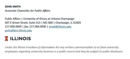
If you ever need a formal email signature, this example made by the University of Illinois is an excellent source of inspiration.
This email signature example is practical, simple, and frills-free, making it great for professionals in traditional industries, such as academia.
What I like: If you work in a traditional industry, this signature offers a great role model. I like that it has a privacy disclosure at the bottom, which is especially important to include if you plan to share your emails with anyone.
Be sure to consult with your legal or HR department to ensure that your email signature complies with any specific requirements in your industry.
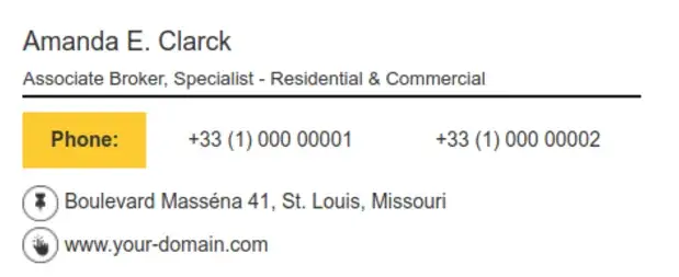
9. Real Estate Email Signature Example

HubSpot's email signature generator tool allows you to easily adjust your signature to your industry’s needs.
Even though this real estate email signature is similar to the one for business professionals, it has a few key differences. There are fewer social platform links, only one phone number, and the name of the real estate agency.
What I like: The social buttons at the bottom are less prominent compared to other email signature designs. This allows an agent to prioritize other elements of their signature, such as their contact information. This design is perfect for real estate agents who want to maintain a professional appearance.
10. Branded Entrepreneur Email Signature Example

With a branded signature, entrepreneurs can combine essential information with some eye-catching imagery.
In this example, Craig A. Cook keeps it simple, highlighting his role as CEO and co-founder, followed by his company’s name and phone number.
What I like: This email signature is a strong example of keeping things clean but still ramping up credibility and personal brand. At first glance, it seems simple enough, but it packs quite a punch.
11. Horizontal Email Signature Example

Take this spacious email signature example as inspiration if you’d like to include plenty of details — all while keeping the attention on your CTA.
You can use this template on HubSpot's email signature generator to show off your expertise and encourage recipients to take action.
What I like: This signature’s simplicity and customizability are fantastic. When you position your CTA separately from the rest of your contact information, you can draw your recipients' attention to the desired action, whether scheduling a consultation, downloading a resource, or visiting your website.
12. CTA Email Signature

A call-to-action email signature adds a little something extra with encouragement to get in touch for a specific product or service.
It can be a bit riskier than your standard email signature since you have to give up some other elements or risk overcrowding, but if it brings business your way it’s worth the trade.
What I like: The CTA takes center stage here. It’s a confident assertion that you have something of value to offer and clients will benefit from getting in touch. Plus, this signature lets you keep most elements of a standard signature — it just shifts the focus to action.
13. Image-Driven Email Signature
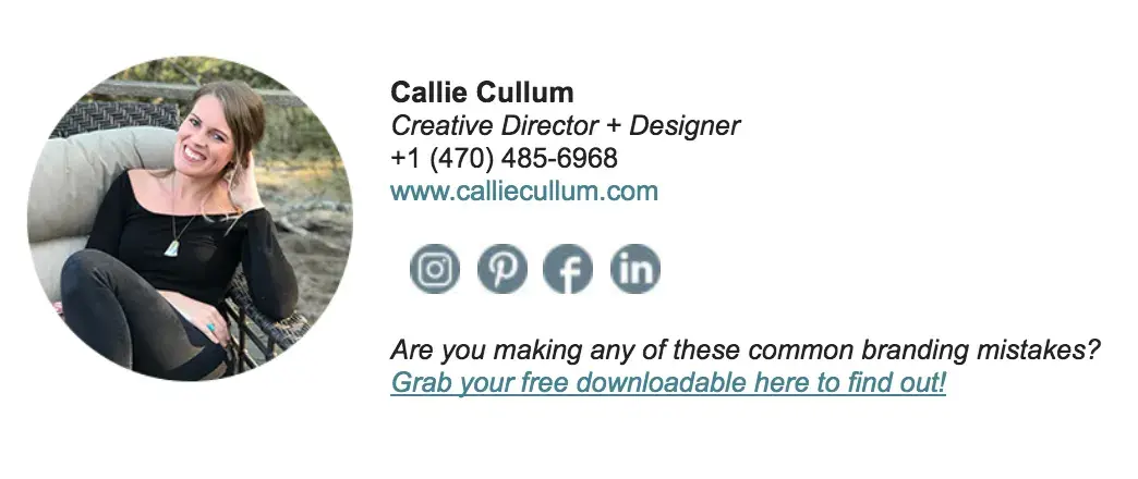
This signature puts the image front and center. The woman in the picture appears friendly and relatable, which are two characteristics that can help drive replies and inquiries. The key to an image-driven signature is two-fold.
Pro tip: First, the picture needs to be you. Not the company logo, not a nature scene, and not a group photo. Second, it needs to be compelling. This means it needs to be front-on from the waist or shoulders up and include eye contact with the camera. Action shots or those looking down or away won’t cut it.
What I like: This signature isn’t complicated. All the details are there, but what draws you in is the image. If you can manage to give off an air of friendliness and competence, you can go a long way to getting more replies.
14. Animated Email Signature
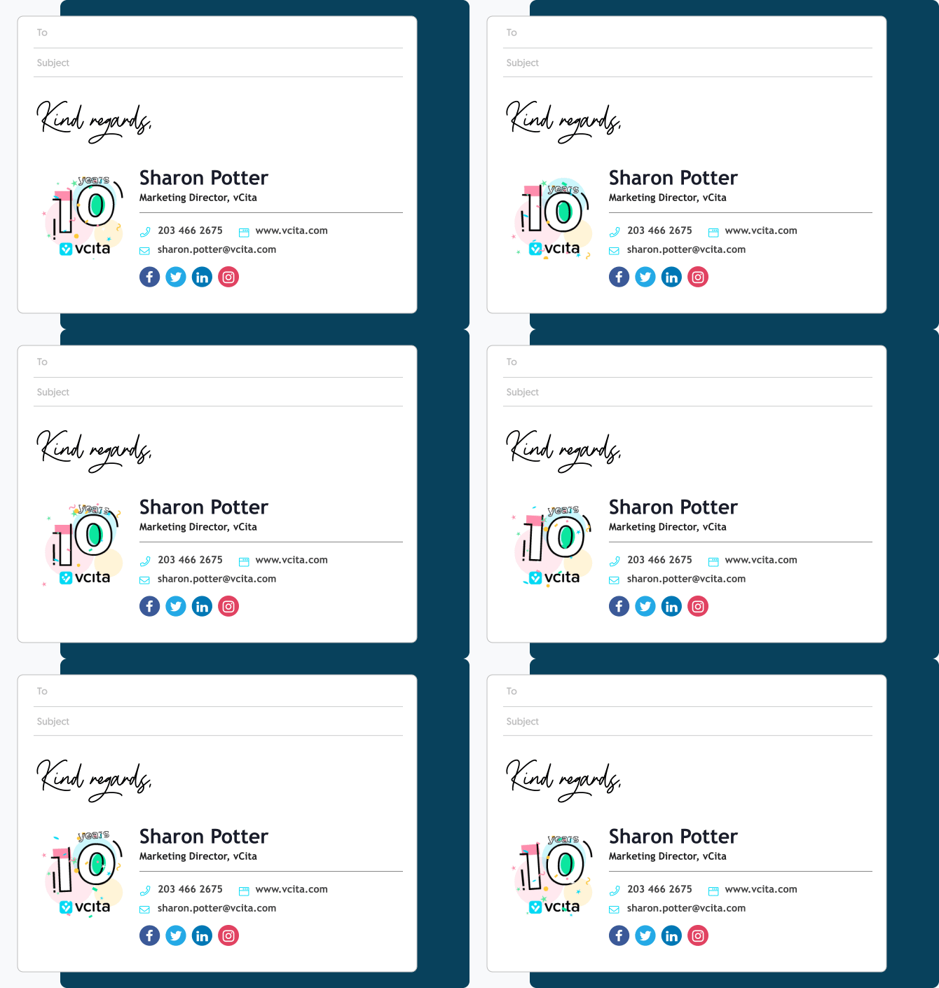
It’s silly, but it works. This animated email signature draws the eye without losing the message, helping add a bit of flair to an otherwise straightforward signature.
What I like: With so many emails sent and received, it’s nice to see something different. Animation adds just a touch of interest that most signatures lack. The caveat? More is less. One animated element is all you need. Two, three, or more, and things get really cluttered, really quickly.
15. Disclaimer Included Email Signature
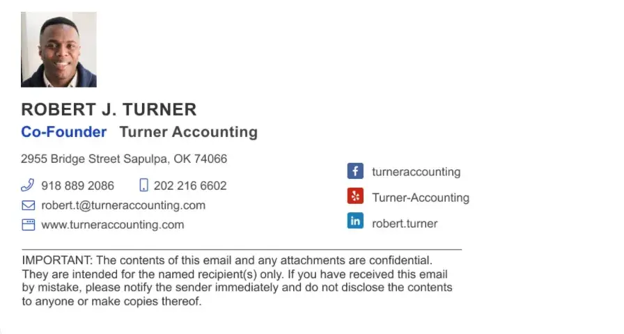
As noted above, some emails must contain disclaimers in the event that messages are sent to the wrong person.
This signature is a simple example of the disclaimer-included style. While the disclaimer itself is longer than the rest of the email put together, it’s also tucked at the bottom out of the way.
Best bet? Draft a disclaimer and then see if you can cut down the word count but keep the same message.
What I like: While the disclaimer is present, it doesn’t overwhelm the signature. Name, email, and phone number are the first things you see, meaning the signature is doing its job right.
16. Achievement Email Signature
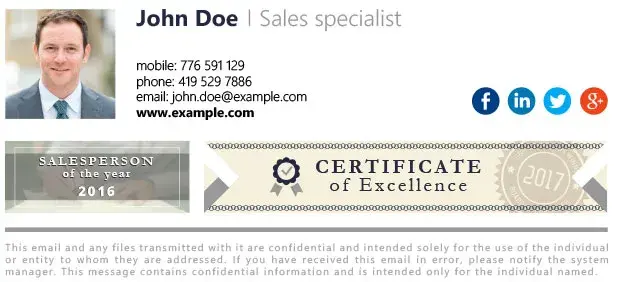
Sometimes, it’s okay to brag. If you’ve got a recent certification, qualification, or award, consider mentioning it in your email signature. Highlighting your expertise — or recognition in your industry — can help engender trust.
What I like: The achievement call-out takes center stage here but doesn’t overwhelm. It lets readers know that they’re dealing with someone who’s put in the time and effort but doesn’t tip over the line into seeming arrogant.
17. Seasonal Banner Email Signature Example
This festive example from Gimmio’s professional email signature generator shows how a banner can add seasonal flair to a polished layout. Criminal lawyer Harry Highpants includes all the essentials — job title, contact info, and social links. Meanwhile, a cheerful “Merry Christmas and a Happy New Year” banner in holiday colors and festive decorations adds warmth and spreads holiday cheer.
What I like: The banner adds personality without compromising professionalism, making it a smart way to acknowledge the season while staying top-of-mind with clients. This type of banner works well for holidays, special company announcements and achievements, or even promoting an event or limited-time offer.
Writing the Perfect Email Signature
The ideal professional email signature helps encourage customer and partner replies. Once you add the basic contact information, the rest of your email signature is a blank canvas on which you can add personality to each professional email you send.
Armed with these best practices for email signatures, you can create your own signature that aligns with your brand and gives your emails a little extra oomph.
Editor's note: This post was originally published in June 2016 and has been updated for comprehensiveness.
Email Design



![How to Add Social Media Icons to Your Email Signature [+ Free Resources]](https://53.fs1.hubspotusercontent-na1.net/hubfs/53/email%20signature-Jul-25-2023-03-50-33-9137-PM.png)
![Creating HTML email marketing campaigns: The design playbook you need [+ free templates]](https://53.fs1.hubspotusercontent-na1.net/hubfs/53/html-email-marketing-1-20251029-6001253.webp)


.jpg)
![How to Make Your Emails More Interactive [Expert Tips + Examples]](https://53.fs1.hubspotusercontent-na1.net/hubfs/53/interactive-email.jpg)

