Lots of times, when marketers want to make a big impact on their marketing, they focus on going after a big project: big email campaigns, big website redesigns, big social media plans, big everything.

But while big projects can have big payoffs, you don't have all the time in the world to execute them. You've got lots of other things on your plate -- the only free time you have left in your day is the 43 minutes on Wednesday between scarfing down your bagged lunch and your weekly 1:00 p.m. client call.
Yeah ... not a lot of time for those big campaigns, huh?
The good news is you don't need them to make a big impact on your marketing -- often, a smaller tweak can work wonders. And one of the smallest changes you can implement with the biggest splash is call-to-action (CTA) revamps. On our own CTAs, we've seen small changes yield 30% increase in conversion ... which is no chump change.

So if you only have a few minutes in your week to optimize your conversion rates, souping up your out-of-date and gnarly looking calls-to-action is the way to go. To be sure you aren't forgetting any crucial components of CTAs, be sure to follow along with the checklist below.
11 Essential Elements of an Effective Call-to-Action
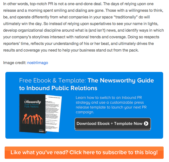
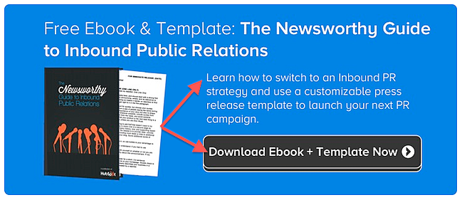
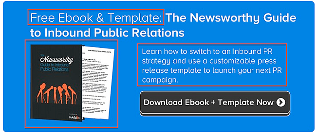
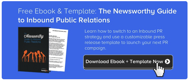
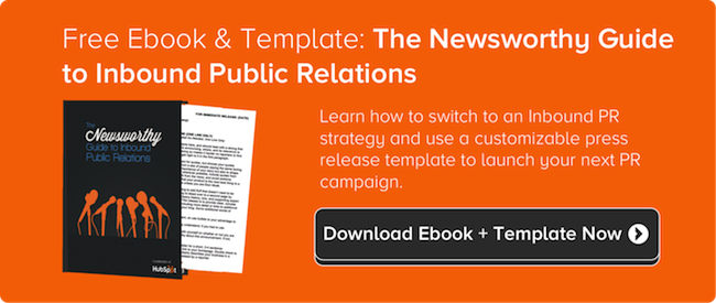
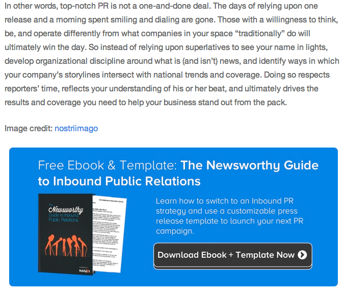
To help demonstrate the anatomy of a well-crafted CTA, we're going to pick apart the primary CTA we recently featured in a blog post about the biggest problem in your PR.
1) Use actionable language.
HubSpot's CTA tool helps you create click-worthy CTAs.
In grade school, you were probably told that writing in the second person (writing to "you") wasn't ideal.
Forget that lesson immediately.
When you're designing CTAs, effective copy all boils down to using action-oriented, second-person verbs. Use verbs like "discover, unearth, find" instead of ones like "be smarter." In the CTA below, notice how we began sentences with "Learn" and "Download." Besides empowering your readers a tad to click on your CTA, you're also shortening your copy -- which all boils down to a more effective and concise call-to-action.
According to AJ Beltis, Senior Content Marketing Manager for HubSpot's Acquisition team, succinctness pays off for CTA copy. “I've found that direct CTA copy tends to perform better than lengthier CTA copy. Succinctly pitching the value of what you're linking out to on a page with an abundance of copy and visual distractions can act as an unambiguous directive on what readers should do once on the page.” Create authoritative and click-worthy CTAs with HubSpot's CTA tool.
2) Align CTA copy with landing page copy.
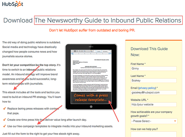
When you're creating CTA copy, you also want to make sure your CTA copy and your landing page copy align. The name of the thing you are promoting -- whether it's a free ebook, whitepaper, template, guide, crash course, or presentation -- should align with the name of it on the landing page.
You should also be calling the offer the same thing on both the CTA and the landing page. For example, if you mention that people can download a crash course on Facebook advertising on the CTA, you shouldn't call it an ebook on the landing page. It may seem like small potatoes, but those details matter.
On the landing page that goes with the CTA above, we did both of these things -- notice how the title of the offer and how we position it is the exact same as the CTA. This way, when people get to the landing page, they aren't confused about what we're offering and click away.
3) Include a clear value proposition.
Each call-to-action you create is unique to your business -- it's your offer, service, or product you're trying to promote. But that's not how users perceive it. When they come in contact with your CTAs, they wonder why they should download that very offer from you at this specific moment. They might wonder if they've already downloaded something similar from your competitor. Or maybe they are just confused about value you're going to bring to them in exchange for their email.
Either way, you've got to quell these suspicions by making the benefit of clicking on the CTA super clear. On your CTA, give a quick description of what happens when they click on it -- will they magically become better at their job? Will they save time? Will they end up saving humanity from a pack of zombies? Regardless of what you want them to do, it should be very what is going to happen when people click.
On our CTA below, you can see this principle in action. In both the headline and the description, we describe what people will get when they click and how they will be able to use it -- which helps readers trust us and differentiate us from other companies' offers.
4) Play up its time-sensitivity.
People are busy online. While they are browsing your website, blog, or social media accounts, they're also probably fielding emails, taking a client call, and maybe drafting a tweet of their own. With all of these potential distractions, you want to keep your readers focused on clicking your CTA.
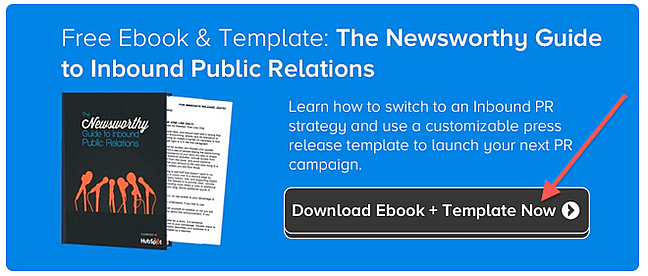
The best way to do that is to tap into the element of urgency and tell people to do something right now. One way to do that is to add words like "now" or "today" to your CTA button (that's what we did in the example below). Just reminding people to do something now can increase the chance of them actually doing it now.
5) Make it big.
In the land of calls-to-action, the motto is go big or go home. You can't make a tiny little button that appears at the bottom of the page and hope that people will click on it -- chances are, people are going to miss it when they're glossing over your site in an F-shaped pattern.
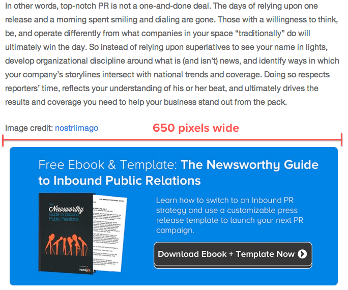
To make sure that people notice your CTA, you've got to have it large and in charge on your site. For example, the CTA we're talking about here is the full width of the blog post body column -- about 650 pixels wide. That way, there's no way in hell you're going to gloss over it. That being said, there's no industry standard for the smallest size a CTA can be, so you've got to test how the size affects conversions on your own.
6) Create a highly contrasting design.
Another way to attract your visitors' attention is through the actual design of your button. You can forget another lesson here: calls-to-action shouldn't blend in with the rest of your website design. Yes, you can use similar styling -- fonts and colors can still match your style guide -- but the way you combine these elements should make the design pop from the rest of the page.
Check out our CTA to see what I mean. We use our brand colors (orange, slate grey, white, and blue) and our font family (Proxima Nova) to make the CTA look like it's part of the HubSpot family ... but the way we put the CTA together makes it pop. The blue CTA background contrasts nicely against a white blog post background, and the grey button with white text and outline on top of it all grabs your attention even more. These contrasting elements were strategically chosen to help our readers notice this CTA.
7) Make the button look clickable.
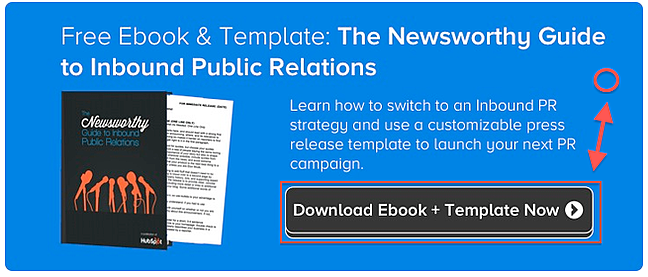
Most things you can click online look like they can be clicked. Usually, they have some sort of shading or contouring that makes them look like a button you could press in real life. So if you want your CTAs to be clicked, it makes sense to make it look like something people are already familiar with clicking ... right? Use your design program to add shadows and borders to not only give your CTA an extra design finish -- but also make it look functional.
We did that in our CTA in the "Download Ebook + Template Now" button. Notice how the button looks almost 3D? That's because of a nifty little tool in PowerPoint that adds depth to 2D objects. Definitely experiment with which "clickable designs" work best for your CTAs -- they could drastically improve your conversion rate.
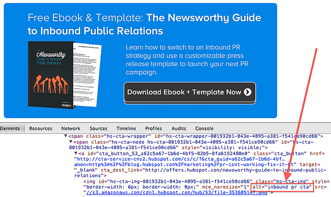
8) Add alt text.
Despite the web becoming more and more reliant on visuals to communicate, lots of people still have problems displaying images in their browsers. Sometimes, they just have errors loading your images in your browser, while other times, they may purposefully block them from appearing -- and in either instance, you need to have a backup plan. Alt text allows you to display text whenever a CTA doesn't appear properly in a website or email. (Bonus: Because alt text is, you know ... text, search engines can actually read it -- spelling additional SEO juice for you.)
In our CTA below, we've included the alt text "inbound pr cta" to help direct those who can't view images. Granted, it's probably not the most engaging alt text, but it does give people and search engines an indication of what should have appeared in that image's place.
9) Place your CTA prominently on your website.
Once you've finished all the copy and design, it's time to start putting that baby to work on your website. Whether you're placing it above the fold (where it generally will get more clicks and conversions) or below the fold (where you can get higher quality of leads converting), you want your CTA to be noticed. So put it where it can get noticed -- heck, draw even more eyeballs to it by adding directional cues so you get more clicks and conversions.
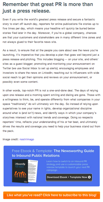
In the example we've been using, our primary call-to-action is featured at the bottom of every blog post. Notice how the size and design go hand-in-hand with placement -- because it's placed at the bottom of the post, we really need to ramp up the size and eye-catching design components. See how much more prominent it is compared to the paragraphs above it?
Beltis adds that the CTA should not be buried. “If the CTA is hidden too far below-the-fold or blends in with the rest of a page's contents, it's likely the CTA may be overlooked. That's why in some situations it's appropriate to have multiple CTAs,” he said. “The key here is to find the right balance of CTA placements to ensure an optimal conversion rate without coming off as spammy, hurting your brand, or detracting from the user experience.”
10) A/B test multiple CTAs to find the best performer.
Once you've got one CTA set, don't stop. Chances are, you have even more opportunities to convert leads and customers through your CTAs -- even if you've optimized them using the tips in this blog post. So keep tweaking copy, design, sizing, placement, etc. until you find a CTA that performs above the rest.
To be honest, we didn't A/B test this specific CTA because we were focusing on optimizing it per the next action item, but we frequently A/B test new CTAs on the blog and in emails. Let's say we did A/B test it though -- below is an example of a test we could run.
Version A:
Version B:
11) Personalize CTAs for different segments of your audience.
Besides A/B testing, you can also tailor CTAs to only appear to select audiences. For example, your visitors can see one thing, your leads can see another, and your customers can see something else altogether. To be honest, you'll need the right software to do this (HubSpot customers: You've covered on this point if you're a Pro or Enterprise account) but if you have the software, you're golden.
We do this all the time on our blog -- if you look at the CTA below, you might see a CTA for creating CTA templates (meta, I know) or a CTA for demoing HubSpot's landing pages. So the example CTA we've been using is no different.
What leads see:
What everyone else sees:
Ultimately, by testing and optimizing and testing again, you'll figure out which CTA best practices work for you -- and which don't -- all in the sliver of time you have free each week.
What have you learned while optimizing CTAs on your own website? Share your insights with us in the comments!
Image credit: D+J+


![How the HubSpot Blog Generates Leads [+ How Yours Can, Too]](https://blog.hubspot.com/hubfs/17_Lead%20Generation.png)

![28 CTA Templates to Design Clickable CTAs in PowerPoint [Download]](https://blog.hubspot.com/hubfs/cta-template.jpg)

![What is a CRO Test? [+ the 5 Steps to Perform Them Yourself]](https://blog.hubspot.com/hubfs/conversion-rate-optimization-tests_4.webp)

![How to Add Slide-In Calls-to-Action to Your Blog Posts [Tutorial]](https://blog.hubspot.com/hubfs/Slide-in_CTAs.webp)