Over the years (and after countless email marketing iterations, trials, and errors), I’ve worked my way to figure out what goes into crafting the best event invitation emails. I’ve noted what’s worked — and what hasn’t.
In this blog post, I’ll distill everything I’ve learned from my experiments and conversations with the pros about crafting the perfect event invitation email that gets people to open and respond.
Ready to explore? Read along, or jump directly to any of the sections below.
Table of Contents
How to Write an Email Invitation For an Event
I’ll start by setting one thing straight: Not every online event invitation email you send needs to be a fancy, high-budget production.
And you don’t need a ton of time or resources to create a compelling event invitation. A few minutes is all it takes to craft something solid when you’ve got the right approach.
Let me walk you through a simple cheat sheet I’ve created to help you get your event invitation email on track.
1. Answer the 5 “W's.”
The first thing I always do is ensure my email covers those five W’s we’ve all learned: Who, What, When, Where, and Why.
Answer all these in your event invitation email, and there’s no need for follow-ups.
Recipients will know precisely when and where to be and even immediately understand the event's purpose.
For example, check out this event invitation email that perfectly answers the 5 W’s below.
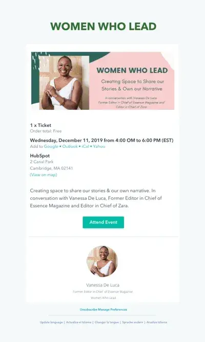
Do you see how the five “W” are crystal clear?
- Who: Vanessa De Luca
- What: A seminar called “Women Who Lead”
- When: December 11th, 4-6 PM
- Where: HubSpot
- Why: To create a space where women can share and own their stories.
When I was discussing this 5 W’s approach with Mike Funkhouser, the founder of Agency Helper, he made a fair point. He said, "While all five Ws are crucial, the ‘Why’ carries the most weight when getting people to attend an event. “Without a strong ‘Why,’ even the most well-crafted invitation can result in lower attendance.”
I agree with Funkhouser on this. It makes sense to pay extra attention to clarifying the “Why” precisely and explaining what attendees will gain from the experience. But how do you make the “Why” loud, clear, and visible?
For that, you can follow this tip I’ve picked from (email geek) Jaina Mistry, director of brand and marketing at Litmus. Mistry says, “Lean into the inverted pyramid principle when drafting emails. Put the most critical information first and continue in descending order of significance.”
In an event invitation, this would mean putting your event's headline first, followed by the date/time of the event and then the call-to-action button. Keeping with Funkhouser and Mistry’s advice, I now treat it as a thumb rule to ensure the headline answers the Why and catches the eye.
My key takeaway: Ensure the five W’s are crystal clear in your event invitation email. Focus on crafting a compelling why and include that critical information on top.
2. Remember that less is more.
When you share details in your event invitation email, you must include critical information but not overwhelm the audience. Take my word for it: if your email feels cluttered or confusing, your readers will feel the same about your event.
After all, who wants to attend an event that looks unorganized from the get-go? This is even more pressing if your event is low-key or recurring!
When I discussed this “less is more” sentiment with Anete Vesere, a senior content marketing manager at Speakap, she was also all-in on it. She shared a great tip for helping the email recipient find the most crucial information quickly.
Vesere recommended this: “Either use a design or visual to convey the key details or stick to plain email text. Trying to do both in one email risks making it feel cluttered and overwhelming.”
I couldn’t agree more. Less is more indeed applies to both text and design.
Let me show you an event invitation email from Starbucks about their Happy Hour, which echoes the motto “less is more.” It is straightforward, uncluttered, and to the point.
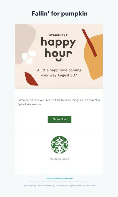
Do you see it now?
- It answers all the essential questions.
- It doesn't bog you down with unnecessary details.
- It leaves room for curiosity and action (which, by the way, is key).
My key takeaway: Brevity is the way to get people to RSVP without any fuss. Keep the essentials, and don’t try to fit too many extra details into your email. Stick to either visuals or plain text when communicating key info to avoid clutter.
3. Don't forget a CTA.
I can’t stress this enough. If you haven’t been including a CTA (call-to-action) in your email invites, take my word for it: You’re seriously missing out, friend.
Adding a CTA in event invitation emails serves different purposes, such as RSVPing, adding to one’s calendar, and more.
It enhances the recipient’s experience and offers a way to measure engagement in the content management system via click-through rates.
As Joe Berman pointed out, it even increases the likelihood of attending. Berman has hosted many hyperlocal meetups for marketing, content creators, and even popup markets and fashion events, for which he’s relied heavily on event invitation emails.
Berman shared his approach with me: “I generally try to get in my invitees‘ Google calendars with the CTA. That’s because once the event is in their Google calendar, it’s synced to all their devices, and the likelihood of attending increases.”
I got another tip from him. Berman suggested, “Sometimes, let people know you will send them a calendar invite with the location details once they RSVP via email.
This way, they are more inclined to RSVP to receive the location, and once the location is on their calendar, their phone might buzz an hour before the event.” That’s smart, right?
Are you wondering what adding CTAs to your event invitation email can look like? Check out this example email created using HubSpot's email software.
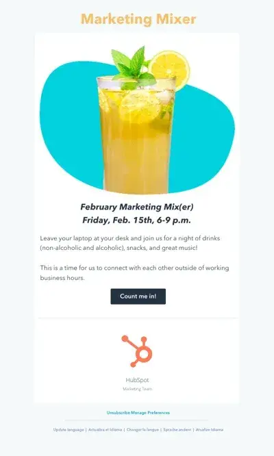
My key takeaway: CTAs are a win-win for user experience, higher attendance, and tracking. Make sure you include them.
4. Make the design enjoyable.
Here’s the deal: The design of your email matters. Whenever I receive an invitation, a lot of how I feel about it boils down to design. Doesn’t that happen to you too? And this makes perfect sense; we humans are visual beings, right?
Creating a good design doesn’t mean you need to break a sweat or be a pro at coding. You can pretty much use templates while sticking with your branding.
I usually use tools like Canva and Mailchimp. They have a vast library of templates, and I always find something that suits my style. Want an example? Let me show you this template I’ve picked straight from Canva.
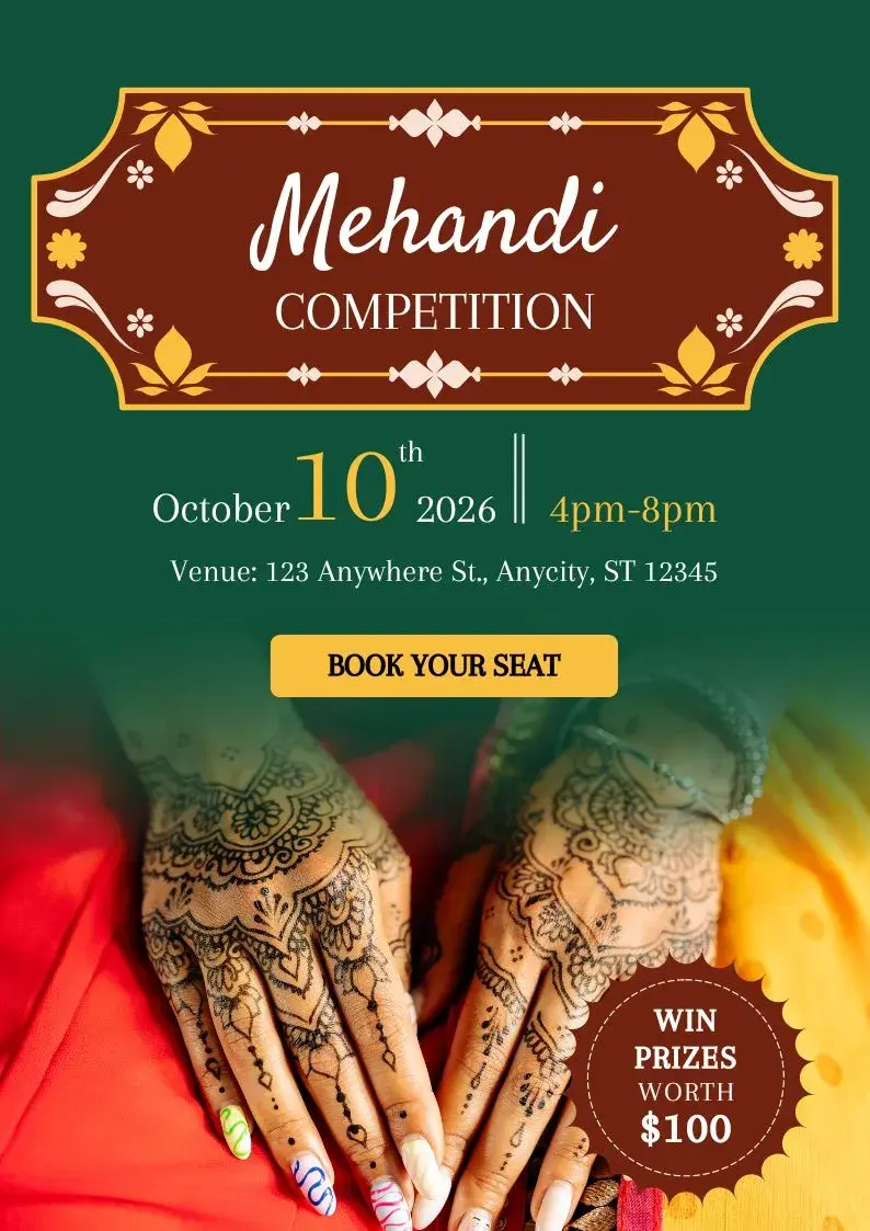
To make the event invitation email design enjoyable, here’s what I do:
- I start with the templates I like and customize them.
- I play with simple elements like shapes, colors, and text sizes, which impacts how my invite looks and feels.
- Once my design draft is ready, I immediately consider whether I want to attend this event based on the design alone. If my answer is no, I know I’ve got to revisit and tweak things until that turns into a yes.
And let me tell you one more thing: design doesn’t just apply to design-centric emails. When working with predominantly text-based emails, I still add some design.
In those cases, I get creative with the email signature. A tool I swear by to make this easy and quick is the free email signature template generator by HubSpot.
My key takeaway: Aesthetics matter. Use templates, customize, and ensure the invitation email is visually appealing. When writing text-only emails, insert a creative email signature to add that visual appeal.
5. Consider your language.
Earlier, when I used to draft event invites, I tended to use overly formal or generic language. Eventually, as I kept measuring results and worked on honing my craft, I realized that’s not the vibe that usually works in event invitation emails.
But wait, what does?
I’ve found that a conversational tone makes the event email invite feel more personal and welcoming. After all, you’re inviting humans! Therefore, I ensure my language is inviting and engaging and reflects the event's tone.
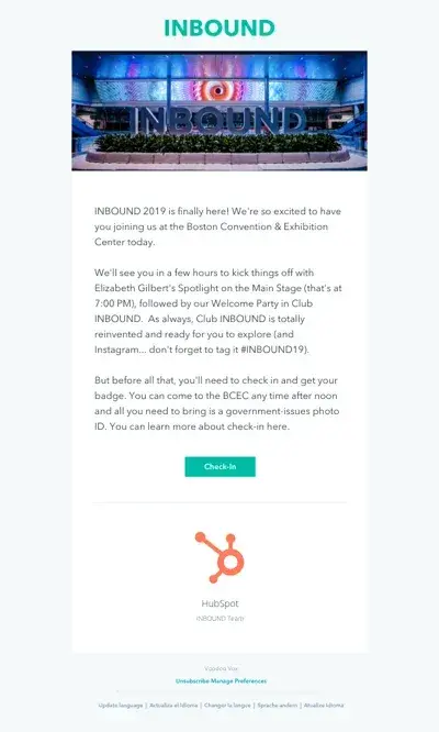
Here’s an example of an invitation email I dislike. I’m not a fan of it because even though it’s laid back, it’s loaded with corporate speak and less personality for the event that it is.
I was discussing the importance of human-centric language with Mistry when she gave me another language tip I found super helpful: leaning into FOMO.
Mistry explained, “The fear of missing out can be a strong driver that will motivate folks to take action on your email and, hopefully, accept your event invite.” How do you do that?
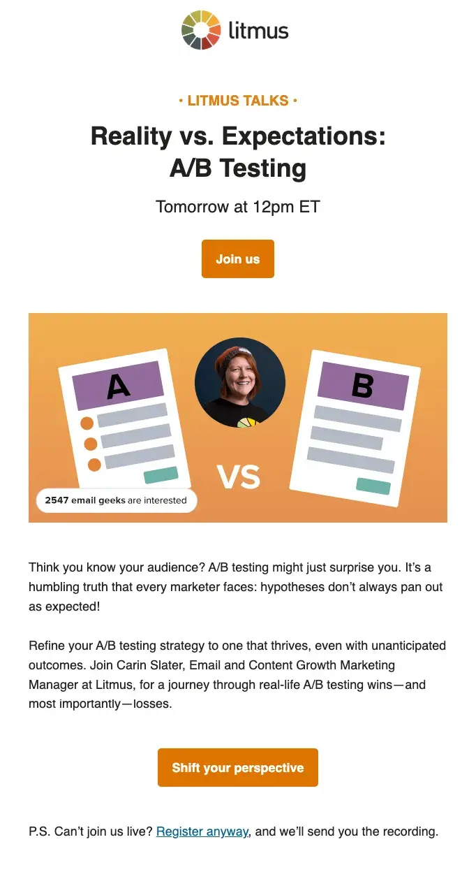
One way is to add a simple interest signal. This lets you display how many folks have clicked on your event invite. As that number climbs, it motivates others to join in, too. Mistry shared an example. Check out the image below for an invitation email by Litmus’ team with a strong interest signal in just a few words.
My key takeaway: Keep the language of your event invitation emails human and conversational. Lean into FOMO and add interest signals. But of course, don’t overdo it.
6. Think about the details.
This is usually my final step. After drafting and designing my email, I review it again to ensure I’ve considered the smaller yet significant details.
Some questions I tend to ask myself include:
- Is the subject line within the ideal character limit for visibility? If it’s longer than the limit, a part of it will be truncated in the user’s view. Here are some of the default subject line character limits on popular email apps for your reference: Gmail (70), Yahoo Mail (46), Outlook (54-73), iPhone (41-64).
- Is the subject captivating enough to catch the reader’s attention? This can make or break your opens.
- Is the event location tricky to find?
- Do I need follow-up emails? How many, and when should I send them?
- Should I also design a thank you email for event attendees?
Looking into such details is super important today, as people are busy and inboxes are more crowded than ever. Small touches can make a big difference, and showing you care even after the event is an excellent way to leave a lasting impression.
Anthony Bartlett, a senior content strategist at Survey Monkey, gave me this tip: “When sending your thank you email, take the opportunity to ask attendees about their experience — what they enjoyed and what could be improved. This demonstrates your commitment to providing value, and the feedback you receive can help you refine and perfect your invitations for future events.”
Let me show you an event invitation email that demonstrates the importance of taking care of the finer details.
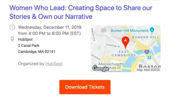
This event is at a hard-to-find location, so they’ve added a screenshot of Google Maps to help attendees. Add details like these, you’ll make a good impression and show invitees their needs are thought of.
By following these simple steps and focusing on the essentials I just explained, I’ve been able to create event invitations that get people excited and eager to attend.
Event Invitation Email Template
Do you want a framework for your event invitation email? Use this event invitation email template I’ve created and tweak it to your unique needs.
Subject Line: Get Ready for [Event Name]! Join Us on [Date]
Header:
[Event Name]
[A compelling tagline answering the why for the event]
Body Text:
Hi [First Name],
[Event Name] is happening on [Date] at [Location/Online]. This isn’t your ordinary [industry/topic] event — it’s where [the benefit of attending].
Here’s what’s in store:
- [Brief description of Highlight 1]
- [Brief description of Highlight 2]
- [Brief description of Highlight 3]
Space is limited, so we recommend securing your spot today. Early registrants get exclusive access to [bonus perk or feature].
CTA Button: Register Now
Looking forward to seeing you there!
[Your Name/Team Name]
Why Event Invitation Emails Are Super Important
Are you wondering why you should follow these tips or the event invitation email template? The short answer is to get your event invitation emails on point and unlock many benefits.
Let me take you through them quickly.
Creates the First Impression
The event invite email is likely the first point of contact with your potential attendees and can set the tone for the entire event. If it is unclear, unprofessional, or lacks appeal, you can risk losing interest before invitees even RSVP.
Boosts Attendance Rates
A well-crafted invitation always piques interest and excites people. Take my word for it: the more precise, value-packed, and engaging you make it, the higher the attendance will likely be.
Aligns Expectations and Improves Experience
A clear and detailed invitation ensures your recipients know the event’s value and what to expect. This reduces confusion, helps attendees feel prepared and excited, and improves their overall experience.
Reflects Your Brand
How you present your event in the invitation reflects your brand or company. Craft a polished, thoughtful invitation, and you’ll convey professionalism that sparks trust and credibility.
Encourages Early Responses
Well-designed event invitation emails convey urgency and importance and usually get quicker responses. You can better plan logistics, catering, and accommodations when you get that.
Maximizes Engagement
A compelling event invitation email grabs attention and generates excitement, encouraging invitees to engage even before the event. This can generate social proof as recipients share with their network and generate pre-event buzz — the result is increased awareness and potential attendee referrals for your event.
Final Thoughts
Event invitation emails are powerful tools for marketing an event. But crafting the best event email invite is about more than bells and whistles.
I’ve realized it’s all about getting to the point, being thoughtful and personable, and making it easy for people to engage. The more I’ve experimented with design, language, and CTAs, the better my invitations have become.
Getting this right is super important because a well-crafted event invitation email doesn’t just provide event details — it builds the groundwork for your event’s success. It creates an experience your audience will remember.
I hope this post, with all its examples, helps you take your event invitation emails to the next level.
Editor's note: This post was originally published in February 2020 and has been updated for comprehensiveness.

