

To make the right decision, businesses have to evaluate their needs and resources. For B2B companies, unified platforms like HubSpot streamline the entire lead process, from capture to nurturing, while providing clear ROI tracking and analysis.
When it comes to making the right choice, teams should consider business size, budget, and integration needs. In this guide, marketers will discover 26 proven lead generation tools that can help teams level up.
Table of Contents
- What is lead generation?
- Why is lead generation important?
- What is a lead generation platform?
- How to Choose a Lead Generation System
- Best Online Lead Generation Tools Comparison
- The 26 Best Online Lead Generation Tools
- Frequently Asked Questions About Lead Generation Tools
What is lead generation?
Lead generation is the process of attracting and converting people who’ve shown interest in a product or service. It’s about getting them to take action — download a guide, sign up for a newsletter, book a demo — so marketers can build a relationship.
Inbound vs. Outbound Lead Generation
Inbound lead generation means allowing prospects the chance to discover a business organically. These potential buyers become exposed to the brand through content, search, or social media. The inbound approach involves creating landing pages with offers and optimizing for search.
Meanwhile, outbound lead generation involves actively reaching out to prospects who may not yet be familiar with the brand. Teams taking the outbound approach find potential prospects’ emails, use sales intelligence tools to conduct outreach, or message leads cold.
.webp?)
Free Marketing Software
Easy marketing tools that deliver fast time-to-value, unified in one place.
- AI Tools
- Email Marketing
- Social Media Management
- And More!
How Lead Generation Tools Fit Into the Sales Funnel
Different tools excel at different stages of the sales funnel. Here’s when each comes into play:
- Top-of-funnel tools build awareness. They can help optimize for organic search and build teams’ social presences.
- Middle-of-funnel tools focus on getting prospects to consider a purchase. For example, teams may host a Webinar over Zoom or nurture clients via email with Mailchimp.
- Bottom-of-funnel tools help teams guide buyers toward a decision. For example, live chat software can help buyers find tools that fit their needs. Meeting schedulers can put buyers directly in front of a salesperson.
Want a complete breakdown? Start with this beginner’s guide to lead generation. Then, grab our free lead gen starter guide to help launch and sustain effective lead generation efforts.
Why is lead generation important?
Without leads, a business is just a costly hobby.
No leads = no pipeline = no revenue.
But there’s more to it. Lead generation is foundational not just for growth, but for scalable and predictable growth. Let’s break down three key benefits.
1. Revenue growth that compounds over time.
Sopro’s State of Prospecting research found that 91% of marketers reported that lead generation was their most important goal for 2025. Given that companies with a solid lead generation engine see massive payoffs, this is unsurprising.
However, generating leads is just one, albeit essential, part of the puzzle. With 80% of new leads never translating into sales, the difference-maker in converting those that do lies in nurturing them. In fact, businesses with best-in-show lead nurturing strategies “generate 50% more sales-qualified leads (SQLs) at a 33% lower cost.”
The long and skinny? When teams consistently fill their pipeline with qualified prospects, it feeds every part of the sales funnel — and ultimately drives long-term profitability.
2. Smarter marketing spend with clear ROI.
Lead gen is one of the most measurable parts of your marketing strategy. Marketers can track cost-per-lead, conversion rates, time-to-close, and customer lifetime value. This kind of clarity means your marketing team can double down on what works — and cut what doesn’t — without guessing.
According to HubSpot’s State of Marketing report, 61% of marketers say generating traffic and leads is their top challenge, yet it’s also the area with the most measurable ROI.
3. Better alignment between sales and marketing.
Good lead generation aligns your sales and marketing teams. With the right tools and handoff processes in place, marketers can deliver sales-ready leads that match the ideal customer profile. This reduces friction, shortens sales cycles, and improves win rates.
Want to improve alignment between sales and marketing teams? Research shows that 78% of sales leaders say an effective CRM achieves this goal. Enter HubSpot. HubSpot offers a unified platform for marketing, sales, and service, facilitating seamless communication.
Want to go deeper? Check out this free lead generation introduction.
What is a lead generation platform?
Lead generation platforms are tools that help businesses find, attract, and capture leads. Some help with email outreach. Others focus on landing pages, pop-ups, chatbots, or data enrichment. The best ones? They integrate seamlessly with the CRM and workflows.
HubSpot’s lead management and tracking software, for example, allows teams to have full visibility into each lead’s journey, to automate lead routing to the right reps instantly, and to prioritize high-value prospects with lead scoring.
Companies can explore lead gen from every angle, but it boils down to three things:
- Get attention.
- Create value.
- Make it easy to take action.
How to Choose a Lead Generation System
Lead generation tool selection depends on business size, budget, and integration needs. For example, large enterprises require scalable solutions due to lead volume. Small and medium-sized businesses (SMBs) typically work with lower volumes of leads and need more cost-effective solutions.
Regardless of a business’s size or budget, a key feature to look for in a lead generation solution is CRM integration. CRM integration enables seamless lead management and follow-up. Automation is another key feature for lead generation solutions. AI-powered lead generation tools offer more specialized features, such as automated lead scoring and personalized outreach, tailored to the data in your CRM.
Furthermore, when evaluating lead generation solutions and their features, ensure that they support two-way data synchronization, allowing updates to flow in both directions. And look for pre-built integrations to avoid custom development work. The best integrations eliminate manual data entry and ensure your entire team has real-time visibility into lead status and history.
Business niche also comes into play when choosing a lead generation system. For example, B2B lead generation tools are designed for business-to-business customer acquisition, specifically. B2B companies should also consider that the B2B customer journey is more complex than in other niches.
B2B customers typically require multiple layers of approval, often across departments and stakeholders, before they can invest in tools or services. As a result, it can take longer for a sale to “land.”
Looking at the numbers, over 60% of B2B leads won’t convert for at least three months. As time passes, the likelihood of a sale slipping through the cracks increases. Due to this, HubSpot is one of the best lead generation tools for B2B businesses, as it offers an end-to-end view of sales pipelines even over longer buying journeys.
Best Online Lead Generation Tools Comparison
|
Tool |
Category |
Best For |
Starting Price |
|
HubSpot’s Lead Management Software |
All-in-One Marketing & CRM Platform |
B2B teams that need visibility into every lead’s journey |
Free; Paid plans $20/mo |
|
HubSpot Marketing Hub |
All-in-One Marketing & CRM Platform |
Inbound marketing & CRM integration |
Free; $20/mo |
|
Keap (formerly Infusionsoft) |
All-in-One Marketing & CRM Platforms |
Automating small business lead nurturing |
$299/mo |
|
Mailchimp |
Landing Page & Conversion Builders |
Email marketing and landing page combos |
Free; $13/mo |
|
Unbounce |
Landing Page & Conversion Builders |
High-converting pages without code |
$99/mo |
|
Leadpages |
Landing Page & Conversion Builders |
Fast, code-free landing page creation |
$49/mo |
|
OptinMonster |
On-Site Capture & Pop-ups |
Converting website visitors with pop-ups |
$16/mo |
|
Wisepops |
On-Site Capture & Pop-ups |
Advanced on-site lead capture pop-ups |
$49/mo |
|
BDOW! (formerly Sumo) |
On-Site Capture & Pop-ups |
List building and email capture on-site |
Free; $39/mo |
|
Leadfeeder |
Website Visitor Intelligence |
Identifying anonymous B2B website visitors |
Free; $99/mo |
|
FlippingBook |
Landing Page & Conversion Builders |
Interactive lead capture flip books |
$26/mo |
|
Albacross |
Website Visitor Intelligence |
Identifying anonymous website visitors (EU-friendly) |
The Starter plan is €84 ($98) per month |
|
Pipedrive |
Sales Pipeline & CRM |
Visual sales pipeline management |
$14/mo |
|
Hotjar |
Website Analytics & Optimization |
Understanding user behavior to optimize lead flows |
Free; $49/mo |
|
Wiza |
B2B Data & Prospecting |
B2B contact and email outreach |
$49/mo |
|
ZoomInfo |
B2B Data & Prospecting |
B2B contact and company data at scale |
Custom pricing |
|
Apollo.io |
B2B Data & Prospecting |
B2B email outreach and lead databases |
Free; $49/mo |
|
Crunchbase |
B2B Data & Prospecting |
Prospecting and market research |
Free; $99/mo |
|
Typeform |
Interactive Lead Magnets & Forms |
Interactive lead capture forms |
Free; $25/mo |
|
Outgrow |
Interactive Lead Magnets & Forms |
Creating lead magnets like quizzes and calculators |
$22/mo |
|
Jotform |
Interactive Lead Magnets & Forms |
Building complex forms with conditional logic |
Free; $34/mo |
|
Salesloft (formerly Drift) |
Conversational Marketing & Chat |
Conversational lead capture via chat |
Custom pricing; Free plan available |
|
Intercom |
Conversational Marketing & Chat |
Combining live chat, support, and nurture |
$29 per seat/mo, billed annually with $0.99 per Fin resolution |
|
LinkedIn Lead Gen Forms |
Paid Ads Lead Capture |
B2B paid campaigns on LinkedIn |
Free with ad spend |
|
Google Ads: Lead Form Extensions |
Paid Ads Lead Capture |
Capturing leads directly from search results |
Included with Google Ads spend |
|
Facebook Lead Ads |
Paid Ads Lead Capture |
High-volume B2C lead capture on social |
Free with ad spend |
The 27 Best Online Lead Generation Tools
Companies of all sizes should consider trialing free and paid lead generation tools to find the right fit. Free lead generation tools allow businesses to test features before investing. However, they often have fewer features. Although paid lead generation tools come at a cost eventually, these solutions usually offer more customized features.
Below, is a list of the best lead generation platforms and tools on the market, including free and paid-for options.
All-in-One Marketing and CRM Platforms
These tools provide comprehensive marketing automation, CRM, and lead management capabilities within a single system.
1. HubSpot’s Lead Management Software
Best for: B2B teams who need visibility into every lead’s journey
HubSpot’s Lead Management Software is a free CRM that helps marketers to organize, prioritize, and engage prospects from a single centralized platform. It automatically scores leads based on their behavior and characteristics, then routes them to the right sales reps so teams can prioritize high-value prospects. Whether a lead first interacts through your website or responds to an email campaign, HubSpot brings every touchpoint together so you can see exactly where each prospect is in their buyer journey.
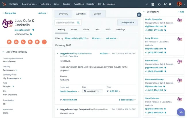
Key Features
- Full lead visibility. See complete timelines of a lead’s engagement with the business, including page views, form submissions, emails opened, calls made, and more. This unified view empowers sales and marketing teams with the context they need for timely outreach.
- Automated lead scoring & routing. HubSpot automatically assigns scores to leads based on behavior and demographics using customizable criteria or data-driven models, helping teams focus on high-value prospects. Leads can then be routed instantly to the right sales rep — eliminating manual handoffs and speeding up follow-ups.
- Smart segmentation & nurturing. With all contact properties in one place, marketers can build targeted lists, personalize communications, and automate nurturing workflows that gently guide prospects down the funnel.
- Streamlined task management. Create tasks, assign follow-ups, and track engagement without ever leaving the CRM — reducing manual admin work and keeping leads moving forward.
Pricing: Free plan available. Paid plans starting at $20/month per seat.
What I like: Every interaction — from website visits to email opens to sales calls — is automatically tracked and logged, providing your team with full context without requiring manual data entry. This visibility across the entire customer journey helps sales and marketing stay aligned, shortens follow-up times, and ultimately drives more conversions.
2. HubSpot Marketing Hub
Best for: All-in-one inbound marketing
HubSpot Marketing Hub is a suite of marketing tools that help businesses attract, convert, and engage high-intent visitors. HubSpot’s lead management software is included in Marketing Hub, as is the AI email marketing tool. Both can help companies of all sizes with lead generation.
With HubSpot’s Marketing Hub, marketers can build landing pages, automate emails, score leads, and track performance — all in one dashboard. The integration with the CRM means users don’t have to switch tools just to understand where a lead came from or how qualified they are.

The lead capture functionality is the best — all customizable, all trackable. Marketers can launch a new lead gen campaign in an afternoon and know it will plug right into their nurturing workflows.
Businesses can easily integrate Marketing Hub with their preferred CRM, email tool, or customer data platform. Opting for HubSpot’s Starter Customer Platform also saves companies from the headaches that come with integrating third-party apps.
The platform packs email automation and content marketing tools, cross-departmental analytics, ecommerce features, and a lot more, all under an intuitive interface.
Pricing: Free plan available; Starter starts at $20/month, with Professional and Enterprise tiers offering deeper automation and ABM features.
What I like: The built-in CRM and marketing automation combo is hard to beat. Companies don’t need five different platforms to do the job of one. Plus, the scalability makes it great for small teams and big operations alike.
3. Keap (formerly Infusionsoft)
Best for: Automating small business lead nurturing
Sometimes small teams don’t just want a CRM — they want an entire marketing backend. Keap provides just that. It offers CRM, email automation, payments, forms, and appointment booking — all tied together with visual workflows.
Key Features
- All-in-one CRM and automation.
- Easy-to-use campaign builder.
- Built-in invoicing and appointment scheduling.
- Designed for service-based businesses.
Pricing: Starts at $299/month.
What I like: Keap is purpose-built for solopreneurs and small teams. Everything is centralized in one place, which reduces tool fatigue and data silos.
Landing Page and Conversion Builders
These lead generation tools focus on creating high-converting landing pages that effectively capture leads.
4. Mailchimp
Best for: Email marketing and landing page combos
Mailchimp isn’t just about newsletters anymore. Marketers can now build email workflows, lead gen landing pages, and even run basic A/B tests. For small businesses or solopreneurs, it’s a solid starting point with a friendly UI and drag-and-drop everything.
Key Features
- Email sequences and automation.
- Landing pages and signup forms.
- Segmentation and tags.
- Integrations with hundreds of tools.
Pricing: Free plan available with up to 500 contacts. Essentials starts at $13/month; Standard and Premium plans offer more automation.
What I like: It’s approachable but still powerful. Marketing teams can launch a full-funnel lead gen campaign — form, email, nurture — without touching code. Plus, their pre-built templates save serious time.
5. Unbounce
Best for: High-converting landing pages
Unbounce is a lifesaver for small teams. Marketers can build and publish branded, mobile-optimized landing pages without touching a line of code.
What stands out is how quickly teams can A/B test different layouts, calls-to-action (CTAs), and form formats. The AI-powered Smart Traffic feature, which sends visitors to the landing page variation most likely to convert, can make a noticeable difference in sign-up rates.

Key Features
- Drag-and-drop builder for fast launches.
- Smart Traffic optimization.
- Over 100 templates to choose from.
- Integrates with most CRMs and email tools.
Pricing: Starts at $99/month for the Build plan. More advanced features (like Smart Traffic and AMP) are included in higher tiers.
What I like: The ease of setup and A/B testing is unmatched. It’s perfect for marketers who want to launch campaigns quickly without relying on devs.
6. Leadpages
Best for: Fast, code-free landing page creation
Leadpages is built to convert — plain and simple. Marketing teams can use it to create lead capture pages, from free resource downloads to webinar registrations. The drag-and-drop builder feels snappy, and the analytics are precise.

Key Features
- Conversion-focused templates.
- Built-in pop-ups and alert bars.
- A/B testing and real-time optimization.
- Easy Zapier and email marketing integrations.
Pricing: Starts at $49/month for the Standard plan. Pro plan is $99/month with more A/B testing and checkout options.
What I like: The speed. Marketing professionals can go from idea to published page in under an hour. Great for time-crunched marketers who need results now.
On-Site Capture and Pop-ups
These lead generation platforms capture leads through website overlays, pop-ups, and forms.
7. OptinMonster
Best for: Converting website visitors with pop-ups
OptinMonster stands out from other tools for its consistent performance in terms of accurate user targeting. It’s not just about showing a discount to everyone who’s about to bounce — it’s about showing the right message at the right time.

With OptinMonster, marketers can use exit-intent pop-ups, scroll triggers, and even geo-location targeting. I once ran a campaign that only showed a free trial pop-up to returning visitors from California. It crushed it.
Key Features
- Exit-intent and time-triggered campaigns.
- Drag-and-drop campaign builder.
- Audience segmentation and personalization.
- Built-in A/B testing.
Pricing: Starts at $16/month for Basic. Higher-tier plans unlock advanced features like exit-intent and onsite retargeting.
What I like: Its targeting options are precise, and it plays nicely with most CMS platforms. Marketers can personalize the experience without needing custom code.
8. Wisepops
Best for: Advanced on-site lead capture pop-ups
Ever felt limited by other pop-up builders? Wisepops is worth a look. It offers a variety of dynamic targeting options — cart value, scroll percentage, device type, and more.

Key Features
- Slide-ins, bars, modals, and full-page overlays.
- Email and SMS capture in one flow.
- Behavior-based triggers and segmentation.
- Built-in analytics and A/B testing.
Pricing: Starts at $49/month for up to 100K monthly pageviews.
What I like: The editor is intuitive, but it’s the targeting that makes Wisepops stand out. Marketing pros can build sequences based on what someone does and their position in the funnel. It’s the kind of personalization that actually boosts conversion rates without annoying users.
9. BDOW! (formerly Sumo)
Best for: List building and email capture on-site
BDOW! offers welcome mats, pop-ups, scroll boxes — whatever marketers might need to capture visitor info and build lead lists. Even the free version gives users enough tools to meaningfully grow their lists.

Key Features
- Easy-to-install WordPress plugin.
- Pre-designed opt-in forms.
- Built-in email integrations.
- Heatmaps and analytics for form performance.
Pricing: Free version available. Pro starts at $39/month.
What I like: BDOW! is lightweight but powerful. It’s especially good for content-driven brands that want to turn readers into leads without building a whole landing page.
Website Visitor Intelligence
These lead generation solutions identify and track anonymous website visitors.
10. Leadfeeder
Best for: Identifying anonymous B2B website visitors
Leadfeeder tells users what companies are visiting their site — even if they don’t fill out a form. That means marketing and sales teams can start warming up leads before they convert.
When used in tandem with cold outreach tools to prioritize companies already showing intent, this tool can help sales teams get to the right accounts faster.

Key Features
- Connects to Google Analytics and CRM.
- Company-level visitor tracking.
- Daily lead reports and notifications.
- Integrations with Pipeline, Salesforce, and HubSpot.
Pricing: Free version available (limited data). Paid plans start at $99/month, depending on company size and lead volume.
What I like: It’s like getting a second chance with anonymous traffic. If your site gets decent B2B traffic, this tool pays for itself quickly.
11. FlippingBook
Best for: Capturing leads directly within your content
FlippingBook offers a unique and engaging way to capture potential clients’ attention and generate high-quality leads. The tool converts PDFs into interactive digital flipbooks that you can easily share and track. You can add a built-in lead capture form to your flipbook, customize it to your needs, and collect contact details directly within the document. All captured leads are stored in your account, where you can manage them or export via integrations like Zapier.
With FlippingBook, you can also generate individual trackable links for each prospect, giving you instant insights into interactions such as document opens, page views, reading time, and other key metrics. This data helps you better understand each prospect’s level of interest, personalize follow-ups, and improve overall results.

Key Features
- Trackable document sharing.
- Built-in analytics dashboard with 10+ metrics.
- Multiple integrations.
- Easy team collaboration.
Pricing: Starts at $26/month: free 14-day trial.
What I like: Easy to use. It’s especially useful for sales teams and marketers looking to generate leads and analyze data to close deals more effectively.
12. Albacross
Best for: Identifying anonymous website visitors (EU-friendly)
Similar to Leadfeeder, Albacross helps sales and marketing teams uncover companies visiting B2B sites. Their data compliance is a key benefit — since they’re based in Europe, they’re GDPR-aware by default.

Key Features
- Company-level website visitor tracking.
- Lead enrichment and firmographic filters.
- Integrations with HubSpot, Pipedrive, and Salesforce.
- Real-time alerts and customizable lead feeds.
Pricing: The Starter plan is €84 ($98) per month.
What I like: If your business serves Europe or you’re worried about privacy laws, Albacross gives companies peace of mind with powerful insights. Plus, the intent data helps sales reps reach out at the right time.
Sales Pipeline and CRM
These lead generation tools manage sales pipelines and deal tracking.
13 . Pipedrive
Best for: Visual sales pipeline management
Pipedrive conveniently lays out the sales process in drag-and-drop stages. It’s so much easier to keep track of where leads are, what next steps need to happen, and where momentum is being lost.
The real magic, though, is in the automation. Marketing pros can set up workflows where a new lead from a specific form automatically gets added to a pipeline, assigned to a rep, and sent a custom follow-up email. Once it’s set up, it just works.

Key Features
- Kanban-style deal tracking.
- Workflow automation tools.
- Activity reminders and scheduling.
- Insights into sales velocity and conversion.
Pricing: Starts at $14/month per user. Advanced plans offer more automation and reporting capabilities.
What I like: Its simplicity is a major win for small teams, and the automations can save serious time on repetitive tasks.
Website Analytics and Optimization
These lead generation systems help understand user behavior to improve conversions.
14. Hotjar
Best for: Understanding user behavior to optimize lead flows
This isn’t a traditional lead gen tool, but it’s hard to imagine running a website without it. Hotjar provides heatmaps and session recordings so marketers can see how people are actually using a site.
One client who used Hotjar on their landing page found that 80% of users never scrolled past the hero section. That insight alone reshaped their form placement strategy.

Key Features
- Heatmaps, click maps, scroll depth.
- Session replays to spot friction points.
- Feedback widgets and surveys.
- Easy to install and use.
Pricing: Free plan available; paid plans start at $49/month based on daily sessions.
What I like: Hotjar doesn’t just give numbers — it provides a narrative. Companies can literally watch how users move through a site, rage-click, or abandon forms. That visibility is game-changing when businesses are trying to understand drop-off points or improve their UX for better lead capture.
B2B Data and Prospecting
These lead generation tools find and enrich B2B contact data.
15. Wiza
Best for: B2B prospecting and outreach data
Wiza is a powerful lead generation and sales intelligence platform designed to turn LinkedIn into your most reliable source of high-quality B2B data. Unlike traditional databases that rely on static, often outdated information, Wiza differentiates itself by verifying contact data in real-time. This ensures that every email and phone number you export is accurate and deliverable the moment you need it.
Whether you are building a list from LinkedIn Sales Navigator or looking to enrich an existing CSV, Wiza streamlines the transition from prospecting to outreach with a 99%+ accuracy rate on work emails.
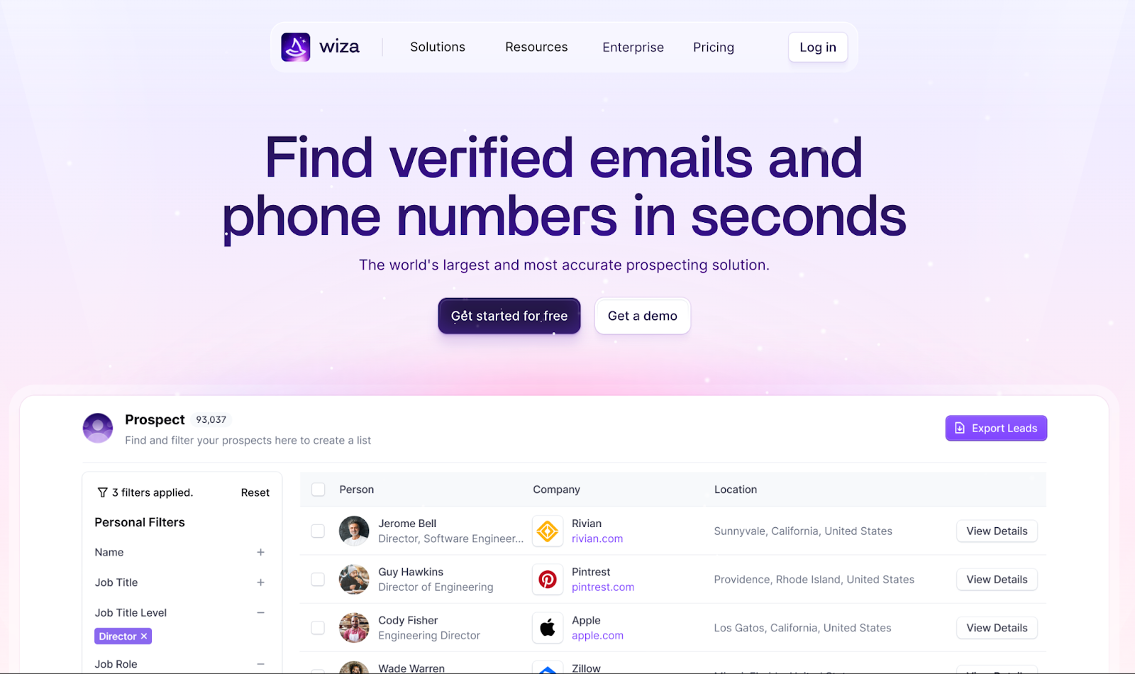
Key Features
- Real-time contact and company data verification.
- LinkedIn and Chrome extension capabilities.
- Comprehensive data enrichment beyond emails.
- Wiza monitoring with automated alerts.
Pricing: Paid plans begin at $49/month for the Starter plan.
What I like: The real-time verification is a game-changer for deliverability. It’s incredibly satisfying to export a list from LinkedIn and know you won't be hit with a "Mail Undeliverable" bounce ten minutes later. It’s lightweight, fast, and removes the "middleman" of manual data cleaning.
16. ZoomInfo
Best for: B2B contact and company data at scale
If a sales or marketing team needs deeper insight into enterprise accounts, beyond just emails or job titles, ZoomInfo delivers.
It’s not just a contact database — it’s a sales intelligence platform. Sales reps can use it to build segmented ICP lists, enrich CRM data, and trigger outreach based on company changes like hiring spikes or funding rounds.

Key Features
- Real-time contact and company enrichment.
- Intent signals and technographic data.
- Workflow automation for sales and marketing.
- Native integrations with HubSpot, Salesforce, and Outreach.
Pricing: Custom pricing based on seat count and features. Typically geared toward mid-sized to enterprise teams.
What I like: The depth and reliability of data are hard to beat. If your lead gen strategy depends on targeting the right people at the right companies, ZoomInfo gives businesses both the map and the compass. Bonus points for its intent signals that help prioritize outreach based on behavior.
17. Apollo.io
Best for: B2B email outreach and lead databases
Apollo combines a solid contact database with a cold outreach tool — perfect for SDRs or founders doing their own outreach.

Key Features
- Over 250M contact profiles.
- Built-in email sequencing and dialer.
- Intent signals and filters for ICP targeting.
- Works well with CRMs like HubSpot and Salesforce.
Pricing: Free plan with limited contacts; paid plans start at $49/month.
What I like: Apollo lets users do research, build a list, and launch a campaign — all from the same dashboard. The filters are super specific, and the emails don’t feel like spam when done right. It’s outbound made scalable and efficient, especially for scrappy B2B teams.
18. CloudTalk
Best for: Outbound teams
When I worked with a sales team that depended heavily on outbound calls, CloudTalk quickly became one of the most impactful tools in our entire lead generation stack. Reps could make more calls per hour, connect with more prospects, and automate the admin work that used to slow everything down.

What stood out the most was how much time we saved. Features like the Power Dialer and Smart Dialer meant reps weren’t wasting minutes manually dialing or switching tabs. And the AI-powered call summaries and transcriptions made follow-up and coaching dramatically easier. It genuinely leveled up our outbound efficiency and helped us convert more leads in less time.
With 80+ advanced calling features, 80+ native integrations, and seamless syncing with CRMs like HubSpot, Salesforce, Pipedrive, and Zoho, CloudTalk fits easily into any sales or marketing workflow. Plus, it’s GDPR compliant and offers HIPAA compliance, which makes it a secure choice for teams handling sensitive customer or patient data.
Key Features
- Power Dialer & Smart Dialer for fast, high-volume outbound calling
- AI call summaries & transcription to boost follow-up quality and coaching
- Automatic call logging directly into HubSpot and other CRMs
- Real-time dashboards to track rep activity and lead engagement
Pricing: Starts at $25/user/month for the Starter plan.
What I like: CloudTalk makes outbound calling fast. It removes most of the manual work—dialing, logging, note-taking—so reps can focus entirely on qualifying leads and booking meetings.
19. Crunchbase
Best for: Prospecting and market research
When building Ideal Customer Profile (ICP) lists, Crunchbase helps sales teams identify funding rounds, decision-makers, and tech stacks all in one place. It’s a goldmine for cold outreach when paired with tools like Apollo or HubSpot.

Key Features
- Company insights, revenue, funding, and contact info.
- Advanced filters by industry, stage, and geography.
- Custom lists and saved searches.
- Ideal for B2B research and sales teams.
Pricing: Free tier available; Pro plan starts at $99/month.
What I like: Crunchbase saves hours of manual research. The tool provides a data-rich picture of prospects before a marketer or sales rep ever writes a cold email, which massively improves personalization.
Interactive Lead Magnets and Forms
The following lead sourcing software are ideal for creating engaging forms, quizzes, and calculators.
20. Typeform
Best for: Interactive lead capture forms
Most forms are boring. Typeform makes them feel like a conversation. Marketers can use Typeform for everything from newsletter sign-ups to product fit surveys. People actually enjoy filling them out, and that matters when every conversion counts.

Key Features
- One-question-at-a-time design.
- Logic jumps and personalization.
- Beautiful design, even for free users.
- Easy integrations with HubSpot, Zapier, and more.
Pricing: Paid plans start at $25/month with more responses and customization.
What I like: Typeform turns lead gen into a branded, user-friendly experience. It’s not just a form — it’s a micro-conversion tool that respects your audience’s time.
21. Outgrow
Best for: Creating lead magnets like quizzes and calculators
Want to stand out? Build something interactive. Outgrow allows marketing pros to build interactive magnets like ROI calculators, product recommenders, and personality quizzes — and they convert way better than static PDFs.

Key Features
- Templates for quizzes, polls, assessments, and calculators.
- No-code builder with logic branching.
- Built-in analytics and lead scoring.
- Integrates with most CRMs and email tools.
Pricing: Starts at $22/month for freelancers and $115/month for businesses.
What I like: Outgrow makes lead magnets feel like tools, not freebies. That helps companies offer value before asking for info, which builds trust and boosts conversions.
22. Jotform
Best for: Building complex forms with conditional logic
If Typeform feels too sleek and Google Forms too basic, try out Jotform. Teams can build registration forms, multi-step questionnaires, and file upload forms with zero code.

Key Features
- 10,000+ templates for all industries.
- Conditional logic and calculation fields.
- HIPAA and GDPR-compliant options.
- Payment integrations and e-signatures.
Pricing: Free plan includes five forms. Paid plans start at $34/month, billed annually, and scale by submissions and storage.
What I like: Jotform handles complexity without making your life complex. It’s ideal when the lead gen form needs to do more than just collect an email.
Conversational Marketing and Chat
These lead generation tools use real-time chat and bots for lead capture.
23. Salesloft (formerly Drift )
Best for: Conversational lead capture via chat
Salesloft can transform the way B2B teams talk to site visitors. Instead of sending someone to a static form, Salesloft lets a business start a conversation. That real-time interaction means more qualified leads, booked meetings, and less waiting.

Key Features
- AI chatbots and live chat.
- Custom chat playbooks based on page behavior.
- Calendar integrations for instant meeting booking.
- ABM support with personalized experiences.
Pricing: Custom pricing for teams. Free plan includes live chat and basic bot features.
What I like: Salesloft doesn’t just capture leads — it qualifies them. I love how easy it is to route visitors based on actions or attributes and get them talking to the right person faster.
24. Intercom
Best for: Combining live chat, support, and nurture
Intercom particularly shines when customer education is key. Their bots handle onboarding and lead capture while keeping the tone human and helpful. It’s chat that scales.

Key Features
- Custom bots and carousels.
- Product tours and triggered messages.
- Email, SMS, and app messaging in one place.
- Deep user segmentation and behavioral targeting.
Pricing: Starter plans begin at $29 per seat/month, billed annually with $0.99 per Fin resolution. Larger teams need custom pricing.
What I like: Intercom stands out when a company needs to educate and nurture leads over time. It blends marketing and support so that the handoff between interest and onboarding feels seamless.
Paid Ads Lead Capture
The following lead generation tools are native lead generation forms within advertising platforms.
25. LinkedIn Lead Gen Forms
Best for: B2B paid campaigns on LinkedIn
If a company’s audience lives on LinkedIn, this tool is a no-brainer. Lead Gen Forms allows businesses to run sponsored content campaigns and capture quality leads without sending users to a landing page. The forms auto-fill with LinkedIn profile data — a huge win.

Key Features
- Native forms inside LinkedIn ads.
- Auto-populated contact info.
- Easy CRM sync (like with HubSpot or Salesforce).
- Works across Sponsored Content and InMail.
Pricing: Free to use, but only available with LinkedIn Ads spend.
What I like: The frictionless experience leads to higher conversion rates, especially if you’re targeting execs who don’t like clicking around. The lead quality is usually higher, too.
26. Google Ads: Lead Form Extensions
Best for: Capturing leads directly from search results
Instead of sending users to a landing page, Google’s lead form extensions let people submit their info directly from the ad.
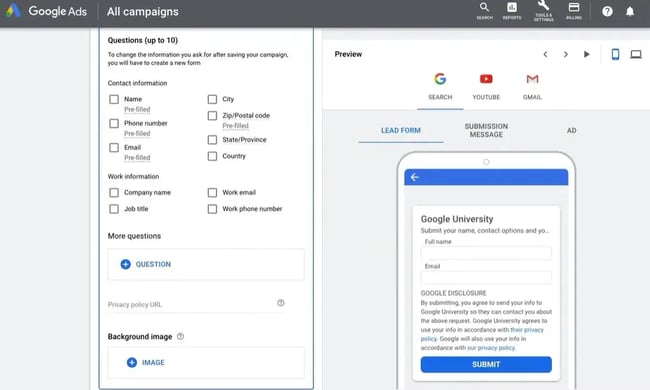
Key Features
- No-click lead capture.
- Mobile-optimized form experience.
- Integrates with CRMs like HubSpot and Salesforce.
- Best for high-intent, lower-funnel keywords.
Pricing: Included with your Google Ads spend.
What I like: It reduces the steps needed to convert — no click-throughs, no drop-offs. If businesses already run paid search, this is a low-effort way to boost lead volume.
27. Facebook Lead Ads
Best for: High-volume B2C lead capture on social
Running lead gen campaigns for a consumer product? Facebook Lead Ads make it super easy to collect emails, phone numbers, and other details without making users leave the app.

Key Features
- Native forms within Meta products, Facebook and Instagram.
- Auto-filled fields based on profile data.
- Syncs with email and CRM tools.
- Works great for giveaways, downloads, and sign-ups.
Pricing: Free to use with your Facebook/Instagram ad spend.
What I like: It’s fast, frictionless, and very scalable. I’ve used it to grow newsletter lists, book consults, and even pre-launch audiences. By far my favorite tool and strategy.
Frequently Asked Questions About Lead Generation Tools
What is a lead generation tool?
A lead generation tool is software that helps businesses attract, capture, and qualify potential customers who have shown interest in their products or services. These tools automate the process of converting website visitors and prospects into sales-ready leads through features such as forms, pop-ups, chatbots, landing pages, and data enrichment.
How do lead generation tools work?
Lead generation tools work by capturing visitor information at various stages of the buyer's journey and routing that data to sales and marketing teams. They typically use forms, chatbots, landing pages, or tracking pixels to collect contact information, including names, emails, and company details. Once captured, leads are automatically scored based on their behavior and characteristics, then routed to the appropriate sales representative or added to a nurturing campaign.
What are the best B2B lead generation tools?
HubSpot's Lead Management Software and Marketing Hub stand out as top choices for B2B companies because they offer end-to-end lead tracking, scoring, and nurturing within a single, unified platform. Other strong B2B options include ZoomInfo for deep company intelligence and contact data, Apollo.io for outbound prospecting and email sequences, and LinkedIn Lead Gen Forms for high-quality leads from professional networks.
How do I choose the right lead generation tool for my company size and budget?
To choose the right lead generation tool for your company size and budget, first determine whether a point solution or an all-in-one platform is needed. More generally, small businesses and startups should start with free tools like HubSpot’s Lead Management Software or Mailchimp to test features before investing. Meanwhile, enterprises require scalable solutions like ZoomInfo or HubSpot Marketing Hub that can handle high volumes of leads. Finally, consider trialing both free and paid options to find the right fit.
What’s the difference between a lead generation tool and a lead generation platform?
A lead generation tool typically focuses on one specific function, like building landing pages (Unbounce), capturing pop-ups (OptinMonster), or identifying website visitors (Leadfeeder). A lead generation platform, on the other hand, is a comprehensive solution that handles multiple stages of lead generation in one system — from capture and scoring to nurturing and conversion.
Can AI tools like ChatGPT help with lead generation?
Yes, AI tools like ChatGPT can support lead generation by helping create compelling content, write personalized outreach emails, and generate landing page copy quickly. However, AI tools work best as part of your broader lead gen stack rather than as standalone solutions — they enhance efficiency but still need to connect with your CRM and marketing workflows. Tools like HubSpot’s Marketing Hub increasingly incorporate AI to optimize campaigns and personalize experiences at scale.
How do I integrate lead generation tools with my CRM or marketing stack?
Most lead generation tools offer native integrations with popular CRMs like HubSpot, Salesforce, and Pipedrive, or connect via automation platforms like Zapier. For example, HubSpot’s Lead Management Software integrates seamlessly with the HubSpot CRM, automatically syncing lead scores, activities, and contact data across marketing, sales, and service teams.
Are there free lead generation tools worth trying?
Several high-quality, free lead generation tools are available without requiring an upfront investment. HubSpot’s Lead Management Software provides a free CRM with lead tracking, scoring, and routing capabilities that cater to businesses of all sizes. Other solid free options include Mailchimp for email marketing and landing pages, as well as BDOW! for on-site pop-ups, and Leadfeeder’s free tier for identifying anonymous website visitors.
What are the most important features to look for in a lead generation solution?
The most important features to look for in a lead generation solution include CRM integration for seamless lead management, automated lead scoring to prioritize high-value prospects, and lead routing to ensure the right reps get the right leads instantly. Look for tools that provide full visibility into each lead’s journey with automatic activity tracking across website visits, email opens, and sales calls — features that HubSpot’s Lead Management Software offers out of the box.
How do I measure ROI from lead generation tools?
Lead generation ROI is measured by conversion rates and cost per lead. Track metrics like the number of leads generated, lead-to-customer conversion rate, average deal size, and customer acquisition cost (CAC) to understand whether your investment is paying off. Compare your cost per lead against the lifetime value (LTV) of customers acquired through each tool, and monitor time-to-close to see if leads are moving through your pipeline faster.
Getting Started
While there’s no magic formula for lead generation, there are tools that make it way easier. Every tool on this list contributes to growing pipelines, nurturing relationships, and enhancing the process of connecting with potential customers. Whether a marketer is running paid ads, building quizzes, or optimizing landing pages, the key is choosing the tools that match your style and your audience.
Personally, I’ve found that success comes from stacking tools that work well together — like combining Hotjar insights with an Unbounce test, or using Typeform data to drive better segmentation in Mailchimp. The more intentional the stack, the smoother the funnel.
So, experiment. Try a few. Break things (gently). The right lead generation tool won’t just save businesses time — it’ll show what’s working and help teams double down on it.
And if you’re still unsure where to begin, start simple: Pick one tool from this list, set it up, and run a small test. That first lead that comes in? It’ll feel like magic.
Editor's note: This post was originally published in March 2019 and has been updated for comprehensiveness.
HubSpot Marketing Analytics Software
Measure the performance of all your marketing campaigns in one place with built-in analytics, reports, and dashboards.
- Marketing Analytics
- Dashboard Software
- Website KPIs
- And More!
Lead Generation
![What is a lead magnet? 20 lead magnet ideas and examples [+ step-by-step]](https://53.fs1.hubspotusercontent-na1.net/hubfs/53/lead%20magnet%20represented%20by%20a%20magnet.webp)


![Gated Content: What Marketers Need to Know [+ Examples]](https://53.fs1.hubspotusercontent-na1.net/hubfs/53/UNGated%20Content.png)

![What is demand generation? Here’s how you can create buzz for your offering [FAQs]](https://53.fs1.hubspotusercontent-na1.net/hubfs/53/demand-generation-1-20251208-2900472.webp)


![Lead Generation Content: Top Types to Use [Data + Expert Tips]](https://53.fs1.hubspotusercontent-na1.net/hubfs/53/lead%20generation%20content.webp)