
Heat maps are a game-changer for marketers who want to optimize their website and blog for better engagement and conversions.
By using heat maps to track user behavior, marketers can determine what their visitors like, what they don't like, and what they're ignoring.
Here, we’ll take a closer look at heat maps, how they work, and the different types of maps you can use to optimize your website for more conversions and less friction.
Free Download: A/B Testing Guide and Kit
Table of Contents
Different Types of Heat Maps [+ What They Can Tell You]
What is a heat map?
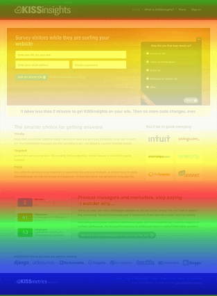
A heat map is a visual representation of user behavior on your website or blog. It uses color to mark the areas of a webpage that get the most attention from visitors.
Imagine a marketer is re-designing a landing page and wants to position a call-to-action in a high-traffic area. Instead of taking wild guesses on where it should go, she generates a heat map of her website, allowing her to see where visitors are most engaged.
This is what makes heat maps so effective. They allow marketers to visualize, understand, and interpret complex data at a glance.
By identifying patterns in movement and behavior, you can tailor your website (or landing page) to improve user experience, increase conversion rates, and even reduce bounce rates.
How do heat maps work?
Different color schemes can be used in heat maps — from grayscale to rainbow. However, rainbow-schemed maps are often preferred because they enable you to interpret data points more easily.
The “hot” sections of a heat map — typically represented by warmer colors — are most popular with users. Alternatively, the “cold” sections — typically represented by cooler colors — are less popular.
There are two main categories of heat maps:
- Interaction heat maps are used to identify how users interact with a website or blog. They do this by tracking clicks, mouse movements, and scrolling behavior.
- Attention heat maps are more complex, leveraging eye-tracking technology to record the movement of a user' eyes as they scan a webpage.
Next, we'll discuss the different types of heat maps and the benefits of each.
Different Types of Heat Maps [+What They Can Tell You]
1. Scroll maps
Scroll maps show you the percentage of visitors who scroll through each section of your webpage. The hotter the section, the more visitors have viewed it. This data can help determine where to place CTAs or important information on your webpage.
For instance, if your visitors only scroll down 50% of the page, placing a CTA closer to the top — rather than the middle or bottom — would make the most sense.
Remember: When using scroll maps, always look at metrics on different devices, including smartphones and tablets.
2. Click maps
As the name suggests, click maps identify the parts of your page that visitors click on the most. The hotter the section, the more frequently your visitors click on it.
This data can show you if visitors care to click on your CTAs or other buttons that allow them to take a desired action. It can also show you if they’re getting distracted by non-clickable elements or experiencing navigational issues.
-6.png?width=350&name=pasted%20image%200%20(1)-6.png)
3. Hover maps
Hover maps, also known as mouse-tracking heat maps, show you where visitors hover their cursor while reading your webpage. The hotter the area, the longer they hang their cursor over it.
This data can help determine how visitors actually navigate your website, so you can place important elements in a location where they’ll receive the greatest amount of attention possible.
For example, a marketer can track the hover patterns on a checkout page to see where customers experience the most friction.
-3.png?width=434&height=338&name=pasted%20image%200%20(2)-3.png)
How to Use Heat Maps
Analyzing the heat map of each type of page on your website would be ideal, but, unfortunately, it isn’t efficient. The most effective way to leverage heat maps is to analyze the pages that influence your website’s conversion rate the most: your home page, landing pages, and high-conversion blog posts.
Home Page
Your homepage is an introduction to your brand. If you constantly monitor which sections visitors are scrolling through and whether they’re hovering over key information and clicking on CTAs, then you’ll know exactly where to place the most important elements of your homepage, reducing your bounce rate and increasing your conversion rate.
Landing Pages
Your landing pages are the last step in turning visitors into leads. If you can analyze your users’ behavior on these pages, then you can implement the optimal landing page design for generating the most amount of leads for your business.
High-Conversion Blog Posts
Your CTAs placement on your blog posts can heavily influence their conversion rate. For instance, at HubSpot, even though our end-of-post banner CTAs are visually engaging, we found out that they only generate a small fraction of our blog leads.
After analyzing our heat maps, we discovered that our anchor text CTAs, which are just hyperlinked blurbs of text located after each blog post’s introduction, actually generated the majority of our blog leads because most visitors saw the CTA at the beginning of the post and not the one at the end.
Back to You
Whether you’re A/B testing your website design or figuring out the best place to put a call-to-action on your blog posts, heat maps are your best tool for measuring attention and designing content that connects with your audience and converts them into leads and customers.

Web Analytics


![How Many Visitors Should Your Website Get? [Data from 400+ Web Traffic Analysts]](https://53.fs1.hubspotusercontent-na1.net/hubfs/53/how-much-traffic-does-website-get.png)
%20(6).webp)

![What Is the Average Time Spent On a Website? [+ How to Improve It]](https://53.fs1.hubspotusercontent-na1.net/hubfs/53/GettyImages-1356122303%20copy.jpg)

![6 Steps to Reduce Your Bounce Rate [+ Platform-Specific Tips]](https://53.fs1.hubspotusercontent-na1.net/hubfs/53/decrease-bounce-rate.jpg)