.png?width=112&height=112&name=image%20hackathon%20%E2%80%93%20square%20(62).png)
Since then, I’ve experimented a zillion times and crafted different variations of graphs and charts in Excel that look super polished.
My takeaway? Having a defined process always helps. So, I now have a go-to, step-by-step process I swear by when creating Excel charts and graphs.
So you have one too, I’ve compiled a detailed, actionable guide to help you visualize data in Excel like a pro. Follow it, and creating graphs and charts in Excel will become your second nature.
Table of Contents
.png)
Free Excel Graph Templates
Tired of struggling with spreadsheets? These free Microsoft Excel Graph Generator Templates can help.
- Simple, customizable graph designs.
- Data visualization tips & instructions.
- Templates for two, three, four, and five-variable graph templates.
Download Free
All fields are required.
What is an Excel chart or graph?
An Excel chart or graph is a visual representation of a Microsoft Excel worksheet’s data. These graphs and charts allow you to see trends, make comparisons, pinpoint patterns, and glean insights from within the raw numbers. Excel includes countless options for charts and graphs, including bar, line, and pie charts.
But why visualize in Excel when you can simply explain the numbers? This was my first thought when I was asked to create the graph.
I’ve learned that adding Excel charts helps the audience understand and retain the relevant findings much better.
Presenting data as a graph makes information visually digestible and helps communicate clearly and efficiently, especially for large data sets.
(I’ve seen this firsthand a thousand times when looking at data from tools like SEMrush, Ahrefs, and more.)
Moreover, when the data has more than one finding to communicate — such as a comparison or changes taking place over time — Excel charts and graphs offer several options for creating impactful visuals.
How to Create a Graph in Excel
- Enter your data into Excel.
- Choose your graph or chart type.
- Highlight data and insert your graph.
- Switch your axes if needed.
- Customize colors and layout.
- Adjust label sizes.
- Refine Y-axis measurements.
- Reorder your data.
- Add a compelling title.
- Export your graph like a pro.
Creating a graph in Excel is simple. Follow my step-by-step process or download the PDF instructions below:
Most of the buttons and functions you'll see and read are very similar across all versions of Excel. Don’t want to start from scratch and prefer something quicker to fix instead? You can leverage Excel Graph Generators.
Just plug in your data, tweak the design, and you’ll get a professional-looking graph with minimal effort. I swear by this when time is tight. But I go through the entire process when I want or need something fully customized.
Let me walk you through my steps.
1. Enter your data into Excel.
So, I start by plugging in my data, which I organize into columns and rows. This is basic, but it's all you need to start.
Whether you’re importing data from a survey tool, downloading it from your marketing platform, or simply typing it in manually, step one is organize.
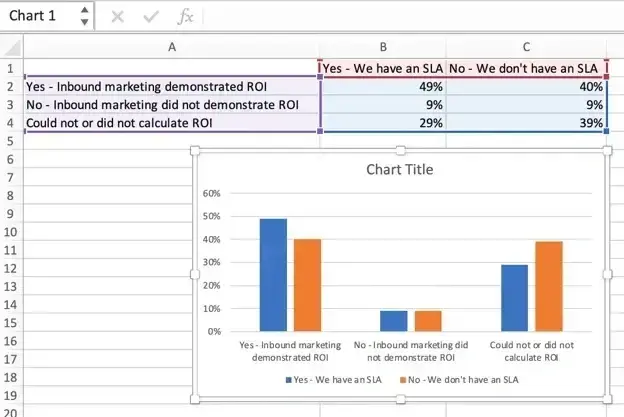
Let me show you a quick example of how I organize my data.
Let’s say we’re visualizing marketing ROI.
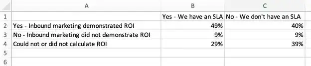
As you can see in the spreadsheet above, I’ve organized it as follows:
- Column A lists responses to the question, “Did inbound marketing demonstrate ROI?” or “Could not or did not calculate ROI?”
- Columns B and C list responses detailing whether or not the company had a formal sales-marketing agreement.
So, as per my data arrangement, Column B, Row 2 illustrates that 49% of people with a service level agreement (SLA) also say that inbound marketing demonstrated ROI.
2. Choose your graph or chart type.
Once my data is in and organized, I choose my preferred graph style. Excel offers many options, including bar charts, line graphs, pie charts, scatter plots, and more.
I choose the type that best tells my story. For example, when comparing things, I go for bar graphs. When emphasizing percentages or scatter plots for trends, I tend to use pie charts.
There’s no hard and fast rule here. I’d say, consider your audience and whether you want to keep it simple or add a creative flair. (More on this below.)
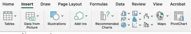
3. Highlight data and insert your graph.
Once I’ve organized my data and decided on my chart type, I highlight the cells I want to visualize (including the headers). Next, I click on the Insert tab and select the chart type I’ve decided on in the previous step.
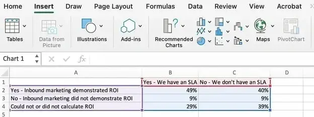
I’ve chosen a clean, two-dimensional column chart here because flat bars look sharp and professional. See below:
But hey, this isn’t always set in stone. I also sometimes customize based on the audience.
For example, I once used a three-dimensional chart to mimic skyscrapers when creating charts for a construction client. This made the data visually relevant and memorable, and they loved it.
Case in point: Small tweaks go a long way.
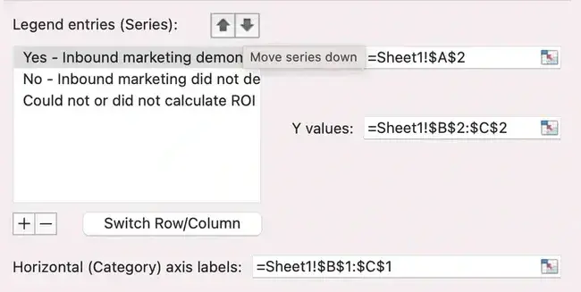
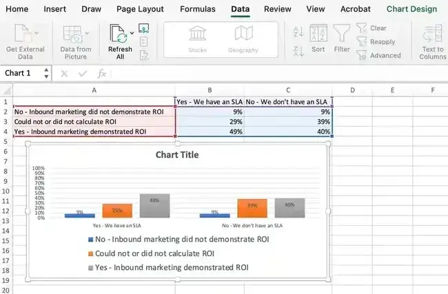
4. Switch your axes if needed.
Sometimes, after inserting my graph, I feel the X and Y axes may need to be swapped for clarity. When this happens, I right-click on the graph, select Select Data, and hit the Switch Row/Column button.
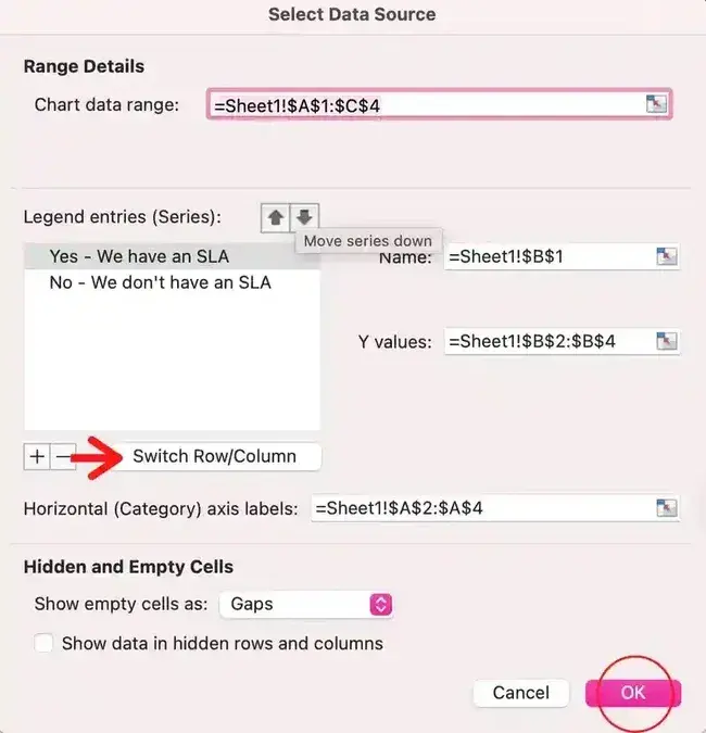
Let me explain this more by revisiting the SLA data example.
So, the first orientation worked great for general audiences. However, if my presentation was all about SLAs and I were to present it to a room full of executives focused on deciding whether or not to secure one, I’d prefer to flip.
I’d go for the second XY orientation to create something like the one below.
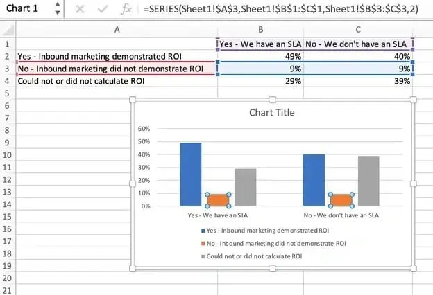
Do you now see the difference in clarity with this one simple change?
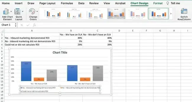
5. Customize colors and layout.
This is one of my favorite parts, where I can let my creativity loose and pick and choose between colors and layout. And trust me, these details matter.
I usually use softer tones for internal presentations and bold, branded colors for external audiences. I also go the extra mile for key clients and customize the bar colors to match their brand palette, instantly making the chart more professional.
I’ve seen this make a lasting impression.
To customize, I click on the chart and explore the Chart Design tab to adjust layouts, colors, and legend placement.
When I want to format the legend further, I click on it and hover over the Format Legend Entry sidebar, as shown below.
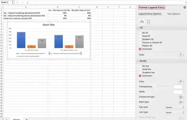
Here, I change the fill color of the legend to change the color of the columns as I want it. Sometimes, I also format other parts of my chart. For that, I click on them individually to reveal a corresponding Format window.
Free Excel Graph Templates
Tired of struggling with spreadsheets? These free Microsoft Excel Graph Generator Templates can help.
- Simple, customizable graph designs.
- Data visualization tips & instructions.
- Templates for two, three, four, and five-variable graph templates.
Download Free
All fields are required.
6. Adjust label sizes.
Small labels can ruin a great graph. I always check and bump the font size for axis and legend labels whenever needed. This ensures they’re always legible, especially while presenting them.
To do this, I click on the label, go to the Home tab, and adjust the font size. This is a simple step, but again, it makes a big difference. See below:

7. Refine Y-axis measurements.
I’ve often encountered situations where Excel’s default Y-axis doesn’t cut it, and interpreting the data becomes complex.
In those situations, I customize my Y-axis measurements. To do this, I click on the Y-axis percentages in my chart, which reveals the Format Axis window.
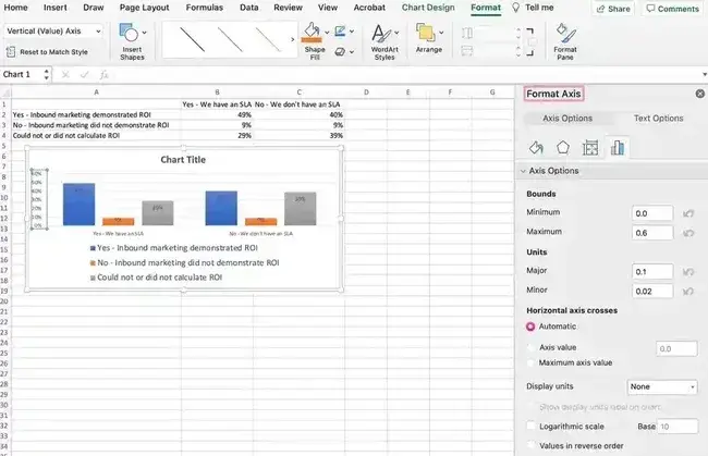
Here, I decide whether to display units on the Axis Options tab and whether to show percentages to two or no decimal places on my Y-axis.
As you can see, my graph automatically sets the Y axis' maximum percentage to 60%. When I want to change it manually to 100% to represent data on a universal scale, I select the Maximum option (this is two fields down under Bounds in the Format Axis window).
Here, I’ve changed the value from 0.6 to one. This gives a resulting graph like the one below:
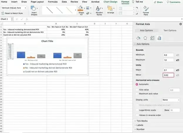
PS: In this example, I’ve also increased the font size of the Y-axis via the Home tab so that you can see the difference.
8. Reorder your data.
Sometimes, I feel it may be better if my data appears in reverse order.
When I want to sort it that way, I right-click on the graph and click Select Data to reveal the same options window as in Step 3 above. To reorder, I choose the arrow up or down to reverse the order of my data on the chart.
Re-arranging in ascending or descending order is possible even when there are more than two lines of data to adjust. When I want to do this, I highlight all of my data in the cells above my chart, click Data, and select Sort, as shown below.
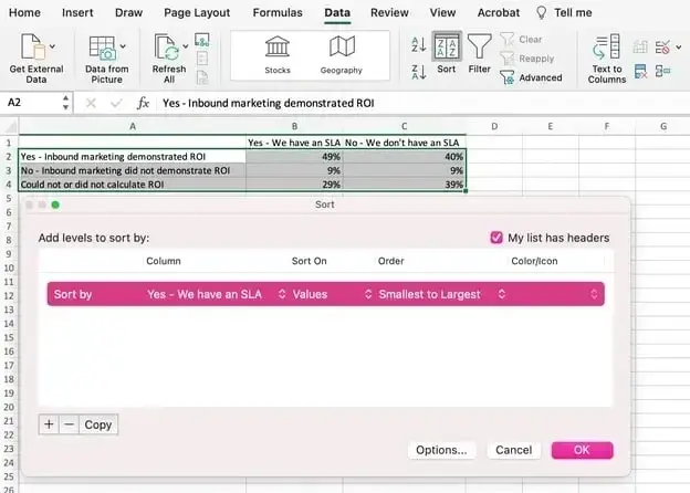
Depending on my preference, I choose to sort based on the smallest to largest or vice versa. The resulting graph looks something like the one below.
It's tremendously better, right? As you can see, this version reflects the progression of results and is much more visually persuasive.
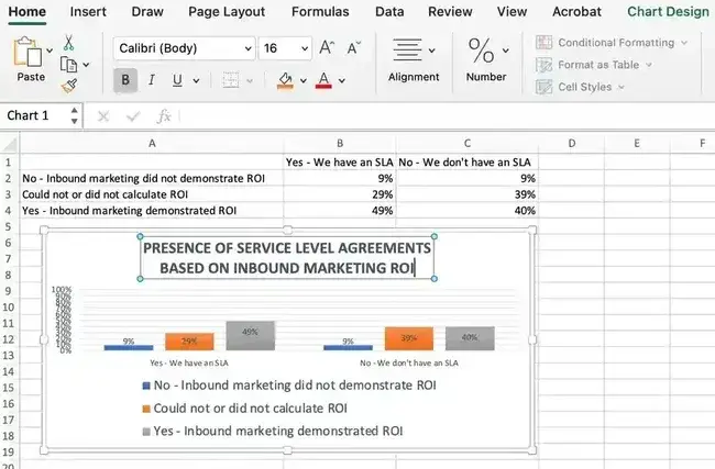
9. Add a compelling title.
The title is your graph’s headline — and I strongly feel you’ve got to make it count. To add a title, I click on the default Chart Title to reveal a typing cursor. Then, I replace it with something specific and engaging.
Once I’ve filled in what I like, I click Home on the top navigation bar and use the font formatting options to give my title the emphasis it deserves.
See these options and my final graph below:
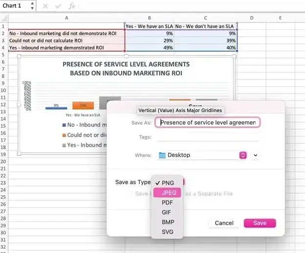
10. Export your graph like a pro.
Voila! We’re nearly done and have an amazing graph.
My next step? I definitely won’t screenshot it. Instead, I’ll right-click on the chart and select Save as Picture. This will give me a clean, high-quality image that I can now use for presentations, Canva graphics, and social media posts.
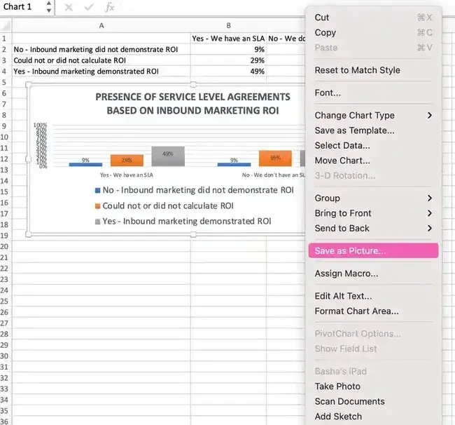
As shown in the image below, a dialogue box will appear to add the file name, location, and type while saving. I’ve saved this example as a JPEG in my desktop folder.
So far so good? Once I’ve got any chart ready, I often play around a bit more. I experiment with different types to present my story in the best-suited manner. Let me take you through how I do that.
Visualize Data Like a Pro: How to Experiment With Chart Types
My favorite part of working with Excel data is deciding how to present it visually.
Sometimes, I start out thinking a bar graph will do the trick. However, after experimenting, I realize a pie chart or line graph would tell the story better, so I swap it.
PS: Every time I do this, I’m reminded how much the right graph can elevate the presentation.
Swapping chart types in Excel is simple. Here’s precisely how I approach it.
Step 1: Select the chart.
First, I click on a blank area of my chart to select it. Once I see the border light up around the chart, I know it’s ready for edits. This ensures that whatever changes I make apply to the whole graph, not just a specific label or axis.
Step 2: Open the chart design tab.
Next, I head to the ribbon and click the Chart Design tab. Sometimes, I take the faster route and just right-click on the chart to pull up the same options. It’s a little trick I’ve picked up to save time, and it works every time.
Step 3: Change the chart type.
Here’s where things start to get fun.
I click Change Chart Type, and Excel shows me all my options on the left-hand side. Bar charts, pie charts, scatter plots — you name it, and it’s there. On the right, a handy preview lets me see how each chart type would look with my data.
In this step, I think about the story I’m trying to tell and make my choice. For example, if I want to emphasize proportions, I may use a pie chart. If I want to show trends over time, I may use a line graph.
Step 4: Shop for the best fit.
This part feels like window shopping (I’ll admit, I’ve spent more time here than I care to admit.) I scroll through the Recommended Charts and All Charts tabs, clicking through options and seeing how my data transforms.
Once I find a chart type that works — something clean, clear, and aligned with my audience’s needs — I hit OK. Watching the graph change instantly is always satisfying and often sparks new ideas for presenting my insights!
As I have shared my steps with you, I'm sure you might have wondered at some point what factors should go into choosing the appropriate chart or graph for your project.
So, let’s chat charts now and give you ideas about which charts could help you tell the stories in your data.
The 18 Types of Charts in Excel
Understanding the uses of different chart types in Excel can put you at an edge in optimizing how you present information. This can be highly valuable and insightful for your team’s projects.
In the following section, I’ll share my favorite tried-and-tested options. Then, at the end, I’ll also briefly summarize the advanced chart types and those that I feel may not be as useful to marketers from my experience.
Excel Charts Most Useful to Marketers
1. Area Chart
Excel area charts allow you to see trends over time or other relevant variables. They’re essentially a line graph with colored-in sections emphasizing progression and giving a sense of volume.
Then, there are stacked area charts. These denser area charts allow you to show more information at once, such as comparing trends in multiple categories or tracking changes across different variables.
Best for: Demonstrating the magnitude of a trend between two or more values over a given period.
2. Clustered Bar Graph
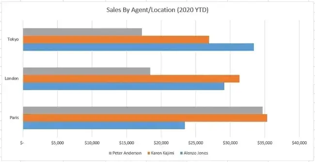
An Excel bar graph represents information horizontally and compares different data series. It allows you to easily see the proportions between various categories or elements of your data.
For instance, you can use clustered bar graphs to compare the sales by different agents across locations. This can help you understand how different agents perform across geographies in the same time frame.
Best for: Comparing the frequency of similar values between different variables.
Free Excel Graph Templates
Tired of struggling with spreadsheets? These free Microsoft Excel Graph Generator Templates can help.
- Simple, customizable graph designs.
- Data visualization tips & instructions.
- Templates for two, three, four, and five-variable graph templates.
Download Free
All fields are required.
3. Clustered Column Charts
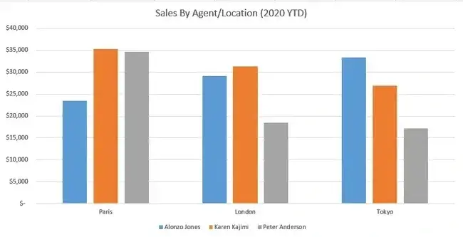
Column charts are similar to bar graphs, but they differ in one critical way: they’re vertical, not horizontal. The vertical orientation helps viewers rank different data elements.
Like bar graphs, column charts compare data, display trends, and show proportions. For instance, if you want to rank your sales agents conversion numbers and view it across different locations.
You can visualize them in a clustered column chart and see which agent performs best in a particular location. This will be visible as the tallest in that cluster.
Best for: Displaying various data elements to rank them visually over time.
Pro tip: I’ve seen firsthand how column charts displaying T-bars of statistical significance are extremely useful in helping people in leadership dispel likely but ultimately untrue interpretations of data.
Sometimes, data showing meaningful change is still within normal parameters. Sometimes, a slight difference is significant. Managers and directors may need help seeing these realities so they don’t oversteer at decision time.
4. Line Graph
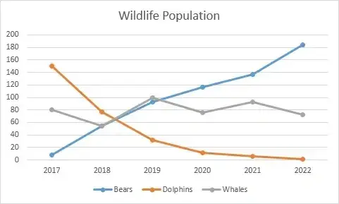
A line graph is a simple but highly effective way to visually see trends over time — even without the frills of bars, columns, or extra shading. You can also compare multiple data series.
As you can see in the graph above, the line graph compares changes in population over time for bears, dolphins, and whales.
This has exciting applications in the marketing context. For instance, you can use it to visualize the number of organic visits from Google versus Bing over 12 months. You can also see the rate or speed at which your data set changes.
In the Google vs. Bing example, a steep incline would mean a sudden spike in organic traffic, whereas a more gradual decline could mean traffic is decreasing slowly.
Best for: Illustrating trends over time, such as spikes or drops in sales due to holidays, weather, or other variables.
5. Pie Chart

A pie chart is a helpful way of seeing how different data elements proportionally compare, such as sales across months, as shown in the chart above.
Like line graphs, this is also extensively used in marketing. Let’s say you’re curious about the percentage of your organic traffic from Google versus Bing. Or how much market share do you have compared to competitors?
A pie chart can be a fitting way to visualize that information. It’s also a great way to see and communicate progress toward a specific goal. For instance, if your goal is to sell a product every day for 30 days in a row, then you might create a pie chart with 30 slices and shade a slice each day you sell the product.
Best for: Showing values as percentages of a whole and viewing data elements proportionately.
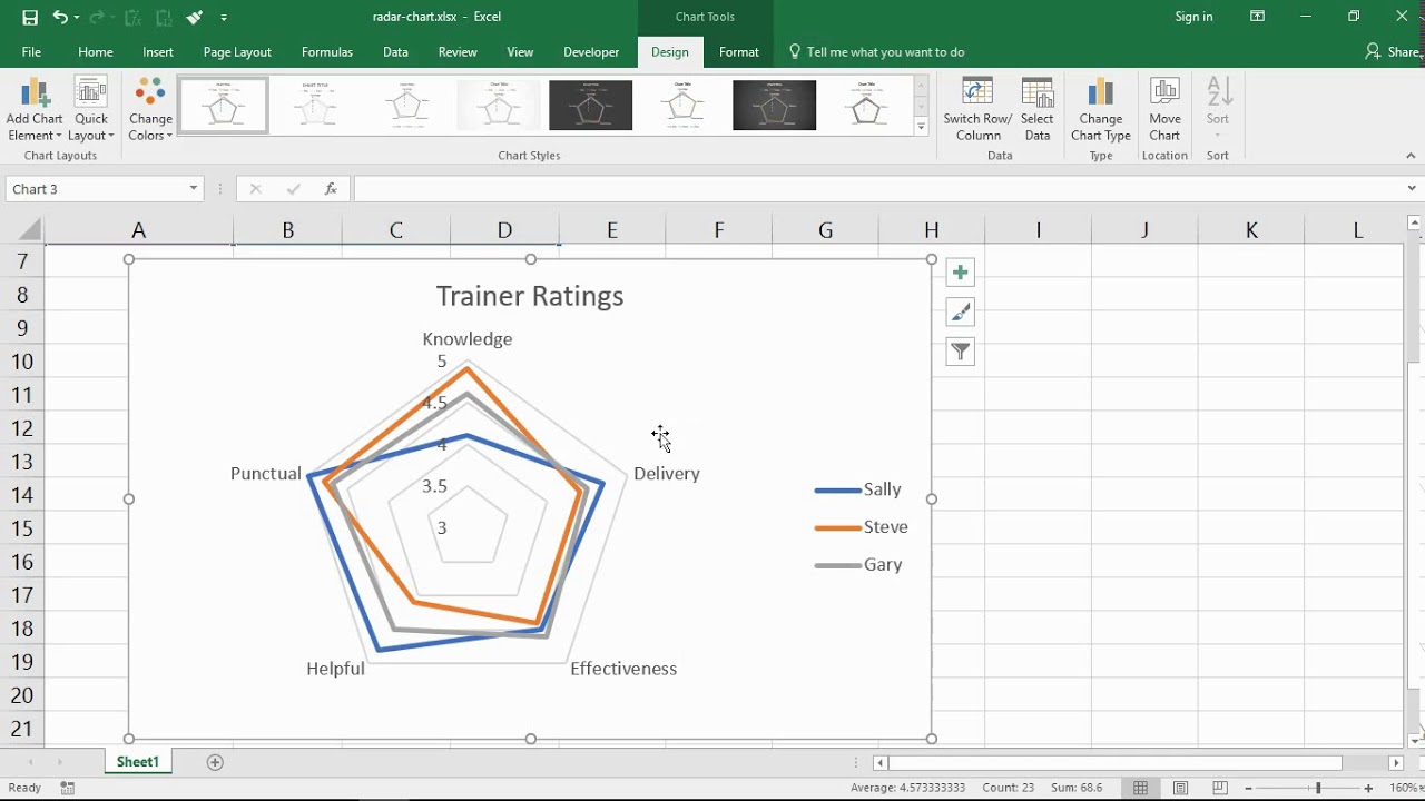
6. Radar Chart
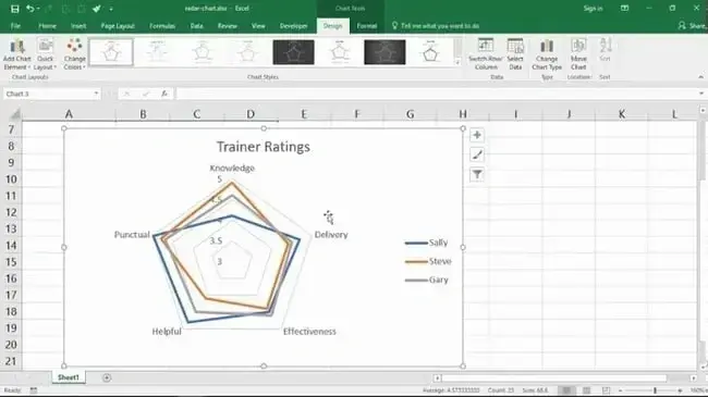
A radar chart might look familiar to you if you’ve ever taken a personality test, but it’s also useful outside of that industry.
Radar charts display data in a closed, multi-pointed shape. Each point is called a spoke, and multiple variables “pull” spokes of the shape. Then, shapes can be stacked up for comparison.
This type of chart is well-designed for comparing different data elements, such as attributes, entities, people, strengths, or weaknesses. It also helps you see the distribution of your data and understand whether it's overly skewed.
Best for: Comparing the aggregate values of multiple data series at once.
7. Scatter Plot
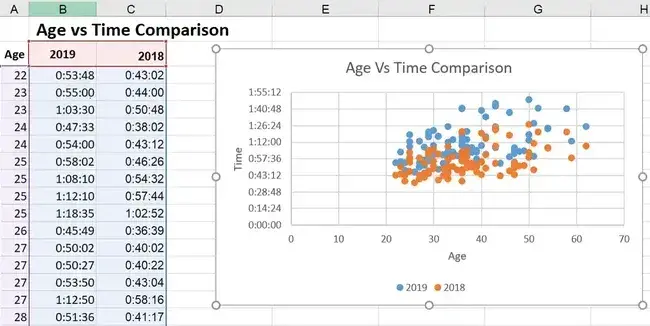
Scatter plots look similar to line graphs but with one critical difference: They evaluate the relationship between two variables shown on the X- and Y-axes, enabling you to identify correlations and patterns between them. The scatter plot in the graph above denotes the correlation between age and time.
In the marketing context, you can use scatters in scenarios like comparing the amount of organic traffic (X-axis) with the number of leads and signups (Y-axis).
If you see an upward trend in the dots where these two converge, you’ll know how an increase in organic traffic affects your leads and signups.
If you have a leads/signups goal, you can create a more data-driven plan for increasing organic traffic.
You can even further compare the number of leads and signups with daily sales or conversions to keep more programs on data-driven paths.
Best for: Visualizing positive or negative relationships between two variables.
8. Funnel Chart
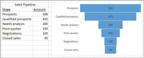
Funnel charts are incredibly well-suited to marketers who want to optimize processes and pipelines.
In the image above, it’s clear that you drop the most candidates between the stages Qualified Prospects and Needs Analysis. So, it may be interesting to examine that portion of your funnel more deeply to understand why.
Best for: Visually representing changes through processes helps to clarify where the biggest changes occur along the way.
Pro tip: My experience has taught me that if you only use two levels — especially if there’s no great change between them, it’s easy to mistake this for a bar graph, which functions entirely differently. You’ll want to use at least three levels so it’s more clearly distinguished as a funnel shape.
9. Histogram Chart
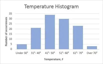
Histograms are a solid option when explaining data that occurs most usefully in ranges. For instance, the graph above shows the number of occurrences of a particular event, compared across temperature ranges.
In marketing, you can use it for applications like showing your clients the buying habits of various age demographics in their product niche. You may find that the target audience has moved, possibly even jumped a range up or down.
If the client has sold baby products for the last 100 years, you’d see that their target audience of first-time parents is getting older as people wait longer to have children.
This may change your marketing strategies to meet the needs and issues of this older first-time parent demographic.
Best for: Demonstrating data findings that are most noticeable and useful when the data is grouped in ranges.
Advanced Excel Charts
Excel also has advanced charts that are more complicated and better suited to audiences who can already read advanced-level charts. Some of these include:
10. Box and whisker chart.
11. Pareto chart.
12. Surface chart.
13. Sunburst chart.
14. Treemap chart.
Industry-Specific Excel Charts
The remaining Excel chart types don’t typically lend themselves to marketing. But, hey — if your niche calls for it, these charts listed below are there to support you:
15. Stock chart.
16. Waterfall chart.
17. Filled map chart.
18. Combo chart.
Summarizing the Charts
I know this has been a ton of information. If you’re still unsure which to choose, here’s a concise comparison of the Excel charts I find most helpful to marketers.
|
type of chart |
Use |
|
Area |
Area charts demonstrate the magnitude of a trend between two or more values over a given period. |
|
ClusteredBar |
Clustered bar charts compare the frequency of values across different levels or variables. |
|
Clustered Column |
Clustered column charts display data changes over a period of time to visualize rank among data sets. |
|
Line |
Similar to bar charts, they illustrate trends over time. |
|
Pie |
Pie charts show values as percentages of a whole. |
|
Radar |
Radar charts compare the aggregate value of multiple data series. |
|
Scatter |
Scatter charts show the positive or negative relationship between two variables. |
|
Funnel |
Funnel charts excel at visualizing changes to one data point over various processes. |
|
Histogram |
Histograms show variations in data that are best represented as a range of values. |
Side quest: If you’re looking for a deeper dive to help you figure out which type of chart/graph is best for visualizing your data, check out this free ebook, How to Use Data Visualization to Win Over Your Audience.
Excel Charting Adventure: Confidence and Mastery Await
Looking back on that first day when I scrambled to make my graph, I’m amazed at how far I’ve come in creating graphs and charts in Excel.
My journey has made me realize that charting effectively is not about perfection — it's about process. Now, with a clear, step-by-step approach, building charts has become my second nature.
Whether you‘re just starting or refining your skills, remember that every graph you create will add to your expertise. Don’t be afraid to experiment, adjust, and make mistakes.
Excel offers endless possibilities to tell stories through data — so trust the process, have fun with it, and watch your skills grow. You’ve got this!
Editor's note: This post was originally published in April 2013 and has been updated for comprehensiveness.
Free Excel Graph Templates
Tired of struggling with spreadsheets? These free Microsoft Excel Graph Generator Templates can help.
- Simple, customizable graph designs.
- Data visualization tips & instructions.
- Templates for two, three, four, and five-variable graph templates.
Download Free
All fields are required.
Excel


![How to Use VLOOKUP Function in Microsoft Excel [+ Video Tutorial]](https://53.fs1.hubspotusercontent-na1.net/hubfs/53/VLOOKUP-hero.webp)

